
Two ways to solve this problem sit side by side, and they look alike until you use them. One way is a single platform that tries to do everything, with one login and one bill. The other way is a small set of focused tools, each doing one job well, with a little extra work to keep them in step. That is the question this guide answers for best color palette generators for branding, with every tool tested against real work rather than a sales page.
The single platform wins on simplicity. One place to log in, one place to search, and one support team to call. The focused set wins on depth, since a tool built for one job usually does that job better than a module inside a larger system. The right answer depends on how your team works and how much complexity it will tolerate.
This guide compares both approaches across the tools that matter in 2026. Each entry covers what the tool does, what it costs, who it fits, and where it falls short. By the end you should know not only which tool leads, but which approach fits your team.
The best pick by job
Start here if you are short on time. The table below matches the most common jobs to the tool that handles each one best, so you can find your fit without reading every entry. The best color palette generators for branding in this table were ranked on the core job first, then on price and ease of use.
| Job | Best tool |
|---|---|
| Fast palette exploration | Coolors |
| Brand systems inside Adobe workflows | Adobe Color |
| AI trained palettes matched to personal taste | Khroma |
| Brand directions shown on real mockups | Huemint |
| AI palettes learned from real artwork | Colormind |
| Learning harmony rules and testing them | Paletton |
| Seeing a palette on a real page with contrast scores | Realtime Colors |
| Brand focused palettes with AI help | Brandmark Color Wheel |
If your job is not in the table, read the full entries for the two tools closest to your situation. The comparison table later in this guide covers price and best fit for every tool, so a quick scan there will narrow the list to two or three names.
What the best color palette generators for branding do differently
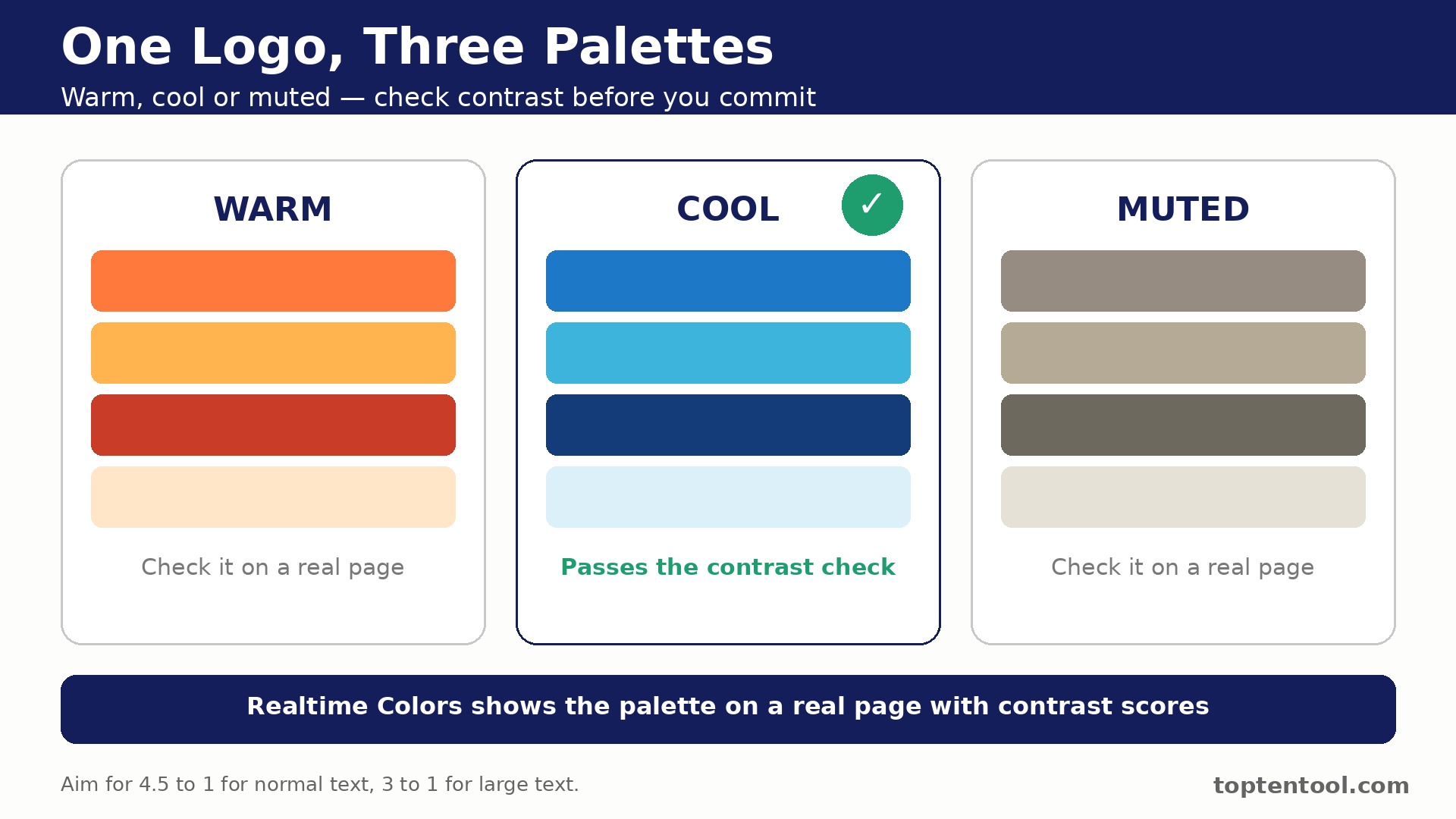
A palette generator is only useful if the colors survive contact with real work. A scheme that looks lovely as five swatches can fail the moment it meets a button, a headline and a photo. Judge every tool on whether it shows the palette in context, on a page, a card or a logo, before you fall for the swatches alone.
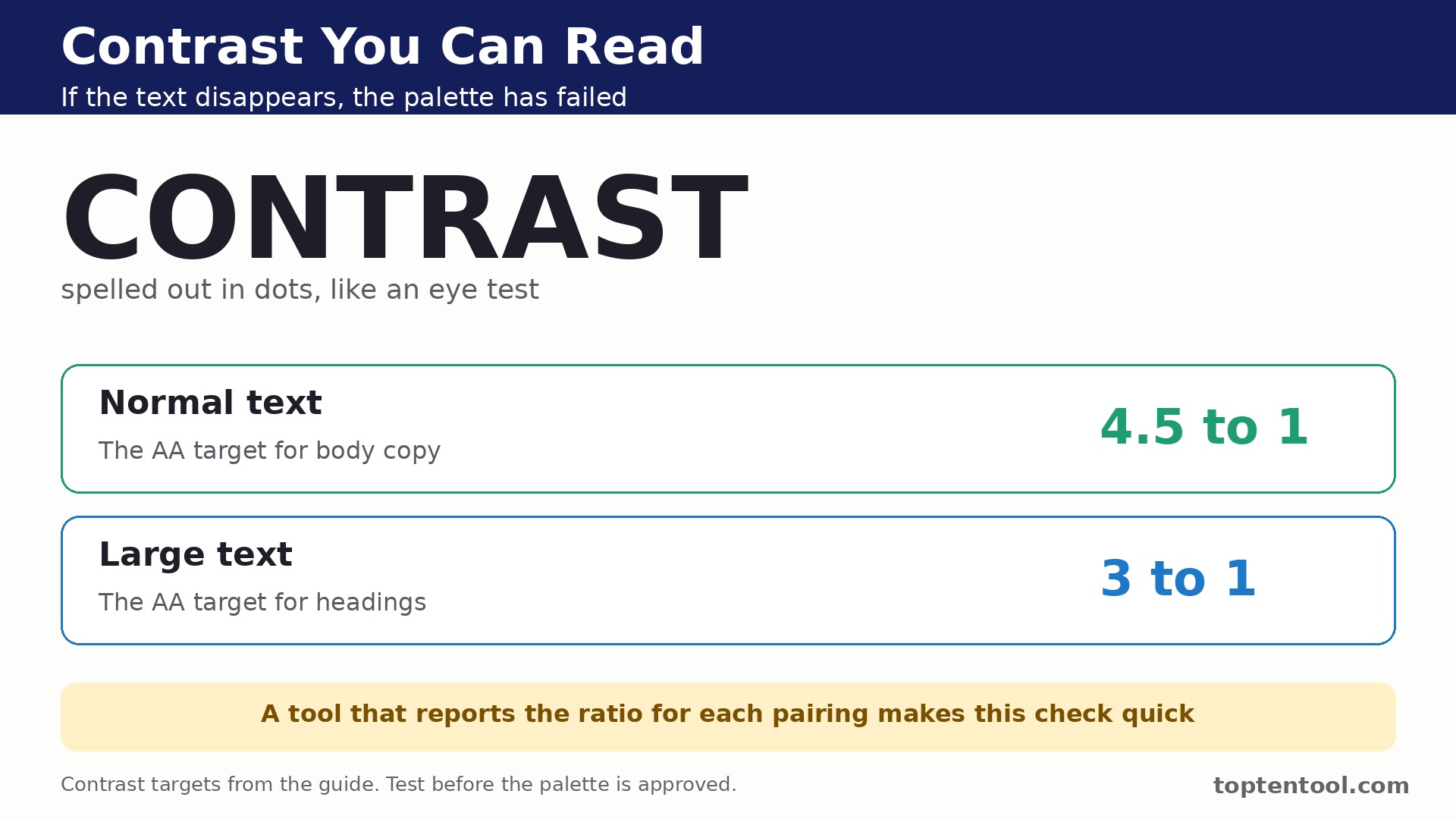
Contrast is the test most teams skip and regret later. A soft grey on white may look refined in a deck and unreadable on a phone in sunlight. Pick a tool that reports contrast ratios for text pairings and flags the ones that fail. If the tool hides that check behind a paywall, run the check in a free tool before you commit.
Think about where the palette has to live. A web team needs hex, CSS and Tailwind export. A print team needs CMYK values and ASE files for Illustrator. A brand team needs the palette saved in a shared library that everyone can open. The right export list matters more than the prettiest generator.
Keep the palette small on purpose. Two main colors, one accent and two neutrals will carry most brands further than eight competing hues. A generator that pushes you toward endless options is working against you. Lock the colors that matter, test them in real layouts, and stop when the system feels calm.
The best color palette generators for branding in this guide were judged on real daily work, not on a demo. Price, fit, and the quality of the core job mattered more than the length of the feature list.
Side by side comparison
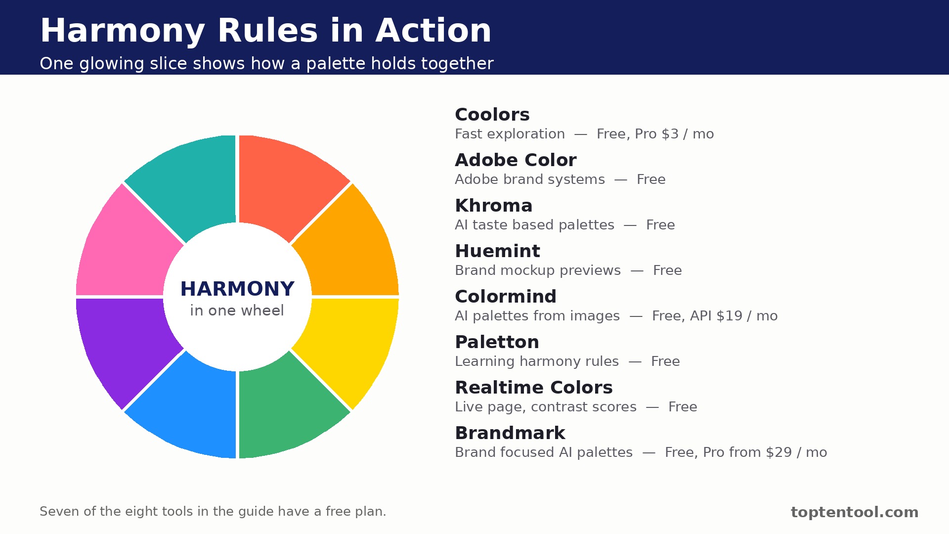
The table below puts price and best fit side by side, so the trade offs are easy to see. The best color palette generators for branding that look cheapest on the first line are not always cheapest in real use, since shipment caps, per user fees and add ons change the total. Read the price column together with the best fit column before you rank the tools.
| Tool | Starting price | Best for |
|---|---|---|
| Coolors | Free, Pro 3 dollars per month | Fast exploration |
| Adobe Color | Free | Adobe brand systems |
| Khroma | Free | AI taste based palettes |
| Huemint | Free | Brand mockup previews |
| Colormind | Free, API 19 dollars per month | AI palettes from images |
| Paletton | Free | Learning harmony rules |
| Realtime Colors | Free | Live page and contrast checks |
| Brandmark Color Wheel | Free, Pro from a reported 29 dollars per month | Brand focused AI palettes |
The tools in detail
1. Coolors
Coolors is built for fast palette exploration. Press the spacebar and a new palette appears, with any color locked in place while the rest change. Palettes export to CSS, Tailwind, ASE, SVG and PDF, so the colors move straight into design and code. The combination suits a team that wants the core job handled well without a long setup or a steep learning curve.
The Palette Visualizer shows a scheme on real layouts, which helps a team judge a palette before committing. Pricing is Free, Pro from 3 dollars per month billed annually. Check the plan limits before you commit, since caps on users, volume or features can change the real cost once the team uses the tool in earnest.
Coolors fits fast palette exploration best. The free plan caps palettes at five colors and ten saved palettes, and the contrast check sits behind the Pro paywall. Weigh that drawback against how often it would touch your daily work before you decide.
2. Adobe Color
Adobe Color is built for brand systems inside Adobe workflows. The color wheel applies harmony rules like complementary, analogous and triadic, and moving one stop moves the related colors with it. Extract Theme pulls colors out of any uploaded image, which is useful when a brand starts from photography. The combination suits a team that wants the core job handled well without a long setup or a steep learning curve.
Palettes save to a Creative Cloud library and appear in Photoshop, Illustrator and InDesign without copy and paste. Pricing is Free with an Adobe account. Check the plan limits before you commit, since caps on users, volume or features can change the real cost once the team uses the tool in earnest.
Adobe Color fits brand systems inside Adobe workflows best. Applying a palette to designs automatically needs a paid Adobe plan, so the free tool is strongest for building the palette itself. Weigh that drawback against how often it would touch your daily work before you decide.
3. Khroma
Khroma is built for AI trained palettes matched to personal taste. Khroma learns from the colors you like and dislike, then generates combinations that fit that taste. Palettes preview on typography, gradients, posters and images, so you see the colors working before you choose. The combination suits a team that wants the core job handled well without a long setup or a steep learning curve.
Search by color, name or hex keeps a large library of generated palettes easy to explore. Pricing is Free. Check the plan limits before you commit, since caps on users, volume or features can change the real cost once the team uses the tool in earnest.
Khroma fits AI trained palettes matched to personal taste best. There is no team library or brand management layer, so it fits early exploration better than a finished brand system. Weigh that drawback against how often it would touch your daily work before you decide.
4. Huemint
Huemint is built for brand directions shown on real mockups. Huemint previews palettes on logos, websites, business cards and illustrations in one view. The AI suggests distinct directions rather than small variations on one idea. The combination suits a team that wants the core job handled well without a long setup or a steep learning curve.
Locking a color and iterating around it keeps the parts you like while the rest change. Pricing is Free, with a public API for non commercial use. Check the plan limits before you commit, since caps on users, volume or features can change the real cost once the team uses the tool in earnest.
Huemint fits brand directions shown on real mockups best. Export options are lighter than Coolors or Adobe Color, and there is no published paid plan for heavier commercial use. Weigh that drawback against how often it would touch your daily work before you decide.
5. Colormind
Colormind is built for AI palettes learned from real artwork. Colormind learns color styles from photographs, films and art, then generates palettes in those styles. Image upload produces a palette drawn from the picture itself. The combination suits a team that wants the core job handled well without a long setup or a steep learning curve.
The API lets developers generate palettes inside their own products. Pricing is Free, API from 19 dollars per month. Check the plan limits before you commit, since caps on users, volume or features can change the real cost once the team uses the tool in earnest.
Colormind fits AI palettes learned from real artwork best. The interface is simple and the palette count per session is limited, so it suits quick generation more than deep brand work. Weigh that drawback against how often it would touch your daily work before you decide.
6. Paletton
Paletton is built for learning harmony rules and testing them. Paletton shows how harmony rules work with a clear wheel and live preview on a sample page. Monochromatic, adjacent, triad and tetrad modes make the theory visible in one click. The combination suits a team that wants the core job handled well without a long setup or a steep learning curve.
Color blindness simulation shows how a palette reads for people with different vision. Pricing is Free, no account needed. Check the plan limits before you commit, since caps on users, volume or features can change the real cost once the team uses the tool in earnest.
Paletton fits learning harmony rules and testing them best. It looks dated next to newer tools and the export options are basic, so it works best as a learning and checking tool. Weigh that drawback against how often it would touch your daily work before you decide.
7. Realtime Colors
Realtime Colors is built for seeing a palette on a real page with contrast scores. A full sample page updates live in light and dark mode as you change colors. Contrast ratios show for every pairing, with AA and AAA targets marked clearly. The combination suits a team that wants the core job handled well without a long setup or a steep learning curve.
Export covers CSS, Tailwind, SCSS and Figma, plus OKLCH values for modern workflows. Pricing is Free, no paid tier. Check the plan limits before you commit, since caps on users, volume or features can change the real cost once the team uses the tool in earnest.
Realtime Colors fits seeing a palette on a real page with contrast scores best. It is built for web and app interfaces, so print brand work gets less attention here than in a general palette tool. Weigh that drawback against how often it would touch your daily work before you decide.
8. Brandmark Color Wheel
Brandmark Color Wheel is built for brand focused palettes with AI help. The tool is built around brand identity, so palettes are judged on how they work as a system rather than as single colors. AI suggestions start from a brand direction and build out from there. The combination suits a team that wants the core job handled well without a long setup or a steep learning curve.
Logo and brand previews show the palette in context rather than as bare swatches. Pricing is Free version available, Pro plans from a reported 29 dollars per month. Check the plan limits before you commit, since caps on users, volume or features can change the real cost once the team uses the tool in earnest.
Brandmark Color Wheel fits brand focused palettes with AI help best. The Pro price is high next to tools that are free, and the free version limits how far you can take a palette. Weigh that drawback against how often it would touch your daily work before you decide.
Mistakes to avoid
Most buyers in this category make the same few mistakes, and the tools that look best on paper are often the ones that punish those mistakes most. A short list of the common errors will save more money than a long feature comparison.
The most common mistake is choosing colors from swatches alone. A palette needs to be tested on the surfaces where it will live, which means headlines, buttons, cards and photos. A tool that shows the palette in context will save a rebrand later.
Another mistake is adding too many colors. Every extra hue makes the brand harder to remember and harder to use well. Start with a small set, use neutrals for most of the space, and let one accent do the loud work.
The third mistake is ignoring contrast until launch. Text that fails contrast rules is not a style choice, it is a barrier for real readers. Check every text pairing before the palette is approved, and keep a record of the ratios that pass.
A simple decision checklist
Use this checklist before you pay for any of the best color palette generators for branding above. It takes ten minutes and it catches the errors that turn a good tool into a bad purchase.
- Write down the one job the tool must do well every day, and test that job first.
- Count the real users, locations or volume the plan must cover, including the busy season.
- Check the price of the tier that includes the features you need, not the cheapest tier on the page.
- Test the tool with a real task from your own work, not the sample data in the demo.
- Read the contract terms, the renewal rules and the cancellation process before you sign.
Frequently asked questions
These are the questions buyers ask most often about best color palette generators for branding. The answers are short, and each one points back to the comparison above so you can check the detail for yourself.
How many colors should a brand palette have?
Most brands work well with five colors, which means two main colors, one accent and two neutrals. That set covers backgrounds, text, buttons and highlights without turning every page into a contest between hues.
What is the best free color palette generator?
Coolors is the fastest free start, Adobe Color is the deepest free tool for harmony rules, and Realtime Colors is the best free check for contrast on a real page. Use all three together and you cover speed, theory and accessibility for nothing.
Should I use AI to pick my brand colors?
AI is a good starting point for directions you would not have tried, but it cannot judge whether a palette fits your market or your story. Treat AI palettes as drafts, then test the best two on real layouts before you choose.
What is a good contrast ratio for brand text?
Aim for at least 4.5 to 1 for normal text and 3 to 1 for large text. Those are the common AA targets. A tool that reports the ratio for each pairing makes this check quick, and it is worth doing before the palette is approved.
Can I use a palette generator for print branding?
Yes, but check the export options first. You need CMYK values or ASE export for print work, and not every web focused generator provides them. Adobe Color and Coolors both export in formats a print designer can use.
One more point deserves attention before you choose. Coolors leads this list for a reason, but the lead is narrow, and the second and third tools each win on a specific job. A buyer who reads only the ranking will miss those wins. Read the best fit column again with your own job in mind, and let that decide the shortlist rather than the order of the entries.
Support quality is easy to overlook until something breaks. Adobe Color and Coolors both have a reputation for answering quickly, while some of the cheaper tools in this list rely on email support with slower replies. If your team depends on the tool every day, the speed of support is worth real money, and it should count in the decision alongside price.
Training time is a real cost too. A tool that takes a week to learn will cost more than a tool with a slightly higher monthly price that the team learns in a day. Ask each vendor for a short trial with your own data, and watch how long it takes a new user to finish a routine task without help. That test tells you more than any feature list.
Integration with the tools you already use matters more as the stack grows. A platform that connects cleanly to your current system will save hours of manual copying, while a tool that needs workarounds will add a weekly chore. Check the integration list for the two or three apps your team opens every day, and confirm the connection works on the plan you would actually buy.
Finally, remember that the best tool is the one the team will keep using. A powerful platform that sits unused is worse than a simple tool that everyone opens daily. Involve the people who will use it in the trial, listen to what frustrates them, and choose the tool they reach for without being told. That habit is what turns a purchase into a result.
Think about the second year, not just the first month. A tool with a low entry price and a steep renewal can cost more over two years than a pricier tool with stable pricing. Ask about renewal rates, price changes on higher tiers, and what happens when the team grows past the current plan. A vendor that answers those questions plainly is easier to trust with a long term commitment.
Data export is a quiet test of a good vendor. Before you commit, check how your work leaves the platform if you ever decide to move. A tool that exports cleanly to standard formats respects your business, while a tool that locks data inside is betting that you will never leave. The export test takes five minutes and it is worth doing on every shortlisted tool.
Seasonal peaks deserve a specific check. A tool that handles a normal week well can still struggle in the busiest month of the year, when volume doubles and the team is under pressure. Ask the vendor how the plan behaves at peak volume, whether limits can be raised temporarily, and what the cost of that extra capacity looks like. The answer will tell you whether the tool is built for real business cycles.
Security and privacy checks belong on the shortlist too. Ask where data is stored, who can access it, and how the vendor handles a request to delete it. A tool that handles customer or employee data should answer those questions without hesitation. If the answers are vague, treat that as a warning sign rather than a detail to check later.
Start small even when the plan allows a big rollout. Pick one team, one project or one location, run the tool there for a month, and measure the result before you roll it out everywhere. A pilot catches the problems that a demo hides, and it gives the team a success story to share when the wider rollout begins. That careful start is how a good tool becomes part of the daily routine instead of another unused subscription.
Measure the result after the first month with numbers you already track. Time saved per order, per call or per project is the clearest test, followed by the cost per order and the number of errors or rework. If the tool has not moved at least one of those numbers in thirty days, the problem is either the tool or the way the team uses it, and both are worth a frank review before the next payment.
Keep the decision record simple. Write down why you chose the tool, what it must do in the first ninety days, and what would make you switch. That short note stops the team from drifting into a tool that no longer fits, and it makes the next review a fact based conversation instead of a debate about feelings. A good purchase is one you can explain a year later.
Talk to a current user before you buy, not just to the sales team. A short call with a business of a similar size will reveal the daily friction that a demo never shows, like a slow mobile app, a confusing setting, or a support queue that only answers quickly before the sale. Most vendors will arrange a reference call if you ask, and the ones that refuse are telling you something.
Check what happens when the team changes. A tool that is easy to join should also be easy to leave, with clear steps for removing a user, moving their work, and keeping the history. Staff turnover is normal, and a platform that makes offboarding painful will cost time on every departure. Ask about that process during the trial, while you still have a choice.
Look at the roadmap with a skeptical eye. A vendor that promises every feature on your wish list is selling a future, not a product. Buy the tool for what it does today, and treat the roadmap as a bonus. If the core job is not covered now, no promised update should change the decision.
Finally, set a review date in the calendar the day you buy. Ninety days is enough to know whether the tool is working, and a fixed review stops a mediocre tool from becoming a permanent cost through habit. At the review, check the numbers you recorded at the start, ask the team what they would change, and be willing to switch if the answer is clear. A tool should earn its renewal.
The verdict
For most branding work, start with Coolors for speed and Adobe Color for harmony, then check the winner in Realtime Colors for contrast. Khroma and Huemint are the best second look when you want fresh directions, and Paletton is the tool to open when you want to understand why a palette works. Brandmark is the paid option to consider when the palette must be judged as a brand system from the start.
Test the palette on a real page before you approve it. A set of swatches can look beautiful in a row and still fail on a website, where a button needs to stand out, a link needs to be obvious, and body text needs to stay readable for a long read. Build one landing page and one email with the top two palettes, then compare them side by side on a phone and on a laptop. The palette that survives both screens with no tweaks is the one to keep, and the comparison usually takes less than an hour.
Keep a note of why each color earned its place. A short line beside every swatch, saying what it is used for and what it should never replace, stops the palette from drifting as new designers join the team. When a new campaign needs a fresh accent, the note also makes it clear whether the new color fits the brand or fights it. That small record is what turns five pleasant colors into a system the whole team can use without guessing.
That is the honest summary for best color palette generators for branding in 2026. Start with the tool that matches your situation, use the free trial or free plan to test it on real work, and only then commit to a paid plan. A tool that fits the job will feel obvious within a week, and a tool that does not will show its gaps just as fast.