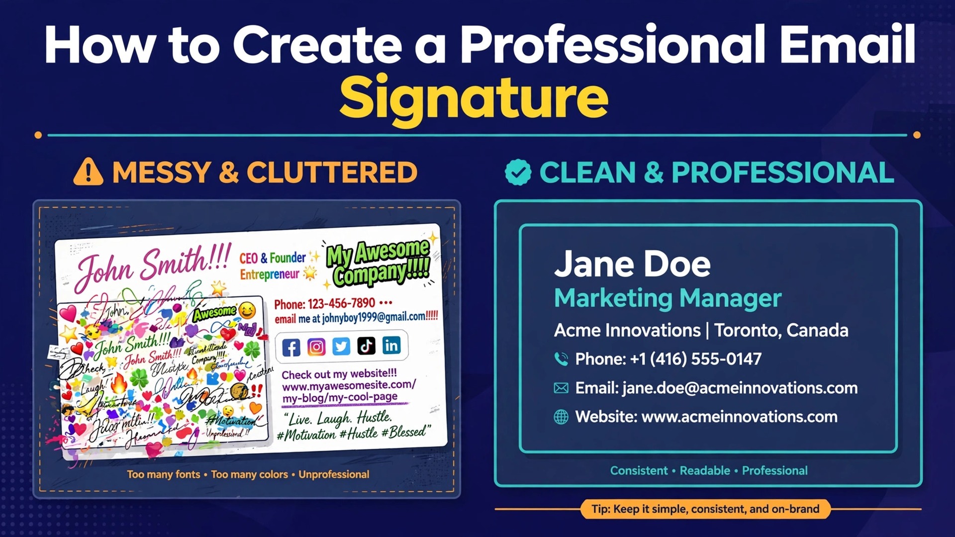
Roughly 240 million emails are sent every minute around the world, and your signature sits at the bottom of every one you send. That makes it the most seen piece of marketing most professionals ever produce, and also the most neglected. A signature with a headshot is reported to lift response rates by about a third, while a bloated signature with five social icons, a quote and a banner does the opposite and pushes readers away. Learning how to create a professional email signature is a thirty minute job, and the difference between a good one and a bad one comes down to restraint rather than design skill.
A professional email signature is a short block of contact information and branding that appears automatically at the end of your emails. It should answer three questions in under two seconds. Who are you, what do you do, and how can the reader reach you. Everything else is optional, and most of what people add to signatures fails that test. The signature is not a brochure, not a personal statement, and not a place for your favourite quote. It is a business card that travels with every message you send, and it should behave like one.
The hard part is not the design. It is the rendering. Email clients are far less forgiving than web browsers, and a signature that looks perfect in Gmail can break in Outlook, stretch on a phone, or vanish entirely when images are blocked. That is why this guide spends as much time on the technical rules as on the design choices. A signature that renders cleanly everywhere beats a beautiful signature that only works in one inbox.
What Belongs in a Signature and What Does Not
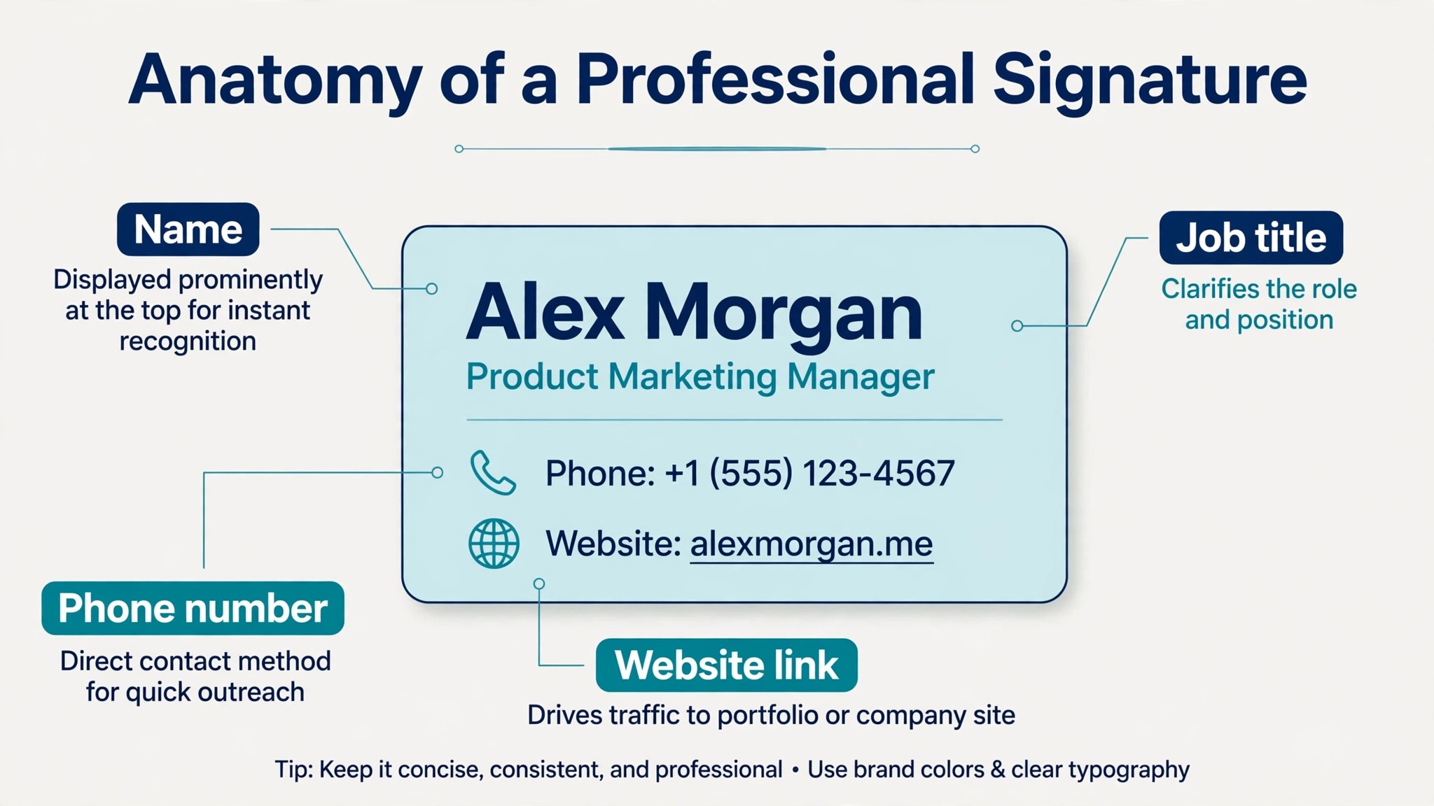
Every professional signature needs five elements. Your full name, your job title, your company name, one phone number, and your website address. Those five cover the questions a reader actually asks. A company logo earns its place too, because it makes the signature recognisable at a glance, and one social link earns its place when it points to the profile where you are actually active. For most professionals that means LinkedIn. A headshot is a judgement call. It works well in sales, real estate and consulting, where face recognition matters, and it adds clutter everywhere else.
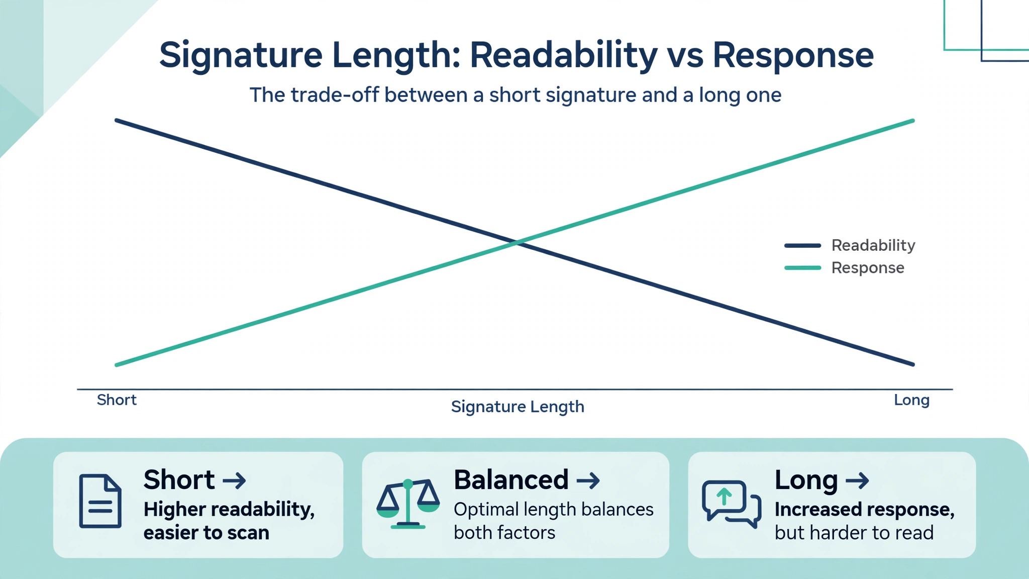
What does not belong is a longer list than most people expect. Inspirational quotes, personal mottos, multiple social icons, animated images, promotional banners and long legal disclaimers you are not required to include all weaken the signature. Each extra element competes with the contact details for attention, and the contact details always lose because the extra elements are more colourful. Keep the signature to four to six lines. That is the length that renders cleanly on mobile and fits under a short email without taking more screen space than the message itself.
Regulated industries are the exception. Finance, healthcare and legal work often require a disclaimer or a registration number, and those belong in the signature because the law puts them there. If your industry requires one, keep it short, set it in a smaller grey type, and place it below a thin divider so it reads as a footnote rather than part of the message.
The Technical Rules That Decide Whether It Renders
Email clients do not support modern web design, so the rules for signatures are stricter than the rules for websites. The whole signature should stay under 600 pixels wide, which is the safe ceiling for mobile screens and narrow preview panes. Use one font family, and choose a web safe one like Arial, Verdana, Georgia or Trebuchet, because brand fonts that are not installed on the reader’s machine will fall back to a default anyway. Set the text at 10 to 12 points for contact details and slightly larger for your name, and keep the total HTML under 10,000 characters, because Gmail caps signatures at that length and Outlook at 8,000.
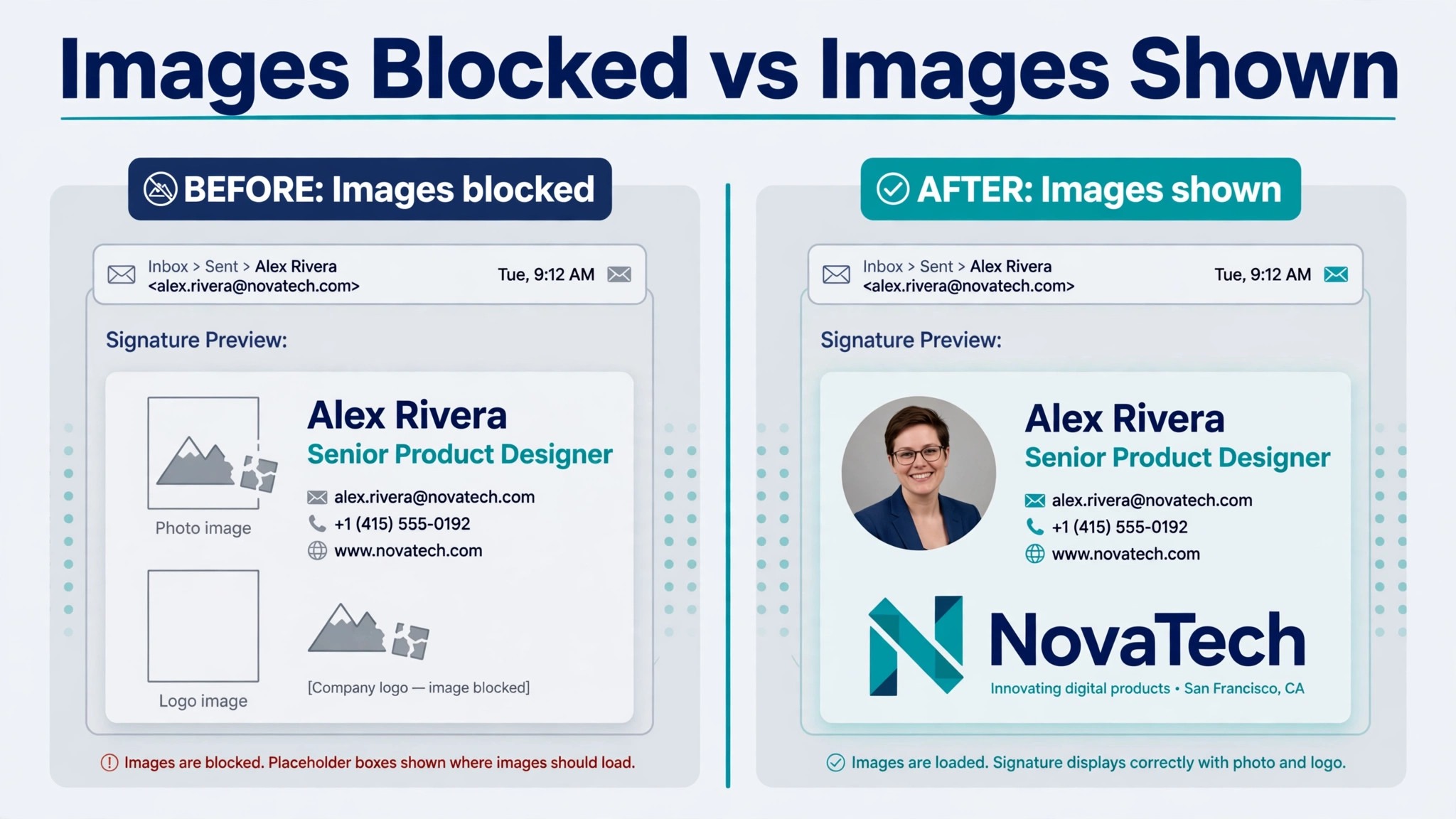
Images need the same discipline. Keep the total image weight under 100 kilobytes, host images on public secure URLs, and never use base64 encoding, because Gmail strips it entirely. Upload your logo at twice the display size so it stays sharp on high resolution screens, and save it as a PNG or JPG under 350 kilobytes. Roughly 43 percent of Gmail users view emails with images turned off, according to research from Litmus, so your signature must still make sense when every image is blocked. That means your name, title and phone number must be real text, never part of an image.
Dark mode is the newest rendering problem. A logo with dark text on a transparent background disappears when the reader’s email client switches to a dark theme. Check your signature in both light and dark mode before you deploy it, and use a logo version with a white outline or a light background block if the dark version fails. Two minutes of testing here saves you from sending a signature that is invisible to half your readers.
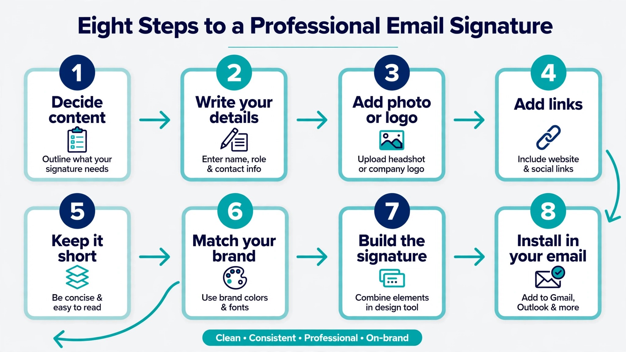
How to Create a Professional Email Signature in 8 Steps
This is the full process for how to create a professional email signature, from the first decision about content to the final test in three email clients. Work through the steps in order the first time. After that, updating a signature takes five minutes.
Step 1. Decide What Belongs and Cut the Rest
Write down everything you are tempted to include, then cut the list to the five essentials plus a logo and one link. Your name and title go first, then your company, then one phone number and your website. If you are in sales or consulting, add a headshot. If you run a business where bookings matter, add a calendar link instead of a second social icon. Everything else goes. The test for each item is simple. If a reader needs it to contact you or to trust you, it stays. If it only promotes something, it goes, unless it is the single call to action covered in step six.
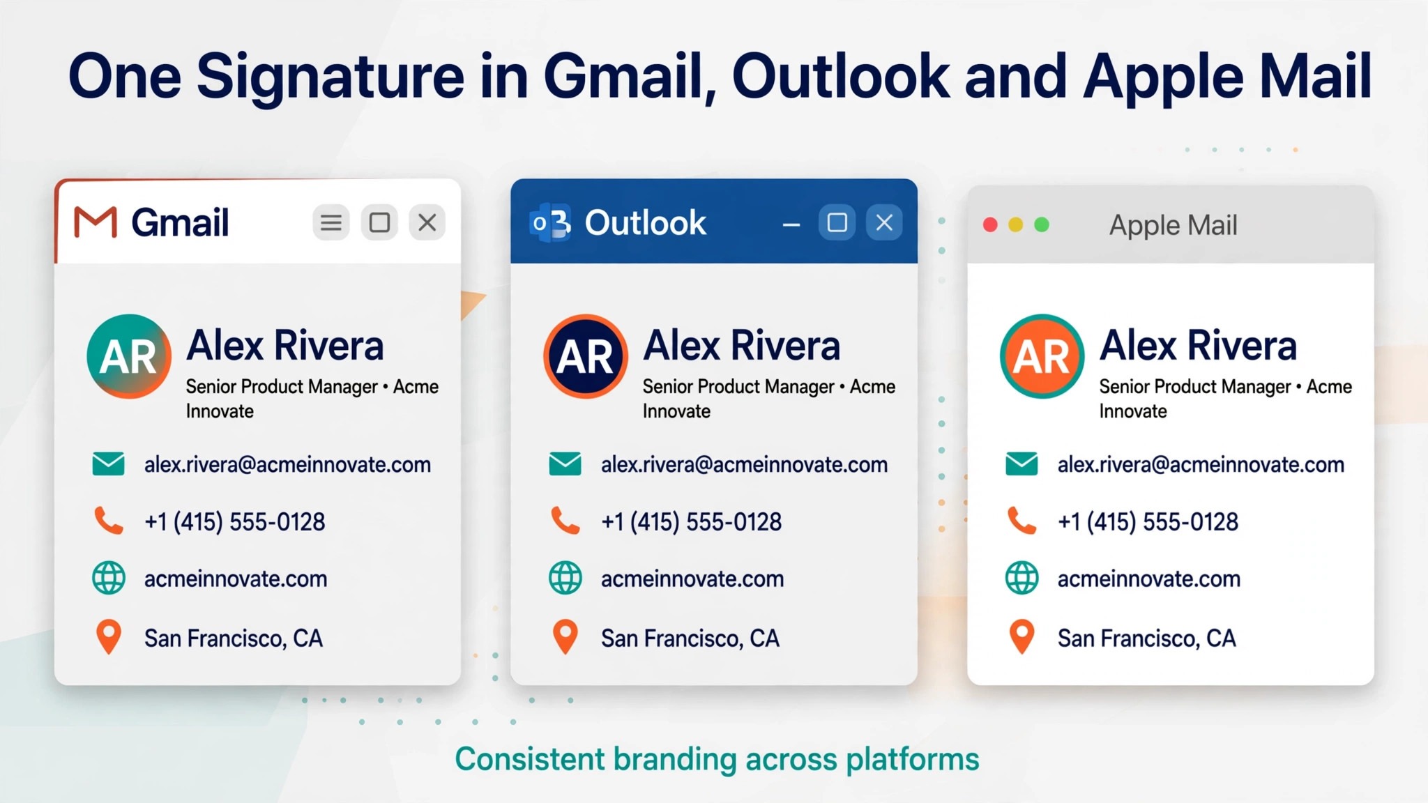
This is also the moment to decide on two signatures rather than one. A full branded signature works for first emails, while a minimal reply signature with just your name, title and phone number keeps long threads readable. Most email clients let you set a different signature for new messages and replies, and using both is one of the clearest signs of a professional setup.
Step 2. Gather Your Details, Logo and Links
Collect the exact details before you open any tool. You need your name as it appears on your business card, your current job title, your company name and website address, and one phone number. Check that the phone number is the one you actually answer, and that the website address works without a redirect loop. Then find your logo file. A transparent PNG at 200 by 200 pixels is the standard size for a signature logo, uploaded at twice the display size so it stays sharp.
Gather the links too, and test each one. Your website link, your LinkedIn profile, and your calendar booking link should all open to the right page in a private browser window. A signature link that leads to a dead page or a login screen is worse than no link at all. If your company has a brand guide, pull the hex codes for your primary and secondary colours and the name of your brand font. If the brand font is not web safe, note the closest web safe fallback now so you are not guessing later.
Step 3. Pick Your Build Method
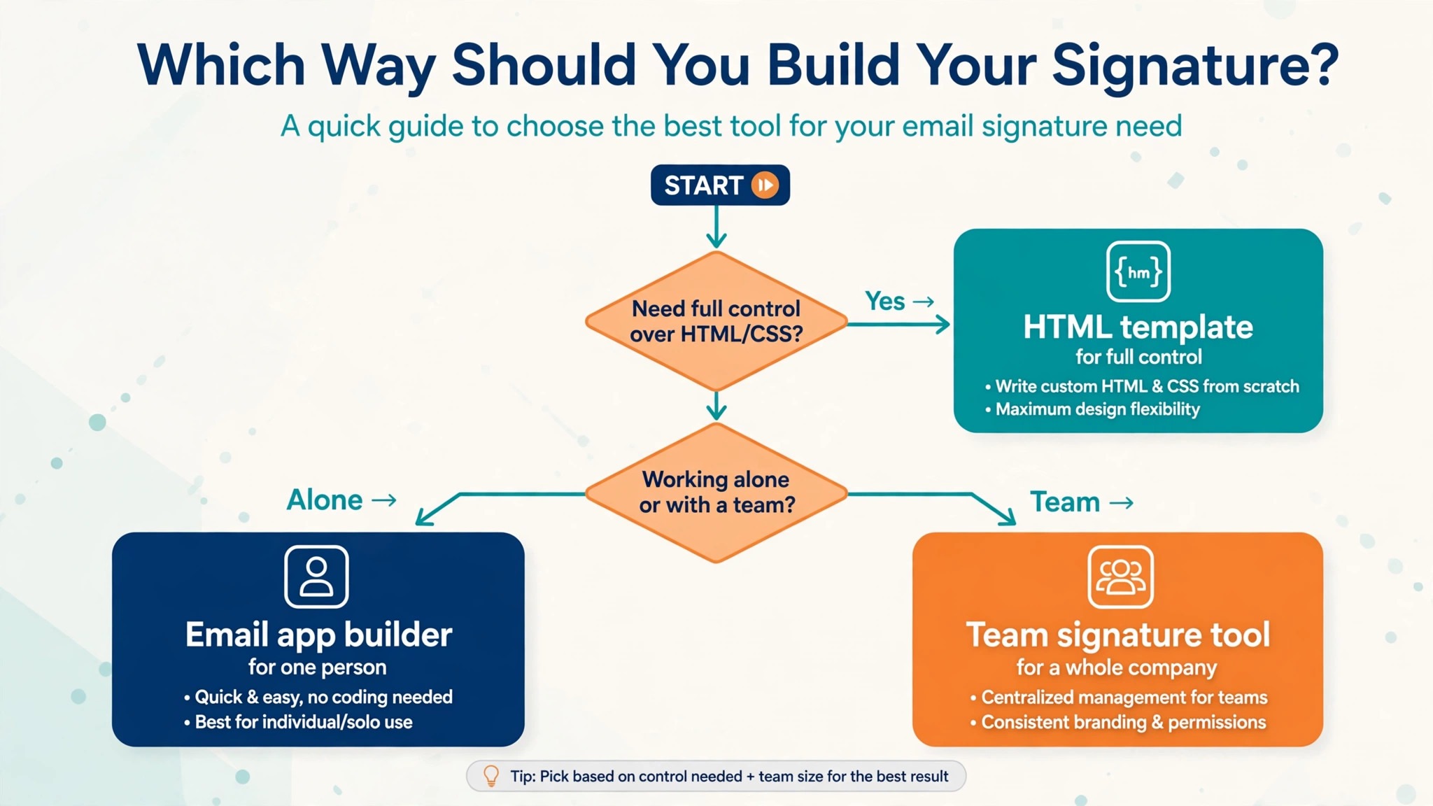
You have three ways to build a signature, and the right one depends on how much control you want. The fastest route is a free generator. HubSpot’s free email signature generator is the default recommendation because it needs no account, outputs clean HTML, and produces a usable signature in under five minutes. You fill in your details, pick a template, and copy the result into your email client. WiseStamp and MySignature offer more templates and design control, with free plans and paid plans for teams that need consistent signatures across many people.
The second route is your email client’s built in editor. Gmail, Outlook and Apple Mail all have signature editors that handle text, links and images at no cost. This route is enough for a clean text based signature, and it is the best choice when you want zero third party involvement. The third route is hand coded HTML, which gives you full control over every pixel but takes thirty to sixty minutes and needs testing in every client. Choose the generator unless you have a specific reason to hand code, because the generator output is tested against the same rendering rules you would have to learn yourself.
Step 4. Choose One Font and Two Colours
Restraint is the whole design. Pick one font family for the entire signature, and make it web safe. Arial and Verdana suit modern brands, Georgia suits traditional and legal firms, and Trebuchet sits between the two. Set your name in bold at a slightly larger size, and keep everything else at the same size so the eye moves down the block in order. Never use more than two font sizes in a signature, and never use a decorative or script font for contact details.
Colour follows the same rule. Use your brand primary colour for your name and one accent for links or a divider, and keep body text black or dark grey. Never use more than two accent colours, and never put a background colour or gradient on the signature container, because Outlook does not support it and the result looks broken. The signature should look like it belongs to your brand without shouting about it. If a reader notices the colours before they notice your name, you have used too much colour.
Step 5. Lay Out the Signature in One Column
A single column layout is the safest structure for an email signature, because it stacks cleanly on mobile and survives every email client. Put your name and title at the top, then your company, then your phone and website, then your social link or call to action at the bottom. Add 8 to 10 pixels of padding between elements so the block breathes. A tight, cramped signature reads as amateurish no matter how good the individual elements are.
A two column layout with a logo on the left and text on the right looks good in a design tool and breaks in the real world. Many email clients handle tables poorly, and a multi column signature can collapse into a jumble on a phone screen. If you want the logo beside the text, use a generator that builds the layout with tested HTML rather than building it yourself, and test the result on a phone before you deploy it. The safest layout is the simplest one, and the simplest one is a single column with generous spacing.
Step 6. Add One Call to Action
A signature can do one marketing job without becoming a billboard. Pick the single action that matters most to your work and add it as one short link. A booking link for a sales call, a link to your latest case study, a link to a demo, or a link to your calendar all qualify. The call to action should be short, specific and relevant to the person reading the email. A calendar booking link is reported to pull a click through rate of about 26 percent, which is higher than most marketing calls to action, because the reader is already in a conversation with you.
Do not add two calls to action. Two links compete with each other and both get ignored, while one clear link gets clicked. Do not use a banner image for the call to action either, because banner images are blocked by default in many clients and the link disappears with them. Use plain linked text in your accent colour, and keep it to five words or fewer. Review the call to action every quarter and change it when your priority changes, because a stale link to last year’s webinar is worse than no link at all.
Step 7. Add Social Links Sparingly
Social links are the most overused element in email signatures. The rule is simple. Link to the platforms where you are actually active, and no more than four, with one or two being better for most people. LinkedIn is the right choice for nearly every professional. Instagram suits creatives, and X suits people in media and public work. A row of five social icons says please follow me louder than you intend, and it pushes your phone number further down the block where fewer readers will see it.
Each social icon should be small, consistent in style, and linked to the correct profile. Use the same icon set rather than mixing styles, and make sure the icons are hosted images rather than embedded files. Test every link, and remove any profile you have not posted on in six months. A dead social link in a signature tells the reader that you do not maintain your own public presence, which is the opposite of the impression a signature should create.
Step 8. Test in Gmail, Outlook and on Mobile, Then Install
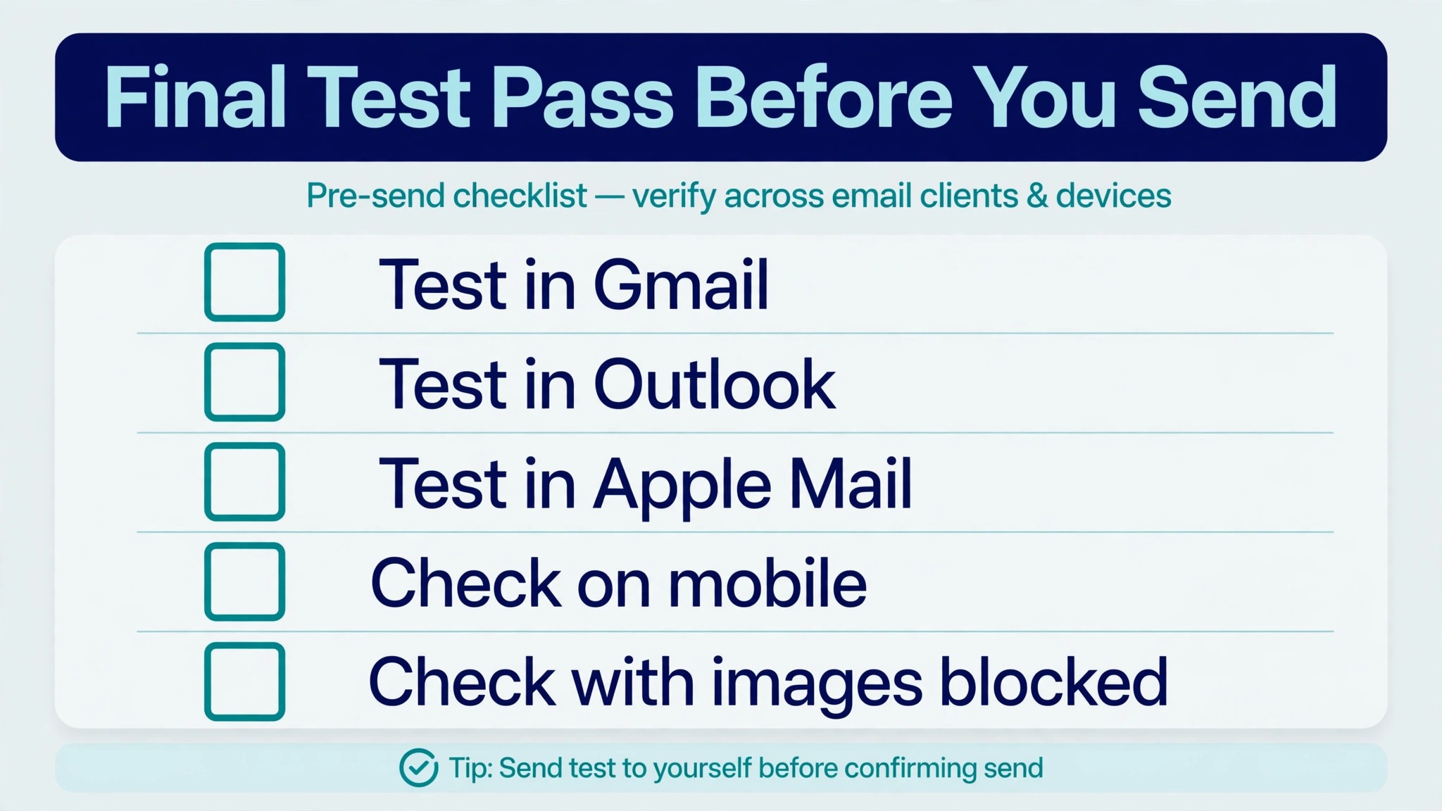
Testing is the step most people skip, and it is the step that matters most. Send a test email to yourself and open it in Gmail, Outlook and Apple Mail, then open it on your phone. Check the layout in each client, and check it again with images turned off. Check the dark mode version too. Look for broken images, wrapped text, links that do not work, and any element that stretches wider than the screen. Fix what you find before you install the signature for real use.
Installing is straightforward once the signature passes the tests. In Gmail, open Settings, then See all settings, then scroll to the Signature section and paste the HTML or build the signature in the editor. In Outlook, open Settings, then Mail, then Compose and reply, and paste the signature there. In Apple Mail, open Settings, then Signatures, and add it per account. Set the full signature for new messages and the minimal version for replies, then send yourself one more test email to confirm the live version looks right.
Best Pick by Job
| Job | Best pick | Why it wins |
|---|---|---|
| Fastest free signature | HubSpot generator | No account, clean HTML, done in minutes |
| Team wide branding | WiseStamp | Central control and dark mode preview |
| Design first visuals | Canva | Full visual control, export as image |
| Solo freelancer | MySignature | Free templates and simple editor |
| Small team deployment | SyncSignature | Bulk setup for Google Workspace and 365 |
| No third party tool | Built in editor | Free, private, already in your inbox |
The Rendering Facts That Catch People Out
A few numbers explain most signature failures. Gmail caps signatures at 10,000 characters and Outlook at 8,000, so a signature built in Microsoft Word, which injects invisible formatting, can exceed the limit before you add any content. Never build a signature in Word. Images should total under 100 kilobytes, and a logo over 350 kilobytes will slow every email you send. The signature should stay under 600 pixels wide, and under 320 pixels on mobile, which is why the single column layout wins.
The most surprising fact is how many readers never see your images at all. With a large share of Gmail users blocking images by default, a signature that depends on an image for the company name or phone number is blank for those readers. Text first design is not a preference. It is a requirement, and it is the first thing to check when you learn how to create a professional email signature that works everywhere. Build the signature so it reads perfectly with every image removed, then add the logo and icons as decoration on top of a working text foundation.
Mistakes That Make a Signature Look Amateur
The same mistakes appear in most bad signatures, and they are all easy to avoid. Anyone who has just learned how to create a professional email signature should run through this list once before installing, because each item below takes seconds to fix and months to notice if it slips through.
- Listing three phone numbers and two email addresses. One phone number and one website is enough. Extra contact methods create a decision the reader does not want to make.
- Using a quote or a motto. A personal quote in a business signature reads as unprofessional, and it takes up space that your phone number should occupy.
- Adding a banner image with a promotion. Banner images are blocked by default in many clients, so the promotion never appears, and the signature looks broken instead.
- Building the signature as one big image. An image signature is invisible when images are blocked, it cannot be copied or clicked, and it triggers spam filters.
- Using five social icons. Two is enough for most people. Five turns a contact block into a social media directory.
- Forgetting the mobile check. A signature that looks fine on a desktop can stretch, wrap or overflow on a phone, where most emails are now read.
Signature Examples by Role
A freelancer’s signature should lead with the service, not the company, because the person is the brand. Name, title, one phone number, website, and a link to a portfolio or a booking page cover the essentials, and a headshot helps because clients hire a person they can picture. A sales professional needs a different emphasis. The booking link matters more than the social links, and a short line pointing to a case study can do more than a list of achievements. Keep the call to action to one link, and change it when the campaign changes.
An executive signature should be the shortest of all. Name, title, company and one phone number, with the company logo, is enough. Executives send the most emails and the least need to promote anything in them, so restraint reads as authority. A job seeker has the opposite problem. The signature needs a link to a LinkedIn profile or an online resume, and a phone number that is answered promptly, because the reader is deciding whether to call. Learning how to create a professional email signature for a job search means treating the signature as a one line resume, with the strongest link you own placed where the reader cannot miss it.
A small business owner should treat the signature as a storefront. The logo and the website link carry the most weight, and a short line with opening hours or a service area can help local customers. Keep the phone number prominent, because local customers call more than they click. Avoid the temptation to list every service in the signature. One clear link to the services page does that job better, and it keeps the signature short enough to read on a phone.
How to Manage Signatures for a Whole Team
A team signature is a branding problem, not a design problem, because twenty people will produce twenty different versions unless someone controls the template. The fix is a central template that locks the layout, fonts and colours, and leaves only the personal details editable. Tools like WiseStamp and SyncSignature exist for exactly this job. They push the same template to every mailbox in a Google Workspace or Microsoft 365 organisation, and they let an admin update a banner or a legal disclaimer for everyone at once.
Start with a written standard before you buy a tool. Decide the exact order of elements, the font and size, the colour rules, the logo file, and the single call to action the whole company will use. Write it in one page and share it with the team. Then roll the template out to a small group first, test it in Gmail and Outlook, and fix the rendering problems before the full rollout. Add a legal disclaimer only where the industry requires it, and keep it in smaller grey type below a divider. Review the template every six months, because a team signature that still links to last year’s campaign tells every recipient that nobody is minding the brand.
Frequently Asked Questions
How do I create a professional email signature for free?
Use HubSpot’s free email signature generator, which needs no account and outputs clean HTML in a few minutes, or use the built in signature editor in Gmail, Outlook or Apple Mail, which costs nothing and handles text, links and images. Both routes produce a professional result. The generator is faster, the built in editor keeps everything inside your own email account, and neither requires a paid tool.
What should a professional email signature include?
A professional signature includes your full name, job title, company name, one phone number, and your website address. A company logo and one social link, usually LinkedIn, earn their place as well. A headshot suits sales, real estate and consulting. A single call to action, like a booking link, is the one marketing element that belongs. Everything else, including quotes, multiple social icons and banners, should be left out.
How long should an email signature be?
Four to six lines is the standard length for a professional signature. That covers your name, title, company, phone number and one link without taking more screen space than the email itself. Signatures longer than six lines risk pushing the message off the screen on mobile, and they signal to the reader that you could not decide what mattered.
How do I add an email signature in Gmail?
Open Gmail, click the gear icon, choose See all settings, and scroll to the Signature section. Click Create new, give the signature a name, and paste your HTML or build it in the editor. Set the signature defaults for new emails and for replies separately, scroll to the bottom, and click Save Changes. Send a test email to yourself to confirm it renders correctly.
How do I add an email signature in Outlook?
Open Outlook settings, go to Mail, then Compose and reply, and find the Email signature section. Paste your signature or build it in the editor, set it for new messages and replies, and save. Outlook supports HTML signatures, but keep the design simple, because Outlook’s rendering engine handles complex layouts poorly compared with Gmail or Apple Mail.
Why does my email signature look broken in Outlook?
Outlook uses a different rendering engine from Gmail and Apple Mail, and it handles HTML tables, background colours and images differently. The most common causes are a signature built in Microsoft Word, which injects formatting that Outlook mishandles, a background colour that Outlook does not support, or images that exceed the size limit. Rebuild the signature in a generator or in Outlook’s own editor, keep the layout to a single column, and test it before deploying.
Final Verdict
A professional email signature is a small asset with a large audience. It travels with every email you send, and it answers the three questions every reader asks in under two seconds. The rules are simple. Five essentials plus a logo and one link, one font, two colours, a single column, one call to action, and a test in Gmail, Outlook and on a phone before you install it.
Learning how to create a professional email signature takes thirty minutes once, and the result works for years with only occasional updates.
Build it this week, test it properly, and let every email you send carry a signature that looks like it belongs to a professional. Review it once a year, update the links and the call to action, and it will keep working for you without another thought.