The verdict is simple. A professional Instagram profile is not built with one clever bio or one pretty grid. It is built when every element a visitor sees in the first three seconds tells the same story. The photo, the name field, the bio, the highlights, and the first nine posts must agree with each other. When they do, a stranger follows without thinking. When they do not, the same stranger leaves without thinking either. This guide shows how to brand an instagram profile step by step, from the strategy underneath the visuals to the daily habits that keep the brand consistent.
What Instagram Branding Really Means
Branding on Instagram is often mistaken for picking a colour palette. Colours matter, but they are the surface. Real branding is the promise a profile makes and keeps. It is the answer to three questions a visitor asks silently. Who is this for. What will I get if I follow. Why should I trust this account over the next one. A profile that answers those questions clearly will outperform a prettier profile that answers none of them. The visuals then make the promise easy to recognise at a glance.
Instagram is a visual first platform, so proof matters more than claims. A business that shows its work, its customers, and its process will earn trust faster than one that only describes its services. That is why the strongest profiles mix education, proof, and personality rather than posting only promotions. A good rule is to lead with value and proof and sell second. Promotion should be the smaller slice of the feed, not the main course. Followers stay for useful posts and real results. They leave when every post asks them to buy something.
A follower who stays for useful posts and real results is the goal.
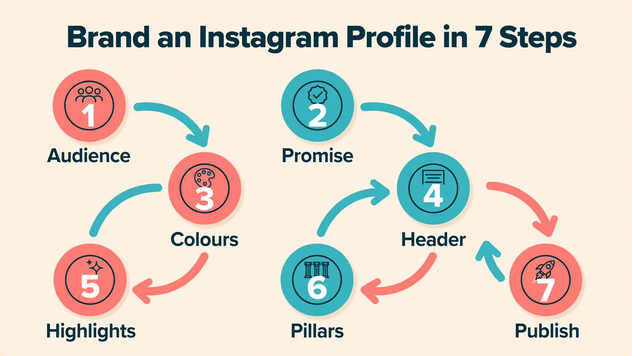
How to Brand an Instagram Profile in 7 Steps
Learning how to brand an instagram profile is easier when the work is done in order. Strategy comes before visuals, and visuals come before posting. The seven steps below form the full sequence. Skipping the first two steps is the most common reason profiles look polished but fail to grow. A beautiful grid with no clear audience and no clear promise is decoration, not branding.
- Define one specific audience and the single outcome they want from following the account.
- Write a one sentence brand promise that a stranger could repeat after one visit.
- Choose three to five brand colours, two fonts, and one photo style, then use them everywhere.
- Rebuild the profile header with a clear photo, a searchable name field, a 150 character bio, and one link.
- Set up four to six highlight buckets with matching covers that answer common questions.
- Plan three to five content pillars and a grid pattern that repeats them in rotation.
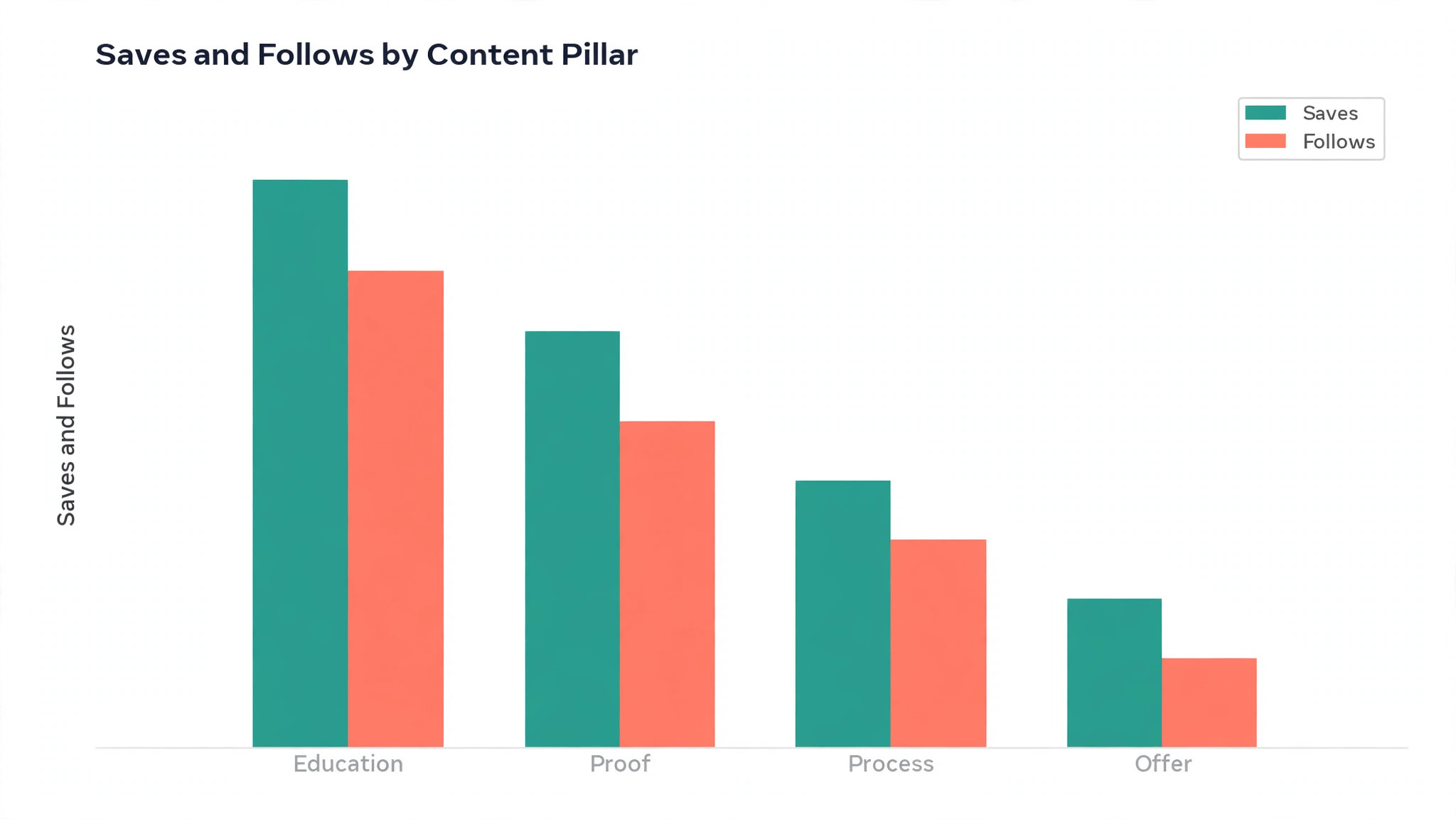
- Publish on a steady rhythm, measure what earns saves and follows, and refine monthly.
Each step is covered in detail below. The order matters because each step depends on the one before it. A bio cannot be written before the audience is defined. A colour palette cannot be chosen before the brand promise is clear. Work through the steps in order, and the profile will feel intentional rather than assembled.
Step 1. Define the Audience Before the Visuals
A profile that speaks to everyone speaks to no one. The first branding decision is who the account is for, described narrowly enough to guide a post. Entrepreneurs is too broad to guide anything. Mid career consultants who want to turn expertise into visible authority is narrow enough to shape every caption. Fitness coaches who need client trust before asking for a sale is another useful level of detail. The narrower the audience, the more the content feels written for the reader.
Write the audience down in one paragraph and keep it where every post is planned. Include what that person is frustrated by, what they are trying to achieve, and what they already believe about the topic. Then list the three to five subjects the account wants to be known for. Those subjects become the content pillars later. If a post idea does not fit the audience paragraph or the subject list, it does not belong on this profile, no matter how popular the trend looks.
Positioning is the second half of this step. It is the reason a visitor should follow this account instead of a larger competitor. The reason is rarely price or quality, because every account claims those. It is usually a point of view, a method, a niche, or a kind of proof. A bakery that shows the full baking process each morning has a different position from a bakery that only posts finished cakes. A coach who shares real client numbers has a different position from one who shares only motivational quotes. Name the difference in one sentence and let it shape the bio, the highlights, and the first posts.
Step 2. Write a Brand Promise a Stranger Can Repeat
The strongest brands are easy to describe to someone else. If a follower cannot explain the account in one sentence, the branding has not landed. A useful formula is to help a specific person reach a specific outcome by sharing a specific method or lens. The formula forces clarity. It removes vague words and leaves the practical value of following. Test the sentence on a friend who has never seen the profile. If they can repeat it back, it works. If they cannot, shorten it until they can.
The brand promise should also set boundaries. Decide which trends fit the voice and which make the account look borrowed. A calm, expert brand that jumps on every loud trend loses its identity in a week. A playful brand that suddenly posts formal corporate updates confuses its followers. Write down three traits that describe how the account should sound, such as calm, sharp, and generous, or warm, direct, and practical. Check every caption against those traits before posting. The traits are the cheapest brand guardrail a small business can own.
Keep the promise visible while planning content. A one page brand sheet with the audience, the promise, the traits, the colours, and the fonts is enough. It does not need design software. A plain document works, as long as anyone who posts for the account can read it in a minute. Teams that share this sheet produce consistent posts. Teams that keep the brand in one person head produce a feed that changes mood every week.
Step 3. Build a Visual Identity That Survives Every Format
Visual identity on Instagram must survive the square feed crop, the vertical Reel, the Story, and the tiny circular profile picture. A logo with small text will fail in that circle, because the image is often seen at around 40 pixels wide in a comment thread. Use a simple logo mark or a clean headshot for the profile picture, with strong contrast and no busy background. Keep the same picture across every platform so followers recognise the account instantly.
Choose three to five brand colours and use them consistently. One primary colour carries the brand. One or two secondary colours support it. A neutral colour handles backgrounds and text. Use the primary colour in highlight covers, Story templates, and graphic posts so the feed develops a recognisable rhythm. Avoid adding a new colour for every post. A feed with twelve colours looks like twelve brands. A feed with four colours looks like one brand with range.
Typography needs the same discipline. Pick two fonts at most, one for headings and one for body text, and use them in every graphic. Canva and Adobe Express both offer brand kits that store colours, fonts, and logos, so a template can be reused without rebuilding the style each time. Photography style matters just as much. Decide whether photos are bright and airy, warm and rich, or clean and minimal, and edit every photo toward that style. A consistent edit is often the difference between a feed that looks professional and one that looks random.
Step 4. Rebuild the Profile Header in One Sitting
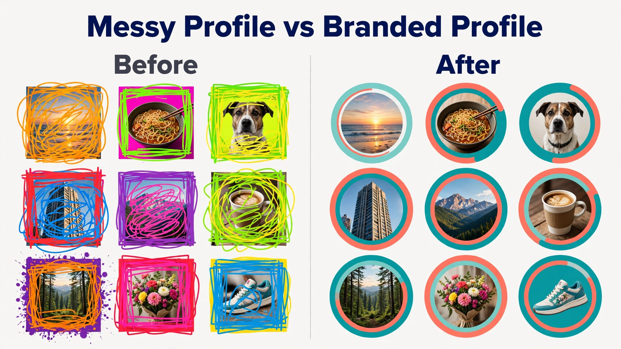
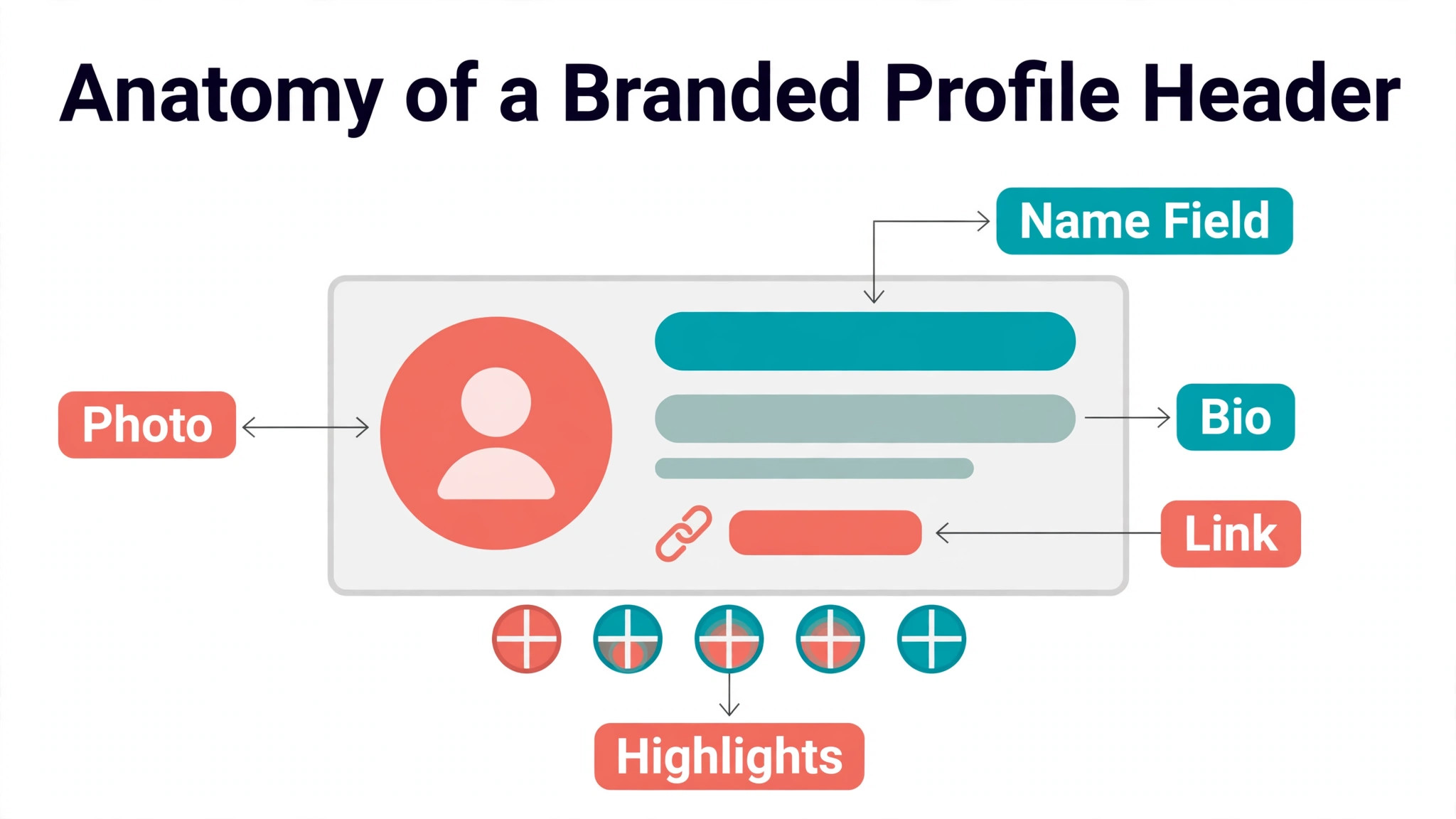
The profile header is a landing page, not a social account. A visitor decides in seconds whether to follow, click, or leave. The header has five elements, and each one must earn its place. The profile picture must be readable at small size. The name field should carry searchable keywords, not just the brand name, because Instagram search reads that field. A format like brand name plus what the business does works well. The username should be short, memorable, and consistent with the handle on other platforms.
The bio has 150 characters, and that limit forces honesty. A bio formula that works for most businesses uses three lines. Line one says what the business does and for whom. Line two gives a credibility marker, such as years in business, clients served, or a result. Line three gives one call to action, such as book a consult, download the guide, or shop the new collection. An emoji can separate the lines, but the bio should still read clearly if the emojis are ignored. Avoid clever wordplay that a stranger cannot decode in two seconds.
The link deserves the same care as the bio. A single focused destination beats a generic homepage link. A start here page, a booking page, or a current offer page will convert better than a homepage that asks the visitor to navigate. Link in bio tools such as Linktree or the built in link list let a profile offer several destinations, but the top link should always match the bio call to action. If the bio says download the guide, the first link must be that guide. Mismatched links are one of the quietest ways a profile loses clicks.
Switch to a professional account before doing any of this. A Business account suits a business that sells products or services, while a Creator account suits a personal brand where the person is the product. A professional account unlocks Insights, contact options, and action buttons. Choose the category a customer would expect, because the right category helps visitors understand the business instantly. Add contact options such as email and WhatsApp where they fit, and connect the profile to a Facebook Page to unlock Meta Business Suite scheduling and Instagram Shopping.
Step 5. Set Up Highlights and Pinned Posts
Highlights sit directly under the bio, so they are the second thing a visitor reads. Treat them as an evergreen menu, not an archive of old Stories. Four to six buckets cover most businesses. Start Here explains who the account helps and what to do first. Services or Products shows what is on offer. Results shows proof such as before and after photos, testimonials, and client wins. FAQs answers the questions every new customer asks. About shows the people behind the account. Reviews collects social proof in one place. A shop can swap one bucket for a seasonal offer, but the core four should stay stable.
Highlight covers deserve a simple system. Use the primary brand colour as the background and a plain white icon for each bucket. Simple icons read better at small size than detailed illustrations. Keep the cover style identical across buckets so the row looks deliberate. A highlight cover that changes style every month signals a brand that has not decided what it looks like yet. Update the content inside a highlight when the information changes, but leave the cover alone unless the whole brand changes.
Pinned posts do the same job for the feed. Instagram lets a profile pin up to three posts to the top of the grid. Pin the posts that convert a visitor best. A good set is one post that explains the offer, one post that proves results, and one post that shows the process or the people. A new visitor who reads those three posts should understand the business without scrolling further. Review the pinned posts every quarter and replace any post that no longer reflects the current offer or the current quality of the work.
Step 6. Plan Content Pillars and a Grid That Repeats Them
A branded profile is planned around pillars, not random posts. Most businesses do best with three to five repeatable pillars. Education covers tips, FAQs, and common mistakes. Proof covers before and after results, wins, testimonials, and case studies. Process covers how the work is done, behind the scenes moments, and a day in the life. People covers the team, partners, local events, and values. Offers covers booking, downloads, events, and promotions. Each pillar serves a different job, and together they show a complete business.
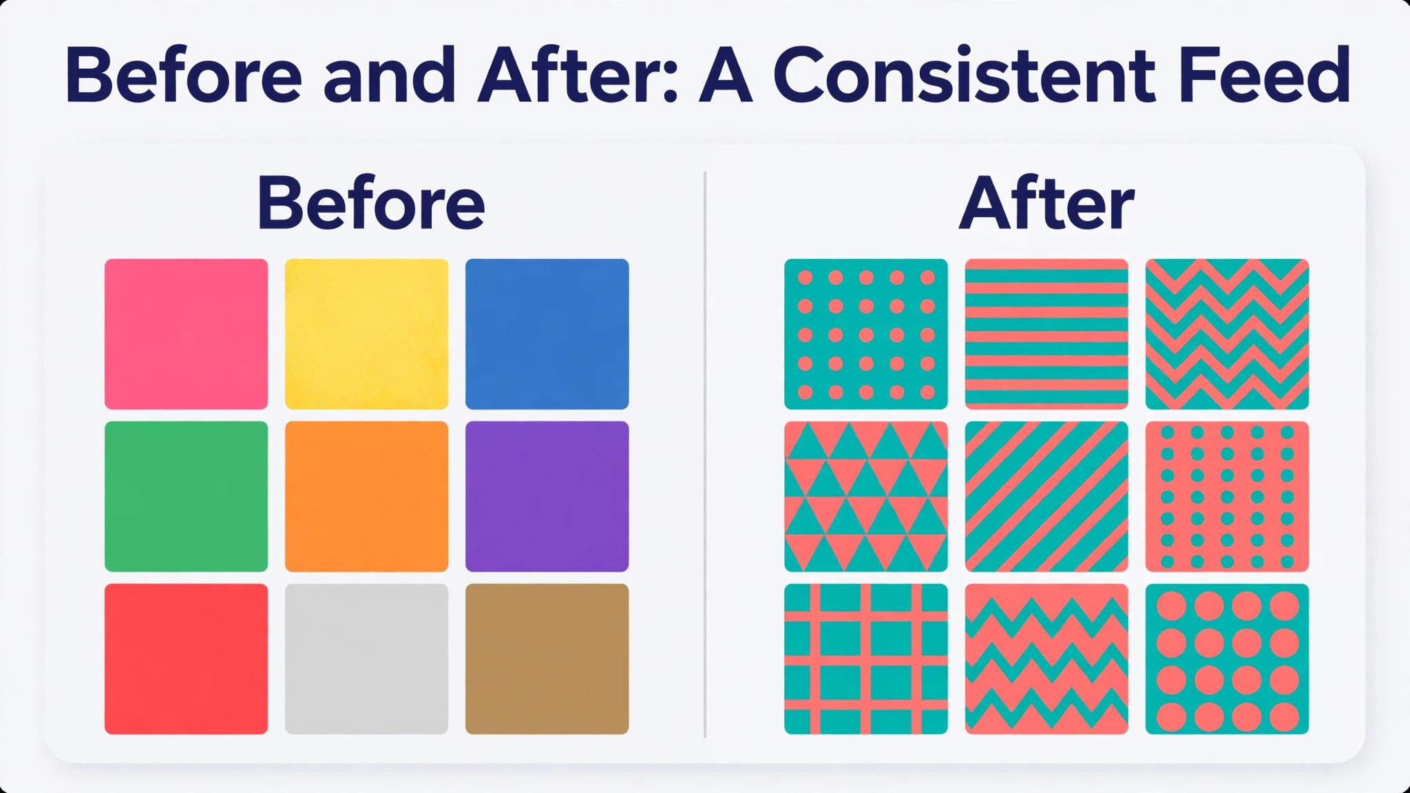
The grid pattern is how the pillars become visible. A simple rotation works well for a small team. One education post, one proof post, and one process post, repeated in order, gives the grid a rhythm a visitor can feel even if they never name it. A business that posts three times a week can run that rotation for a month without repeating a topic. A business that posts daily can add a people post and an offer post to the rotation. The pattern matters more than the exact order. A visitor should be able to scroll nine posts and see variety, not nine versions of the same promotion.
Templates make the rotation sustainable. Build one template per pillar in Canva or Adobe Express, with the brand colours, fonts, and logo placement already set. A new post then takes minutes instead of an hour, because the design decisions are already made. Keep the templates distinct enough that a follower can tell an education post from an offer post at a glance, but similar enough that all of them look like they belong to the same account. That balance is the visual heart of how to brand an instagram profile well.
Step 7. Brand Reels and Stories Without Looking Corporate
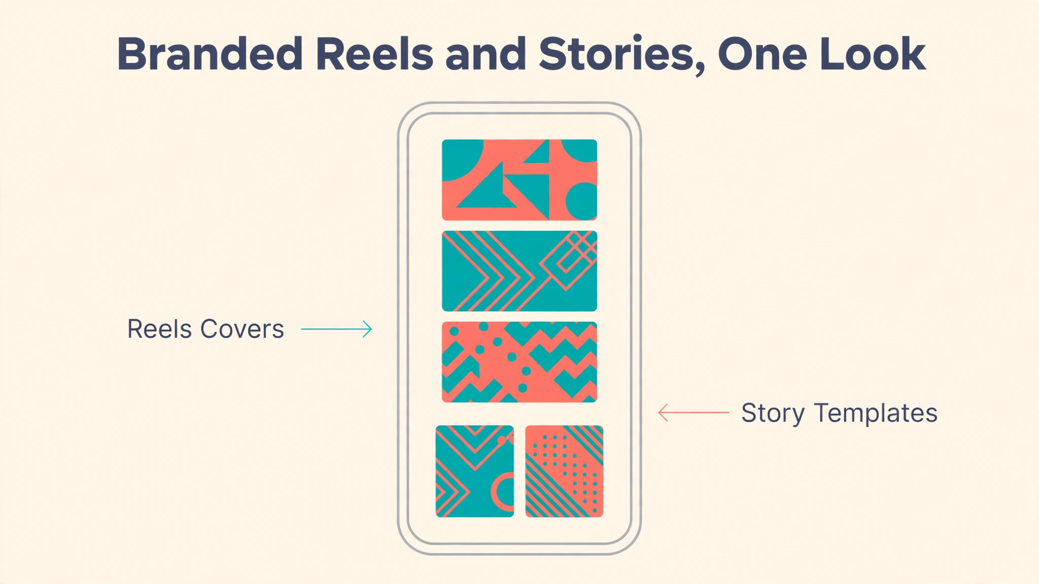
Reels earn reach, so they carry the brand to strangers. A branded Reel needs three consistent elements. The first three seconds must show the promise of the video, not a logo animation. The caption style and the on screen text should use the brand fonts and colours. The cover frame should match the feed grid, so a visitor who opens the profile after watching a Reel sees a coherent page. A Reel that goes viral but leads to a messy profile wastes the reach it earned.
Stories are where the brand can be more personal. Use branded Story templates for recurring formats such as polls, questions, and announcements, and leave room for unpolished behind the scenes clips. The mix matters. A Story feed that is only polished templates feels like an advertisement. A Story feed that is only random clips feels unplanned. Aim for a simple split. Templates carry the recurring information, and candid clips carry the personality. Both should use the same colours and the same voice.
Keep intro and outro branding short. A one second logo mark at the end of a Reel is enough. A long animated intro will lose viewers before the content starts. The same rule applies to captions on video. Burned in captions in the brand font help viewers who watch without sound, and they reinforce the visual identity at the same time. Tools such as CapCut make caption styling fast, and the caption style should match the feed graphics so the brand reads as one system.
Captions, Voice, and Hashtags in 2026
A caption should sound like the brand traits chosen in step two. A calm brand writes short, clear sentences. A warm brand writes conversational captions with direct questions. A sharp brand writes bold claims and backs them with proof. The voice should be recognisable even if the logo is removed. Write captions in that voice every time, including replies to comments and direct messages. A profile whose captions are warm and whose replies are cold has a branding problem that no colour palette can fix.
Hashtag practice changed in late 2025. Instagram began moving captions toward a five hashtag allowance, and fewer targeted tags now outperform many generic ones. Pick about five hashtags that describe the post precisely, including one or two niche tags where the account can actually rank.
Call to action lines should match the post pillar. An education post can ask a question or invite a save. A proof post can invite a direct message. An offer post can link to the booking page. One clear action per post is enough. A caption that asks followers to like, comment, share, save, follow, and click the link in the same breath will get none of those actions. The bio link, the highlights, and the pinned posts already handle the selling. The caption should handle the conversation.
Tools That Keep an Instagram Brand Consistent
A small business does not need many tools, but the right few save hours every week. The table below lists the tools most often used to run a branded Instagram profile, with the job each one does best. All of them are real and currently available. Prices change often, so check the vendor pricing page before budgeting.
| Tool | Best job | Free plan | Paid plan from |
|---|---|---|---|
| Canva | Branded templates, feed graphics, Story designs | Yes | Around 15 dollars per month |
| Adobe Express | Quick graphics with Adobe Fonts and stock | Yes | 9.99 dollars per month |
| CapCut | Reel editing and burned in captions | Yes | Paid plan available |
| Later | Visual planning, grid preview, scheduling | Limited | Paid plans available |
| Meta Business Suite | Scheduling, inbox, Insights in one place | Yes | Free with a business profile |
| Linktree | One link page with several destinations | Yes | Paid plan available |
| Lightroom | Consistent photo edits and presets | Limited | Paid plan available |
Canva is the default choice for most small businesses because its brand kit stores colours, fonts, and logos, and its templates cover feed posts, Stories, and Reels covers. Adobe Express suits businesses that already use Adobe products, because its font library and stock collection are strong and its free plan is generous. CapCut handles the video side, with caption styles and templates that keep Reels looking consistent. Later adds a visual planner, so a business can preview the grid before posting and schedule a week of content in one sitting.
Meta Business Suite deserves a mention because it is free and official. It schedules posts and Reels, manages the inbox across Facebook and Instagram, and shows Insights without a third party subscription. A business that does not need a visual grid planner can run its whole Instagram operation on Meta Business Suite plus Canva. That combination costs nothing beyond a Canva Pro subscription, and it keeps every post inside tools that Instagram itself supports. Whatever tools are chosen, the rule is the same. Fewer tools used well will beat a large stack that no one maintains. That discipline is the practical core of how to brand an instagram profile on a small budget.
Best Pick by Job
Different businesses need different Instagram branding setups. A solo creator and a local shop do not need the same tools, the same posting rhythm, or the same highlight structure. The table below matches the job to the setup that fits it best.
| Job | Best pick | Why it wins |
|---|---|---|
| Personal brand starting out | Creator account, Canva free, three pillars | Low cost, fast start |
| Local shop or salon | Business account, Canva Pro, Later | Visual grid, booking link, steady rhythm |
| Product business with a catalogue | Business account, Meta Business Suite, Shopping | Selling built in, inbox in one place |
| Coach or consultant | Creator account, Adobe Express, CapCut | Authority content, polished video |
| Team account with several posters | Canva Pro brand kit, one page brand sheet | Shared templates keep mood steady |
| Low budget, high volume posting | Free Canva, Meta Business Suite | Zero tool cost, scheduling included |
| Rebrand of an existing messy profile | Header rebuild, new highlights, pinned posts | Fixes first impression fast |
A business that is unsure should start with the personal brand row even if it is a company, because the setup is the simplest and the habits transfer to any larger setup later. Add tools only when a real problem appears. A grid planner is worth paying for when the feed starts looking random. A scheduling tool is worth paying for when posting times are missed. A paid template library is worth paying for when design time is the bottleneck. Pay for the bottleneck, not for the feature list.
Mistakes That Make a Profile Look Amateur
The most common mistake is inconsistent visuals. A profile that changes colours, fonts, and photo style every week looks like several accounts sharing one handle. A clear process for how to brand an instagram profile prevents that drift, because every post is checked against the same sheet. The second mistake is a bio that describes the business instead of the benefit. A bio that says we are a digital marketing agency tells a visitor nothing about what they will get. A bio that says we help local shops get booked out in 90 days tells them everything. Rewrite the bio around the outcome, not the job title.
The third mistake is buying followers. Bought followers never engage, they damage the reach of real posts, and they are visible to anyone who checks the follower list against the engagement on posts. A profile with 20,000 followers and 30 likes per post looks worse than a profile with 800 followers and 80 likes per post. Growth from real content is slower but it compounds. The fourth mistake is ignoring the inbox. A visitor who sends a direct message and gets no reply for three days has learned that the business does not respond. Set up saved replies in Meta Business Suite and answer within a day.
The fifth mistake is posting without a plan and then disappearing for a month. A profile that posts daily for a week and then goes silent for six weeks looks abandoned. A steady rhythm of two to three Reels per week and a few feed posts will beat a burst followed by silence. The sixth mistake is treating Stories as an afterthought. Highlights are built from Stories, so a business that never posts Stories has empty highlights and a header that looks unfinished. Post at least a few Stories a week, even if they are simple behind the scenes clips.
A 30 Day Plan to Rebrand the Profile
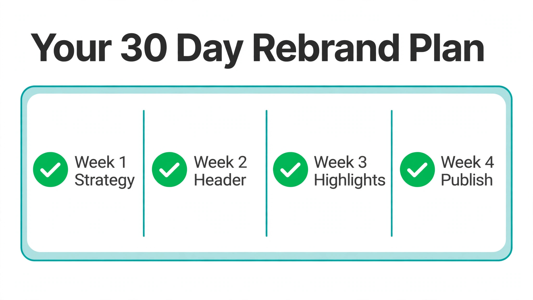
A full rebrand does not need a launch event. It needs thirty days of steady work, done in the order below. Each week has one focus, and the profile improves visibly at the end of each week.
- Days 1 to 7, finish the strategy work. Write the audience paragraph, the brand promise, the three voice traits, the colours, and the fonts on one page.
- Days 8 to 14, rebuild the header. Change the photo, the name field, the bio, the link, and the action button in one sitting, then check the profile on a phone.
- Days 15 to 21, build the highlights and pin three posts. Create four to six highlight buckets with matching covers and fill each one with real content.
- Days 22 to 30, publish on the pillar rotation and measure. Post two to three Reels per week, watch saves and follows in Insights, and adjust the weakest pillar.
At the end of thirty days the profile will look like a different account, even though the business has not changed. The difference is that every element now tells the same story. Keep the brand sheet updated as the business grows, and review the header, highlights, and pinned posts every quarter. Branding is not a one time project. It is a habit of keeping the promise visible.
Frequently Asked Questions
How long does it take to brand an Instagram profile
A focused rebrand takes about 30 days. The strategy and header rebuild take the first two weeks, highlights and pinned posts take the third week, and the pillar rotation takes the fourth. A business that already has content can finish faster, because the work is mostly reorganising what exists. The ongoing habit of consistent posting is what keeps the brand strong after the first month.
What is the first step in how to brand an instagram profile
The first step is defining one specific audience and the outcome they want. Everything else depends on that decision. The bio, the colours, the pillars, and the highlights all follow from knowing who the account is for. A profile built on a clear audience will grow faster than a prettier profile built for everyone.
How many colours should an Instagram brand use
Three to five colours is the right range. One primary colour carries the brand, one or two secondary colours support it, and a neutral handles backgrounds and text. More than five colours makes the feed look random. The same colours should appear in highlight covers, Story templates, and graphic posts so the brand is recognisable at a glance.
Do I need a Business account to brand my profile
A Business account is the right choice for a business that sells products or services, because it unlocks Insights, contact options, and action buttons. A Creator account suits a personal brand where the person is the product. Either professional account works for branding, but a personal account hides the analytics and contact tools a business needs.
How often should I post to keep my Instagram brand consistent
Two to three Reels per week plus a few feed posts is a steady rhythm most small businesses can sustain. Consistency of timing matters more than volume. A profile that posts three times a week every week will look more professional than one that posts daily for a week and then disappears for a month.
Should my Instagram branding match my website
Yes. The same logo mark, colours, fonts, and voice should appear on the website, the Instagram profile, and every other channel. A visitor who clicks from Instagram to a website that looks like a different business will lose trust. Keep one brand sheet and apply it everywhere the business appears.
What is the biggest mistake when learning how to brand an instagram profile
The biggest mistake is starting with visuals before strategy. A beautiful grid with no clear audience and no clear promise will not grow, because visitors cannot tell what they will get from following. Define the audience, write the promise, then choose the colours and templates. Strategy first makes every visual choice easier.