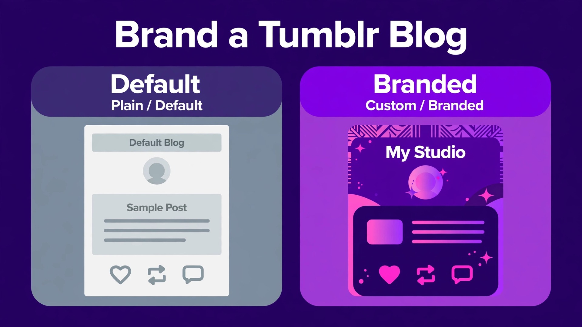
The mistake most Tumblr blogs make is treating the theme as decoration, and learning how to brand a Tumblr blog properly starts by fixing that mistake. A new blogger picks a pretty theme, uploads a favourite photo as the header, and starts posting, and the result looks like every other blog that picked the same theme. Visitors cannot tell what the blog is about, who runs it, or why they should follow. The blog is not ugly. It is anonymous, and anonymous blogs do not get followed, reblogged, or hired.
Branding a Tumblr blog is the work of making it unmistakable. The colours, the fonts, the header, the avatar, the about page, and the way posts look should all point at the same identity, so a visitor who sees one post in the dashboard recognises the next one without reading the name. That recognition is the whole job, and it takes an afternoon of decisions, not a week of coding. This guide covers the decisions in order, from the palette to the custom domain, with the exact sizes and settings Tumblr expects.
Why Most Tumblr Blogs Look Unfinished
A Tumblr blog looks unfinished when its parts disagree. The avatar is a photo, the header is a different photo, the theme uses a third colour, and the posts have no consistent style. Each part is fine alone, and together they look accidental. Professional blogs do the opposite. Every part uses the same two or three colours, the same fonts, and the same voice, so the blog feels designed even when the design is simple.
The second reason is the default settings. Tumblr ships with a plain theme, a blank description, and no about page. A blog that keeps those defaults looks like a blog nobody finished setting up, because that is what it is. Filling in the title, the description, the avatar, and the about page takes twenty minutes, and it is the difference between a blog that looks abandoned and a blog that looks intentional.
The third reason is mobile. Most Tumblr traffic arrives on the app, where the header is cropped, the sidebar is hidden, and the post width is narrow. A blog designed only on desktop can look broken on the phone, where the audience actually is. Check every change on the app before you call it done, and design for the small screen first.
How to Brand a Tumblr Blog in Eight Steps
Work the steps in order. The identity decisions come first, because the theme, the colours, and the header all follow from them. Changing the palette after the header is made means remaking the header, so decide once and build once.
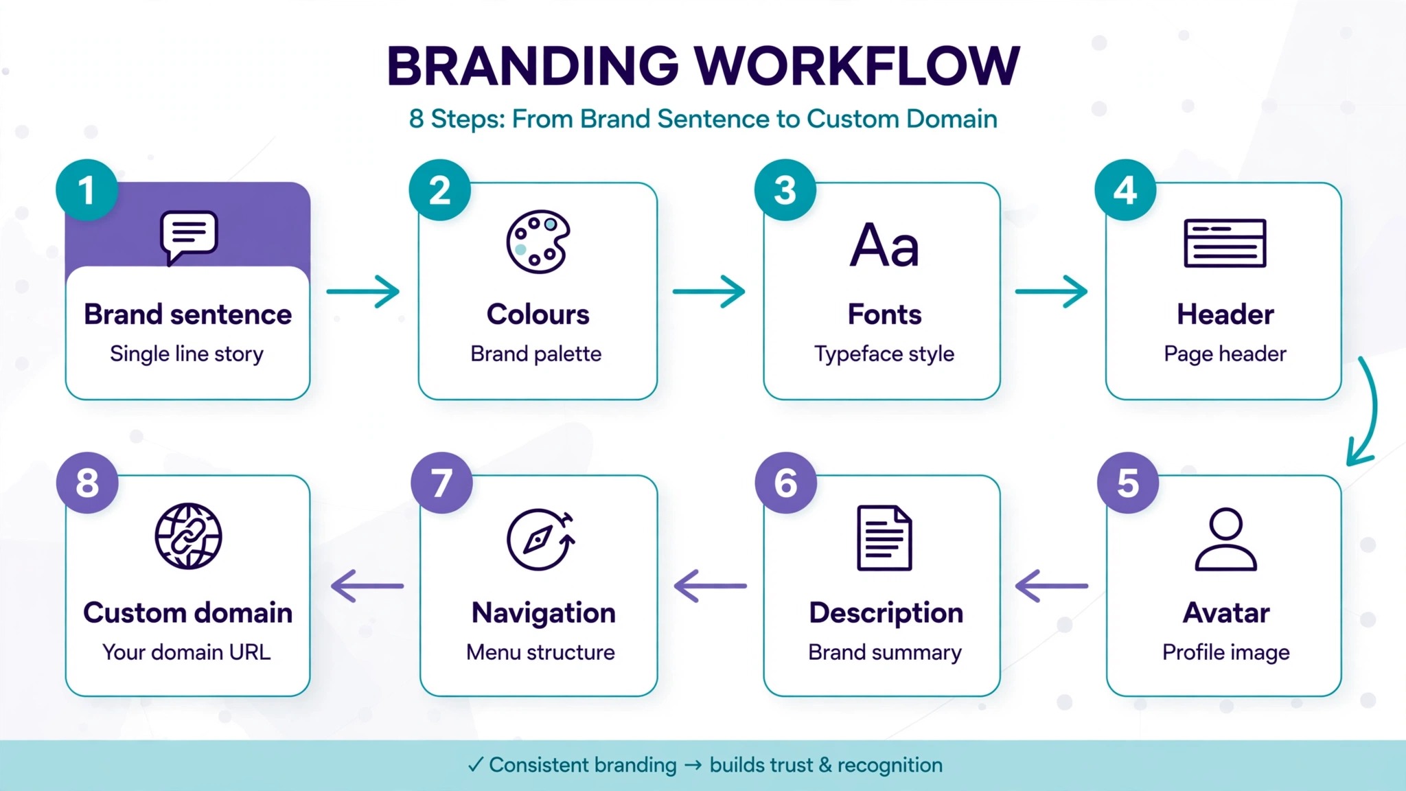
Step 1. Define the blog in one sentence
Write one sentence that says what the blog is and who it is for. A sentence such as “Film photography and darkroom notes for beginners” is a brand. A sentence such as “Stuff I like” is not. The sentence decides the colours, the images, and the tags, so write it down and keep it where you can see it while you work.
Step 2. Pick two colours and one accent
Choose a background colour, a text colour, and one accent colour for links and buttons. Two colours plus an accent is enough for a whole blog, and more than that starts to look busy. Tumblr itself uses a dark blue grey, hex code 34465D, as its signature colour, and a blog that borrows a navy like that with a bright accent reads as professional without copying the platform.
Step 3. Pick two fonts and use them everywhere
Choose one font for headings and one for body text, and use no others. A serif heading with a clean sans serif body is a safe pairing, and a single font family with different weights works too. Tumblr themes let you set fonts in the editor, and a custom theme lets you load web fonts. Whatever you pick, use it in the header image, the about page, and the post graphics, so the type becomes part of the recognition.
Step 4. Make the avatar and the header as a pair
Upload a square avatar of 128 by 128 pixels, the size Tumblr displays, and make the header 3000 by 1000 pixels, the size the theme expects. Design them together, with the same colours and the same style, so they read as one identity. The avatar appears in the dashboard feed and in search, so it should be readable at a tiny size, which means a simple mark or a clear face, not a detailed illustration.
Step 5. Write the title, the description, and the about page
Set the blog title to the name people will search for, and write a description that repeats the one sentence brand from step one. Then build the about page with three things, who you are, what the blog covers, and how to contact you. A blog with a real about page looks like a publication. A blog without one looks like a personal feed, even when the content is professional.
Step 6. Choose the theme and set the colours
Browse the Tumblr theme marketplace, preview the theme on desktop and on mobile, and pick one that fits the content, not the one with the most features. A photo blog needs a grid theme. A writing blog needs a clean single column theme. Set the theme colours to the palette from step two, and turn off any theme feature that fights the brand, such as a busy background pattern or a sidebar widget you do not need.
Step 7. Set the post style and the tags
Decide how posts will look before you publish the next ten. A consistent image size, a consistent caption style, and a consistent set of tags make the archive feel like a body of work. Posts on Tumblr are 540 pixels wide in most themes, so size images for that width. Tag every post with the same core tags plus the post specific ones, because tags are how new readers find the blog.
Step 8. Add a custom domain if the blog earns or sells
A custom domain turns a Tumblr blog into a brand asset. Buy the domain from a registrar, point it at the Tumblr blog in the settings, and update the links everywhere the old address appears. The domain costs about $10 to $15 a year, and it survives a theme change, a rebrand, and even a move off Tumblr, because you own it and Tumblr does not.
Picking a Colour Palette That Works on Tumblr
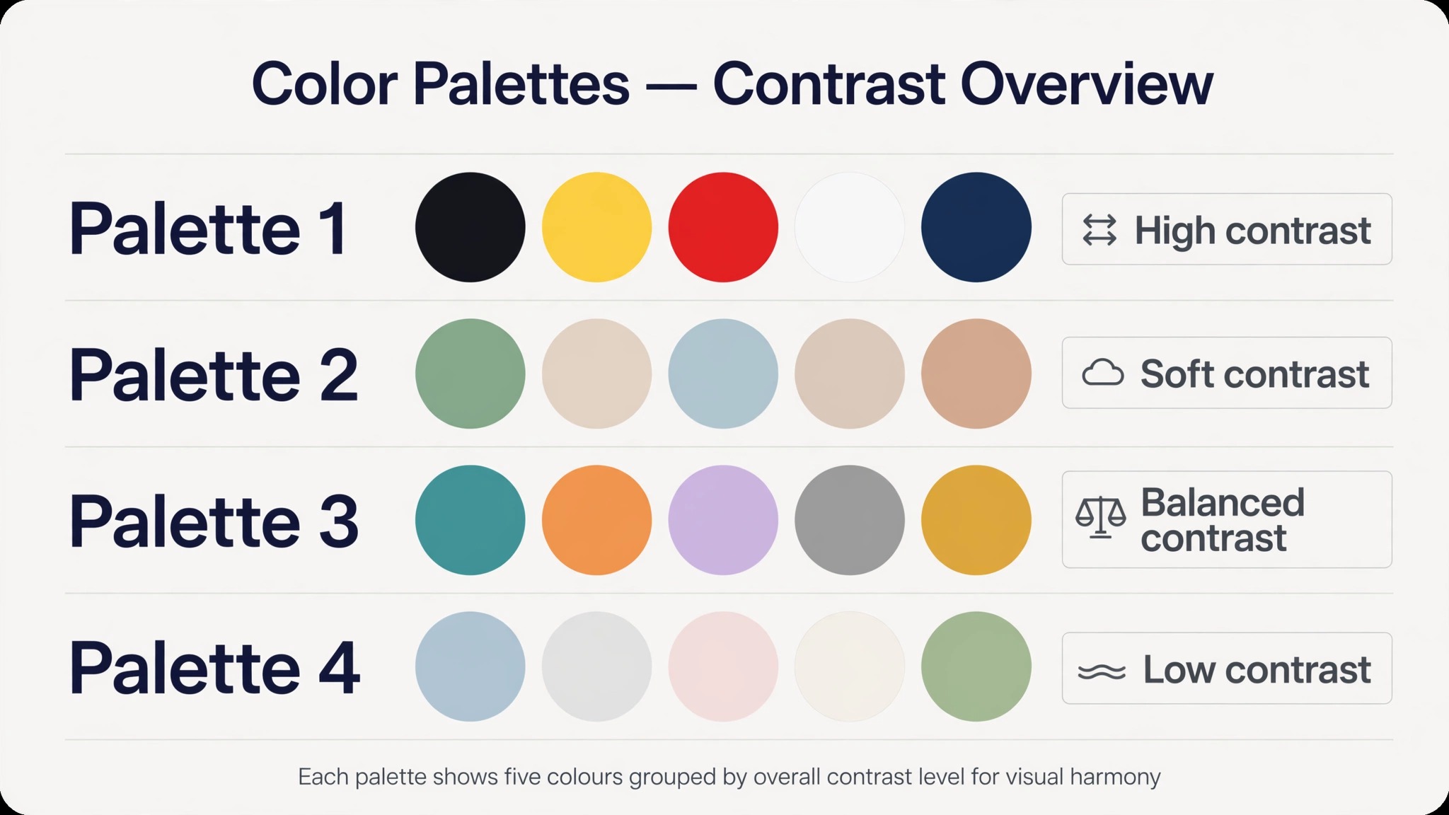
A palette needs contrast first and beauty second, because a beautiful palette nobody can read is a failed palette. Body text needs a contrast ratio of at least 4.5 to 1 against the background, which is the bar accessibility guidelines use. Dark text on a white background passes easily. Light grey text on a white background does not. Check the ratio with a free contrast checker before you commit, and test the blog in dark mode too, since Tumblr supports a dark dashboard palette and a Shift P shortcut to cycle palettes on desktop.
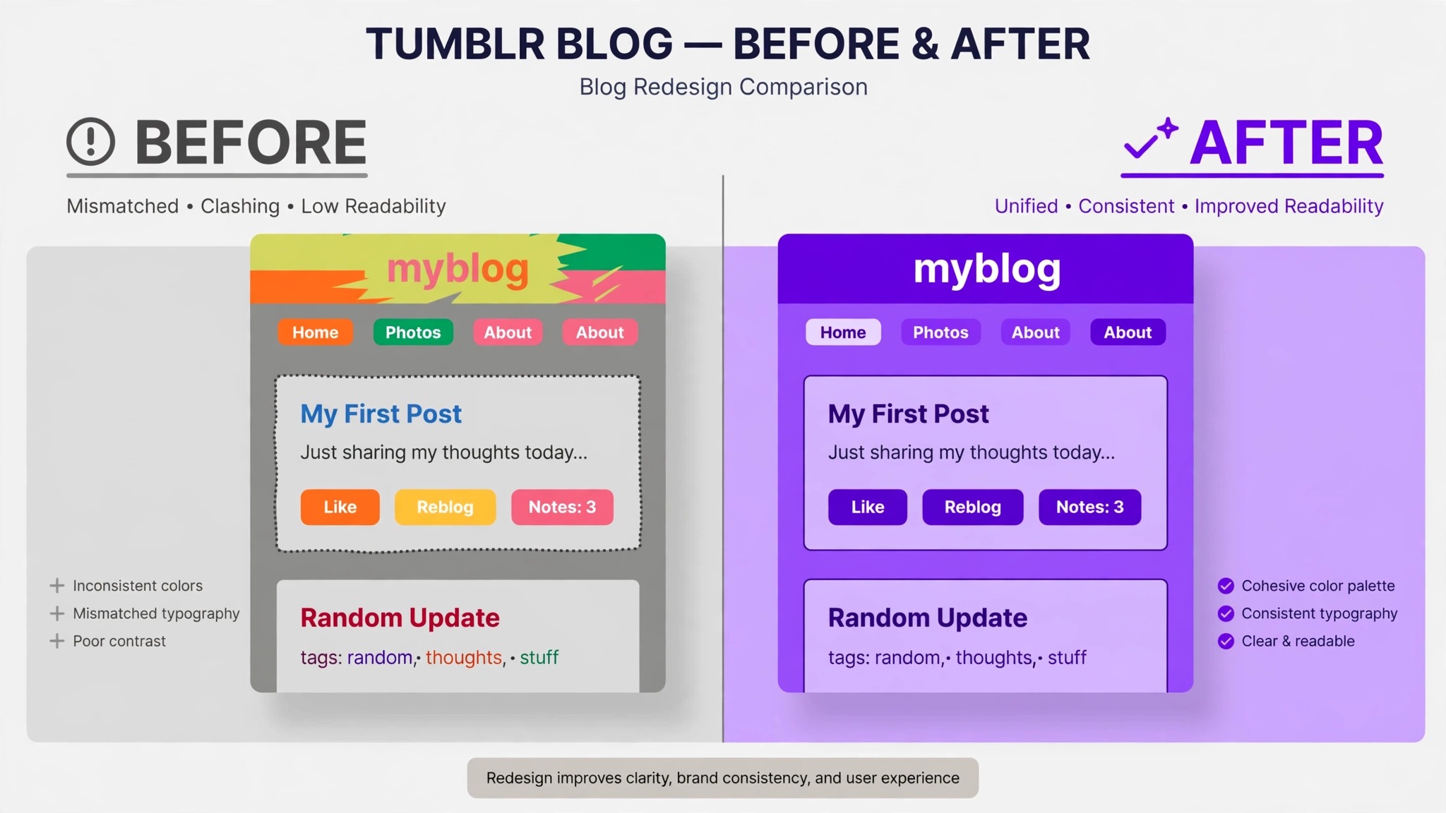
Start from one of the proven directions below, then adjust the accent to fit the subject. A palette is a starting point, not a rule, and the right one is the one you can use for a year without getting bored of it.
| Palette | Background | Text | Accent | Best for |
|---|---|---|---|---|
| Classic navy | White | Near black | Navy 34465D | Writing and journalism |
| Dark mode | Near black 121212 | White | Bright rose EC4186 | Art and photography |
| Soft pastel | Off white E6E5E1 | Dark grey | Muted teal BAD0CC | Lifestyle and crafts |
| Warm editorial | Cream FEF7E9 | Dark brown | Persian red C72E29 | Food and travel |
A dark theme looks striking, but it demands more care, because a dark background makes every image edge visible and every low contrast line unreadable. A light theme is more forgiving and suits a blog that publishes a lot of text. If you are unsure, start light, and add the dark look later as a second option, not as the first decision.
Typography and Readability
Type is the cheapest branding tool on Tumblr, because a font choice costs nothing and changes the whole feel of the blog. A serif heading font such as Georgia reads as editorial and serious. A geometric sans serif reads as modern and clean. A handwritten font reads as personal and casual, and it is the hardest to read, so use it for the title only, never for body text.
Body text needs a size that reads on a phone, which usually means 16 pixels or larger, with generous line spacing. A narrow column of small text is the most common readability failure on Tumblr, and it costs readers who never complain, they just leave. Set the post width to the theme default, keep paragraphs short, and break long posts with subheadings or images.
Consistency matters more than taste. A blog that uses one heading font and one body font everywhere looks designed, while a blog that uses a different font in every post graphic looks scattered. Set the fonts in the theme, then match them in the header image and in any graphics you make, using the same fonts in Canva or your image editor. The match is what makes the blog feel like one thing.
Choosing a Theme
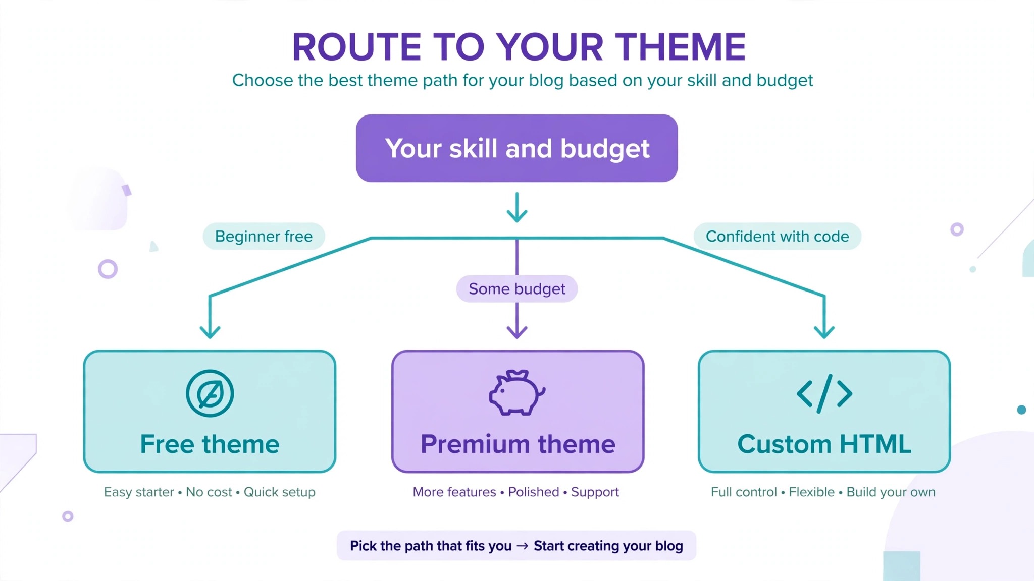
Tumblr themes come in three kinds, and the right kind depends on how much control you want. A free theme from the marketplace costs nothing and covers most blogs, with colour and font settings in the editor. A premium theme costs a one off fee and usually adds better mobile layout, more post types, and cleaner code. A custom theme, built by editing the HTML, gives full control, and it is the only option for a truly unique layout.
The free themes are good enough for most blogs, and the premium themes are worth the price when the free ones cannot do the layout you need. The custom route suits a blogger who knows HTML and CSS, or who can hire someone who does. Tumblr themes use HTML, CSS, and Tumblr template variables, and the editor shows a live preview, so you can test a change before you save it. Always back up the current theme before you edit the HTML, because a broken edit can blank the whole blog, and the backup is the only undo.
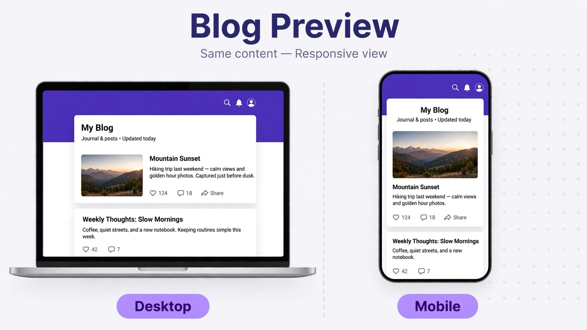
Judge a theme on the phone first. Open the preview on the app, scroll through the archive, and tap a post. If the header crops badly, if the text runs too wide, or if the navigation is hard to find, the theme fails the test that matters most. A theme that looks perfect on desktop and awkward on mobile is a theme for a desktop audience, and that audience is the minority on Tumblr now.
Header, Avatar, and About Page
The header is the first thing a visitor sees, and it should answer three questions in three seconds, what is this blog, who runs it, and what will I find here. A header with the blog name in the heading font, the one sentence brand, and the accent colour does that job. A header that is only a pretty photo does not, because a photo cannot say what the blog is about. Put the name and the sentence on the image, and keep the photo as the background, not the message.
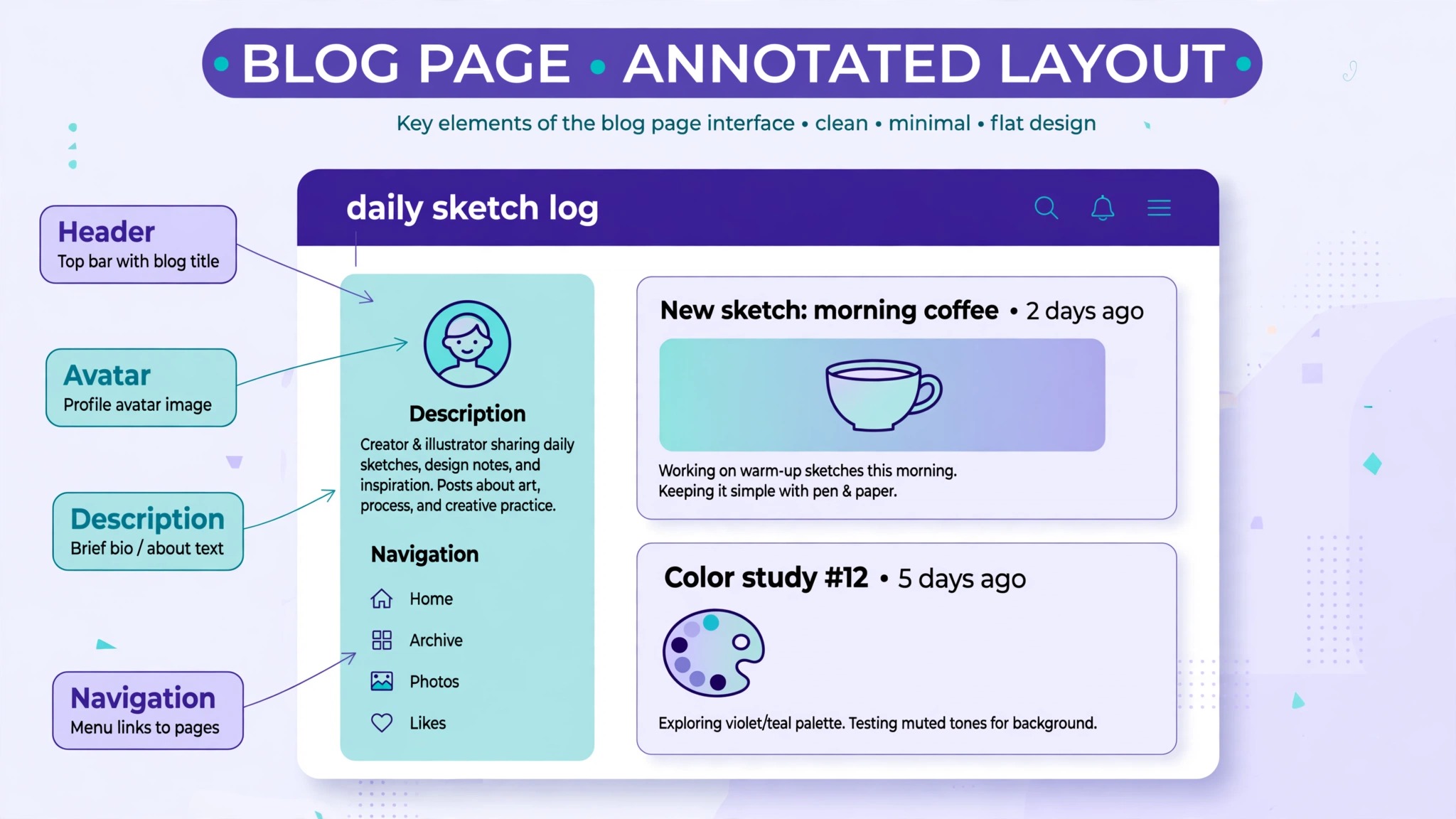
The avatar is the smallest brand asset and the most seen, because it appears beside every post in the dashboard. A simple mark, a clear face, or a bold initial in the accent colour all work at 128 pixels. A detailed photo with small text does not, because the text becomes unreadable. Test the avatar at the smallest size Tumblr shows, and simplify until it reads clearly.
The about page is where the brand becomes a person. Write it in your own voice, say what the blog covers and how often it updates, and add a contact link and a link to your best posts. A blog with a strong about page gets more follows, because the visitor knows who they are following and what to expect. Link the about page from the navigation, not from a post that will scroll away.
Content Consistency and the Queue
A brand is a promise about the next post, and consistency is how you keep it. A blog that posts film photography on Monday, a meme on Tuesday, and a political rant on Wednesday has no brand, because the reader cannot predict what comes next. A blog that posts one kind of content, in one visual style, with one voice, builds an audience that knows what it is following. The niche can be narrow. A narrow blog with a clear promise grows faster than a broad blog with no promise at all.
The queue is the tool that makes consistency possible. Tumblr lets you schedule posts in advance, so you can prepare a week of posts in one session and let them publish on a steady rhythm. A steady rhythm matters more than volume. Three posts a week, every week, builds more trust than twenty posts in one weekend followed by a month of silence. Set a schedule you can keep for a year, not a schedule that burns you out in a month.
Tags are part of the brand too. Use the same core tags on every post, plus the tags that fit the specific post. The core tags build a searchable archive, and the specific tags bring in new readers from search. Tag spam, which means adding tags that have nothing to do with the post, brings the wrong readers and hurts the blog in the long run. Ten honest tags beat thirty dishonest ones.
Reblogging is a branding choice as well. A blog that reblogs everything it likes looks like a scrapbook, while a blog that reblogs selectively, with a comment that adds something, looks like a curator. Add a line of your own to every reblog, even a short one, because the comment is what makes the reblog yours. A reblog with no comment is a repost, and a repost builds the original blog, not yours.
Branding Beyond Tumblr
A Tumblr blog does not live alone. The same identity should appear on the social profiles that link to it, so a visitor who follows from Instagram or X recognises the blog at once. Use the same avatar, the same header colours, and the same name everywhere, and link the profiles to each other. A consistent identity across platforms makes each platform stronger, because the audience meets the same brand wherever they find it.
A custom domain is the strongest step beyond Tumblr, because it makes the blog portable. The domain costs about $10 to $15 a year from a registrar, and Tumblr supports custom domains in the blog settings. Once the domain is set, print it on a business card, put it in an email signature, and use it as the link in every bio. The Tumblr address still works, but the domain is the address you own, and it survives any change Tumblr makes to its own URLs.
Communities are the other growth lever on Tumblr in 2026. Tumblr Communities gather readers around a shared interest, and a blog that posts in the right Community reaches people who care about the subject, not just people who already follow. Join the Communities that match the niche, post the best work there, and reply to comments. A Community is not a place to dump links. It is a place to be useful, and usefulness is the brand.
The same discipline applies when you learn how to brand a Tumblr blog for a second niche. Keep the same palette, the same fonts, and the same voice, and change only the subject. A second blog that looks like the first one borrows the trust the first one earned, while a second blog that looks unrelated starts from zero.
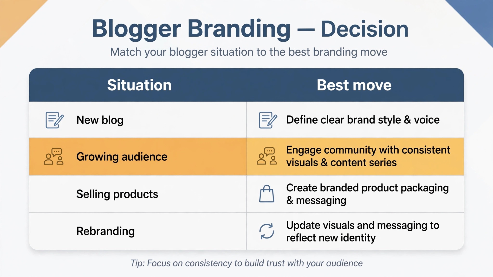
Branding Decision Table
| Your situation | Best move | Why it fits |
|---|---|---|
| Starting from zero | Free theme, light palette, one sentence brand | Fast, free, looks intentional |
| Photo or art blog | Grid theme, dark palette, big images | Images lead, text stays quiet |
| Writing blog | Single column theme, serif headings | Reading comfort first |
| Selling or freelancing | Premium theme, custom domain, about page | Looks like a business, not a hobby |
| Want a unique layout | Custom HTML theme, backup first | Full control, higher risk |
| Growing fast | Queue, core tags, Communities | Steady rhythm, new readers |
How to Brand a Tumblr Blog for a Business
A personal blog can afford to be loose. A business blog cannot, because the blog is a sales tool as well as a creative outlet. Learning how to brand a Tumblr blog for a business means adding three things to the personal branding work, a clear offer, a way to contact you, and proof that the work is real.
The offer should appear in the description and on the about page, in plain words, such as “Custom portraits, bookings open for March” rather than a vague line about art. The contact link should be in the navigation, not buried in a post. The proof should be the best work, pinned or linked from the about page, so a buyer sees the standard before they ask for a price. A buyer who finds all three in one visit is a buyer who can decide, and a buyer who cannot find them is a buyer who leaves.
Pricing is the question every business blog faces, and the answer is to show a starting price or a price range, not to hide the numbers entirely. A buyer who cannot find a price assumes the work is either too expensive or not for sale, and both assumptions lose the sale. A range such as “Portraits from $150” filters out the wrong buyers and invites the right ones, and it saves the back and forth that eats a freelancer week. The blog does not need a full shop. It needs a price, a contact, and a portfolio, and those three turn a feed into a storefront.
A business blog also needs a consistent posting rhythm tied to the work, not to the mood. A post that shows a finished piece, a post that shows the process, and a post that answers a buyer question, repeated every week, builds an audience of buyers rather than an audience of fans. Fans reblog. Buyers book. The content that earns bookings is the content that shows the work, the process, and the price, and a business brand is built from those three, repeated until they are unmistakable.
Common Branding Mistakes on Tumblr
The most common mistake is changing the theme every month. A new theme feels like progress, but it resets the recognition the blog was building, because returning visitors meet a different blog each time. A theme should last at least a year, and changes should be small, such as a new header image in the same palette, rather than a full redesign. How to brand a Tumblr blog well is mostly a question of patience, and patience looks like keeping the same colours and fonts long after you are bored of them, because the audience is not bored yet.
The second mistake is a header that says nothing. A beautiful photo with no text is a wallpaper, not a brand. The header must carry the blog name and the one sentence promise, or the visitor has to guess what the blog is, and visitors do not guess. They leave. Put the words on the image, check that they read at mobile size, and keep them there until the promise changes.
The third mistake is too many colours. A blog with six colours and three fonts looks like a craft project, not a publication. Two colours, one accent, and two fonts are enough, and the discipline of staying inside those limits is what makes the blog look designed. If a new graphic needs a new colour, change the graphic, not the palette.
The fourth mistake is ignoring the archive. A visitor who likes one post will open the archive, and an archive with no consistent style, no tags, and no order tells them the blog has no direction. Tag every post, keep the post style steady, and link the best posts from the about page. The archive is the portfolio, and a portfolio with no order is a drawer full of loose papers.
Frequently Asked Questions
How do I make my Tumblr blog look professional?
Start with the basics, a clear one sentence brand, a matching avatar and header, a filled in description, and a real about page. Then pick two colours and two fonts and use them everywhere. A blog with those pieces in place looks professional even on a free theme, while a blog without them looks unfinished on a premium one.
What size should a Tumblr header be?
The header image should be 3000 by 1000 pixels, and the avatar should be a square of 128 by 128 pixels. Posts display at 540 pixels wide in most themes, so size post images for that width. Design the header and the avatar as a pair, with the same colours and style, and check both on the mobile app, where the header is cropped.
Can I use a custom domain on Tumblr?
Yes. Buy the domain from a registrar for about $10 to $15 a year, then point it at the Tumblr blog in the settings. The domain makes the blog look professional and portable, because you own it and it survives a theme change or a rebrand. Update the links everywhere the old address appears.
What is the best Tumblr theme for branding?
The best theme is the one that fits the content. A photo blog needs a grid theme, a writing blog needs a clean single column theme, and a shop needs a theme with a clear about page and contact links. Preview every theme on mobile before you choose, because most of the audience reads on the app, and a theme that fails on mobile fails the blog.
How do I pick colours for my Tumblr blog?
Pick a background, a text colour, and one accent, and check the contrast ratio between text and background, which should be at least 4.5 to 1. Tumblr own signature colour is a dark blue grey, hex code 34465D, and a navy like that with a bright accent is a safe professional starting point. Test the palette in dark mode as well as light mode.
Should I edit the Tumblr theme HTML?
Edit the HTML only if you need a layout the theme editor cannot give you, and back up the current theme first. A broken edit can blank the whole blog, and the backup is the only undo. For most blogs, the theme editor settings for colours, fonts, and layout are enough, and a premium theme covers the rest without any code.
How often should I post on Tumblr for branding?
Three posts a week, every week, beats twenty posts in one weekend followed by silence. Use the queue to schedule posts in advance, and pick a rhythm you can keep for a year. Consistency builds trust, and trust is what turns a visitor into a follower and a follower into a customer.
Verdict
A professional Tumblr blog is not a prettier Tumblr blog. It is a blog where every part agrees, the colours, the fonts, the header, the avatar, the about page, and the posts, so a visitor recognises it in the dashboard without reading the name. That agreement takes an afternoon of decisions, a palette, a font pair, a header and avatar made together, and a theme that fits the content, plus a custom domain when the blog starts to earn. Do that work once, keep the queue steady, and the blog stops looking like a feed and starts looking like a publication people follow on purpose.
Start with the one sentence brand, then the palette, then the header and avatar. That order is the whole method for how to brand a Tumblr blog, and it works whether the blog is personal, creative, or a business.