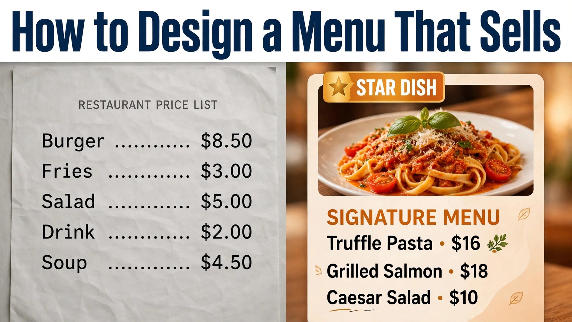
Research on menu engineering puts the payoff from a well planned menu at roughly 10 to 15 percent higher profit on an ongoing basis, according to hospitality training sources cited in 2026 guides, and a separate analysis found that raising average entree price by just 2 percent added about 1.8 percent to annual net revenue, or close to 28,800 dollars per location. Those numbers matter because a menu is the one sales tool every guest reads. Learning how to design a menu that sells is therefore less about pretty paper and more about deciding which dishes get attention, which prices feel fair, and which items quietly earn their place.
A menu that sells does three jobs at once. It helps a guest choose quickly without feeling rushed. It steers attention toward dishes that are popular and profitable. And it protects margin on the items that keep the kitchen busy but earn little. This guide walks through that work in order, from costing and sales data to layout, wording, photography, print, and testing.
How to Design a Menu That Sells Starts With Your Numbers
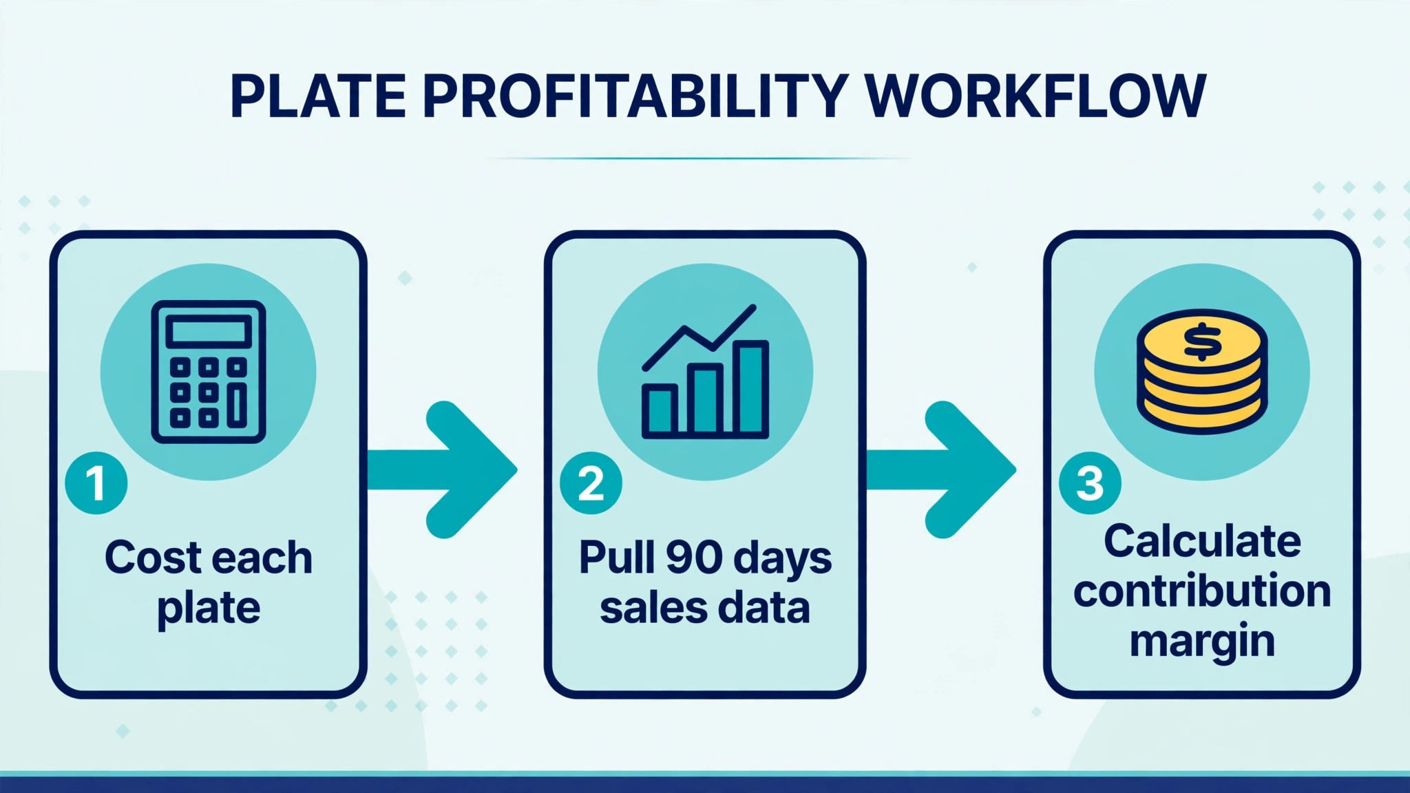
Before a single font is chosen, the menu needs numbers. A dish that looks popular can still lose money, and a dish that rarely sells can still be worth keeping if its margin is strong. The fix is to cost every plate properly and to pull real sales data from your point of sale system for the last 60 to 90 days. Guesswork at this stage leaks margin for months, because every wrong price is repeated on every order.
Start by costing each dish to the gram, including garnish, oil, bread, sauce, and the side that comes with it. Many venues aim for food cost in the region of 28 to 35 percent of the menu price, though the right target varies by dish type and venue. A steak house will run a different food cost from a pasta bar, and a dessert will run a different one from a main course. Use that range as a sanity check for the whole menu, not as a rule for every single plate. What you bank is dollars of contribution margin, which is the menu price minus the food cost, not a percentage on its own.
Next, pull units sold for every item over the same period. Sales mix reports from Toast, Square, Lightspeed, and most modern point of sale systems give you units, revenue, and category totals in a few clicks. Export the report, add your plate cost to each line, and calculate contribution margin per dish. Sort dishes inside each category, because a starter competes with other starters, not with a main course. The result is a simple table that shows which dishes earn their keep and which ones only look busy.
| Dish | Units sold in 90 days | Menu price | Food cost | Contribution margin |
|---|---|---|---|---|
| Wood fired margherita pizza | 1,240 | 18 | 5.10 | 12.90 |
| Truffle mushroom risotto | 860 | 24 | 7.40 | 16.60 |
| Grilled chicken sandwich | 980 | 16 | 6.80 | 9.20 |
| Seared salmon plate | 410 | 29 | 11.20 | 17.80 |
| Seasonal soup of the day | 690 | 9 | 2.60 | 6.40 |
| Chocolate fondant dessert | 540 | 12 | 3.30 | 8.70 |
A table like this turns opinion into evidence. The risotto and the salmon earn the most per plate. The chicken sandwich sells well but earns less per order, so it needs a different treatment from the salmon. Numbers guide the decision, and the role of each dish finishes it.
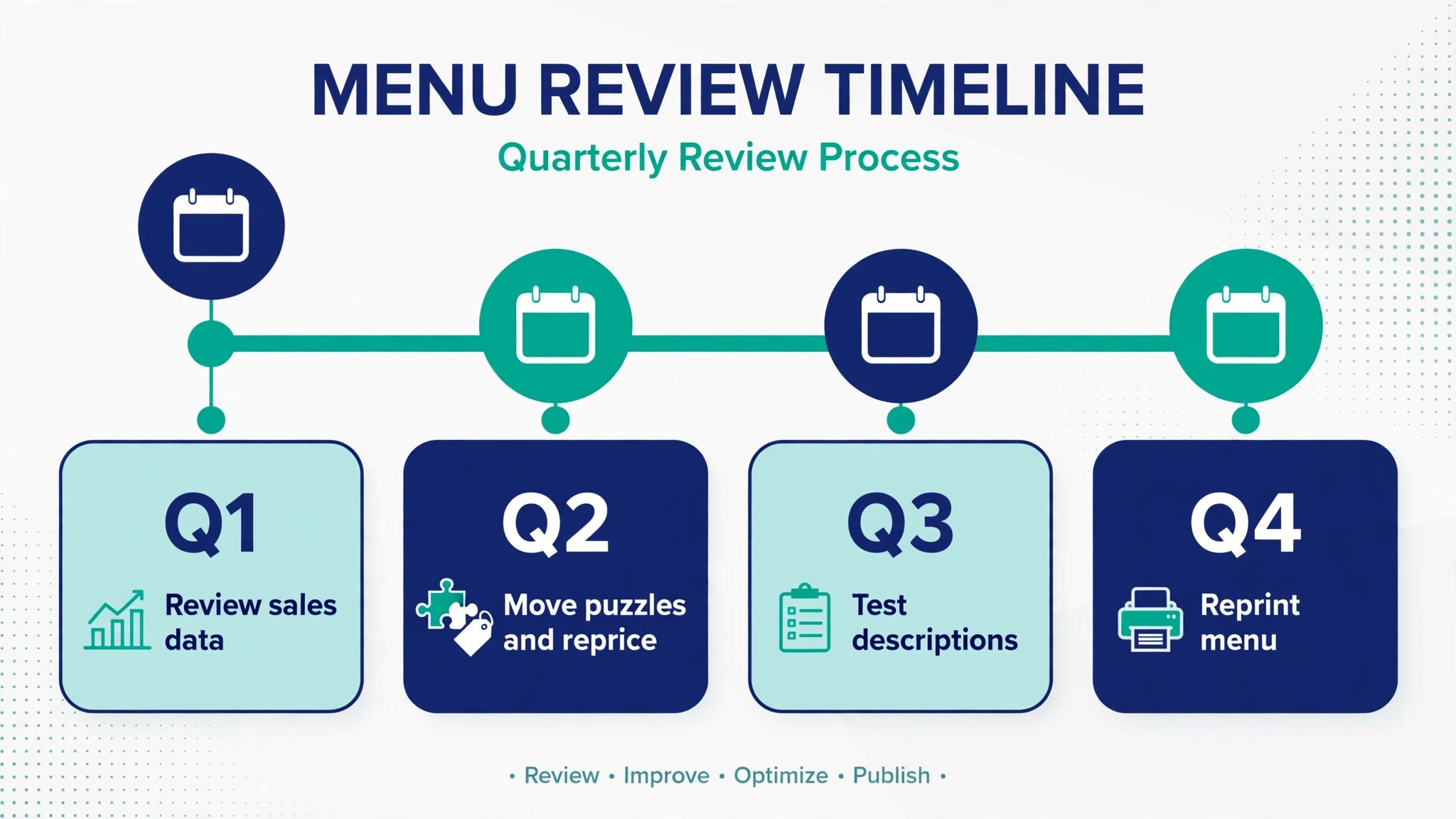
Set a review rhythm before you move on. Re-run the sales mix every quarter, or every month if your menu changes often. Prices move, suppliers change, and a dish that was a star in spring can fade by autumn. Put the next review date on the calendar now, while the numbers are fresh.
Sort Every Dish With the Menu Engineering Matrix
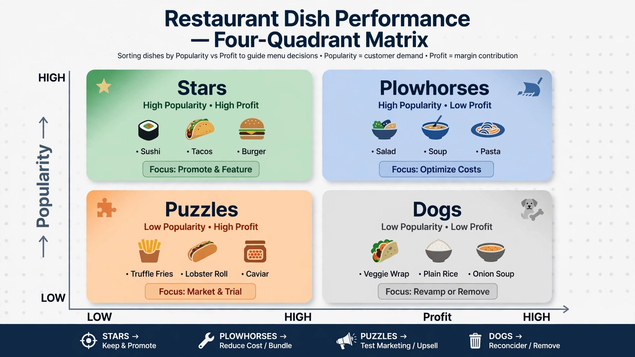
Menu engineering sorts every dish on two axes, popularity and profitability, and the framework comes from hospitality researchers Michael Kasavana and Donald Smith. Popularity is measured against the average for its own category. Profitability is measured by contribution margin against the category average. Two axes give four groups, and each group gets a different job when you learn how to design a menu that sells.
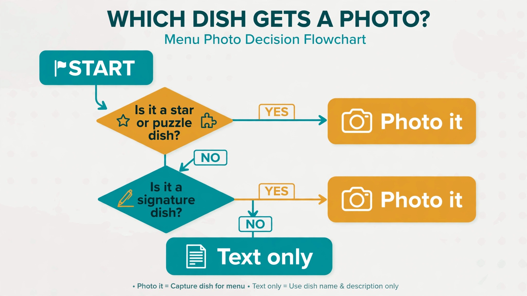
Stars are popular and profitable. Protect them, feature them prominently, and never discount them casually. These are the dishes to build the menu and the marketing around, because they already prove that guests want them and the kitchen earns from them. Plowhorses are popular but low in margin. They bring people in, so keep them, but reprice them carefully, trim their cost, or pair them with a high margin side or drink. Puzzles are profitable but rarely ordered. They need better placement, a stronger description, a photo, or a server recommendation. Dogs are neither popular nor profitable. Fix them, reprice them, rework them, or remove them.
| Group | Popularity | Profitability | Action on the menu |
|---|---|---|---|
| Stars | High | High | Feature first, protect quality, never discount |
| Plowhorses | High | Low | Reprice gently, trim cost, pair with high margin sides |
| Puzzles | Low | High | Promote with placement, photos, and server picks |
| Dogs | Low | Low | Rework the dish or remove it from the menu |
Work through the matrix dish by dish, not section by section. A menu with twenty dishes will usually hold four or five stars, a similar number of plowhorses, a few puzzles, and two or three dogs. That spread is normal. The mistake is to treat every dish as equal on the page, because equal treatment hides the stars and protects the dogs. Your layout, your photos, and your descriptions should all follow the matrix, not fight it.
Price Each Dish From Cost, Then Apply Psychology
When you learn how to design a menu that sells, pricing starts with the plate cost and the margin you need, and psychology comes second. Price from cost first, then adjust for what the market will bear and how the price reads on the page. A price that is right on paper but reads as expensive will still lose orders, and a price that reads as cheap but loses money on every plate is worse. The order matters, so do the maths before the formatting.
Charm pricing has a place, but it is not one rule for every dish. Prices ending in 95 or 99 can suit casual dishes under 15 dollars, where value matters most. Round numbers suit premium dishes, where a price of 24 or 32 reads as confident and simple. The 99 ending signals a bargain in many diners minds, which is the wrong signal for a fine dining main course. Match the ending to the dish and to the room, and keep the pattern consistent inside each section so the menu reads as deliberate.
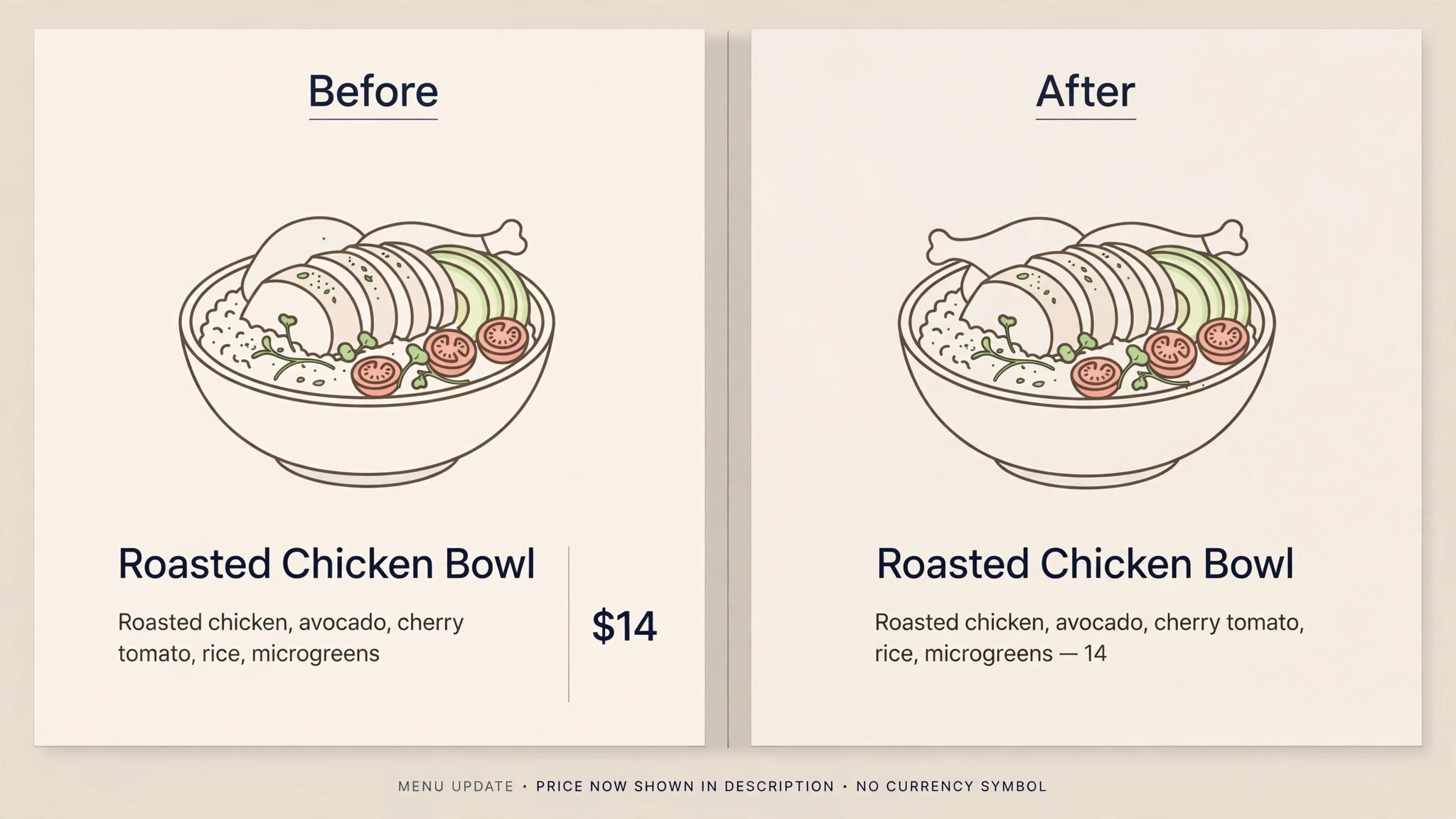
Drop the dollar sign and the trailing zeros where they add nothing. A bare 24 reads as less of a cost than 24.00 dollars, and Cornell research has long shown that menus without currency symbols lead guests to spend more. The symbol triggers a small pain of paying response that a plain number does not. The same research supports avoiding a neat price column down the right edge, because a column invites guests to scan prices first and choose the cheapest option. Tuck the price at the end of the description instead, in the same type size, so the guest reads what the dish is before seeing what it costs.
Use one anchor dish per section. A premium item near the top of a section makes everything below it feel reasonable by comparison. A 58 dollar ribeye makes a 34 dollar hanger steak look like a sensible choice, even if few guests order the ribeye itself. The anchor only works if it is a real dish the kitchen can deliver well. A fake premium item that nobody orders and the kitchen resents will not anchor anything. It will simply take space from a star.
Test price changes in small steps. A 5 percent rise on one section, watched for four weeks, tells you more than a 15 percent rise across the whole menu watched for four days. Watch units sold, average check, and total contribution margin, not just revenue. Revenue can rise while margin falls if guests trade down to cheaper dishes. If a price rise cuts units sharply, reverse it and try a smaller step or a different dish. Small, measured moves compound into real money over a year.
Lay Out the Page So the Eye Lands on Stars
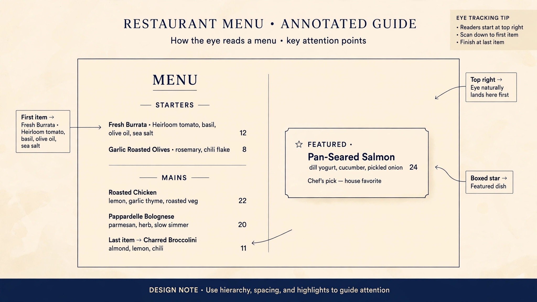
Guests do not read a menu like a book, and that simple fact shapes how to design a menu that sells. They scan it, and the first places their eyes land carry the most selling power. Eye tracking studies of menus consistently show that the top right area of a two page spread and the top of a single page draw attention first, followed by the first and last items in each section. Put your stars and puzzles in those spots, and let plowhorses and dogs sit where they will still be found by guests who want them.
Use boxes, shading, and white space sparingly, and spend them only on stars and puzzles. A box around every dish is the same as a box around none. One boxed feature per page, or one per section on a longer menu, is enough. Give that feature breathing room, because white space around a dish makes it feel more important than a larger font does.
Order items inside each section with intent. Put a star first or last in the section, because those positions are remembered best. Put the anchor dish near the top, where it sets the price frame for the section. Put plowhorses in the middle, where guests who already know what they want will still find them. Never bury a puzzle in the middle of a long list and hope it gets noticed. If a puzzle matters, give it a position, a photo, or a server mention, and measure whether orders move.
Canva for a Fast First Draft
Canva is the fastest route to a clean first draft, and its free plan covers most small restaurants. Start from a restaurant menu template, set your brand colours and fonts once, and keep them consistent across print and digital versions. Canva Pro costs 18 dollars a month for one person, or 144 dollars a year, and adds brand kits, background removal, and more storage. That price is easy to justify for a restaurant that updates its menu every season.
Canva works best when the menu is treated as a file, not as live data. You lay out the menu, download a PDF, and print it. When a price changes, you edit the file and download it again. That is fine for a stable menu with seasonal changes. It becomes a chore when prices change weekly, because every change means a new file, a new print run, and a new QR code link if the file lives online. Know which kind of menu you run before you commit to a file based tool.
MustHaveMenus for Print and Multi Location Menus
MustHaveMenus is built for restaurants, with more than 25,000 restaurant specific templates for menus, flyers, and signage. Its Design plan costs 24 dollars a month when paid annually, and its Pro plan costs 49 dollars a month when paid annually, with QR codes and digital signage on the higher plan. The template library is the main reason to choose it, because a template made for a menu already solves spacing, hierarchy, and print sizing.
The strength of MustHaveMenus is print and multi location control. One dashboard holds the menu for every site, with role permissions and brand kits for groups. Its weakness is that it is a design and display tool, not an ordering system, and its QR code menus are view only. If you need guests to order and pay from the menu, pair it with an ordering platform rather than expecting it to do that job. For a restaurant that prints often and runs more than one site, that trade is usually worth it.
iMenuPro for a Simple Live Menu
iMenuPro takes the opposite approach to a template library. It holds the menu as live data, so one price change updates the print file, the website, and the QR code at the same time. It costs 16 dollars a month, or 11.25 dollars a month on the annual plan, with all features included in that single tier. That simplicity is the product, and it suits a small restaurant that wants a tidy print and QR menu fast.
The limit is design range. iMenuPro gives you fewer visual styles than a general design tool, and it has no online ordering and no point of sale integration. If your menu is stable and your priority is keeping print and digital in sync without rework, that limit rarely matters. If your brand depends on a very specific look, start in a design tool and accept the extra work of keeping versions in sync.
Write Descriptions That Earn the Price
A description should answer three questions in one or two lines. What is it, how is it made, and why is it worth the price. Origin, technique, and one specific detail do more work than a string of adjectives. Wood fired, slow braised, house cured, and locally caught all carry real information. Delicious, tasty, and mouth watering carry none, and guests skip them without noticing.
Keep descriptions short. Two lines is the target for most dishes, and three lines is the maximum for a signature plate. Longer descriptions slow the scan, push prices further down the page, and make the menu feel like a novel. If a dish needs more explanation, let the server tell the story, or put the detail on a separate specials card. The menu should make a guest want the dish, not teach them the recipe.
Name the ingredients that matter and leave out the ones that do not. A guest choosing between two pasta dishes wants to know the sauce, the protein, and the one ingredient that makes it different. They do not need a full inventory of the pantry. Allergen and dietary notes belong in a clear, consistent place, such as a small symbol after the description or a note at the foot of the section. Do not bury a nut warning in the middle of a sentence where a hurried reader can miss it.
Use Photos Only Where They Sell the Dish
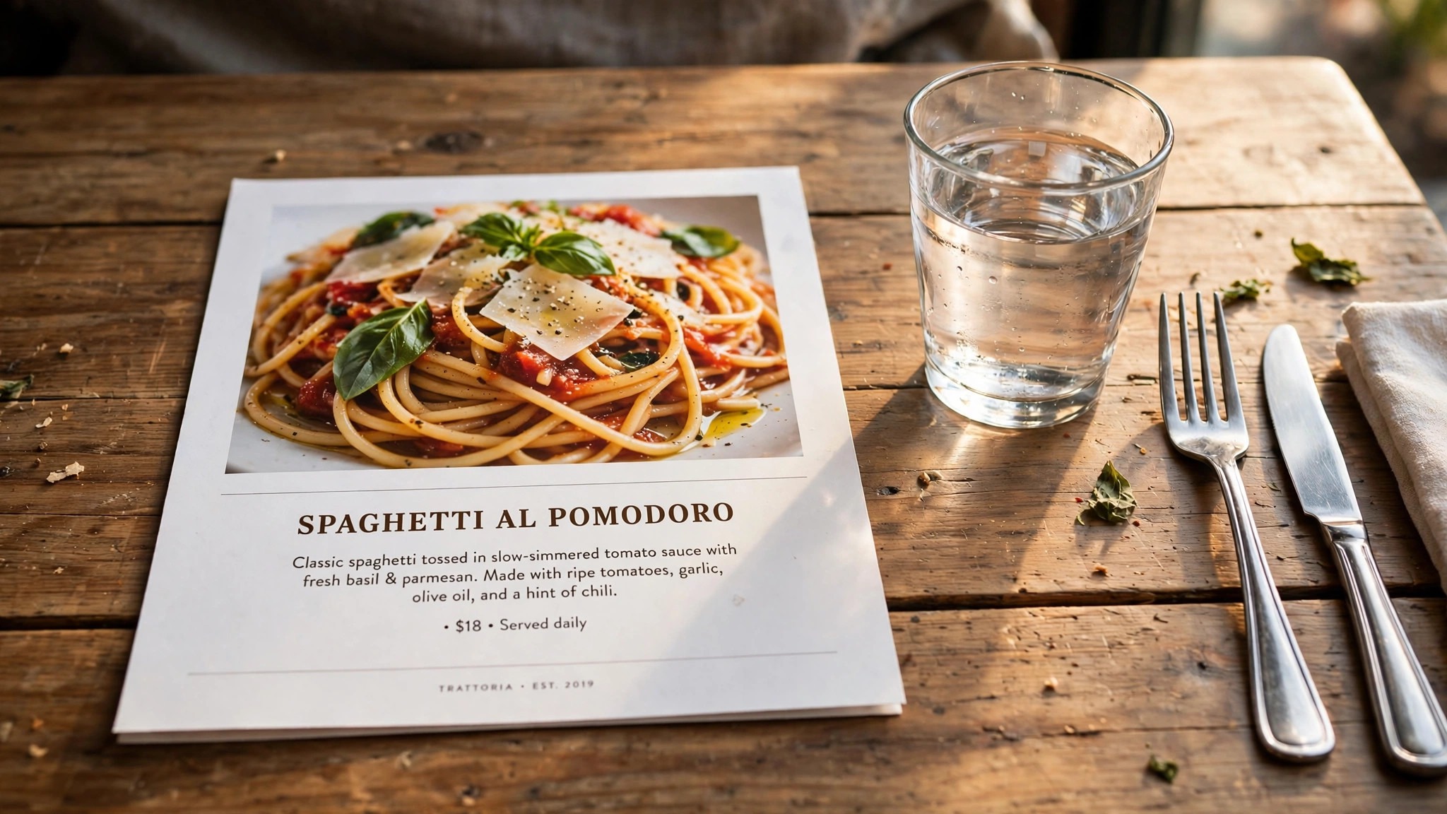
Photos sell food, and knowing how to design a menu that sells means using them only when they are honest and well placed. One strong photo of a star or a puzzle does more than six small photos crowded into a corner. Guests order with their eyes, and a photo that shows the real portion, the real plate, and the real garnish builds trust. A stock photo that looks nothing like the dish on the table breaks it, and a disappointed guest rarely orders a second course.
Place each photo immediately after the section it illustrates, or beside the dish it shows, and keep photos spread through the menu rather than bunched together. A page with four photos in one corner and none elsewhere looks unbalanced, and the dishes without photos feel like afterthoughts. Give every photo a short caption that names the dish and, where it helps, the price. A caption turns a decoration into a selling tool.
Keep the photography consistent. Same light, same angle, same plate style, same background, across every dish you photograph. Inconsistent photos make a menu look assembled from different restaurants, and they make portion sizes hard to judge. If you cannot photograph the whole menu well, photograph three or four stars and leave the rest as text. A menu with a few excellent photos beats a menu with many average ones, every time.
Check photos on the real menu, not just on a screen. Print a test copy at full size and look at it from a normal reading distance. A photo that looks sharp on a laptop can look dark on paper. Adjust brightness and crop before you commit to a print run, because reprinting costs far more than an extra hour of photo work.
Make Print and Digital Menus Work Together
Most guests now meet your menu twice, and how to design a menu that sells means making those two meetings agree. They meet it once online before they arrive and once at the table. Those two versions should agree on dishes, prices, and descriptions, or guests will feel misled. A guest who chooses a restaurant for a dish they saw online, then finds it missing or priced higher in the room, starts the meal annoyed. That is a bad way to sell anything.
A QR code menu solves the sync problem when it points to a live page rather than a static PDF. A live page can hide a sold out dish, update a price, and add a special without a reprint. A static PDF cannot, and a QR code that points to an out of date PDF is worse than no QR code at all. If you use a QR code, test it on two different phones, check that it opens fast on a weak signal, and make sure the page it opens is readable without pinching and zooming.
Print still matters, because a printed menu is easier to share across a table and easier to read without a phone. Print on paper that suits the room, with a finish that survives handling, and keep the type large enough to read in low light. A menu that needs a phone torch to read is a menu that pushes guests toward the cheapest familiar dish. Test the print in the dining room at dinner lighting, not just in a bright office.
Keep the digital menu fast. Compress images, keep the page light, and make sure it loads in a few seconds on a mobile connection. A guest standing outside your door will not wait for a heavy page. They will walk to the next restaurant.
Test, Measure, and Improve the Menu Every Quarter
A new menu is a hypothesis, and how to design a menu that sells includes testing that hypothesis against real orders. The only way to know if it works is to watch what guests actually order. Compare the sales mix before and after the change, and look at units sold, average check, and total contribution margin. A menu that lifts revenue but cuts margin has failed, even if the till looks healthier on a busy night.
Run one change at a time where you can. Move a puzzle to a better position and watch it for four weeks. Rewrite a description and watch it for four weeks. Change a price and watch it for four weeks. When you change five things at once, you cannot tell which one worked, and you cannot repeat the win. A simple log of changes and results, kept in a spreadsheet, is enough. Date, change, units before, units after, and a short note on what you will do next.
Ask the servers what they hear. They know which dishes guests ask about, which descriptions confuse people, and which items get sent back. A weekly five minute conversation with the floor team will surface problems that sales data takes a month to show. Fix the description before you blame the dish.
Mistakes That Quietly Kill Menu Sales
The most common mistake is too many dishes. A long menu feels generous, but it slows decisions, strains the kitchen, and hides the stars. If a dish has not earned its place in the last quarter, it needs a reason to stay beyond habit. Cut with care, but cut. A focused menu is easier to cook well, easier to read, and easier to sell.
The second mistake is copying a competitor price without costing your own dish. Their supplier, their rent, and their portion size are not yours, so their price tells you little about your margin. Use competitor prices as a market check after you have costed the dish, not as a starting point. A price that works for the restaurant next door can lose money in your kitchen.
The third mistake is designing for the owner instead of the guest. A menu that lists dishes in the order the chef likes them, uses a font the owner loves but guests cannot read, or hides prices to look elegant, serves the wrong person. The guest is the reader, and the menu should serve them first. Test the menu with real guests, not just with staff who already know what everything is.
A Menu Checklist You Can Run Before Every Reprint
Run this checklist before you send any menu to print, and keep a copy with the proof.
- Every dish is costed to the gram, and contribution margin is calculated for each item.
- Sales data covers the last 60 to 90 days, and every dish is sorted into the engineering matrix.
- Stars and puzzles sit in the strongest positions on the page, and dogs are fixed or removed.
- Prices are set from cost first, with psychology applied second, and no neat price column invites price shopping.
- Each section holds seven items or fewer, and the anchor dish sits near the top of its section.
- Every description is two lines or fewer, names what matters, and reads like something a server would say.
- Photos show the real dish, sit beside the section they illustrate, and are spread through the menu.
- Print and digital versions agree on dishes and prices, and the QR code opens a fast, readable page.
- Allergen and dietary notes are clear, consistent, and easy to find.
- Type reads clearly in dinner lighting, and a test print has been checked at full size.
Best Pick by Job
Different restaurants need different tools, so choose by the job in front of you, not by the longest feature list. A small cafe with a stable menu needs a different setup from a multi site group that prints every month. The table below matches the common jobs to the tool that fits each one best, using the prices found in research for this guide.
| Your job | Best pick | Why it fits | Starting price |
|---|---|---|---|
| Fast first draft | Canva | Templates and easy PDF export | Free, Pro 18 dollars a month |
| Professional print menus | MustHaveMenus | Restaurant templates, print ready | 24 dollars a month, paid annually |
| One live menu, print and QR | iMenuPro | One change updates every version | 16 dollars a month, 11.25 annual |
| Design plus social posts | Adobe Express | Quick graphics and brand kits | Free, paid from 9.99 dollars a month |
| Ordering from the menu | UpMenu | Online ordering built in | From 49 dollars a month |
Check the price at checkout before you buy, because vendors change list prices during the year and regional prices vary. A tool that fits your workflow at the right price is worth more than a cheaper tool that fights you every time a price changes. Start with a trial where one is offered, build a real menu in it, and print a test copy before you commit.
Frequently Asked Questions
How many items should a restaurant menu have?
Aim for seven items or fewer in each section, and keep the whole menu focused enough that the kitchen can cook every dish well on a busy night. A shorter menu helps guests choose faster, helps the kitchen stay consistent, and makes your stars easier to find. If a section grows past seven, split it into two clear groups or move slow sellers to a separate page.
What is a good food cost percentage for a restaurant?
Many venues aim for food cost in the region of 28 to 35 percent of the menu price, though the right target varies by dish type and venue. Use that range as a sanity check for the whole menu, not as a rule for every plate. What matters most is contribution margin in dollars, which is the menu price minus the food cost.
How often should a menu be redesigned?
Review the sales mix every quarter and redesign when the data says so, not on a fixed calendar. A light review each quarter, with prices updated and dogs retired, keeps the menu honest. A full redesign makes sense when the concept changes, when several stars have faded, or when the layout no longer matches how guests actually order.
Should prices include dollar signs on a menu?
Most menu research says no. A bare number reads as less of a cost than a price with a dollar sign and trailing zeros, and Cornell research has shown that menus without currency symbols lead guests to spend more. Keep the price in the same type size as the description, tucked at the end of the line, so the guest reads the dish first.
Do menu photos increase sales?
Photos increase sales when they show the real dish well and sit beside the dish they illustrate. One strong photo of a star or a puzzle does more than several small photos crowded together. Use photos that match the portion and plate guests actually receive, keep the style consistent, and spread them through the menu rather than bunching them in one place.
How do I price a new dish with no sales history?
Cost the dish to the gram, add the margin you need, and check the result against similar dishes on your menu and against competitor prices for the same kind of dish. Set the price, watch units sold and margin for four weeks, and adjust in small steps. A new dish is a test, so treat the first month as data collection, not as a final verdict.
Is a QR code menu better than a printed menu?
Neither is better on its own, and most restaurants need both. A QR code menu that points to a live page is better for updates, sold out dishes, and price changes. A printed menu is better for sharing across a table and reading without a phone. Use both, keep them in agreement on dishes and prices, and test the QR code on real phones before you rely on it.
The Final Word
A menu that sells is built, not decorated, and that is the heart of how to design a menu that sells. Cost every dish, sort it by popularity and profit, price it from the numbers, and give the winners the best positions, the clearest words, and the strongest photos. Then test the result, listen to the servers and the sales data, and improve it every quarter. Do that work, and the menu stops being a list of prices and starts being the hardest working member of the team.