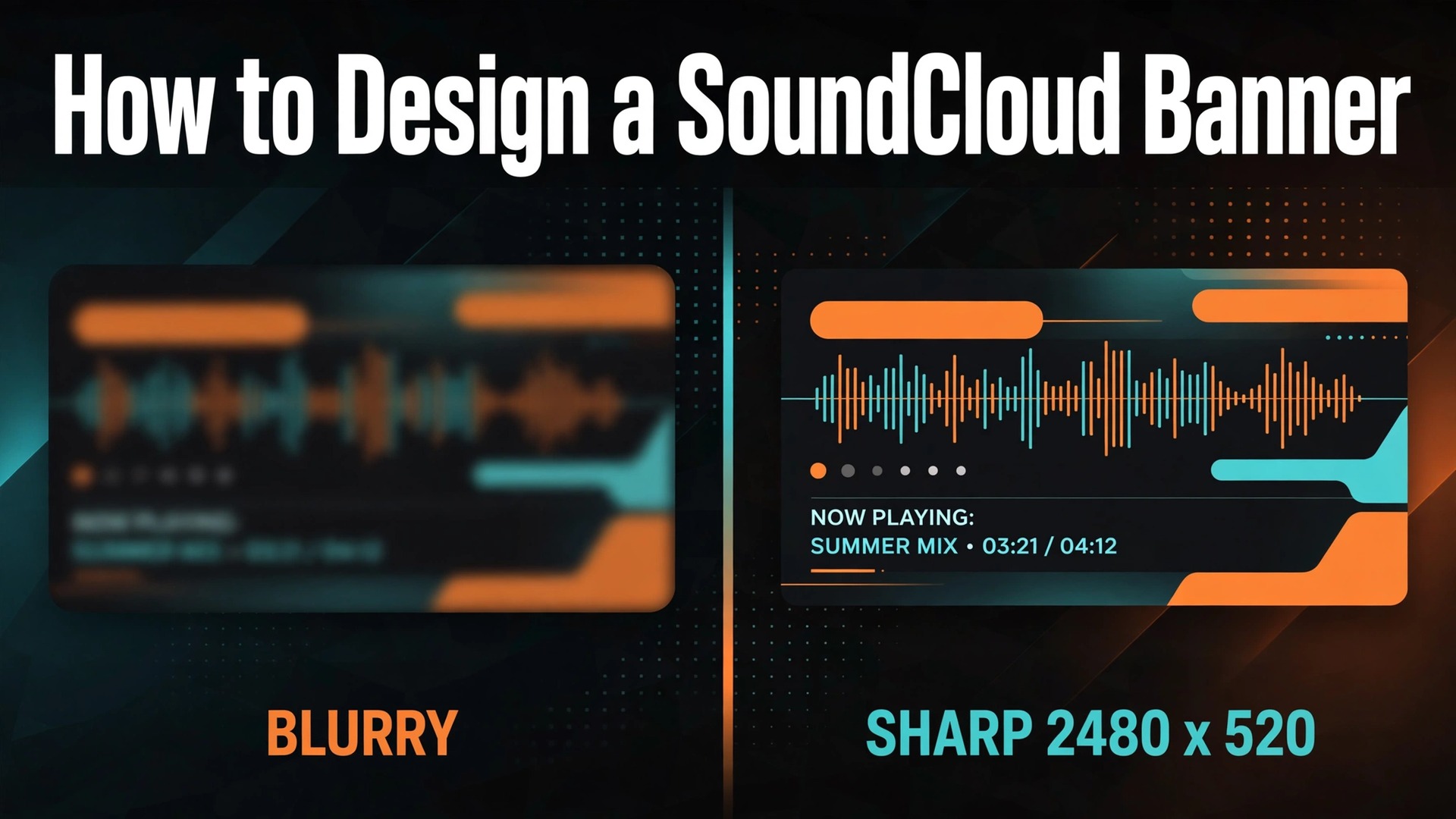
2480 by 520 pixels. That is the minimum size SoundCloud asks for in a profile header, and the file must stay under 2 MB. Get either number wrong and your artwork arrives cropped, stretched, or soft. Get them right and the wide strip across the top of your profile becomes the first thing a listener sees, before a single track plays. This guide walks through how to design a SoundCloud banner that fits every screen, from a phone to a desktop, with the exact sizes, a seven step workflow, and the tools that make the job fast. You do not need design training or a paid app to finish with a banner that looks intentional.
The Short Answer First
A SoundCloud banner is the wide header image at the top of your profile. SoundCloud calls it a header, and most artists call it a banner. Either name points to the same strip. Upload a JPG or PNG of at least 2480 by 520 pixels, keep the file under 2 MB, and keep text and faces near the middle of the frame. That is the whole technical job. The creative job is different. Your banner has about two seconds to tell a visitor what kind of music you make and why they should press play. A sharp stage photo, your name in a readable font, and one clear visual idea will do that. A busy collage will not.
SoundCloud Banner Sizes and File Rules
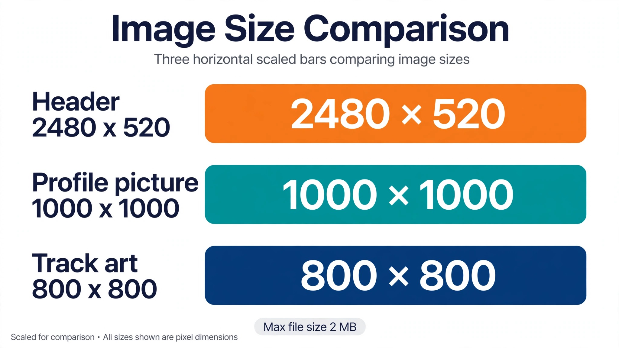
Every image on a SoundCloud profile has its own size, and mixing them up is the most common reason a banner looks wrong. The header is a wide strip, the profile picture is a square shown as a circle, and track artwork is a square. Use the table below as the reference, and design each image at its own size instead of stretching one image across all three spots.
| Image | Size in pixels | Format and limit |
|---|---|---|
| Header banner | 2480 by 520 minimum | JPG or PNG, under 2 MB |
| Profile picture | 1000 by 1000 minimum | JPG or PNG, under 2 MB |
| Track artwork | 800 by 800 minimum | JPG or PNG, under 2 MB |
The header ratio is close to 4.77 to 1, which is far wider than a normal photo. A standard 16 by 9 image will lose its top and bottom when it is squeezed into this strip, and a square image will lose even more. Start from a blank 2480 by 520 canvas instead of cropping a photo you already have, and you keep control of what survives the crop.
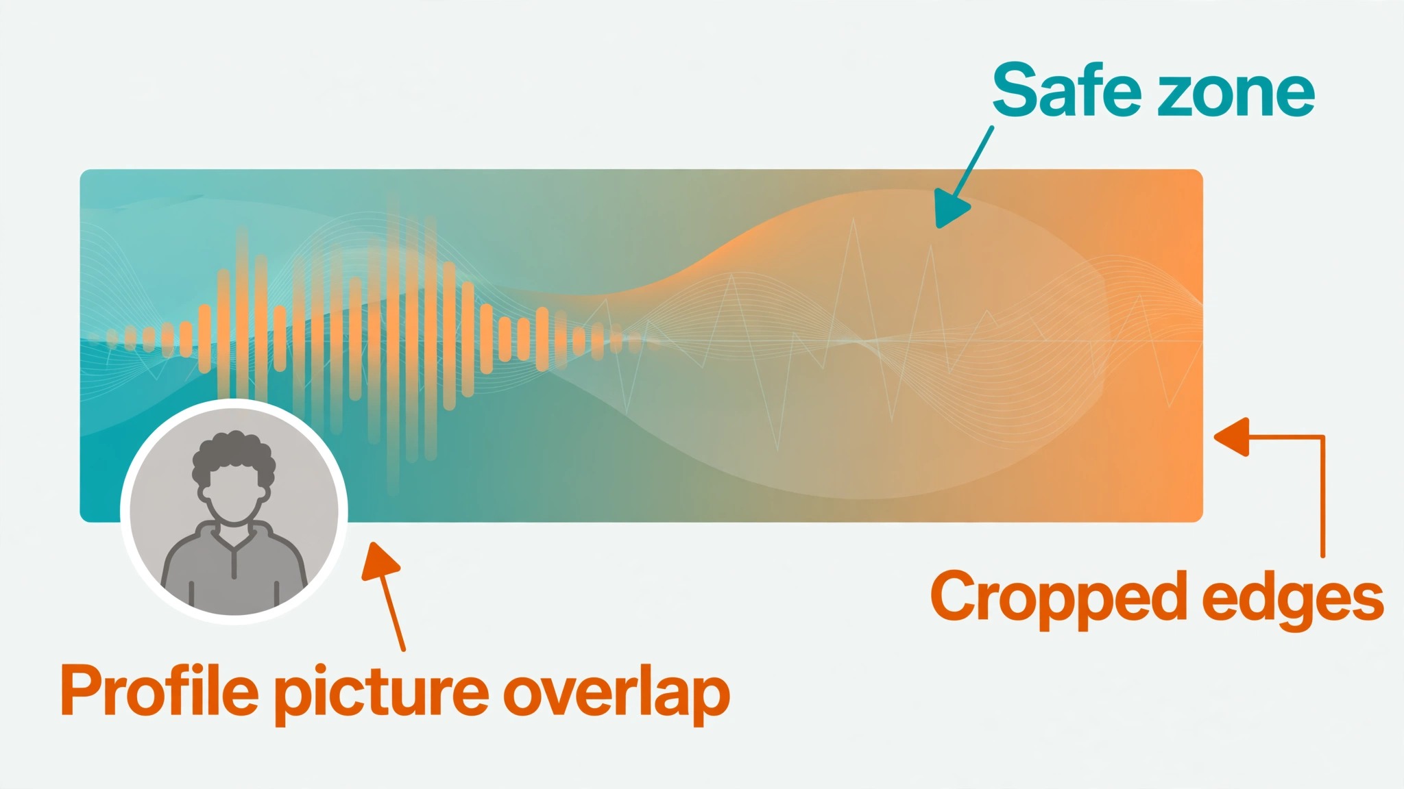
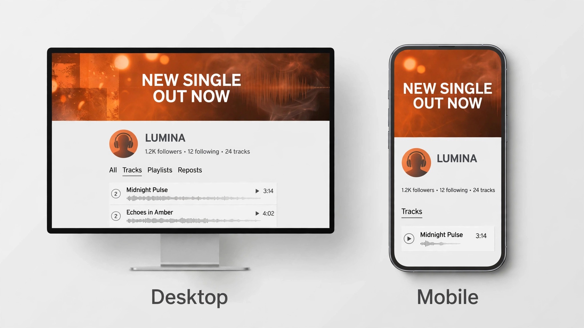
SoundCloud crops the header on smaller screens, and its own help pages advise against putting text in it for that reason. The safe approach is to treat the middle of the banner as the only guaranteed visible area. Keep your artist name, faces, and any release detail inside the central band, and let the edges hold background color, texture, or a photo that can lose a little on each side without damage.
Your profile picture and name sit over the left side of the header, so plan for that overlap before you place anything important. A face or a line of text tucked into the bottom left corner will sit behind your own avatar. Shift the focal point toward the center or the right, and the whole composition reads cleanly on desktop and on mobile.
File size matters as much as pixel size. A JPG exported at high quality usually lands well under the 2 MB limit, while a PNG with large flat areas of color can pass it. If your PNG is too heavy, export a JPG at quality 80 to 90 and check the result at full size. The difference on screen is small, and the file becomes a fraction of the weight.
On paid Artist and Artist Pro plans, SoundCloud also lets you add banner links, which make the header clickable. That feature turns the banner into a working part of your profile, pointing listeners toward a new release, a tour page, or a merch store. If you are on a free plan, the banner is visual only, so the design has to do its work without a link.
How to Design a SoundCloud Banner in 7 Steps
The workflow below takes about 30 minutes once you have a photo or an idea to start from. Follow it in order, because each step protects the next one. A banner built on the right canvas with the safe zone marked first rarely needs a second attempt.
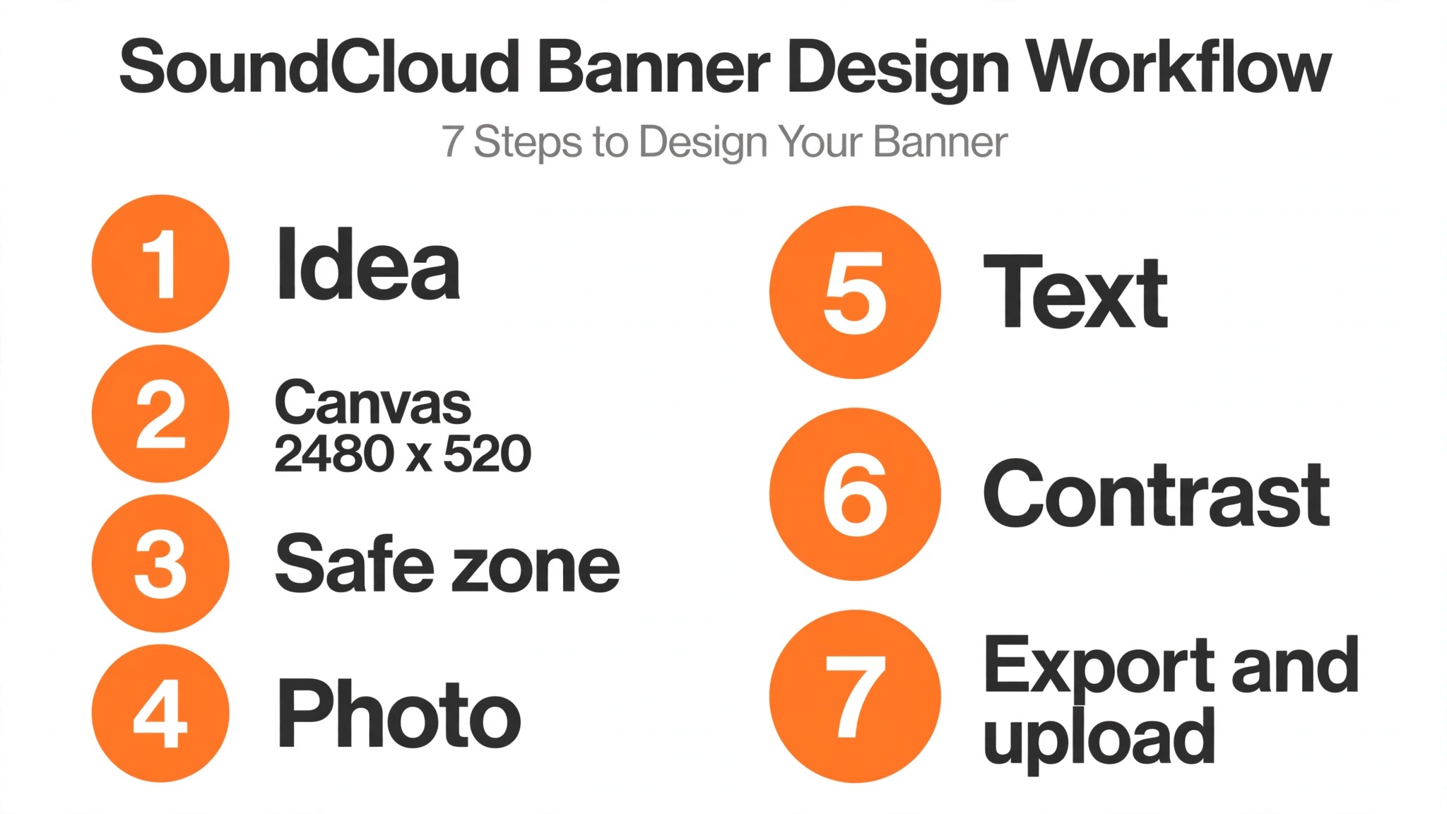
- Pick one idea for the banner before you open any tool. A live photo, a piece of cover art, a bold color field with your name, or a texture that matches your sound. One idea is enough. Two ideas fight each other in a strip this wide, and three turn the header into a poster that nobody reads. Write the idea down in one sentence, then judge every later choice against it.
- Open your tool and set the canvas to 2480 by 520 pixels. Do not start from a social post template or a YouTube banner size and resize later, because the ratio is different and the resize will cut the edges you just designed. If your tool has a SoundCloud header preset, use it. If it does not, type the numbers in by hand and save the size as a preset for next time.
- Mark the safe zone before you add anything. Draw a light guide around the central band of the canvas and another around the bottom left corner where your profile picture will sit. Everything that must be seen goes inside the central band. The left corner stays empty, and the far edges hold only background. Delete the guides before you export.
- Place your main photo or artwork, then scale it so the subject sits in the safe zone. A stage photo works best when the performer is near the center and the crowd or the lights fill the sides. A portrait works best when the face is slightly right of center. Zoom until the image fills the frame edge to edge, because any white gap at the sides reads as a mistake.
- Add your artist name in one font, at a size that stays readable on a phone. Test it by shrinking the canvas preview to phone width. If you cannot read the name in two seconds, the font is too thin, too small, or too close in color to the background. A short tagline or a release date can sit under the name, but keep it to a few words. SoundCloud itself advises keeping text out of the header, so treat any text as a calculated exception and keep it minimal.
- Fix the contrast between text and background. A dark photo with white text is the most reliable combination. If the photo is bright behind the name, add a soft dark panel or a gentle gradient behind the words, and lower its opacity until the text reads clearly without hiding the photo. Check the banner at full size and at phone size before you call this step done.
- Export as a JPG at quality 80 to 90, or as a PNG if the design is mostly flat color and text. Confirm the file is under 2 MB, then upload it from your profile settings and view the result on a desktop browser and on your phone. If the crop hides something important, move that element toward the center and export again. One round of fixes is normal. Three rounds means the safe zone was ignored.
How to Upload Your Banner
Uploading takes less than a minute once the file is ready. Open your profile, find the header area, and use the upload control to select your file. SoundCloud lets you reposition the image after upload, so drag it until the focal point sits where you want it, then save. Check the result on mobile before you move on, because the mobile crop is tighter than the desktop view and it is the version most listeners will see.
If you are updating an old banner, remember that the new image replaces the old one everywhere at once. There is no scheduling and no draft state, so finish the design and the checks before you upload. Keep a copy of the finished file and the editable project, because the next release, tour, or rebrand will need a fresh version and starting from the old project saves an hour.
The Best Tools for a SoundCloud Banner
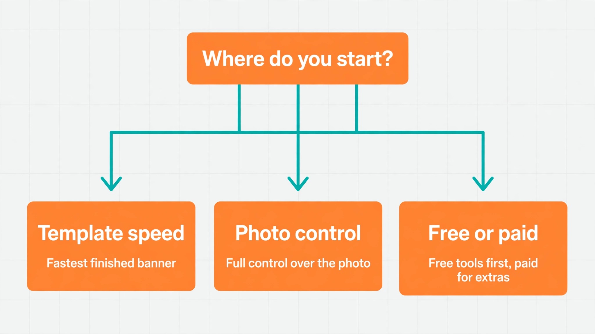
You do not need professional software to make a banner that looks professional. The tools below all handle the 2480 by 520 size, and they split into two groups. Template tools get you from a blank page to a finished banner in minutes. Photo editors give you more control over the image itself, and they suit artists who start from a photograph rather than a template.
Canva
Canva is the fastest starting point for most artists, because its template library already includes SoundCloud header layouts at the right size. Pick a template, swap in your photo, change the name and the colors, and export. The free plan covers the whole job, including full size exports with no watermark. Pro adds brand kits and background removal, which matter if you make banners often. The weakness is familiarity. Canva templates are everywhere, so a banner built from a popular template can look like a dozen other artists. Change the photo, the font pairing, and the color treatment, and the template disappears behind your own choices.
Adobe Express
Adobe Express is the closest rival to Canva for this job, and it has a dedicated SoundCloud banner maker with templates at 2480 by 520. Its strengths are typography and stock photos. The font library is deeper than most free tools, and the built in photo collection means you can build a banner without supplying your own image. The free plan includes thousands of templates and the core editing tools. Premium adds more fonts, templates, and brand controls. If you already use Adobe tools for cover art or social posts, Express keeps your colors and fonts in one place.
Fotor
Fotor started as a photo editor and still leads on the photo side of banner design. Its SoundCloud banner templates come at the exact 2480 by 520 size, and the one click enhancement tools fix dull lighting and flat color in a press photo before you place it. That matters when your best live shot was taken in bad light. Fotor also has AI tools that generate backgrounds and clean up images. The free plan handles a single banner comfortably, and Pro adds batch editing and more templates. Choose Fotor when the photo is the banner and the design around it should stay simple.
Placeit
Placeit takes a different approach. Instead of a blank canvas, it offers finished SoundCloud banner templates built around music genres, from metal to lo-fi to electronic. You pick a template that already fits your sound, swap the text and the image, and download. The templates already know the header dimensions, so sizing is never a question. Placeit runs on a subscription for unlimited downloads, which makes sense if you design banners, mockups, and social graphics every month, and less sense for a single banner. Check the current subscription price before you commit, because it changes with promotions.
VistaCreate
VistaCreate is a Canva style editor with a large template library and a free Starter plan that includes standard quality downloads and 10 GB of storage. Its SoundCloud templates are easy to adapt, and the editor supports animation if you want a moving version of the banner for social posts. Pro costs 10 dollars a month billed annually, or 13 dollars a month billed monthly, and covers up to 10 people on one account, which suits a band or a small label sharing one login. The template quality is strong, though the library is smaller than Canva, so you may need to adapt a general music template rather than finding an exact match.
Photopea
Photopea is a free browser based photo editor that works much like Photoshop, with layers, masks, and precise control over every pixel. There is no template library and no SoundCloud preset, so you set the 2480 by 520 canvas yourself and build the banner from scratch. That is the point. If you already work in Photoshop style tools, Photopea gives you the same control without an install or a subscription, and it opens PSD files directly. It is the best pick when you want a banner nobody else has, and the worst pick when you want a finished design in ten minutes.
Snappa
Snappa is built for speed. Its editor has almost no learning curve, the templates are pre sized, and a finished banner takes about five minutes from a blank page. The free Starter plan allows three downloads a month, which is enough for one banner and a couple of retries. Pro costs 15 dollars a month billed monthly, or 10 dollars a month billed annually, and removes the download cap while adding custom fonts and background removal. Snappa suits artists who want the banner done and want to get back to recording. It does not suit artists who want fine control over typography or layered effects.
Free Tools vs Paid Tools for SoundCloud Banners
A free plan covers this job completely, because a banner is a single static image and every major template tool exports it without a watermark. Paying only makes sense when you make banners often. Pro plans add brand kits that store your colors and fonts, background removal for press photos, and larger template libraries. For a band or a label that refreshes banners for several artists, those features save real time. For one artist making one banner per release, the free plan is enough, and the money is better spent on the photo session that supplies the image.
If you are learning how to design a SoundCloud banner on a budget, start free and upgrade only when a paid feature saves you time every month. If you do pay, pick the tool you already use for cover art and social posts, because one subscription that serves three jobs beats three subscriptions that each serve one. The design matters more than the plan. A thoughtful free banner beats a rushed paid one every time, and the steps in this guide work the same on either tier.
Banner Ideas by Genre
The best banner for your profile depends on the music, because a listener decides in seconds whether the sound matches the image. A DJ or electronic producer can use a dark background, a single bold color accent, and a large name, because the genre reads as minimal and late night. A rock or metal artist can use a high contrast live photo with the band name in a heavy font, because the photo carries the energy. A folk or acoustic artist can use a warm outdoor photo with soft light and a small, clean name, because the genre reads as personal and unhurried.
Hip hop artists often do best with a portrait led banner, the artist large in the frame and the name in a strong sans serif font, because the persona is the product. Lo-fi and ambient artists can use texture, grain, and muted color instead of a photo, because the mood is the product. Whatever the genre, the rule stays the same. One visual idea, one font for the name, and nothing in the corners that the crop will eat.
6 Mistakes That Ruin a SoundCloud Banner
Most bad banners fail in the same six ways, and all six are avoidable. Read the list before you export, because fixing a banner after upload takes longer than preventing the mistake.
- Designing at the wrong size. A banner built on a square or 16 by 9 canvas and squeezed into 2480 by 520 will stretch faces and cut text. Start at the right size and the problem never appears.
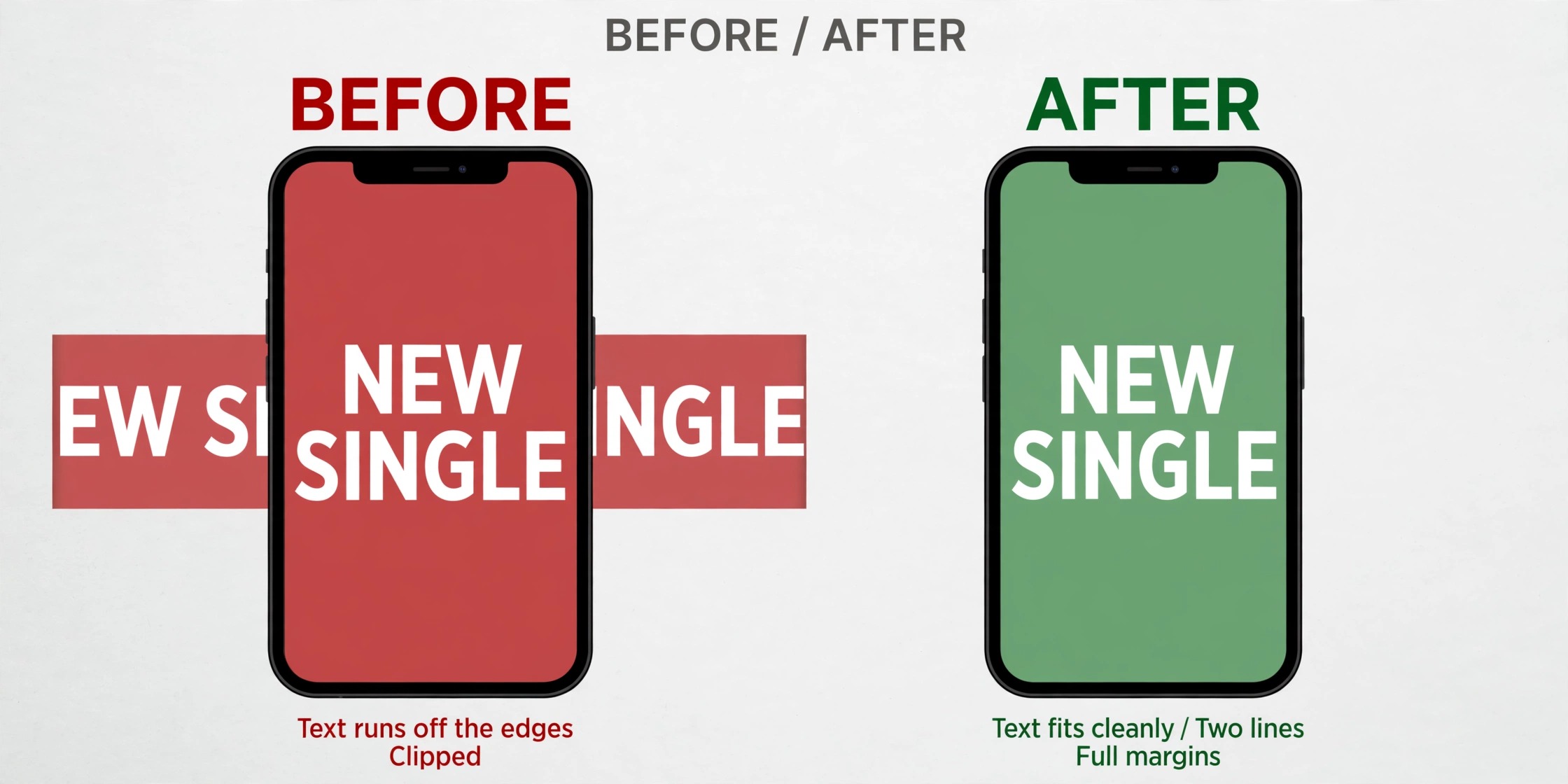
- Putting text near the edges. The mobile crop takes the sides first, and the profile picture covers the bottom left. Text in either spot disappears on the screens that matter most.
- Using a low resolution photo. A small image stretched to 2480 pixels wide turns soft and noisy. Start from the largest original you have, and if the only copy is small, choose a graphic or color led design instead of a photo.
- Choosing a font that is too thin. Thin fonts look elegant on a desktop and vanish on a phone. Use a medium or bold weight for the artist name, and test it at phone width before you export.
- Ignoring the file size limit. A PNG over 2 MB will not upload, and discovering that at the last step wastes the whole session. Export early, check the size, and switch to JPG if the PNG is too heavy.
- Reusing a YouTube or Twitter banner. Each platform crops differently, and a banner that fits YouTube will lose its edges on SoundCloud. Design for the 2480 by 520 strip, and make a separate version for each platform.
How the Banner Works With the Rest of Your Profile
A banner never appears alone. It sits above your profile picture, your name, your bio, and your track list, so it should agree with those pieces instead of competing with them. The simplest way to get that agreement is to pick one color from the banner and repeat it in your profile picture border or your track artwork. The repetition is subtle, and it makes the whole profile feel like one deliberate package rather than three separate uploads.
Your profile picture deserves the same care as the banner, because it appears next to every track you post and every comment you leave. Use the same photo session or the same color treatment, and crop the picture so your face fills the circle. A picture that matches the banner tells a visitor that the artist behind the music pays attention, and that impression carries into the first listen.
Track artwork follows the same logic at a smaller scale. Each track needs a square image of at least 800 by 800 pixels, and a release that goes out to streaming stores needs 3000 by 3000. Keep the style consistent across tracks, with the same font for titles and the same treatment for photos, and your profile starts to look like a catalog instead of a pile of uploads. The banner sets the tone, the profile picture sets the face, and the track art carries the detail.
How to Design a SoundCloud Banner for Mobile First
Most listeners will meet your banner on a phone, not on a desktop. The phone shows a narrower slice of the 2480 by 520 strip, and the profile picture covers more of the frame relative to its size. Designing for the phone first means the banner works everywhere, because a layout that survives the tightest crop also survives the widest view. Start by shrinking your draft to phone width before you judge it. If the name reads clearly and the subject is visible at that size, the desktop version will take care of itself.
The practical rule is simple. Place the artist name in the center, keep it large, and leave generous space around it. A name that fills a third of the banner height on desktop will still read on a phone, while a name at a fifth of the height turns into a smudge. The same logic applies to photos. A wide group shot becomes small faces on a phone, while a single performer in the center stays recognizable. When you design for the smallest screen first, you also learn how to design a SoundCloud banner that holds up when a listener shares your profile in a message or opens it from a notification, where most new listeners arrive.
When to Refresh Your Banner
A banner is not a permanent fixture. Refresh it when you release new music, because the header is the best place to announce a single or an album without saying a word. Refresh it when you change your sound in a real way, because a banner that promises one genre while the tracks deliver another confuses new listeners. Refresh it before a tour, and put the tour name or the dates in the design while the shows are on sale.
Do not refresh it every week. A banner that changes constantly never becomes familiar, and regular listeners stop noticing it. A good rhythm for most independent artists is a new banner with each release cycle, which usually means three or four times a year. Between refreshes, the banner should be stable enough that a returning listener recognizes the profile at a glance. If you are learning how to design a SoundCloud banner for the first time, build the first version, live with it for a month, and note what you would change. The second version is almost always stronger, because you have seen how the first one actually looks on phones and desktops.
Final Checklist Before You Upload
Run through this list with the finished file open. Each item takes seconds to check and saves a re-upload.
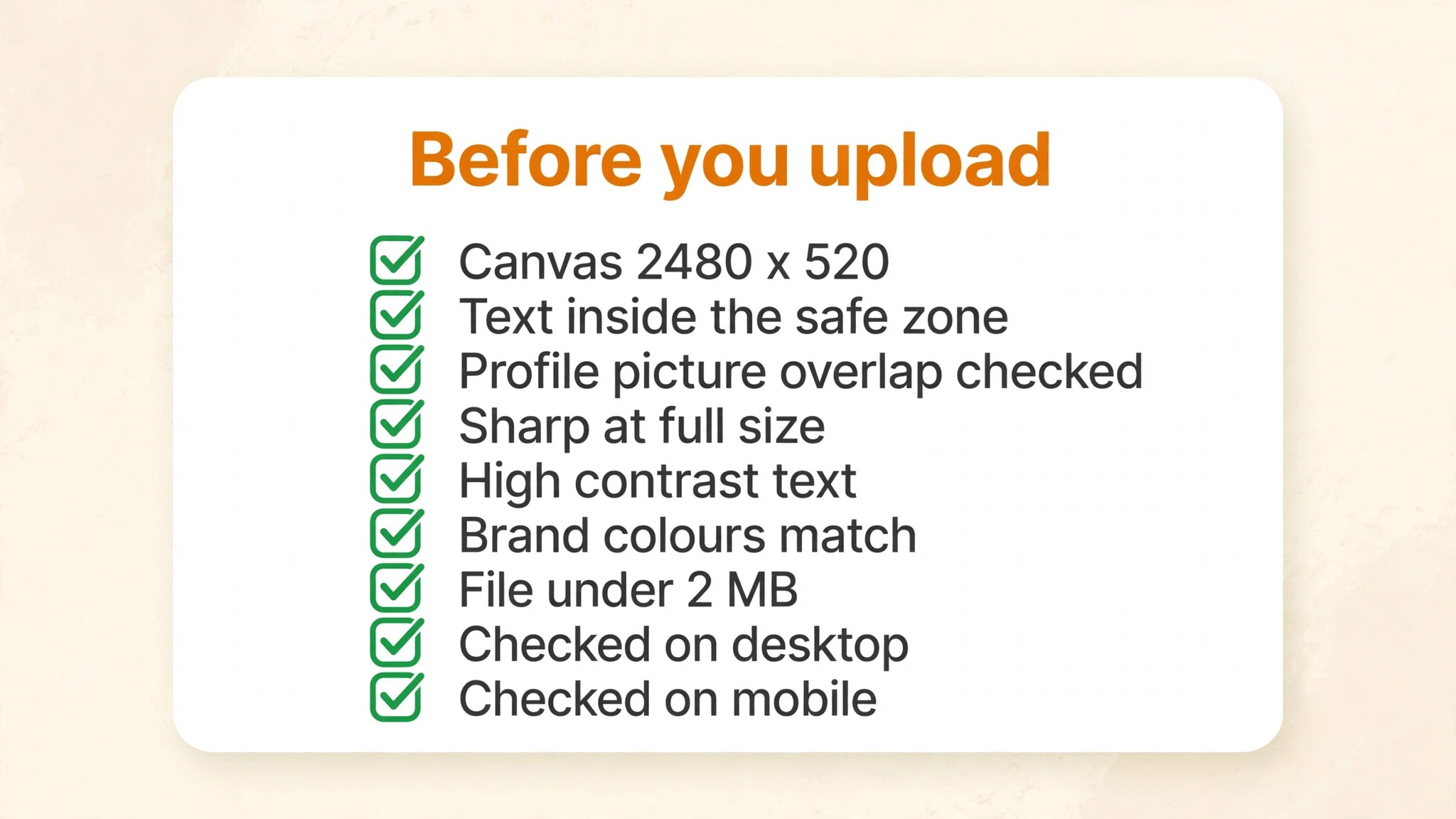
- Canvas is 2480 by 520 pixels, and the image is a JPG or PNG.
- File size is under 2 MB.
- Artist name, faces, and key details sit inside the central band, clear of the edges.
- Bottom left corner is empty, because the profile picture covers it.
- Text is readable at phone width, in a medium or bold weight.
- Colors match the profile picture and the latest track artwork.
- The design carries one idea, not three, and it matches the music.
- You have viewed the banner on a desktop browser and on a phone.
- You saved both the finished file and the editable project for the next refresh.
Frequently Asked Questions About SoundCloud Banners
What size should a SoundCloud banner be?
A SoundCloud banner should be at least 2480 by 520 pixels, in JPG or PNG format, and under 2 MB. That is the minimum SoundCloud asks for, and a larger image at the same ratio also works. Anything smaller will be stretched, and anything over 2 MB will not upload. Design at exactly 2480 by 520 and you avoid both problems.
Can I use text on my SoundCloud banner?
You can, but SoundCloud advises against it, because the header is cropped on smaller screens and text near the edges can disappear. If you add text, keep it to your artist name and a few words at most, place it in the center of the frame, and use a bold weight so it stays readable on a phone. Test the banner at phone width before you upload.
Why does my SoundCloud banner look blurry?
Blur usually comes from a source image that is too small. A photo that starts at 800 pixels wide and gets stretched to 2480 will always look soft. Start from the largest original you have, export at the full 2480 by 520 size, and check the file at full size before upload. A JPG exported below quality 70 can also soften fine detail, so keep quality at 80 or above.
How do I make a SoundCloud banner for free?
Open Canva, Adobe Express, or Fotor, pick a SoundCloud header template at 2480 by 520, add your photo and your name, and export as a JPG. All three tools cover how to design a SoundCloud banner on their free plans with no watermark on the export. Photopea is the free option if you want Photoshop style control with layers and masks instead of templates.
What is the difference between a SoundCloud banner and a header?
There is no difference. SoundCloud calls the wide image at the top of a profile a header, and artists usually call it a banner. Both names describe the same 2480 by 520 image. The confusion comes from other platforms, where a banner and a header can be different images, but on SoundCloud they are one and the same.
Can I add a link to my SoundCloud banner?
Paid Artist and Artist Pro plans let you add banner links, which make the header clickable and send listeners to a release, a tour page, or a store. Free plans do not include banner links, so the header is visual only. If you are on a free plan and want a link, use the profile bio and the links in your track descriptions instead.
How often should I change my SoundCloud banner?
Change it with each release cycle, which for most independent artists means three or four times a year. A new banner announces new music and gives returning listeners a reason to look twice. Changing it weekly makes the profile feel unstable, while leaving the same banner for years makes the profile look abandoned. A banner that matches your latest release is the right balance, and the workflow in this guide means each refresh takes about half an hour once you know how to design a SoundCloud banner at the right size.