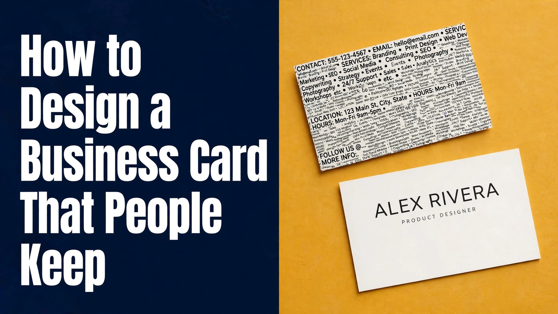
What happens in the ten seconds after you hand someone your card. Do they read it, turn it over, and put it in their wallet. Or do they glance at it, smile politely, and drop it in the first bin they pass. Learning how to design a business card that people keep is mostly about restraint, and the difference is rarely money.
A card printed at home can outperform an expensive one if the design is clear, and an expensive card can fail if the text is too small to read or the layout is crowded. This guide walks through the whole job in ten steps, from the blank canvas to the print order, with the sizes, the print settings and the mistakes that ruin most cards.
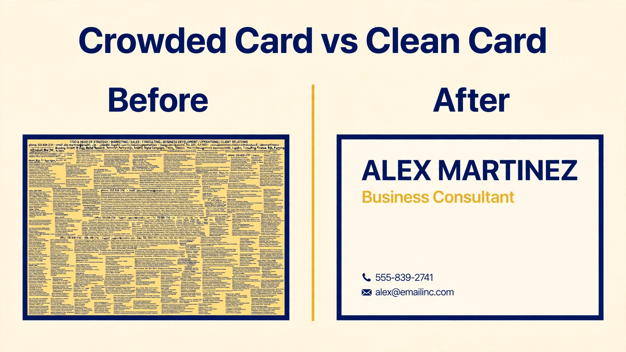
A business card is a small canvas with a large job. It has to say who you are, what you do, and how to reach you, in a space of 3.5 by 2 inches. That constraint is the reason most cards fail. People try to fit everything on the card, and the result is a wall of tiny text that nobody reads.
The cards that work follow a simple rule. One idea per side, one clear headline, and enough empty space for the card to breathe. Keep that rule in mind through every step below, and the rest is craft.
Before You Design. Decide What the Card Must Do
A card designed for a job fair is not the same as a card designed for a client meeting. Before you open any tool, write down the one job the card must do. Is it to get a follow up call after a networking event. Is it to send people to your website or booking page. Is it to make a first impression at a trade show where fifty other people are handing out cards too. The answer decides what goes on the card and what stays off it.
Then write down the audience. A card for corporate clients needs a different tone from a card for creative clients, and a card for a local service business needs a phone number above all else, while a card for an online seller needs a website and a social handle. List the details the card must carry, and cut everything else. Name, role, phone, email, website. That is the core for most people. Add a logo, a tagline or a QR code only if it serves the one job you wrote down. A card that tries to do three jobs does none of them well.
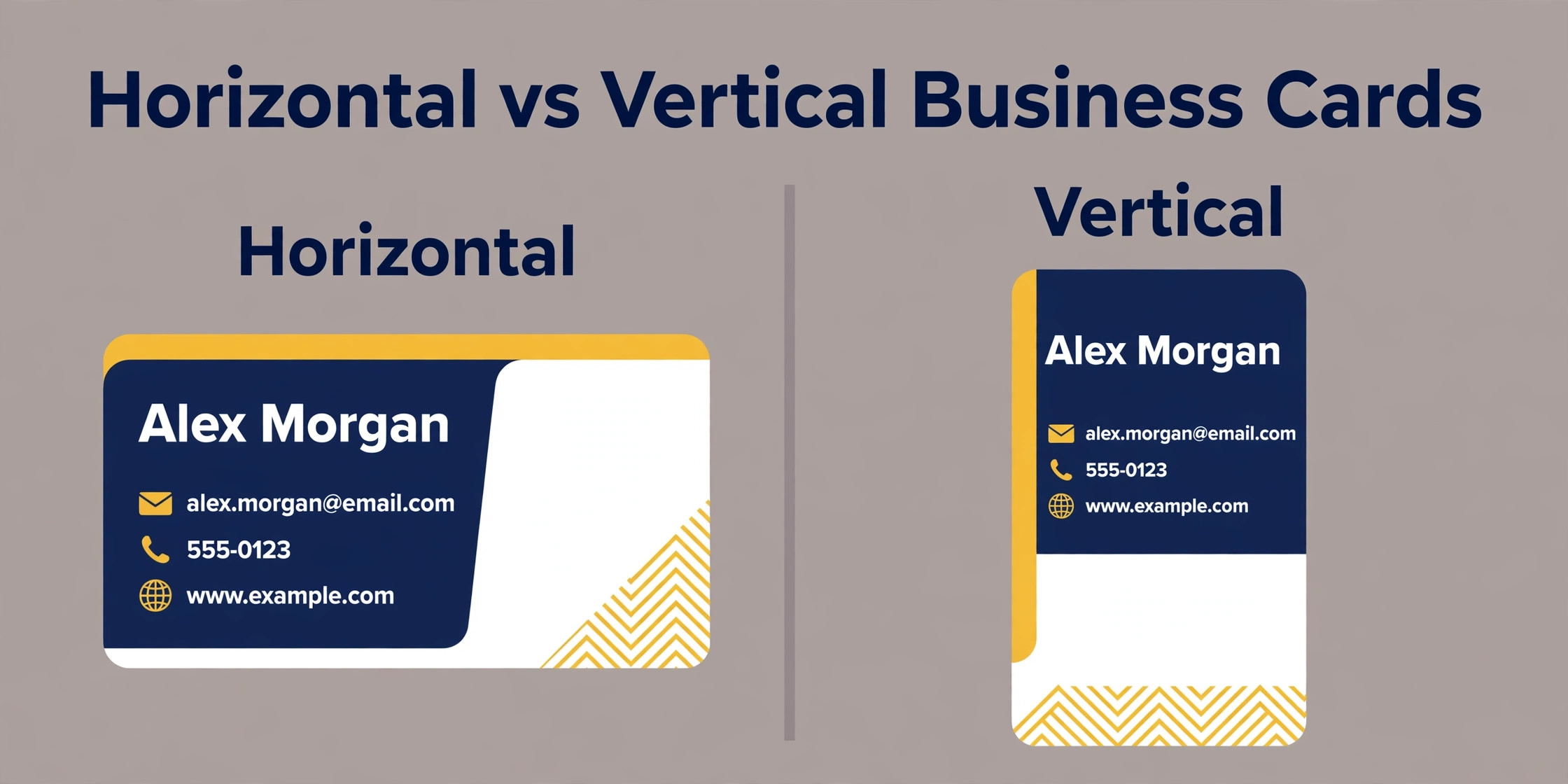
Choose the orientation now, not later. Horizontal is the default and the easier read, and it fits wallets and card holders without a second thought. Vertical feels more modern and stands out in a stack, but you have less width to work with, and a long name or a long web address can get cramped. Square and slim cards exist and they are memorable, but they do not fit standard holders, and a card that does not fit gets folded or thrown away. Unless you have a strong reason to be different, pick horizontal and spend the saved effort on the layout.
Sizes, Bleed and Safe Zones You Must Get Right
Print settings are the least exciting part of card design and the part that causes the most reprints. Get them right once, before you design anything, and the rest of the job is smooth.
| Region | Card size | Size in millimetres |
|---|---|---|
| United States and Canada | 3.5 by 2 inches | 89 by 51 |
| Europe and United Kingdom | 3.35 by 2.17 inches | 85 by 55 |
| India | 3.5 by 2.17 inches | 90 by 55 |
| Square card | 2.36 by 2.36 inches | 60 by 60 |
| Slim card | 3.5 by 1.77 inches | 90 by 45 |
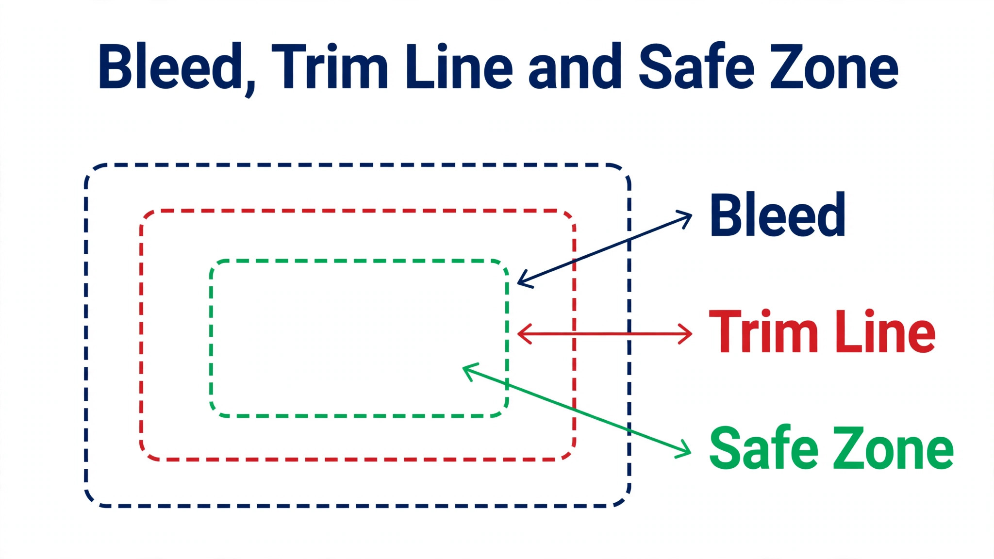
Three settings decide whether a card prints correctly. Bleed is extra artwork that extends past the final trim line, so the printer can cut the card without leaving a white sliver at the edge. The standard amount is an eighth of an inch, or 3 millimetres, on every side. If your design has a background colour or an image that runs to the edge, stretch it into the bleed.
The safe zone is the opposite. Keep all important text and logos at least an eighth of an inch inside the trim line, because anything closer risks being cut off. Resolution is the third setting. Design and place images at 300 DPI at the final size, because images pulled from a website are usually 72 DPI and will look blurry or pixelated in print.
Colour mode matters too. Printers use CMYK, the ink based colour model, while screens use RGB. If you send an RGB file, colours can shift, and bright blues and greens are the worst affected. Build the file in CMYK where your tool allows it, or at least proof the colours before you order. Export as a print ready PDF with bleed marks included and fonts embedded or outlined, and open the PDF before you send it to the printer. A two minute check catches the text that sits in the danger zone and the logo that is too small to print cleanly.
How to Design a Business Card in 10 Steps
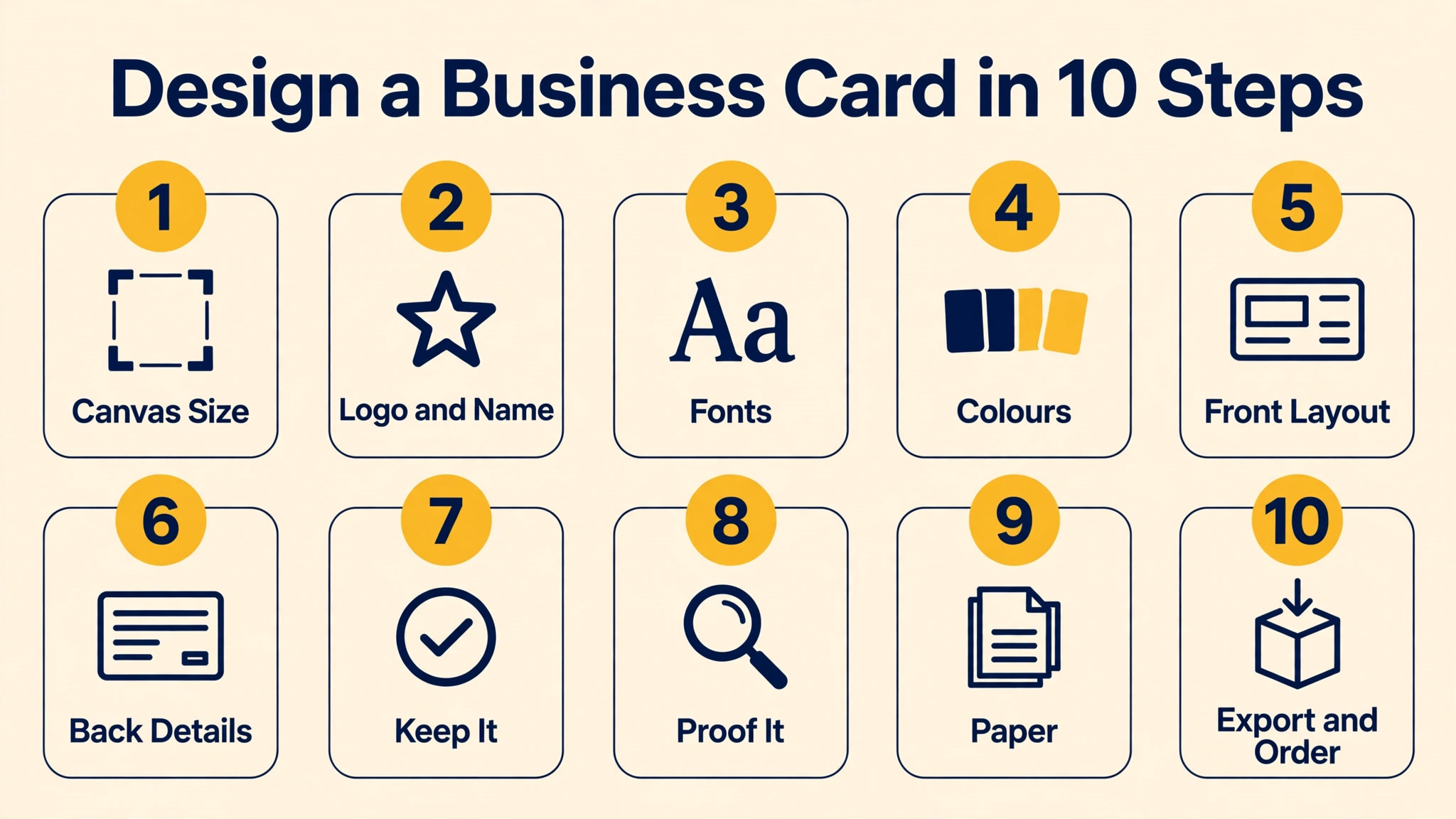
Here is how to design a business card from a blank canvas to a finished file, in ten steps that work in any tool. Each step builds on the last, so follow them in order, and do not skip the proofing steps at the end, because they are where most reprints are prevented.
Step 1. Set Up the Canvas at the Right Size
Open your design tool and create a new file at the standard size for your region. In the United States and Canada that is 3.5 by 2 inches. In Europe and the United Kingdom it is 85 by 55 millimetres. Set the resolution to 300 DPI and the colour mode to CMYK if the tool offers it. Add bleed of an eighth of an inch on all sides, so the working canvas is 3.625 by 2.125 inches for a United States card. Turn on the margins or guides so you can see the safe zone, and keep every important element inside it.
Canva handles most of this automatically. Search for business cards, pick a template or a blank card, and turn on margins and bleed in the file settings. Canva adds an eighth of an inch of bleed on every side for trimmed products, and it shows a red danger zone for anything close enough to the trim line to be cut. In Photoshop or Illustrator, set the size, resolution, bleed and colour mode by hand when you create the document. Getting the setup right takes two minutes and prevents the most common printing failure, which is a card that comes back with a white edge or a cut off phone number.
Step 2. Put the Logo and Name First
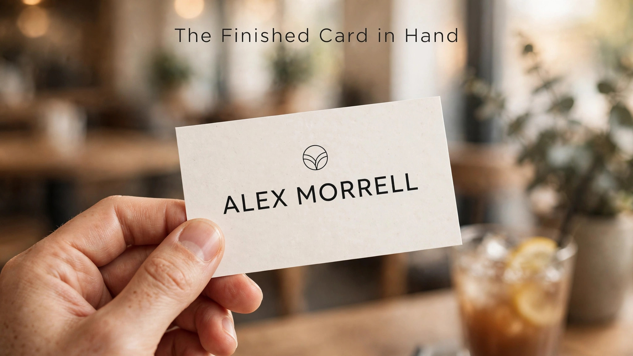
The front of the card belongs to your name and your logo, and nothing else should compete with them. Place the logo at the top or on the left, and make it the largest element on the card. Your name goes next, in the largest type on the card, with your role or job title directly beneath it in a smaller size. This hierarchy is what a reader sees first, and it should answer two questions in two seconds. Whose card is this, and what do they do.
Keep the name and logo clear of the edges and clear of each other. Crowding the logo against the name makes both harder to read, and a logo that is too small looks like an afterthought. If your logo has a tagline built into it, consider using a version without the tagline on the card, because small tagline text turns to mush at card size. A clean logo and a clear name are the foundation of the whole design, and everything after this step is detail.
Step 3. Choose Two Fonts and Stop There
Typography decides whether a card looks professional or homemade, and the rule is simple. Use two fonts at most. One for your name and headings, and one for contact details and body text. A third font adds nothing but noise, and a card with four fonts looks like a ransom note. Pick a pair that contrasts without clashing, such as a strong sans serif for the name and a clean readable sans serif for the details, or a serif for the name and a sans serif for the details if your brand is traditional.
Size matters as much as choice. The company name and logo should always be the largest elements on the card. Aim for 8 to 10 point type for contact information, and never go below 7 point for body text, because anything smaller is unreadable on a small card. Canva generally recommends not going below size 7 for print. Test the sizes by printing the card at actual size on a home printer before you order. Text that looks fine on a large screen is often too small on the real card, and a home print test catches that in a minute.
Step 4. Pick Colours That Print the Way They Look
Colour is the fastest way to make a card memorable, and the fastest way to ruin it. Pick one main colour, one supporting colour and one text colour, and use them consistently. Your main colour should match your brand, your text colour should contrast strongly with the background, and your supporting colour should appear sparingly, for a line, a small shape or a highlight. A card with five colours looks busy. A card with two colours and a clear hierarchy looks designed.
Check how the colours print before you order. Very bright screen colours print softer, and dark backgrounds show fingerprints and scuffs more than light ones. If you use a dark background, keep the text white or very light, and make sure the contrast is strong enough to read in a dim room. If you use a light background, dark text is the safe choice. Print a test at home, hold it at arm length, and check that the name is readable in three seconds. If it is not, the contrast is wrong, not the font.
Step 5. Lay Out the Front. One Idea, Plenty of Space
The front of the card carries the identity. Logo, name, role, and perhaps a one line tagline or a single contact detail. That is all. Resist the urge to add the phone number, the email, the website and the social handles to the front, because they belong on the back. White space is not empty space. It is what makes the name readable and the card feel premium. Aim for at least 3 millimetres of margin on all sides, and let the logo breathe.
Align everything to a grid. Left align the text for a clean professional look, or centre it for a classic feel, but do not mix the two on the same side. Keep the spacing between elements even, so the eye moves smoothly from the logo to the name to the role. If the front feels empty, the answer is rarely more text. It is usually a slightly larger logo, a stronger colour, or a better finish on the paper. A front that says one thing clearly beats a front that says five things badly.
Step 6. Design the Back. Contact Details and One Action
The back of the card is where the details live, and it is also where most cards go wrong by cramming. Put the contact details here, laid out cleanly with generous spacing. Phone, email and website are the core. Add a social handle only if it is how people actually reach you, and add a physical address only if clients visit you. Every detail you add competes with the others, so cut anything that does not serve the one job you wrote down at the start.
Give the back one action. A QR code that opens your website, your booking page or your portfolio is the most useful action on a modern card, because it turns a piece of paper into a tap. Test the QR code at card size before you order, because a code that is too small will not scan. Place it on the back, not the front, and keep it away from the edges. If you prefer a low tech card, a short line such as a website address in large type works just as well. The back should answer one question. How do I reach this person, and what do I do next.
Step 7. Add a Reason to Keep the Card
Most cards are thrown away because they offer nothing after the first reading. A card that people keep has a reason to stay in the wallet. A QR code to a useful resource, a discount, a booking link, or a portfolio is one reason. A beautiful design, an unusual finish, or a clever use of the back is another. A card for a coffee shop might carry a loyalty stamp box on the back. A card for a consultant might carry a short checklist or a useful stat. The trick is to make the back worth a second look.
Do not overdo it. One reason to keep the card is enough, and two will crowd the layout again. Pick the reason that fits your business, design it into the back cleanly, and leave the rest of the space empty. A card that is useful, beautiful or surprising gets kept. A card that is only a list of contact details gets filed and forgotten. This step is the difference between a card that works and a card that is just paper.
Step 8. Proof Everything at Actual Size
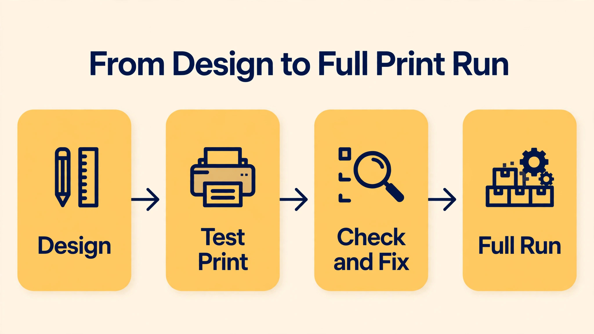
Proofing is the step that saves reprints, and it takes ten minutes. Print the card at actual size on a home printer and check it in your hand, not on a screen. Read every word aloud, because reading aloud catches typos that silent reading misses. Check the phone number by dialling it. Check the email by typing it. Check the website by visiting it. Check the QR code by scanning it with a phone. One wrong digit in a phone number makes the whole print run useless.
Check the layout at actual size too. Zoom to 200 percent on screen to check the logo and photos, because Canva suggests images at 300 DPI and a low resolution logo will look soft in print. Look for text that sits too close to the edge, colours that clash, and spacing that looks uneven. Ask one other person to read the card and tell you what you do, because a fresh pair of eyes will catch the confusion that you no longer see. Fix everything now, while the fix is free.
Step 9. Choose the Paper and Finish
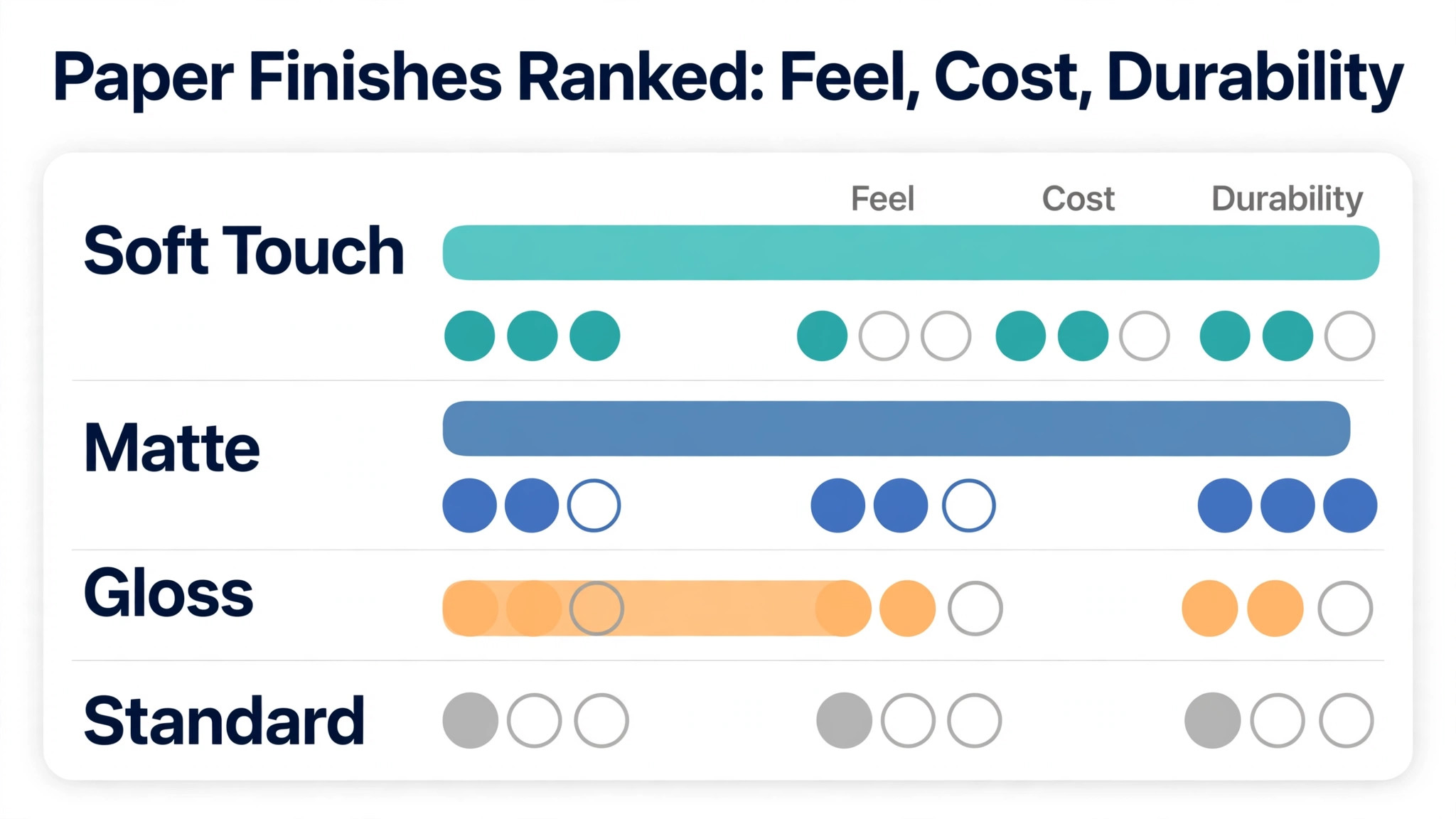
Paper and finish are the parts of a card that people feel before they read, and they change the impression more than most design choices. Standard card stock is fine for a first run, but a thicker stock feels premium in the hand and lasts longer in a wallet. Matte finish looks modern and does not show fingerprints, while gloss makes colours pop but shows every mark. Soft touch laminate feels like velvet and suits luxury brands. Foil stamping, embossing and spot UV add a tactile detail that makes a card memorable, but they cost more and they need a design that leaves room for them.
Rounded corners are a cheap way to stand out, and they stop the card from fraying in a pocket. A folded card or a card with a die cut shape is memorable but risky, because it may not fit a standard holder. Order a small run first, 100 cards, and check the paper and the finish in person before you order 500. A finish that looks good on a screen can feel wrong in the hand, and the only reliable test is holding the real card.
Step 10. Export a Print Ready File and Order
Export the finished design as a print ready PDF with bleed marks included and fonts embedded or outlined. In Canva, download as PDF Print, which handles bleed and resolution automatically. In Photoshop or Illustrator, export as PDF with the print preset and check that the bleed and crop marks are on. Open the exported PDF before you send it anywhere, and check the size, the bleed, the safe zone and the colours one last time.
For ordering, you have two routes. Print with Canva is the simplest if you designed in Canva, because the file, the paper and the finish are handled in one place. A local print shop gives you more paper choices and a person to talk to about finishes, and it is the better route for foil, embossing or unusual stock. Online printers such as Vistaprint and MOO offer a wide range of stocks and finishes with clear pricing, and MOO is known for premium paper and small runs. Whichever route you pick, order a small run first, check the real cards, and then order the full run. A small test order is the cheapest insurance in the whole process.
Tools for Designing a Business Card
When you learn how to design a business card, the tool you pick should match your skill and your budget, not the other way round. Canva is the best choice for most people, because it has hundreds of business card templates on the free tier, it handles bleed and safe zones automatically, and it exports print ready files at 300 DPI. Adobe Express is a strong alternative with cleaner default typography and Adobe Fonts, and it suits people who already use Adobe tools. VistaCreate offers expressive templates for creators who want a bold card.
Photoshop and Illustrator are the professional options. Illustrator is the better pick for a card, because it works in vectors and the text stays sharp at any size. Photoshop works too, but you must set the resolution to 300 DPI by hand and the text will not be as crisp. Both need a Creative Cloud plan and both take longer to learn. Pick a professional tool only if you already know it or you need its precision. For everyone else, Canva or Adobe Express will produce a card that prints beautifully, and the time saved goes into the design rather than the software.
Best Pick by Job
Use this table when you decide how to design a business card for a specific job, because the right tool and the right printer change with the card you need.
| Job | Best pick | Why it fits |
|---|---|---|
| A first card for a new business | Canva free templates | Fast, print ready, and no cost to start |
| A premium card for a luxury brand | Illustrator plus a local print shop | Vector sharpness and foil or soft touch finishes |
| A card with a QR code and booking link | Canva or Adobe Express | Easy QR placement and clean export |
| A bold card for a creative business | VistaCreate | Expressive templates and strong colour |
| A small run to test paper and finish | MOO | Premium paper and small runs with clear pricing |
| A large run on a tight budget | Vistaprint | Wide stock range and competitive pricing |
Mistakes That Ruin a Business Card
The mistakes below are the ones that undo good work when you learn how to design a business card, and each one is easy to avoid once you know it exists.
The most common mistake is overcrowding. A survey from Indeed found that the most common business card mistake is overcrowding, and it is easy to see why. Every element you add competes with every other element, and a card with ten details communicates nothing.
Keep the front to a logo, a name and a role, and keep the back to the details that serve the one job you chose. The second mistake is ignoring bleed and the safe zone.
Text that sits too close to the edge can be cut off when the printer trims the cards, and a background that stops short of the edge leaves a white sliver. Extend backgrounds into the bleed and keep text inside the safe zone.
The third mistake is tiny type. Body text below 7 point is unreadable, and contact details at 8 to 10 point are the right range. The fourth mistake is a low resolution logo. A logo pulled from a website at 72 DPI will print soft, so use a vector file or a high resolution PNG and zoom to 200 percent to check it. The fifth mistake is skipping the proof print. A card proofed only on screen will hide a typo, a wrong number and a layout flaw that a ten minute home print would have caught. Print it, read it aloud, dial the number, scan the code, and only then order the run.
Frequently Asked Questions
How to design a business card for free?
Use Canva or Adobe Express. Both offer free business card templates, free editors and free export. Pick a template or a blank card at the right size, add your logo and details, turn on bleed and margins, and download a PDF Print file. Order a small print run from a budget printer, or print a test at home first to check the layout at actual size.
What size should a business card be?
The United States and Canada standard is 3.5 by 2 inches, or 89 by 51 millimetres. Europe and the United Kingdom use 85 by 55 millimetres. Set the canvas to the standard size for your region, add an eighth of an inch of bleed on all sides, and keep text at least an eighth of an inch inside the trim line. Confirm the size with your printer before you order.
What should I put on a business card?
Name, role, phone, email and website are the core for most people. Add your logo and, if it serves a purpose, a tagline or a QR code. Leave out fax numbers, long addresses and every social handle you rarely check. One idea per side and plenty of empty space will make the card readable and memorable.
What is bleed on a business card?
Bleed is extra background that extends an eighth of an inch, or 3 millimetres, beyond the trim line on every side. It exists so the printer can cut the card without leaving a white sliver at the edge. If your design has a colour or an image that runs to the edge, stretch it into the bleed. Keep text and logos inside the safe zone, an eighth of an inch inside the trim line.
Should I use both sides of the card?
Yes. Put the logo and one line on the front, and the contact details on the back. That split keeps the front clean and gives the back room for details, a QR code or a reason to keep the card. A single sided card forces everything onto one side, which is how overcrowding happens.
What file format should I send to the printer?
Send a print ready PDF with bleed marks included and fonts embedded or outlined, at 300 DPI in CMYK colour. Canva PDF Print export does this automatically. Avoid sending JPG files for print, because they compress the text and can shift colours. Open the PDF before you send it and check the size, the bleed and the safe zone.
How much does it cost to print business cards?
A small run of 100 standard cards from an online printer is inexpensive, and the price rises with thicker stock, special finishes such as foil or soft touch laminate, and larger runs. Premium paper and finishes can double the cost. Order a small run first to check the paper and the print quality, then order the full run once you are happy with the result.
The Card People Keep
Learning how to design a business card that people keep comes down to three habits. Say one thing per side. Leave enough empty space for the card to breathe. And proof the real card at actual size before you order. Get those three right and the rest is craft. A clear card, printed well on good paper, will outwork a clever card that nobody can read. Design it, print a test, fix what you find, and hand it out with confidence.