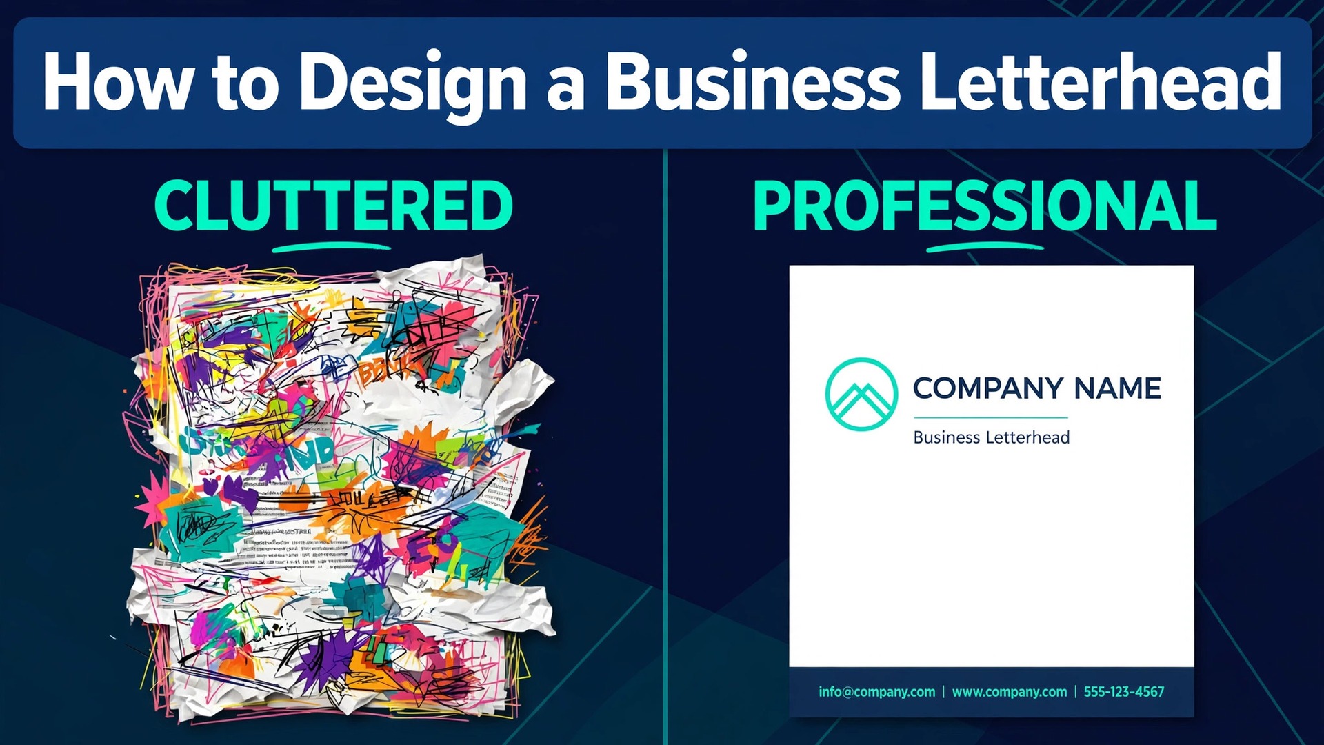
Most business letterheads fail before anyone reads the letter, and the reason is not bad taste. It is a layout that fights the content. The logo is too big, the contact details crowd the top of the page, the colours clash with the text, and the letter itself gets squeezed into whatever space is left. A letterhead has two jobs, and both are simple. It should identify the sender in under a second, and then it should get out of the way so the letter can be read. Learning how to design a business letterhead means learning that restraint, because the best letterheads are the ones nobody notices until they need the phone number.
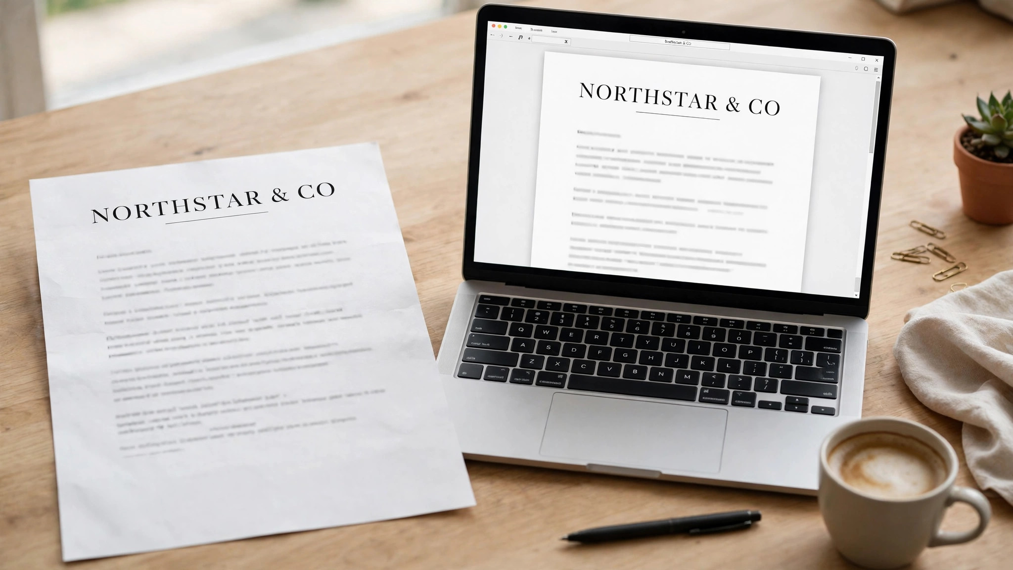
A letterhead is the branded header and footer that appears on business correspondence, usually on the first page only. It carries the company name, logo and contact details, and it signals that the document is official. Invoices, proposals, contracts, reference letters and formal notices all look more credible on letterhead than on a blank page. The design should match the rest of your brand, from the website to the business card, so that a client who receives your letter recognises the company immediately.
The stakes are higher than the size suggests. A letterhead is often the first physical object a client receives from your business, and it sets the tone for everything that follows. A clean, well spaced letterhead says the company is organised and careful. A cluttered one says the opposite, and no amount of good writing in the letter itself can undo that first impression.
What a Business Letterhead Must Do
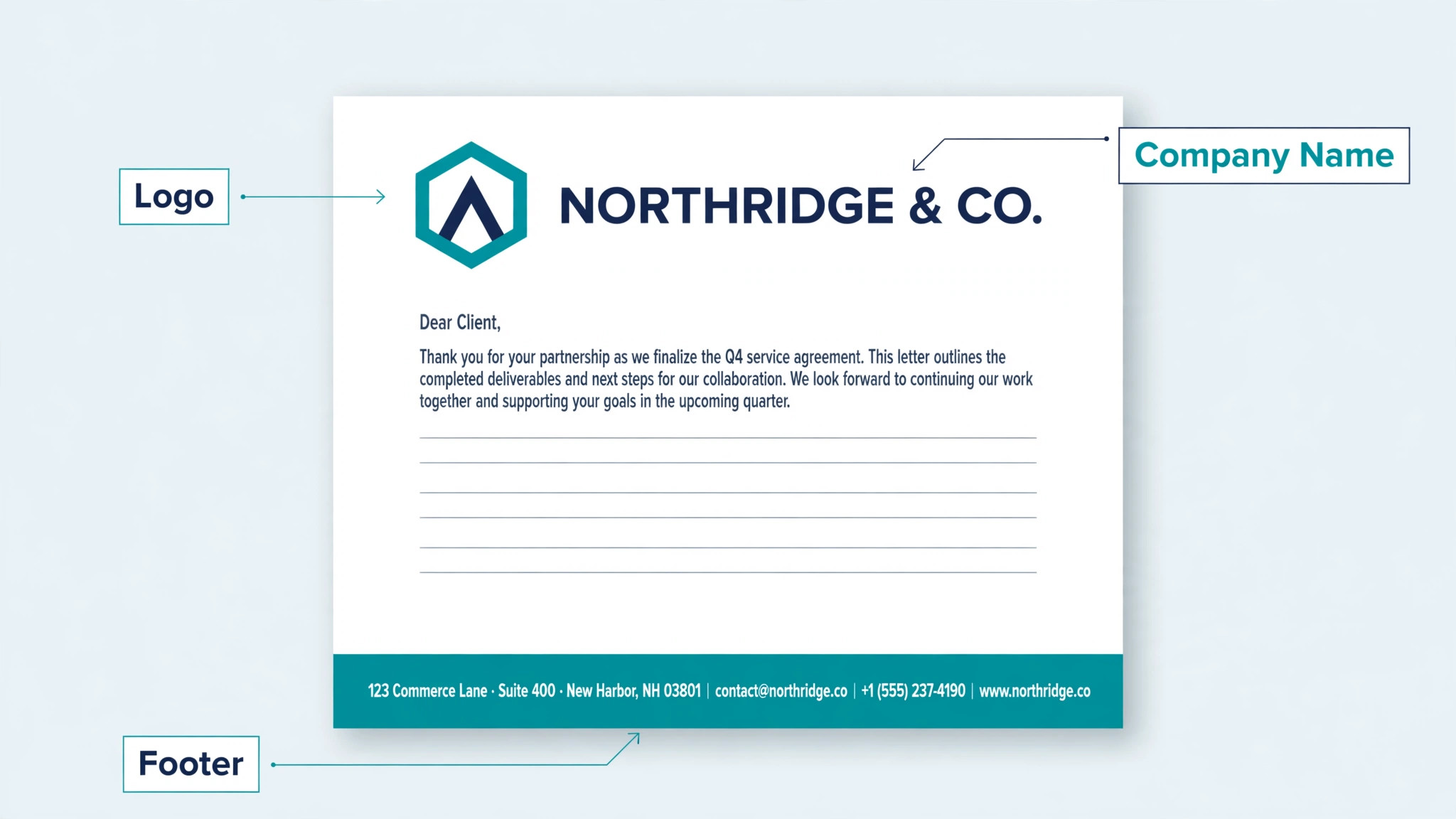
A good letterhead does three things at once. First, it identifies the sender. The company name and logo should be the most prominent elements on the page, placed where the eye lands first, which is usually the top left or the top centre.
Second, it gives the reader a way to reply. The phone number, email address, website and postal address belong in the footer or in a quiet block under the header, where they are easy to find and impossible to miss.
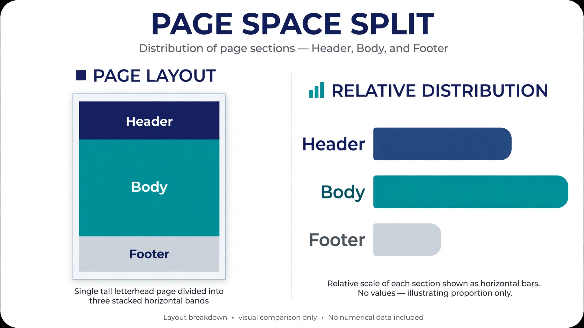
Third, it leaves room for the letter. At least two thirds of the page should stay empty for the content, because a letterhead that eats half the page forces the writer to cram the message into the space that remains.
Visual hierarchy is the skill that makes all three happen. The logo and company name get the largest type and the strongest position. The tagline, if you use one, gets a smaller size and a lighter weight. Contact details get the smallest type on the page, because they are reference information rather than the message. Colour follows the same order. Your brand primary colour belongs in the header, and the body text stays black or dark grey. A letterhead that uses more than two or three colours looks busy, and a letterhead that uses a bright colour for the body text is hard to read on paper.
Legal requirements add a fourth job in some countries. Companies in the UK and parts of Europe must show their registered company number, registered office address and VAT number on business letters, and the rules vary by jurisdiction. Check the requirements for your country and your company type before you finalise the design, because a letterhead that omits a required line can create a compliance problem. Place legal lines in small type in the footer, where they are present without competing with the contact details.
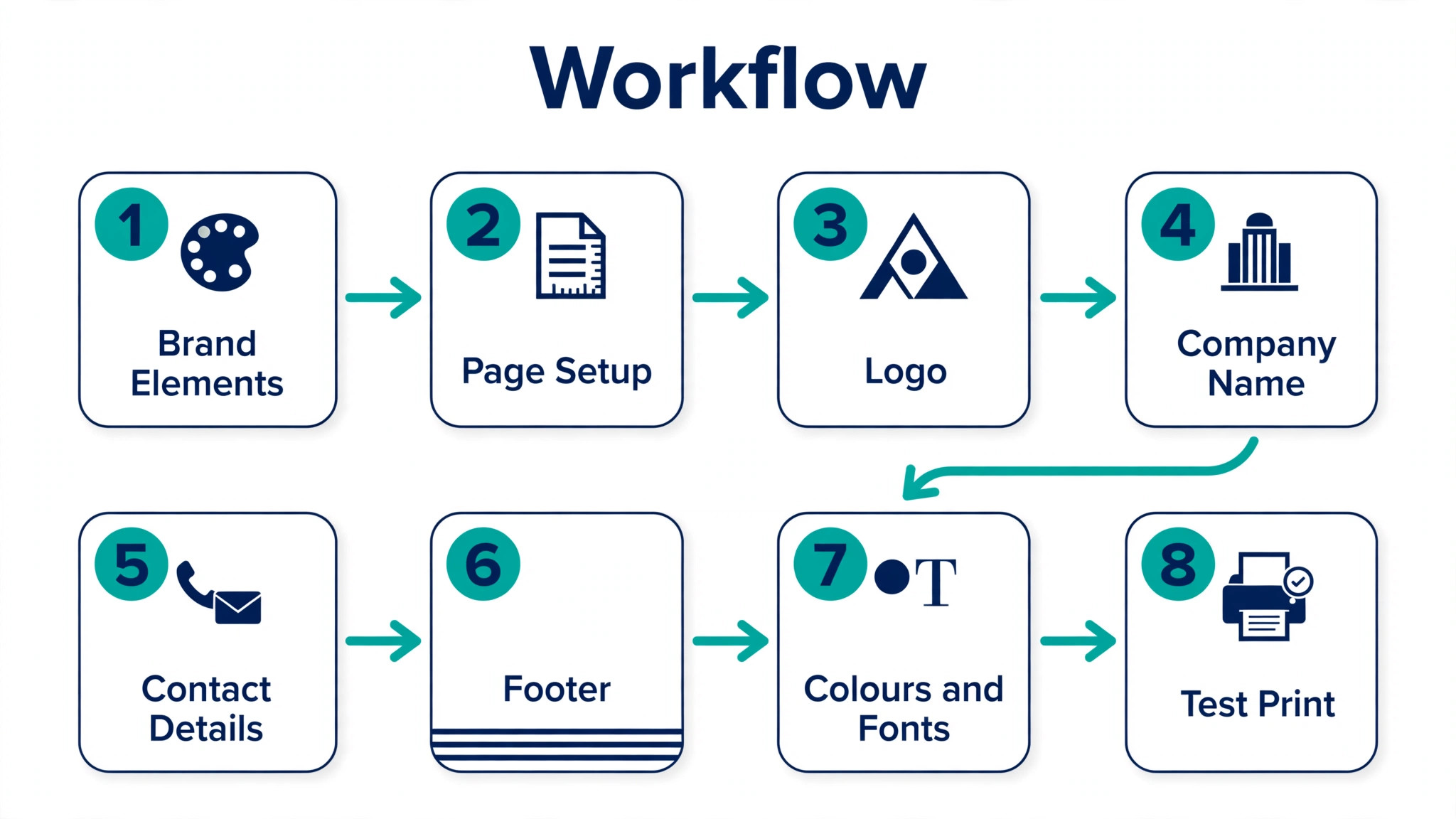
How to Design a Business Letterhead in 8 Steps
This is the full process for how to design a business letterhead, from gathering your brand elements to the first test print. Work through the steps in order the first time. After that, updating the letterhead for a new address or a new logo takes minutes rather than hours.
Step 1. Gather Your Brand Elements First
Collect everything the letterhead needs before you open any design tool. You need your logo as a high resolution file, ideally a vector file or a PNG of at least 300 dots per inch at the size it will print. A logo pulled from your website at 72 dots per inch will look blurry on paper, and that blur is the first thing a client notices. You also need your business name exactly as it appears on your registration documents, your tagline if you use one, and your full contact details, including postal address, phone number, email and website.
Pull your brand colours as hex codes and your brand fonts by name, and note the closest web safe or print safe fallback if your brand font is unusual. If your company has a brand guide, follow it. If it does not, write the choices down in one place now, because those choices become the brand guide for everything that follows. A short note in the same folder as the logo file, listing the colours, fonts and the logo version to use, saves the next person on your team from guessing. Gather first, design second, and the design goes twice as fast.
Step 2. Choose the Page Size and Set the Margins
Set the document to the paper size your business actually uses. In the United States that is Letter size at 8.5 by 11 inches. In most of the rest of the world it is A4 at 210 by 297 millimetres. Using the wrong size means the letterhead prints with a white band on one edge or cuts off the footer, and that mistake is visible on every page. If your business sends letters internationally, design two versions, one for each size, rather than stretching one design to fit both.
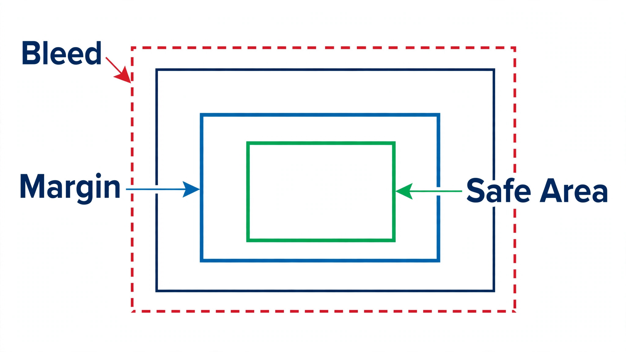
Set the margins before you place anything. Leave at least half an inch, or about 1.27 centimetres, around every edge, and a full inch at the bottom if the footer carries contact details. Printers cannot print to the very edge of the page, and anything placed closer than half an inch risks being cut off. If your design includes a coloured band that runs to the edge, add a 3 millimetre bleed beyond the page edge and tell the printer to trim it. The bleed prevents a thin white strip appearing at the edge when the paper is cut, and it is the mark of a professionally prepared file.
Step 3. Plan the Layout and the Visual Hierarchy
Sketch the layout on paper before you open a design tool. The most common and most reliable layout puts the logo and company name at the top, with contact details in the footer. That layout works because it matches how people read a letter. The eye starts at the top, registers the sender, then drops to the letter, and finds the contact details at the bottom when it needs them. Alternative layouts put the logo at the top centre with the name underneath, or run a thin coloured band down one side, and both can work when the hierarchy stays clear.
Decide the hierarchy in the sketch. The company name should be the largest text on the page, the logo should be the largest graphic, and everything else should step down in size from there. Leave generous white space between the header and the start of the letter, because that space is what makes the page feel calm and professional. A letterhead with no white space feels crowded before a single word of the letter is read. If the sketch looks busy on paper, it will look worse in print, so remove an element before you move on.
Step 4. Place the Logo and the Company Name
Place the logo first, because it sets the position for everything else. The top left corner is the safest placement, and it is where most readers look first. Top centre suits a formal or traditional business, and it works best when the logo is symmetrical. Keep the logo modest in size. A logo that spans a third of the page width dominates the letter and leaves too little room for the content. A logo at about a fifth of the page width, placed with a clear margin around it, reads as confident rather than loud.
Set the company name in your brand font, in a size that is clearly larger than the letter text but not so large that it competes with the logo. If the logo already includes the company name, do not repeat the name in text beside it. Repetition wastes space and looks uncertain. If the logo is only a mark, set the name beside it in the brand font and colour. Check the alignment carefully. A logo and a company name that sit on different baselines look accidental, and that small misalignment is visible on every letter you send.
Step 5. Add Contact Details and Legal Lines
Contact details belong in the footer or in a quiet block under the header, set in the smallest type on the page. Include the postal address, one phone number, the email address and the website. One phone number is enough. Listing three numbers and two email addresses creates a decision the reader does not want to make, and it fills the footer with noise. Social media handles belong on a letterhead only when the business is a creative agency or a media company, and even then one handle is enough.
Legal lines go in the footer too, in smaller grey type below the contact details. In the UK, a limited company must show its registered name, company number and registered office address on business letters, and other countries have their own rules. Check the requirements for your jurisdiction before you finalise the design. Keep the legal text short and separate it from the contact details with a thin rule or a small gap, so it reads as a footnote rather than part of the message. A footer that is tidy and complete tells the reader the business is organised, and that impression carries into the letter itself.
Step 6. Set the Fonts and Colours
Limit the letterhead to two fonts at most, and one is often better. Use your brand font for the company name and a clean, readable font for the contact details and the letter text. Serif fonts like Georgia or Garamond suit law firms, accountants and traditional businesses. Sans serif fonts like Arial or Helvetica suit tech companies, startups and modern brands. Whichever you choose, make sure the font is available on the computer that will print the letter, or embed it in the PDF, because a missing font falls back to a default and breaks the design.
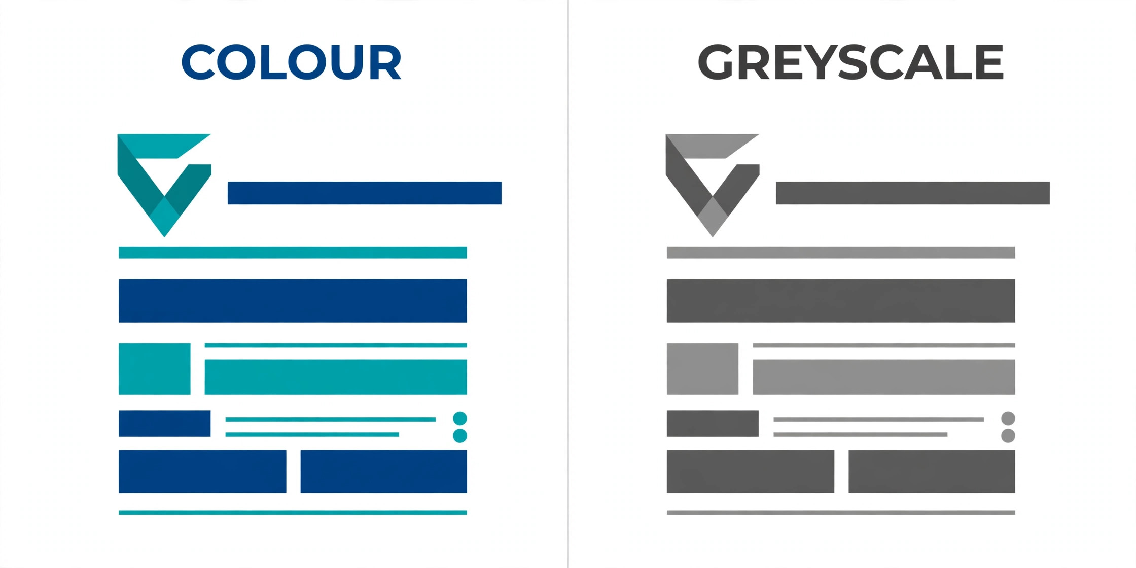
Colour should follow the brand and stay restrained. Use your primary brand colour for the header elements and the divider line, and keep the body text black or dark grey. Never use more than two or three colours on a letterhead, and never use a light colour for text that must be read on white paper. Check the design in greyscale before you finalise it, because many letters are photocopied or printed on a black and white printer, and a letterhead that depends on colour for its structure falls apart in greyscale. A design that works in black and white works everywhere.
Step 7. Make the File Print Ready
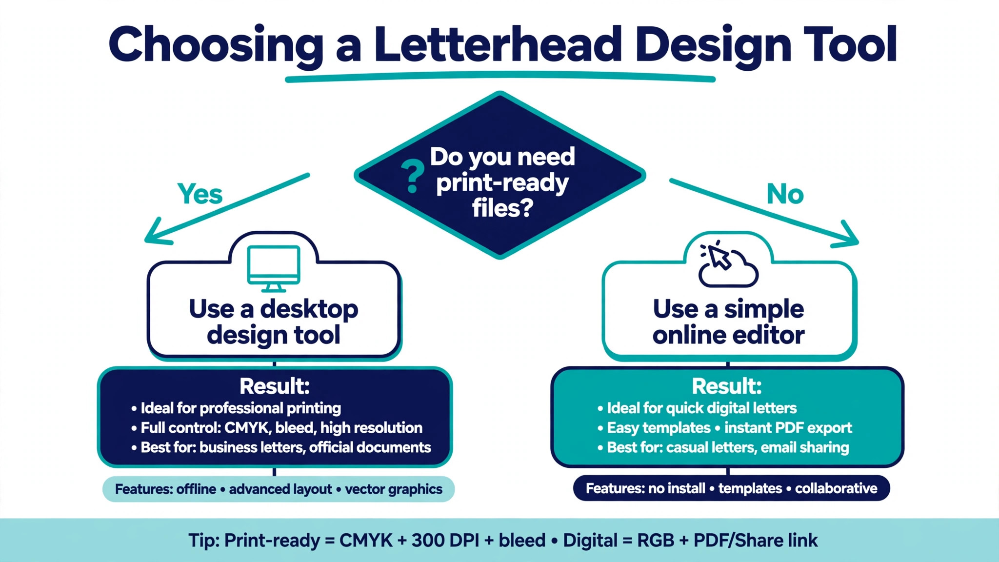
A design that looks good on screen can fail in print, so prepare the file properly. Set the colour mode to CMYK rather than RGB if the letterhead will be professionally printed, because CMYK shows how the colours will actually look on paper. RGB colours on screen are brighter than the same colours in print, and a vivid blue on screen can turn dull on paper. Use images at 300 dots per inch or higher, and check that the logo is sharp at full print size rather than only on screen.
Export the finished letterhead as a high resolution PDF, which is the format printers expect and the format that preserves fonts and colours. Save a second version as a Word template or a Google Docs template with the header and footer locked in place, so anyone on the team can write a letter without rebuilding the design. Test the template by typing a full page of text into it and checking that the body does not overlap the footer. That test catches the most common template problem, which is a footer that sits too high and collides with the last paragraph of a long letter.
Step 8. Save, Test Print and Create the Digital Version
Print a test copy on the paper you will actually use, and look at it in daylight rather than only on screen. Check that the logo is sharp, the colours match your brand, nothing is cut off at the edges, and the letter text has room to breathe. Print a second copy in black and white to confirm the design still works without colour. Then print a full page of text to check that the footer does not collide with the body, and that the second page of a long letter looks right. Most businesses use a plain continuation sheet for page two, with only a small footer, and that is the professional choice.
Create the digital version at the same time. Save the letterhead as a PDF template for email, and as a Word or Google Docs template for the team. The digital version needs the same design as the printed one, but the file should be small enough to email, so compress the images if the PDF is larger than a few hundred kilobytes. Keep the source file, the PDF and the template in one folder with the logo and a short note of the colours and fonts, so the next update is a five minute job rather than a redesign.
Best Pick by Job
| Job | Best pick | Why it wins |
|---|---|---|
| Fastest template | Canva | Hundreds of templates, free to start |
| Team already uses Office | Microsoft Word | Header and footer built in, no new tool |
| Free and collaborative | Google Docs | Shared templates, easy team editing |
| Full professional control | Adobe Illustrator | Vector output, exact print control |
| Formal print work | Adobe InDesign | Proper bleed, CMYK and long documents |
| Quick social style design | Adobe Express | Fast templates with brand kit |
Print Specs That Decide the Result
The numbers below are the ones that matter when a letterhead goes to print, and they are the first thing to check when you learn how to design a business letterhead for professional printing. Keep them with the source file.
| Spec | Value | Why it matters |
|---|---|---|
| Logo resolution | 300 dpi minimum | Stops blur on paper |
| Colour mode | CMYK for print | Matches printed colour |
| Page size US | Letter 8.5 by 11 in | Standard US paper |
| Page size elsewhere | A4 210 by 297 mm | Standard outside the US |
| Bleed | 3 mm beyond edge | Stops white strips |
| Safe margin | 0.5 to 1 in | Stops cut off text |
| Export format | High resolution PDF | Preserves fonts and colour |
Digital printing suits short runs and quick turnarounds, while offset printing suits large quantities and gives the most consistent colour. For most small businesses, digital printing is the right choice, because a run of 250 sheets lasts months and costs little. Order enough to last six months to a year, and store the paper flat in a dry place. Paper choice matters too. A standard white or off white paper suits most businesses, while a lightly textured paper suits a law firm or a premium brand. Avoid glossy paper for letterheads, because ink from a pen smears on it when the recipient signs or annotates the letter.
Mistakes That Make a Letterhead Look Cheap
The same mistakes appear in most bad letterheads, and all of them are easy to avoid once you know what to look for.
- Making the logo too large. A logo that spans a third of the page dominates the letter and leaves too little room for the content. Keep it to about a fifth of the page width.
- Using too many fonts or colours. Two fonts and two or three colours is the limit. More than that looks busy, and a bright colour for body text is hard to read.
- Filling the page with decoration. Borders, background images and watermarks compete with the letter. A letterhead should frame the content, not decorate it.
- Forgetting the bleed and the margins. A design that runs to the edge without a bleed leaves a white strip, and text placed closer than half an inch to the edge gets cut off.
- Using a low resolution logo. A logo pulled from a website at 72 dots per inch looks blurry on paper, and that blur is the first thing a client notices.
- Ignoring the second page. A long letter needs a continuation sheet, and a second page that repeats the full header looks wrong. Use a plain sheet with a small footer.
Digital Letterheads and Email
A letterhead is not only for paper any more. The same design should work as a PDF attached to an email, as a Word template for the team, and as a header on a formal email when the situation calls for it. Anyone who knows how to design a business letterhead for print already has most of the digital version done, because the layout, colours and fonts carry over unchanged. The main difference is file size. Compress the images so the PDF stays small enough to email without bouncing, and test the PDF on a phone, because many recipients open attachments on a mobile screen.
Email itself needs a different treatment. A full letterhead pasted into the body of an email renders badly in most clients, so use a simple email signature for everyday messages and reserve the letterhead PDF for formal correspondence. That split keeps the brand consistent without fighting the limits of email rendering. When you do send a letterhead PDF, name the file clearly with the company name and the date, so the recipient can find it again without opening every attachment.
Letterhead Examples by Business Type
A law firm letterhead should be the most formal version of the design. Top centre logo or top left logo, serif font, dark navy or black header, and the full legal lines in the footer. Nothing decorative, nothing colourful, and plenty of white space. The formality is the point. A client receiving a letter from a law firm expects the document to look serious, and a restrained letterhead delivers that expectation before the first sentence is read.
A creative agency can afford more personality, but the same rules still apply. A bold colour band, an asymmetric layout, or a distinctive logo placement all work when the hierarchy stays clear and the letter still has room to breathe. The difference is degree, not kind.
The agency letterhead may use a brighter accent colour and a more modern font, but it still needs one logo, one company name, and a quiet footer. A tech startup sits between the two. A clean sans serif design, a single accent colour, and a minimal footer with a website and email is usually enough. Learning how to design a business letterhead for a startup means resisting the urge to make the header a second website. One strong mark and a clear name will carry the brand.
A small local business has a different priority. The phone number and the service area matter more than the logo, because local customers call. Put the phone number in a slightly larger size in the footer, add the town or region to the address, and keep the design simple enough to print on a home office printer. The letterhead for a plumber, a florist or a local accountant does not need to impress a boardroom. It needs to make the business easy to reach.
How to Keep the Letterhead Consistent Across the Team
A letterhead only works as a brand asset when everyone uses the same version. The fix is a locked template and one source file. Save the Word or Google Docs template in a shared folder, name it clearly, and tell the team that it is the only version to use. Lock the header and footer so nobody can move the logo or change the font by accident, and keep the source design file in the same folder with a short note listing the colours and fonts. When the address or the logo changes, update the template once and tell the team to use the new version from that date.
Review the template once a year. Check that the phone number is still current, the website address still works, the legal lines still match the company registration, and the logo is still the current version. A letterhead that still shows an old phone number tells every recipient that nobody is minding the details. Anyone learning how to design a business letterhead for a growing team should build the review into the calendar now, because a template that is never reviewed drifts out of date quietly, one small change at a time.
Frequently Asked Questions
How do I make a business letterhead in Word?
Open a new Word document, set the page size to Letter or A4, and set the margins to at least half an inch. Go to the Insert tab, click Header, and add your logo and company name. Then click Footer and add your contact details and any legal lines. Set the fonts and colours to match your brand, save the file as a template, and test print a full page to check that the body text does not overlap the footer. Word is the fastest route when your team already uses Office.
How do I make a business letterhead in Canva?
Open Canva, search for letterhead templates, and choose one that matches your brand style. Replace the placeholder logo with your own logo file, update the company name and contact details, and set the colours to your brand hex codes. Download the result as a PDF for print, and save the design in your Canva account so you can update it later. Canva is the best choice when you want a professional result without design software.
What size should a business letterhead be?
Use Letter size at 8.5 by 11 inches in the United States, and A4 at 210 by 297 millimetres in most of the rest of the world. Design two versions if your business sends letters internationally, rather than stretching one design to fit both sizes. Leave at least half an inch of margin around every edge, and add a 3 millimetre bleed if any design element runs to the edge of the page.
What should be on a business letterhead?
A business letterhead should show the company name, logo, postal address, one phone number, email address and website. A tagline is optional, and social media handles suit creative businesses only. In the UK and parts of Europe, limited companies must also show their registered company number, registered office address and VAT number. Keep legal lines in small grey type in the footer so they are present without competing with the contact details.
Should a letterhead be on every page?
No. The full letterhead belongs on the first page only. A long letter should continue on a plain continuation sheet, usually with only a small footer or a page number. Repeating the full header on every page looks wrong and wastes space, and it is one of the clearest signs of an amateur setup.
How much does it cost to print letterheads?
Digital printing for a short run of 250 sheets typically costs a modest amount per sheet, and the price per sheet falls sharply on larger runs. Offset printing costs more to set up but less per sheet on runs of 1,000 or more. Get a quote from a local printer with your exact paper and quantity, because prices vary widely by region and by paper choice. Many small businesses skip printing entirely and use a PDF letterhead for email, which costs nothing after the design is done.
Final Verdict
A professional letterhead is a small design job with a long shelf life. The rules are simple. Gather the brand elements first, set the right page size and margins, keep the logo modest and the hierarchy clear, limit the design to two fonts and three colours, prepare the file for print at 300 dots per inch in CMYK, and test print before you order. Learning how to design a business letterhead takes an afternoon the first time, and the result works for years with only occasional updates. Build it once, save the template, and let every letter your business sends carry a header that looks like it belongs to a company worth trusting.