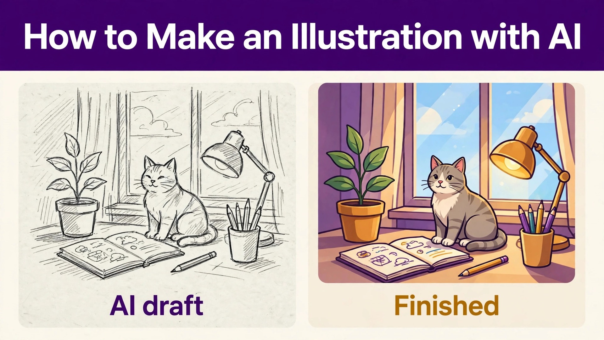
Google reported that its Nano Banana image models had generated more than 50 billion images by its 2026 developer conference, and most of those images were made by people with no design training. That number is the reason this guide exists, because learning how to make an illustration with ai is now a practical skill rather than a novelty. A teacher, a blogger, a shop owner or a parent can produce a custom illustration in minutes, and the difference between a usable result and a wasted afternoon is the process, not the tool.
An illustration is different from a photo, and the distinction matters for every step below. A photo shows what exists, while an illustration shows an idea, a process, a character or a world that does not exist yet. AI tools are strong at the second job, because they build the image from your description rather than from a camera. This guide covers the full process, from choosing a tool and a style to writing prompts, fixing the errors every generator makes, and exporting a file you can actually use. The tools change every few months, and the prices in this guide were checked in November 2026, so confirm the current plan before you pay for a subscription.
Pick Your Tool Before You Prompt
The tool you choose decides what kind of illustration you can make, so pick it before you write a single prompt. Midjourney produces the most artistic results and suits book covers, posters and mood work. Adobe Firefly suits brand work, because Adobe positions its own model output as safe for commercial use and the tool sits inside Photoshop and Express. ChatGPT with GPT Image suits beginners, because you describe the picture in plain chat and edit it by talking back. Ideogram suits any illustration that contains words, because it renders readable text better than its rivals.
Recraft suits vector style illustration, because it generates true SVG output you can edit and scale. Leonardo AI suits game art and concept work, with deep controls and custom models. Canva Magic Media suits quick illustrations inside a design you are already making. Stable Diffusion suits anyone who wants a free local tool and does not mind a technical setup. Start with one tool and learn it properly, because switching tools halfway through a project wastes the style knowledge you just built.
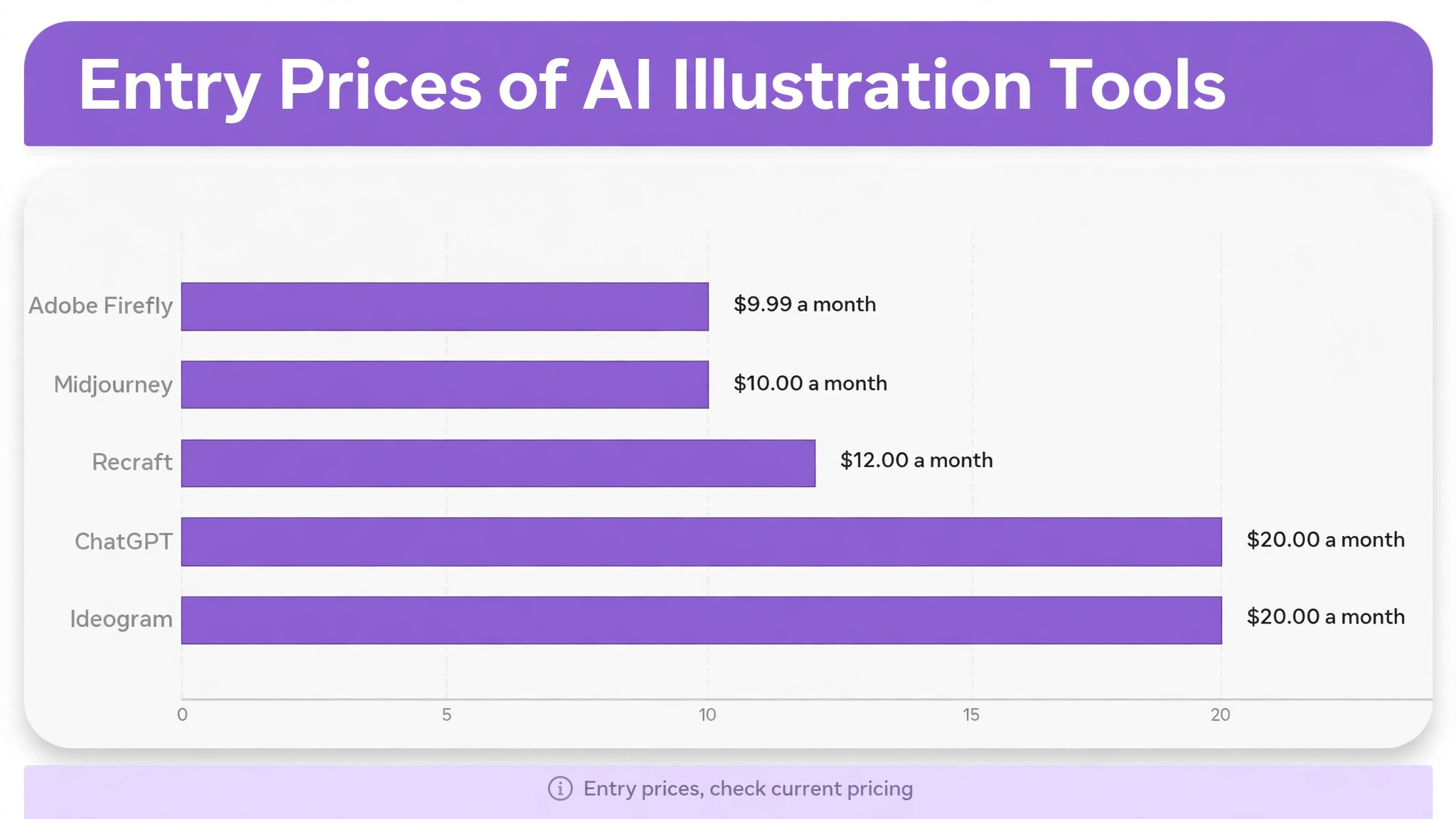
| Tool | Best for | Entry price |
|---|---|---|
| Midjourney | Artistic illustration | 10 dollars a month |
| Adobe Firefly | Commercial brand work | 9.99 dollars a month |
| ChatGPT | Beginners and chat editing | 20 dollars a month |
| Ideogram | Text inside images | 20 dollars a month |
| Recraft | Vector illustration | 12 dollars a month |
How to Make an Illustration with AI in 8 Steps
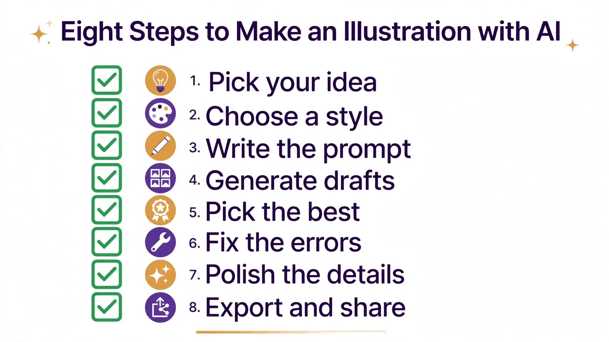
The eight steps below work in any of the tools above, because the process is the same even when the buttons differ. Define the job first, pick a style second, and write the prompt third, because a prompt written before those decisions is a guess. Generate several options, fix the errors, build a matching set, and export at the right size. Follow the order and you will spend your credits on finished illustrations rather than on experiments.
Step 1. Define the Illustration Job
Every illustration has a job, and naming it before you prompt is the step that saves the most time. A blog header must read at a wide size and leave space for a title. A book cover must work as a thumbnail and as a full page. A social post must win attention in one second on a small screen. A worksheet illustration must be simple enough for a child to understand. Write the job in one sentence before you open the tool, and keep that sentence next to you while you work.
Decide three things with the job. First, the size and shape, because a square illustration cannot be stretched into a wide banner without losing the composition. Second, the audience, because an illustration for children uses bright colours and simple shapes, while an illustration for a business report uses restrained colours and clean lines. Third, the feeling, because a calm illustration and an exciting illustration use different colours, different spacing and different subjects. When those three decisions are written down, the prompt almost writes itself.
Step 2. Pick a Style and Stick to It
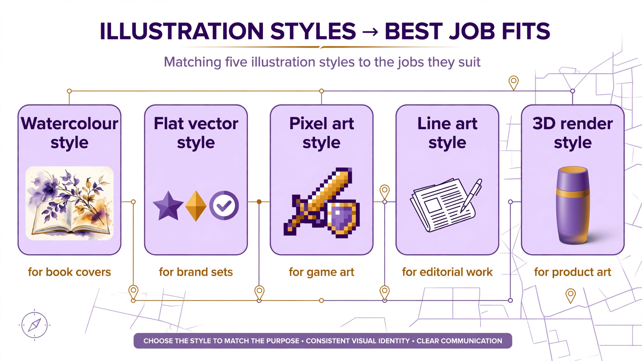
Style is the single most important word in your prompt, and consistency is what makes a set of illustrations look like they belong together. Flat vector style uses simple shapes and solid colours, and it suits icons, infographics and business illustration. Watercolour style uses soft edges and paint texture, and it suits book covers, cards and gentle subjects. Isometric style uses a three dimensional view of objects and rooms, and it suits explainers and product diagrams. Line art uses clean outlines with little colour, and it suits colouring pages and minimal design.
Pick one style for the whole project and repeat the same style words in every prompt. A project that mixes watercolour, pixel art and photorealism looks like three different artists worked on it, and the reader notices the clash before they notice the content. Save the exact style phrase you used for the first illustration, because you will need it again for every illustration that follows. When you want to try a new style, test it on one illustration first and compare it with the old set before you commit.
Colour palettes deserve the same discipline as style, because a set of illustrations with matching colours looks intentional even when the subjects differ. Pick three colours for the project, one main, one accent and one neutral, and name them in every prompt. A warm palette suits friendly subjects, a cool palette suits technical subjects, and a limited palette suits any subject, because fewer colours force the composition to do the work. Save the colour names with the style phrase, because the two travel together.
Step 3. Write a Prompt That Describes the Picture
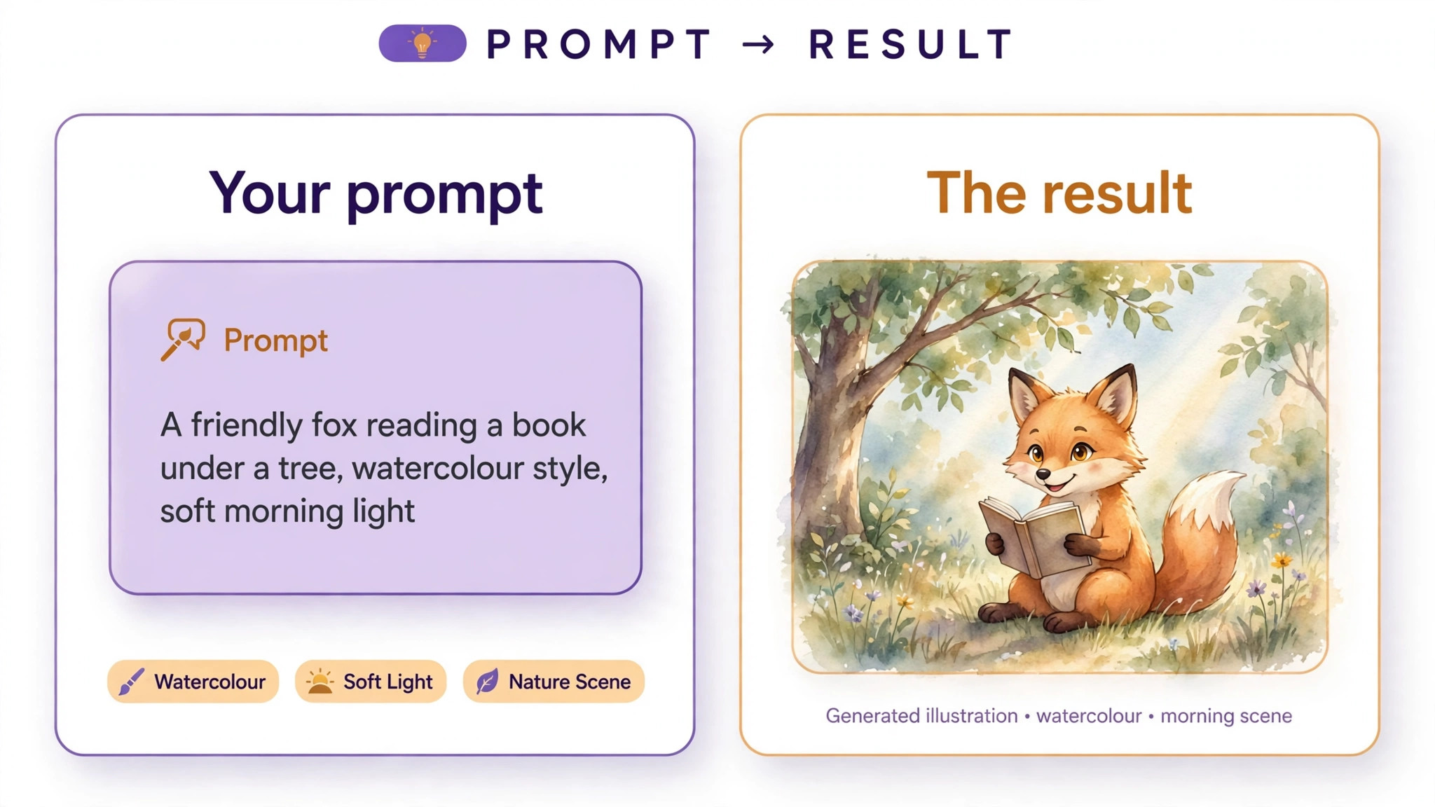
A good prompt describes the picture the way you would describe it to a friend, with the subject, the style, the colours and the mood in that order. Start with the subject and the action, such as a fox reading a book under a tree. Add the style, such as flat vector illustration. Add the colours, such as warm orange and teal on a cream background. Add the mood, such as calm and friendly. Add the composition last, such as the fox on the right with empty space on the left for text. That order gives the generator a clear picture to build.
Keep the prompt to two or three sentences, because a long prompt with ten ideas produces a confused image. One idea per sentence is the rule, and every word should describe something visible, because the generator cannot paint a word like innovative. Avoid negative instructions such as no text or no extra fingers, because most generators handle negatives poorly and the banned element often appears anyway. Instead, describe what you want to see, and fix the errors in step five.
Step 4. Generate Four Options and Compare
Never accept the first result, because the first result is a draft and the fourth option is often the keeper. Generate at least four variations of the same prompt, then compare them side by side at the size the illustration will be used. Look at the composition first, because a beautiful detail cannot save a layout that puts the subject in the wrong place. Look at the colours second, because a palette that clashes with your brand will fight every other element on the page.
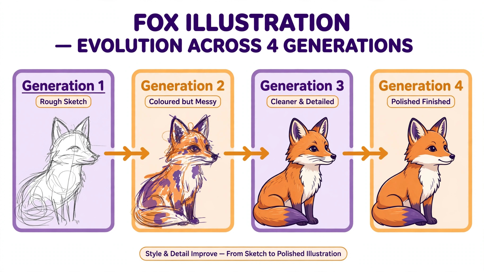
Compare the options against the job you defined in step one, not against each other in the abstract. An option that is beautiful but wrong for the job is still wrong, and an option that is plain but fits the space, the audience and the feeling is the right choice. Save the best two options and discard the rest, because a folder full of near misses slows every later decision. When none of the four works, change one thing in the prompt, usually the style or the composition, and generate four more rather than editing a bad result.
Step 5. Fix Hands, Text and Details
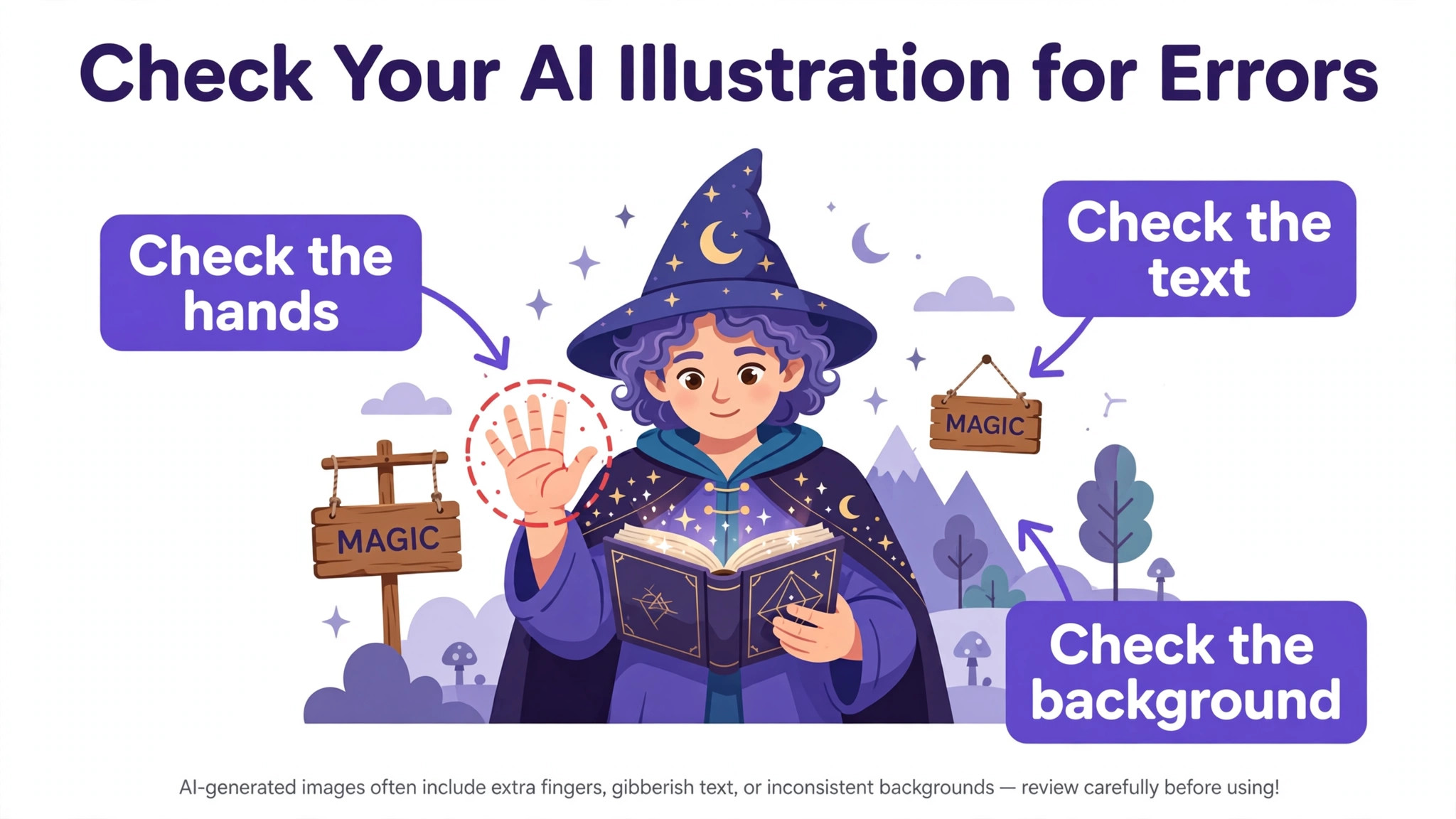
Every image generator makes the same mistakes, and knowing them in advance saves credits. Hands are the most famous failure, with extra fingers, missing fingers and bent joints appearing in otherwise good images. Text is the second failure, with misspelled words and invented letters appearing inside signs, books and labels. Small details are the third failure, with extra objects, floating items and broken patterns hiding in the corners. Zoom to 100 percent and check all three before you call an illustration finished.
Fix these errors by regenerating with a changed prompt rather than by editing the broken image. When hands look wrong, change the prompt so the hands are hidden, such as hands in pockets or a view from behind. When text is misspelled, use Ideogram for that illustration, because it renders text more reliably than its rivals, or remove the text from the image and add it later in Canva. When a detail is broken, crop the image to remove the corner or regenerate with a simpler composition. The cheapest fix is usually a simpler prompt.
Step 6. Edit and Refine the Winner
Editing is where a generated image becomes an illustration, and most tools now let you edit by describing the change. In ChatGPT you can say make the sky darker and the tool repaints the image. In Firefly you can select an area with Generative Fill and describe what should replace it. In Recraft you can restyle the whole image or change the colour palette in one click. Use these tools for small changes, because a small edit keeps the parts that already work, while regenerating from scratch risks losing them.
Make one change at a time and save a copy after each change, because a chain of five edits is hard to undo when the fourth one goes wrong. That patience is part of how to make an illustration with ai that survives contact with a real project. Check the edited image at the size it will be used, not at full screen, because a fix that looks perfect at 100 percent can look wrong as a thumbnail. When the edits stop improving the image, stop editing, because an illustration that is good enough today beats a perfect illustration that never ships. Save the final version with a clear name that includes the style and the date.
Step 7. Make a Matching Set
A single illustration is a decoration, and a matching set is a brand, so the seventh step is the one that turns a good image into a useful asset. Use the same style phrase, the same colour words and the same tool for every illustration in the set, and generate them in one session so the tool stays consistent. A blog that uses five illustrations in the same flat vector style with the same palette looks professional, while a blog that mixes five styles looks like it borrowed images from five different sites.
Build a reference sheet for the set, with the style phrase, the colour values and one approved illustration as the example. When you need a sixth illustration next month, open the sheet and reuse the exact words, and the new image will match the old ones. Some tools help directly, because Recraft lets you save a style and Leonardo lets you train a model on your own images. Even without those features, the discipline of reusing the same words produces a set that holds together.
Step 8. Export at the Right Size and Format
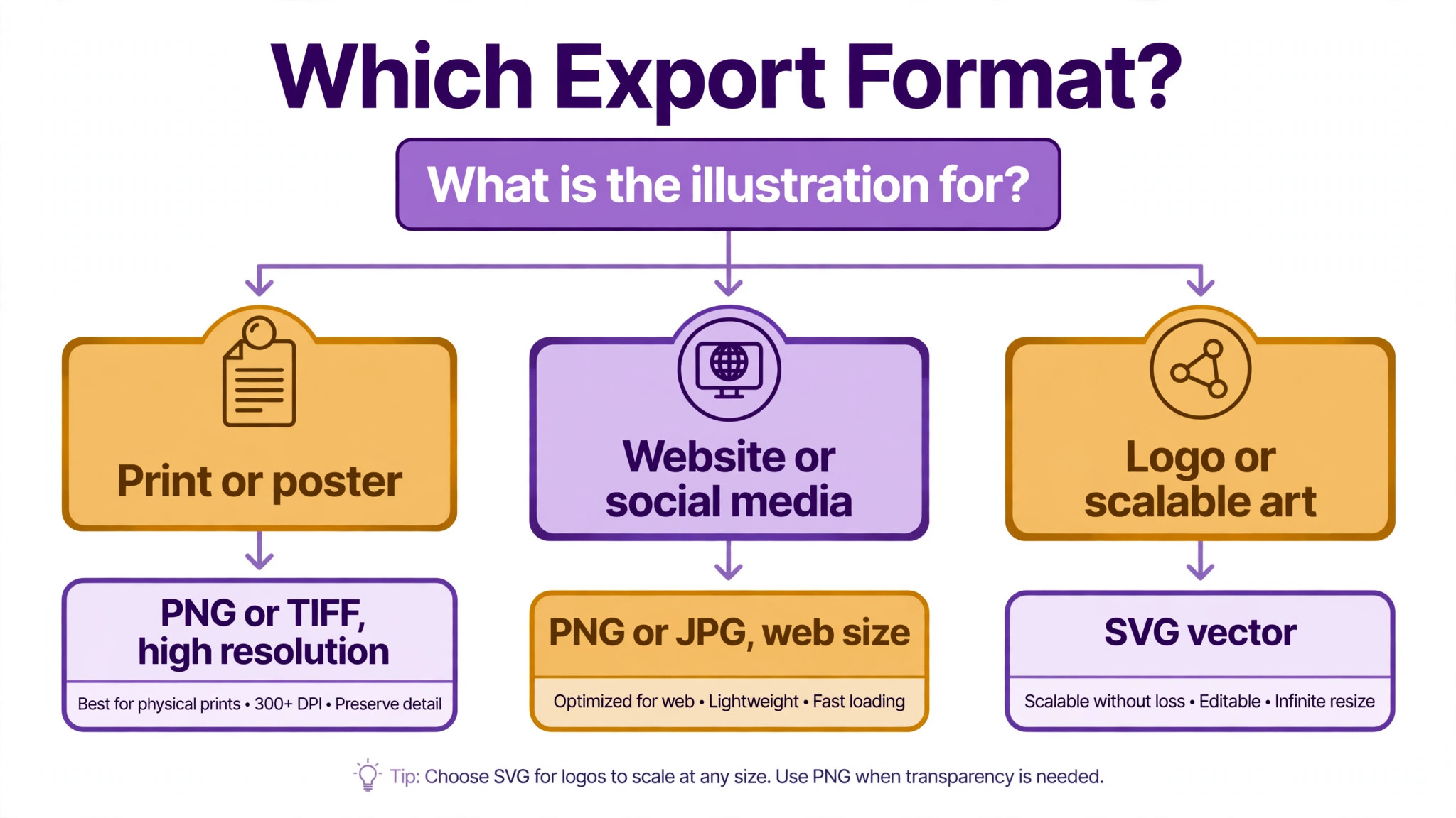
Export is the step that decides whether the illustration survives real use, and the format depends on the job. Use PNG with a transparent background for illustrations that sit on top of other content, such as a character on a web page. Use JPG for photographs and for illustrations that fill a rectangle, because the file is smaller. Use SVG for vector illustration from Recraft, because it scales from a favicon to a poster without losing quality. Use PDF for anything that will be printed, because print shops prefer it.
Export at the size the illustration will be used, or larger, because enlarging a small image softens it and no tool can fully restore the lost detail. A blog header needs at least 1200 pixels wide, a social post needs the exact size of the platform, and a print illustration needs 300 dots per inch at the final size. Check the exported file by opening it in the place it will live, on the blog, in the slide or on the printed page, because a file that looks right in the generator can look wrong in context. Save the master file as well as the export, so you can re-export at a new size later.
Style Recipes That Work
A style recipe is a short phrase you can reuse, and the five below cover most illustration jobs. For flat vector business illustration, use the words flat vector illustration, simple shapes, solid colours, minimal detail, white background. For a watercolour book cover, use soft watercolour illustration, gentle paint texture, muted colours, dreamy light. For an isometric explainer, use isometric illustration, three dimensional view, clean geometry, soft shadows. For a line art colouring page, use simple black line art, clean outlines, white background, no shading, no colour.
For a retro poster, use retro illustration, bold shapes, limited colour palette, grain texture, 1970s poster style. Test each recipe on one illustration before you commit to a set, and adjust one word at a time when the result misses. The recipe that works is the one you save, because a saved recipe is the difference between a consistent brand and a fresh guess every time. Learning how to make an illustration with ai that looks consistent is mostly about reusing the words that worked.
Build a Style Sheet
A style sheet is a one page document that keeps every illustration in a project consistent, and it takes 20 minutes to make. Write the style phrase at the top, then list the colour values, the background rule, the character description and the composition rule. Add one approved illustration as the example, and add one rejected illustration with a note about what went wrong, because the rejection teaches the next prompt as much as the approval does.
Keep the style sheet where you will find it, in the same folder as the illustrations, and open it before every new prompt. A style sheet is the quiet part of learning how to make an illustration with ai well, because it turns one good result into a repeatable process. When a collaborator joins the project, the style sheet is the handover document, because it carries the decisions that would otherwise live in one person’s head. A project with a style sheet produces illustrations that match, and a project without one produces illustrations that drift, even when the same person makes them all. The sheet is the cheapest quality control in the whole process.
When to Use Each Tool
The right tool depends on the job, and knowing how to make an illustration with ai starts with matching the tool to the task. Midjourney suits the cover, the poster and the mood piece, because its default style is artistic and its variations are strong. The cost is the lack of a free plan and the chat based interface, which feels strange the first time you use it. Use Midjourney when the picture is the product, such as a book cover or a print.
Adobe Firefly suits the brand job, because the training story is the strongest in the category and the tool sits inside Photoshop and Express. The cost is a narrower stylistic range than Midjourney, so the results can feel safe. Use Firefly when the illustration will appear on a product or a client project and the license matters more than the artistic edge.
ChatGPT suits the beginner and the quick job, because you describe the picture in plain chat and edit it by talking back. The cost is less control over style and a queue at busy times on the free tier. Use ChatGPT when you need one illustration today and you do not want to learn a new tool.
Ideogram suits any illustration with words in it, because it renders readable text better than any rival. The cost is fewer pipeline controls than Leonardo or Recraft. Use Ideogram for posters, cards and labels where the words must be spelled correctly, and use another tool for the rest of the set.
Recraft suits vector work and brand sets, because the SVG output stays editable and the style controls keep a set consistent. Leonardo suits game art and concept work, because the custom models and the token meter reward heavy users. Canva Magic Media suits the illustration inside a design you are already making, because it never leaves the editor. Stable Diffusion suits the technical user who wants a free local tool and full control over the model, and it is the only option here that costs nothing to run.
Copyright and Commercial Use
The legal side of AI illustration is unsettled, and the honest answer is that the rules are still forming. Adobe positions Firefly output as safe for commercial use, because its model was trained on licensed Adobe Stock images and public domain content, and that training story is the strongest in the category. Midjourney allows commercial use on paid plans, but companies earning more than 1 million dollars a year must use the Pro or Mega plan. Recraft states that free plan images are public and not licensed for commercial use, so a paid plan is required before the illustration appears on anything you sell.
Check the terms of the tool you use before the illustration appears on a product, a book cover or a client project, because the terms differ more than the prices. Keep a record of the tool, the plan and the date for any illustration that earns money, because a client may ask where the image came from. When the project is high value, such as a book cover that will sell for years, consider a human illustrator for the final art, because a human made illustration carries clear ownership that no AI tool can promise today.
Mistakes That Waste Credits
The most common mistake is prompting without a plan, which burns credits on images that do not fit the job. A prompt written before the size, the style and the audience are decided is a guess, and the generator will answer the guess with a pretty picture that cannot be used. Write the job sentence first, then the prompt, and the credits go to illustrations that ship.
The second mistake is editing a bad image instead of regenerating it. A broken composition cannot be fixed by changing the colours, and an extra finger cannot be painted away reliably. When the image is wrong in a big way, change the prompt and generate again, because a fresh generation costs one credit and an hour of editing costs far more. The third mistake is mixing styles across a set, which makes a professional project look improvised. Save the style phrase and reuse it, and the set will hold together.
The fourth mistake is exporting at the wrong size. An illustration made at 512 pixels looks fine on screen and blurs in print, and no upscaling tool fully restores the lost detail. Export at the final size or larger, and save the master file so you can re-export later. The fifth mistake is ignoring the license, because a free plan image used on a product can cost more in legal trouble than a paid plan ever would. Check the terms before the illustration earns money, not after.
Frequently Asked Questions
Can I use AI illustrations commercially?
It depends on the tool and the plan, and you must check the terms for the one you use. Adobe Firefly is positioned as safe for commercial use, Midjourney allows commercial use on paid plans with a higher tier required for companies earning over 1 million dollars a year, and Recraft requires a paid plan because free images are not licensed for commercial use. Keep a record of the tool and the plan for any illustration that earns money, and check the terms again before a high value use such as a book cover or a product.
What is the best AI tool for illustration?
The best tool depends on the job, because each one leads on a different strength. Midjourney leads on artistic quality, Firefly leads on commercial comfort, ChatGPT leads on ease of use, Ideogram leads on readable text, Recraft leads on vector output, and Leonardo leads on game art and custom models. For a beginner, ChatGPT or Firefly is the easiest start, because both let you describe the picture in plain words and edit by talking back. Test two tools with the same prompt and compare the results at the size you will use.
How to make an illustration with ai that looks consistent?
Consistency comes from reusing the same words, not from a better tool. Save the exact style phrase, colour words and composition rule from the first illustration that works, and repeat them in every prompt that follows. Generate the set in one session, use the same tool throughout, and keep a style sheet with one approved example. Recraft lets you save a style directly, and Leonardo lets you train a model on your own images, but even without those features, the discipline of reusing the same prompt words produces a set that holds together.
Do I need to be able to draw to use AI illustration?
No, you do not need to be able to draw, because the generator does the drawing and your job is to describe the picture clearly. The skills that matter are different from drawing, and they are easier to learn. You need to describe a subject in plain words, to recognise a good composition when you see one, and to judge whether an image fits the job. Those skills improve fast with practice, and ten generations teach more than ten hours of reading about prompts.
How much does AI illustration cost?
The cost ranges from free to 20 dollars a month, depending on the tool and the plan. Stable Diffusion is free to run on your own computer, Firefly offers free daily generations with a Standard plan at 9.99 dollars a month, Midjourney starts at 10 dollars a month with no free plan, and Leonardo, Recraft and Ideogram all offer free tiers with paid plans from 12 to 20 dollars a month. The real cost is credits, because regenerating a bad image costs as much as generating a good one, so a clear prompt saves more money than a cheap plan.
Can AI illustration replace a human illustrator?
AI illustration can replace a human illustrator for a quick blog image, a social post or a draft, and the best tools produce results that look professional at small sizes. A human illustrator still wins when the work needs a truly original style, a consistent character across a whole book, or a picture that must carry clear ownership for years. Many publishers use both, AI for drafts and exploration, and a human for the final art. That sequence gives you speed now and originality later.
Knowing how to make an illustration with ai is a skill that improves with every generation, because each prompt teaches you what the tool understands and what it ignores. Start with one tool, define the job, pick a style, write a short prompt, generate four options, fix the errors, build a matching set and export at the right size. The first illustration takes an hour, the tenth takes ten minutes, and the set you build along the way is an asset you will reuse for years.