The best Reels cover is decided before you open any design tool. Pick one strong frame, put a short title inside the safe area, and let everything else serve that title, and the cover earns the tap. Most covers fail because creators do the opposite. They decorate first and check the safe area last, so the title lands where the caption sits or where the username sits, and the cover that looked perfect in the editor arrives on Instagram with its best words hidden. That gap is the whole reason to learn how to make instagram reels covers that earn the tap.
If you want to know how to make instagram reels covers that earn the tap, start with that safe area, put the title inside it, and let everything else serve the title. The rest of this guide gives you the exact sizes, the grid crop, and a workflow you can repeat for every Reel you post.
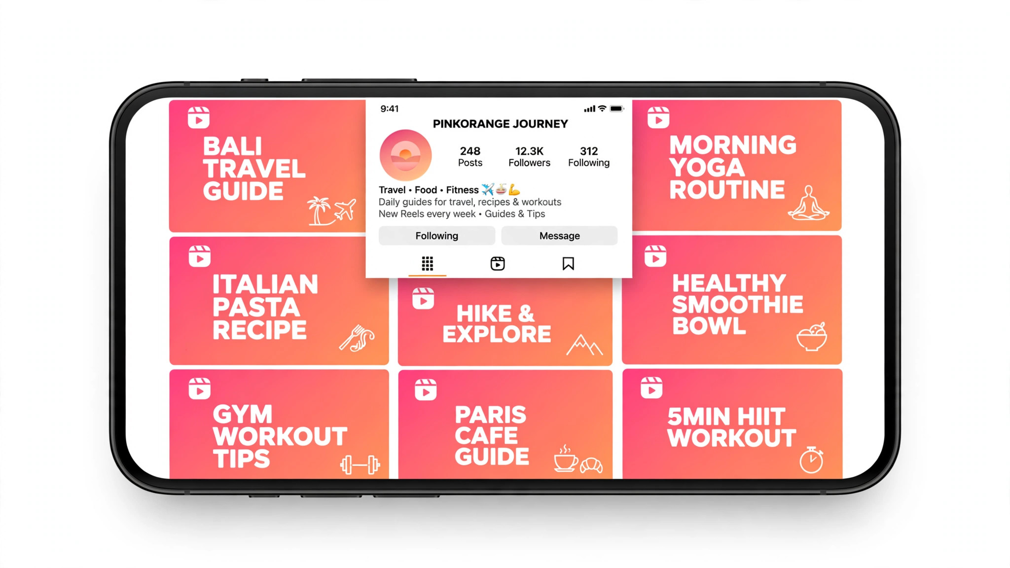
A Reels cover is the still image a viewer sees before tapping play. It appears full screen in the Reels feed, cropped to a 3 by 4 tile on your profile grid, and smaller still in search and in the explore page. The cover has one job, which is to make a stranger stop scrolling and tap. It is not a summary of the video, and it is not a place for your logo. It is a promise about what the viewer will get in the next fifteen seconds, written in words large enough to read on a phone without zooming, over an image clear enough to understand at a glance.
This guide is written for creators, small businesses, and anyone who posts Reels and wants more of them watched. You do not need paid software or design training. You need the right canvas size, a clear idea of what the Reel promises, and a short check before you publish. The steps below work with free tools, and they work whether you design the cover from a video frame, a still photo, or a flat background. Read the size section first, because every later decision depends on it.
The Sizes Instagram Actually Uses
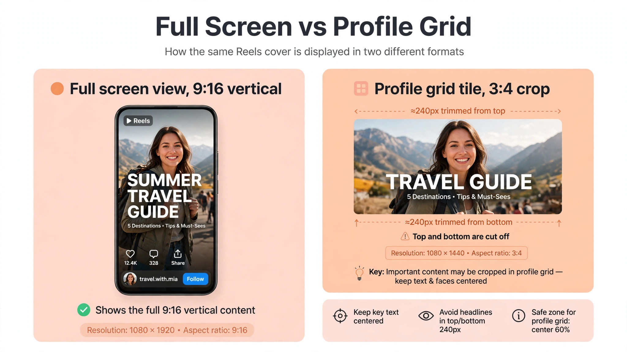
A Reel and its cover share the same canvas. Export the video at 1080 by 1920 pixels, in a 9 by 16 vertical aspect ratio, as an MP4 file, and upload the cover at the same 1080 by 1920 pixels. The cover is what shows up on your profile grid, where Instagram crops it down to a 3 by 4 tile of about 1080 by 1440 pixels, losing roughly 240 pixels from the top and 240 from the bottom. Older guides describe the grid crop as a square, because Instagram used square tiles before January 2025, but the current grid is taller. Design for the 3 by 4 crop and the cover works everywhere.
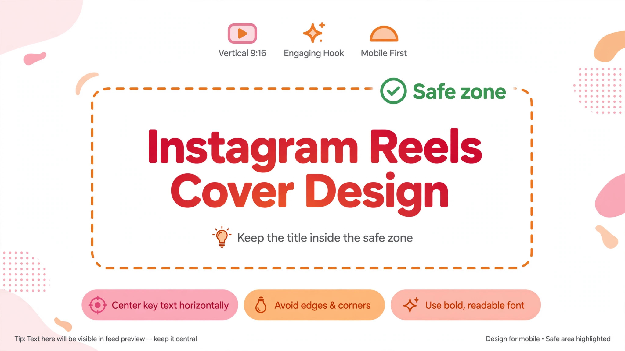
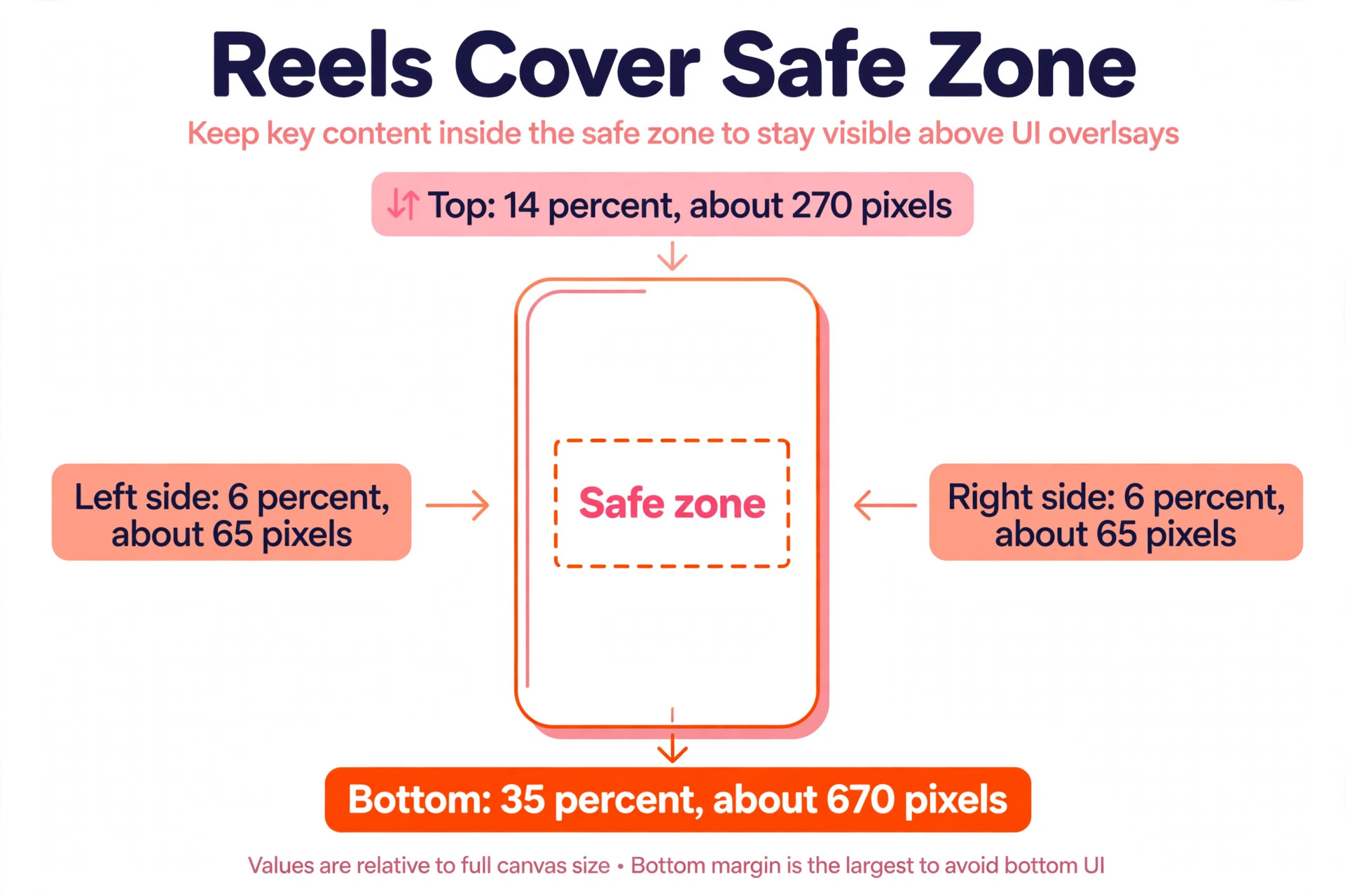
The safe zone is the part of the frame that stays visible no matter where the Reel appears. Meta combined the safe zones for Stories and Reels across Instagram and Facebook into one percentage based specification in March 2026, and the numbers are 14 percent from the top, 35 percent from the bottom, and 6 percent from each side. On a 1080 by 1920 frame, that means about 270 pixels clear of the top, about 670 pixels clear of the bottom, and about 65 pixels clear of each side. The bottom clearance catches most creators, because the caption, the username, and the audio label all sit there, and the action buttons stack up the right side as well.
| Where the cover appears | Crop | What to expect |
|---|---|---|
| Full screen Reel playback | 9 by 16, 1080 by 1920 | The whole cover as designed |
| Profile grid | 3 by 4, 1080 by 1440 | Top and bottom trimmed |
| Reels tab | 9 by 16, 1080 by 1920 | Full cover, UI overlays apply |
| Search and explore | Small tile | Title must read at small size |
The practical rule is simpler than the percentages. Keep the title, the face, and anything else that earns a tap inside the centre of the frame, well clear of the bottom third and the right rail. If the title sits in the middle vertical band of the frame, it survives the grid crop, the caption overlay, and the action buttons at the same time. That centred layout is the core of how to make instagram reels covers that work everywhere.
How to Make Instagram Reels Covers in 8 Steps
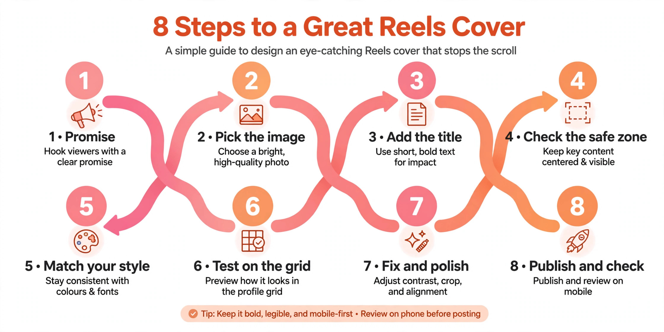
The eight steps below take you from a finished Reel to a published cover. Each step answers one decision, and the order matters. Do not place text before you have picked the frame, and do not publish before you have checked the cover on the profile grid. The whole workflow takes under half an hour once you have done it twice, and most of that time goes to choosing the frame and the words rather than to the technical work.
Step 1. Decide what the Reel promises
A cover can only promise one thing, so pick that thing before you open any tool. A recipe Reel promises the finished dish. A tutorial promises the result in a time the viewer can believe. A travel Reel promises the place. Write the promise down in one sentence, then cut every word that does not serve it. A cover that tries to promise a recipe, a tip, a story, and a product at the same time ends up promising nothing, because a viewer gives it about one second before scrolling on.
The promise also decides the words on the cover. A promise about speed needs a number, such as 15 minutes or 3 steps. A promise about a result needs the result in plain words, such as a softer sourdough or a cleaner kitchen. A promise about a place needs the place name. If you cannot state the promise in one sentence, the Reel is not ready for a cover yet. Spend five minutes on this sentence and the rest of the steps get easier, because every later choice is a test against the promise.
Step 2. Pick the strongest frame from the video
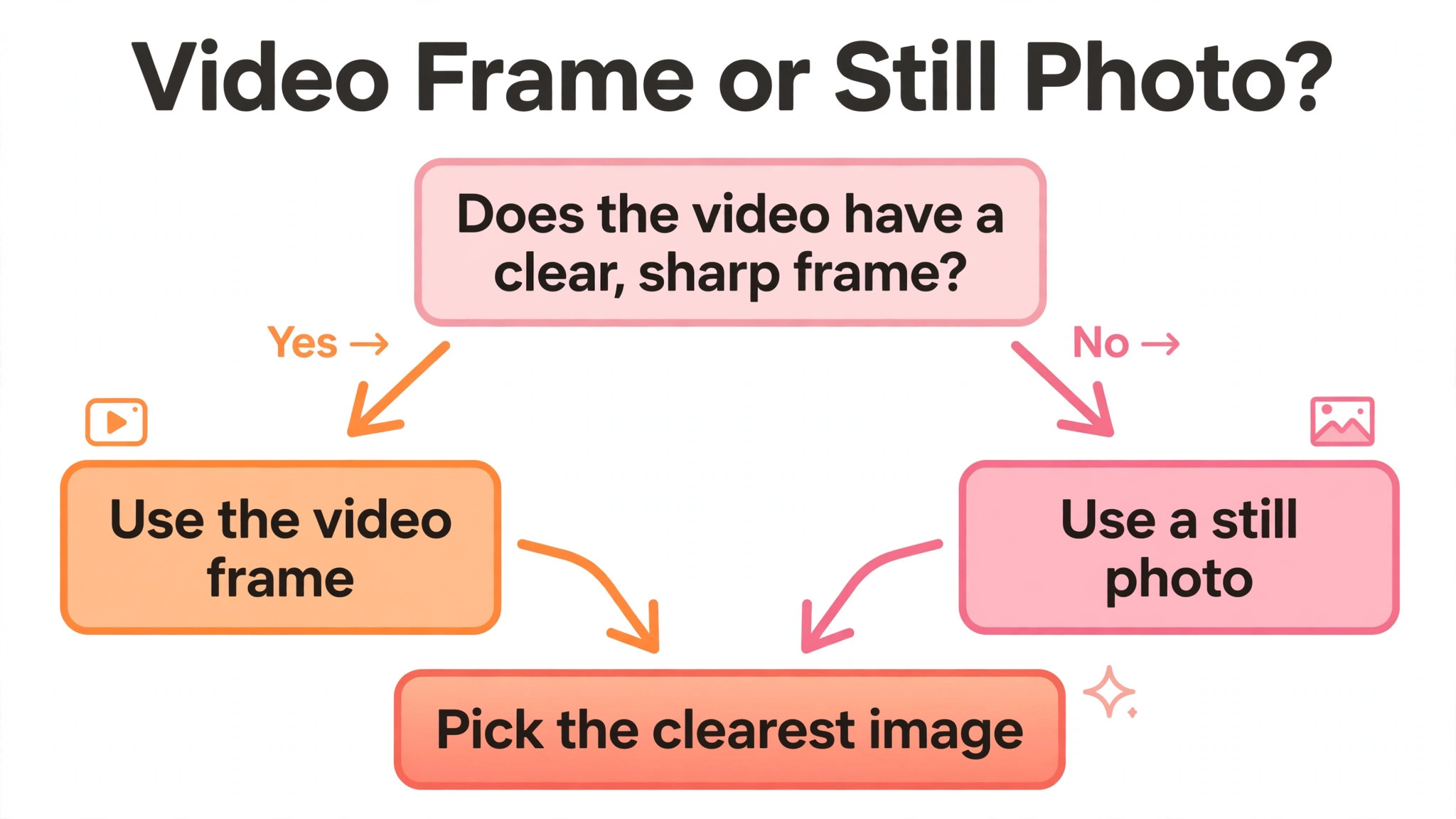
Scrub through the Reel and find the single frame that shows the promise most clearly. The best frame usually shows a face with a clear expression, a finished result, or a moment of action, and it is sharp, well lit, and easy to understand at a glance. A blurry frame, a dark frame, or a frame where the subject is small will not carry a cover, no matter how good the text is. If no frame in the video is strong enough, take a still photo of the same subject and use that instead, since a sharp photo beats a weak video frame every time.
Check the frame at the size it will actually display. A frame that looks good full screen on a computer can turn to noise on a phone, where the cover appears as a small tile in a grid of other covers. Zoom out to the size of a phone screen and look at the frame. If you can still tell what it shows in one second, it works. A strong frame is the first asset you need when you learn how to make instagram reels covers.
Step 3. Set the canvas to 1080 by 1920 pixels
Open your design tool and start with a blank canvas of 1080 by 1920 pixels, which is the 9 by 16 vertical frame Instagram expects. If your tool offers an Instagram Reel cover template, use it, since the template carries the right size and often marks the safe zone for you. Check the canvas size before you add anything, because resizing a finished cover is the fastest way to ruin the layout, and a cover built at the wrong size will be stretched or cropped on upload.
Mark the safe zone before you place anything. Draw a rectangle in the centre of the canvas that leaves about 14 percent clear at the top, 35 percent clear at the bottom, and 6 percent clear on each side, and treat it as the only area where important content is allowed to live. Everything outside that rectangle is background only. A sky, a blurred room, or a solid colour can extend to the edges, but no word, face, or logo should cross the boundary. When the design is finished, delete the rectangle or hide its layer before you export, since it is a guide only and should never appear in the published cover.
Step 4. Place one face or one result in the centre
Put a single focal point in the centre of the frame, and make it large. A face looking at the camera, a finished dish, or a before and after result all work, because the viewer understands them in one second. Two focal points compete with each other, and a cover with no focal point looks like a random frame from the video rather than a designed cover. Crop the image so the focal point fills the centre of the frame, and leave the edges for background that can be cropped on the grid without loss.
The focal point must survive the profile grid crop, which trims about 240 pixels from the top and 240 from the bottom. That means the face or the result must sit in the central 1080 by 1440 area of the frame, not near the top or the bottom. A face near the top of the frame will lose its forehead on the grid, and a result near the bottom will lose its base. Centre the subject, check it against the grid crop, and the cover will look deliberate everywhere Instagram shows it.
Step 5. Write a title under six words
Put the title inside the safe zone and keep it under six words. A Reels cover is not a blog post title, and nobody reads a sentence on a cover. The strongest covers carry a short promise in large type, such as the result, the time, or the number of steps, and they leave the details to the caption below the video. Set the title large enough to read on a phone without zooming, and keep it to one or two lines at most. If the title needs a third line, the words are too long and should be cut.
Use plain words that a stranger understands in one second. Numbers help, because they make a specific promise, and a title with a number outperforms a title without one when the number is honest. Avoid puns, avoid jargon, and avoid words that only make sense after watching the video, since the cover has to earn the tap before the video is watched. When the title is set, read it out loud. If it sounds like a promise you would tap on, it works. If it sounds like a label, rewrite it until it sounds like a promise.
Step 6. Make the text readable at small size
Choose a bold font with thick strokes, and set it large enough that the title reads on a phone held at arm’s length. Thin fonts, script fonts, and all caps text in a narrow font all fail at small size, because the strokes disappear and the letters merge. A bold sans serif font is the safest choice for a cover, and it suits almost every kind of Reel, from cooking to fitness to business. Use one font for the title and, if you need a second line, the same font in a smaller size, since two fonts on a cover usually fight each other.
Contrast decides readability more than font choice does. Put light text on a dark image or dark text on a light image, and add a solid band or a dark overlay behind the text when the image is busy. A text shadow is a weaker fix, and it often makes the problem worse by blurring the edges of the letters. Test the cover by shrinking it to the size of a grid tile on your phone screen. If you can read the title without zooming, the contrast is strong enough. If you cannot, increase the size, darken the overlay, or shorten the title, in that order.
Step 7. Keep the design consistent across Reels
Use the same layout, the same font, and the same title position on every cover, and change only the photo and the words. A consistent cover style turns your profile grid into a recognisable set, and a viewer who has seen one of your Reels will recognise the next one before reading the title. The consistency also saves time, since you can duplicate the last cover, swap the photo and the title, and publish in minutes rather than starting from a blank canvas each time.
Step 8. Upload the cover and check the grid
Upload the Reel, choose the cover from your camera roll or pick a frame in the app, and publish. Then open your profile grid on your phone and look at the cover as a tile among the others. Check that the title is fully visible, that the face or the result is centred, and that the cover looks like it belongs with the rest of the grid. Instagram lets you change the cover after posting by editing the Reel and choosing a new cover image, so a cover that looks wrong on the grid can be fixed without reposting the video.
Ask one other person to look at your profile grid and tell you which cover they would tap first and why. If they pick yours and repeat the title correctly, the cover works. If they pick another cover, ask what caught their eye, and use that answer on the next cover. Change one thing at a time and re-upload, since changing the photo, the text, and the colours together makes it impossible to know which change fixed the problem. A cover that passes this check on the grid is ready to stay up.
Cover Ideas by Account Type
A cooking account, a fitness account, and a business account need different covers, because their viewers tap for different reasons. A cooking cover works best with the finished dish large in the centre and a title that names the dish and the time, since the viewer is deciding whether the recipe is worth the effort. A fitness cover works best with a clear action shot and a title that names the result or the number of minutes, since the viewer is deciding whether the workout fits their day. A business cover works best with a plain background, a short promise, and no clutter, since the viewer is deciding whether the advice is worth their attention.
The pattern behind all three is the same. Show the result, name it in plain words, and leave everything else out. A travel account shows the place, a beauty account shows the finished look, and a finance account shows the number. The subject changes, but the structure does not, and that is why a template works across account types. Pick the structure that fits your subject, keep the title in the safe zone, and the cover will earn taps regardless of the niche.
Five Tools That Make Covers Faster
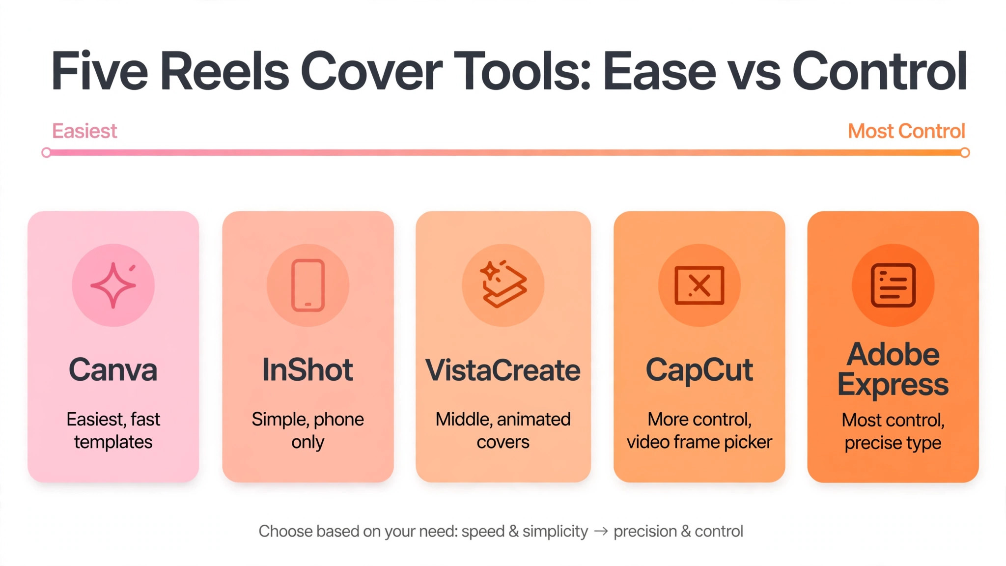
You can design a cover in any image editor, but a tool with a Reel cover template and a video frame picker saves the setup work. The five tools below all offer a free starting point for how to make instagram reels covers. Pick the one whose editor you already know, since learning a new tool costs more time than the cover itself is worth.
Canva
Canva is the fastest starting point for most creators, because its Instagram Reel cover template is already sized at 1080 by 1920 pixels and its library holds thousands of layouts you can adapt in minutes. The free plan covers the template, the basic editor, and a large set of free photos and fonts, which is enough for a personal account or a small business. Canva Pro, listed near 15 dollars a month in the United States, adds background removal, brand colours, and one click resizing. The trade off is that the most popular templates are easy to recognise, so change the photo, the colours, and the fonts rather than publishing a template unchanged.
Adobe Express
Adobe Express is the strongest choice when clean typography and consistent branding matter, since it comes from Adobe and its text tools are more precise than most free editors. The free plan includes the Reel cover template, a set of fonts, and Firefly image generation with daily limits, while Premium costs 9.99 dollars a month and raises those limits. Adobe Express is a good fit if you already use Adobe products or if you want the same design to work as a story, a post, and a cover. The editor takes slightly longer to learn than Canva, but the results look more considered, especially for business accounts that need a formal tone.
CapCut
CapCut is a video editor first, and that is its advantage for Reels covers. You can pick the cover frame from the video itself, add text and effects in the same app, and export the cover without moving files between tools. The free plan covers the basics, including text, stickers, and templates, while the paid Pro plan adds premium effects, templates, and cloud storage, with the price shown on the app store or the site at the time you subscribe. CapCut suits creators who edit the Reel and the cover in one place, and it is the fastest workflow when the cover comes from a video frame rather than a still photo.
InShot
InShot is a mobile video and photo editor that handles Reels covers well, because it is built for vertical video and works entirely on the phone. You can pick a frame from the video, add text in a bold font, adjust the brightness and the contrast, and export the cover at 1080 by 1920 pixels without opening a computer. The free version covers the basics with a watermark on some exports and ads in the app, while the paid Pro version removes the watermark and the ads. InShot suits creators who shoot, edit, and post entirely on a phone, and it is the simplest tool on this list for a quick cover.
VistaCreate
VistaCreate, formerly Crello, is a solid middle option with a large template library and a free Starter plan that covers the basics. Its strength is animated covers and social graphics, which suit accounts that post often and want a consistent look across formats. The paid plan is priced by the month with annual billing bringing the cost down, and it removes the watermark on premium assets. VistaCreate is worth a look if Canva feels too familiar and you want templates that fewer of your competitors are using. The editor is straightforward, and the learning curve is short for anyone who has used a drag and drop tool before.
Best Pick by Job
The table below matches each common job to the tool that fits it best. Find your job, take the pick, and skip the rest of the comparison.
| Job | Best pick | Why it fits |
|---|---|---|
| Personal account, first cover | Canva | Free template and fast setup |
| Business account, branded covers | Adobe Express | Precise type and brand control |
| Cover from a video frame | CapCut | Frame picker in the video editor |
| Phone only workflow | InShot | Built for vertical video on mobile |
| Frequent posting, varied looks | VistaCreate | Animated templates and variety |
| Cover plus story and post | Canva | One click resize to all formats |
How to Change a Cover After Posting
Instagram lets you change a Reel cover after the Reel is published, and knowing that takes the pressure off the first upload. Open the Reel, tap the three dots, choose Edit, then tap the cover image and choose a new image from your camera roll or pick a different frame from the video. Save the change and the new cover appears on your profile grid and in the Reels feed. The video itself does not change, the views and the comments stay in place, and the only thing that changes is the still image viewers see before they tap.
Use this option when a cover underperforms. If a Reel gets far fewer views than your recent average, and the topic is one that usually performs well, the cover is a likely cause. Design a new cover with a shorter title and a clearer focal point, swap it in, and watch the views over the next day. A cover change will not save a Reel that nobody wants to watch, but it can rescue a good Reel that was hidden behind a weak cover. Check the grid after every change, since the grid is where the new cover has to work hardest.
Seven Mistakes That Kill Clicks
Most bad covers fail in the same seven ways, and all seven are avoidable once you know to look for them. Anyone learning how to make instagram reels covers should read the list before exporting, and check the cover against each item in turn.
- The title sits at the bottom of the frame, so the caption and the action buttons hide it.
- The title carries more than six words, so nobody reads it before scrolling past.
- The focal point sits near the top or the bottom, so the grid crop cuts it in half.
- The font is thin or script, so the title disappears at grid tile size.
- The cover is a random video frame with no text, so the viewer has no reason to tap.
- The cover uses a different font and layout from the last ten covers, so the grid looks disorganised.
- The cover is never checked on the profile grid, so the creator only sees the full screen version that looks fine.
Frequently Asked Questions
What size should an Instagram Reels cover be?
Upload the cover at 1080 by 1920 pixels, the same as the Reel itself, in a 9 by 16 vertical aspect ratio. Instagram crops the cover to a 3 by 4 tile of about 1080 by 1440 pixels on your profile grid, losing roughly 240 pixels from the top and 240 from the bottom. Keep the title, the face, and anything else that earns a tap inside the central 1080 by 1440 area, and the cover works in every place Instagram shows it.
Why does my Reels cover look cropped on my profile?
Your profile grid crops every cover to a 3 by 4 tile, while the Reel itself plays full screen at 9 by 16. Anything near the top or the bottom of the frame is trimmed on the grid, which is why a title placed at the bottom disappears and a face placed at the top loses its forehead. The fix is to centre the focal point and keep the title in the middle vertical band of the frame. Older guides describe the grid crop as a square, because Instagram used square tiles before January 2025, but the current grid is 3 by 4.
Can I change a Reels cover after posting?
Yes. Open the Reel, tap the three dots, choose Edit, then tap the cover image and choose a new image from your camera roll or pick a different frame from the video. Save the change and the new cover appears on your profile grid and in the Reels feed. The video, the views, and the comments stay in place. Use this option when a Reel underperforms and the cover is a likely cause, and check the grid after every change.
What is the safe zone for Instagram Reels covers?
Meta’s guidance for vertical placements says to leave roughly 14 percent of the top, 35 percent of the bottom, and 6 percent on each side free of text, logos, and key elements. On a 1080 by 1920 frame, that means keeping key content about 270 pixels clear of the top, about 670 pixels clear of the bottom, and about 65 pixels clear of each side. The bottom clearance is the largest, because the caption, the username, and the audio label all sit there, and the action buttons stack up the right side.
Should a Reels cover have text on it?
Yes, in most cases. A cover with a short title under six words earns more taps than a cover with no text, because the title tells a stranger what the Reel promises before they tap. The exception is a cover where the image alone makes the promise obvious, such as a striking place or a finished dish, though even then a short title usually helps. Keep the title in the safe zone, use a bold font, and test it at grid tile size before you publish.
What app is best for making Reels covers?
For how to make instagram reels covers, Canva is the best pick for most creators, because its Reel cover template is already sized correctly and its library holds thousands of layouts. Adobe Express is the better pick for branded business covers, CapCut is the better pick when the cover comes from a video frame, InShot is the better pick for a phone only workflow, and VistaCreate is the better pick for varied animated covers. The tool matters less than the size, the safe zone, and the short title, and all five tools in this guide offer a free starting point.
The Short Version
A good Reels cover is a short promise in the centre of the frame. Set the canvas to 1080 by 1920 pixels, keep the title inside the safe zone, put one clear focal point in the middle, and check the result on the profile grid before you call it done. That is how to make instagram reels covers that get clicks, and the same steps work for every Reel you post, whether it is a recipe, a tutorial, or a business tip.
The cover is a small piece of design with a large effect on how many people watch your Reel. A viewer decides in one second whether to tap, and the cover is the only thing they see in that second. Spend the half hour, follow the eight steps, and publish a cover that earns the tap on every screen your viewers use.