The verdict is simple. A good YouTube channel icon is a bold mark or a clear face inside a circle, built at 800 by 800 pixels, with nothing important near the edges. That one sentence covers most of what you need, and the rest of this guide shows you how to get there without design training. If you know how to design a youtube channel icon the right way, the same small image will work next to your videos, in comments, in search results and on your channel page, and viewers will start to recognise it before they read your channel name.
Your icon is the hardest working image on your channel. It appears next to every video you publish, next to every comment you leave, and next to your name in search. A thumbnail gets one chance to earn a click. Your icon gets hundreds of chances to build recognition, and it does that job at a tiny size, often no bigger than a fingernail on a phone screen. Most new creators spend hours on thumbnails and five minutes on the icon, and that order is backwards. The thumbnail wins the click. The icon wins the subscriber who comes back.
Why the Icon Matters More Than the Banner
The banner is the biggest image on your channel, and it is also the least seen. Most viewers meet your channel through a video or a comment, not through your channel page. The banner shows up only when someone visits the page, and many viewers never do. The icon shows up everywhere, every time, in every context. It is the face of the channel in the feed, in notifications and in the subscription list.
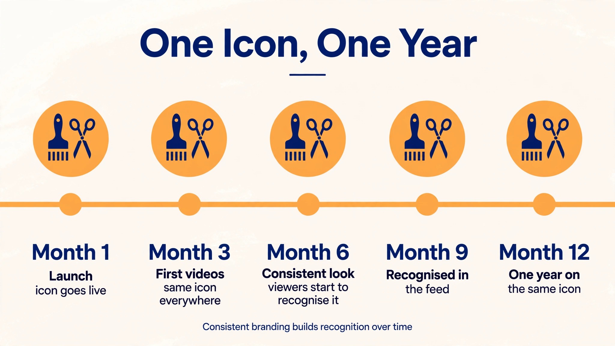
Recognition is the real goal. A viewer who has seen your icon ten times will spot your next video faster than a viewer who has never seen it. That speed matters in a feed where every video competes for the same second of attention. A consistent icon builds a visual habit, and that habit turns a casual viewer into a regular. Changing your icon every month breaks the habit, so the design you pick now should be one you can live with for a year.
The Exact Specs Before You Start
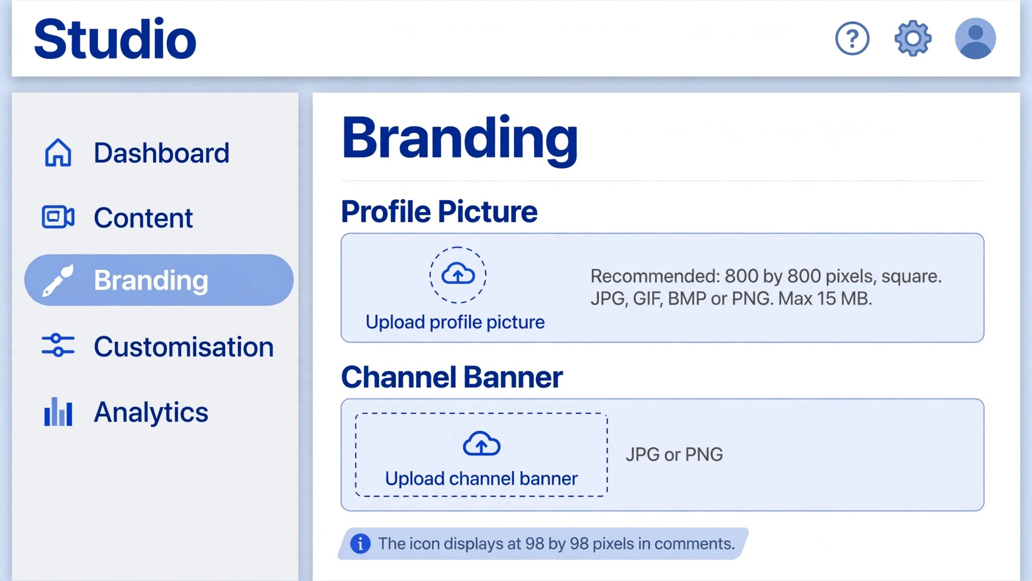
YouTube keeps the official spec short, and that causes confusion, because design blogs fill the gap with different numbers. Here is what YouTube itself publishes. The profile picture renders at 98 by 98 pixels. It accepts JPG, GIF, BMP or PNG files up to 15 MB, with no animated GIFs. YouTube does not publish a recommended upload resolution in that help page, only the display size and the file limits.
The working standard among creators and design tools is an 800 by 800 pixel square. That size is sharp on the channel page, where the icon displays larger, and it stays clean when YouTube shrinks it to 98 by 98 pixels in comments. Some designers upload at 1080 by 1080 pixels for extra headroom, and that is fine too, as long as the file stays under the size limit and the shape stays square. Do not upload a rectangle. YouTube will force a square crop, and the crop will cut whatever you placed near the edges.
| Spec | What to use |
|---|---|
| Canvas | 800 by 800 pixels square |
| Display size | 98 by 98 pixels in comments |
| File types | JPG, GIF, BMP or PNG |
| Animated GIF | Not allowed |
| Max file size | 15 MB |
| Shape on YouTube | Circle, cropped from the square |
| Safe area | Central 70 percent of the square |
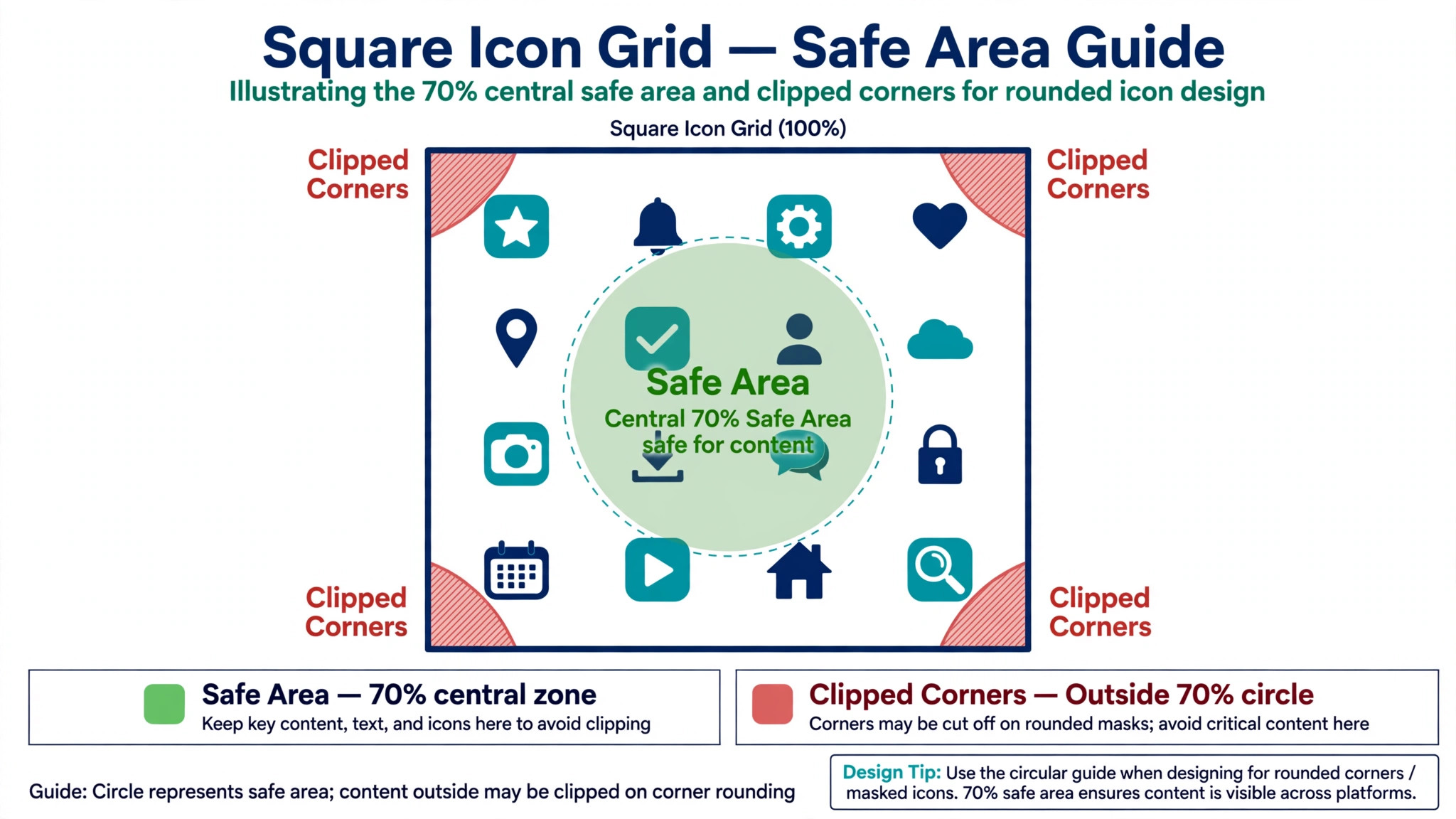
The circle crop is the fact that ruins most first icons. YouTube masks the square into a circle everywhere it shows the icon, so the four corners of your square are cut off. A logo pushed into a corner, a face near the top edge, or text running to the side will be clipped. Keep everything important inside the central 70 percent of the square, with clear padding on all four sides, and the crop will never hurt you.
Face or Logo, Pick One and Commit
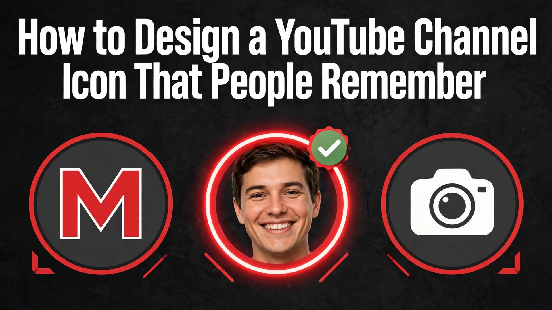
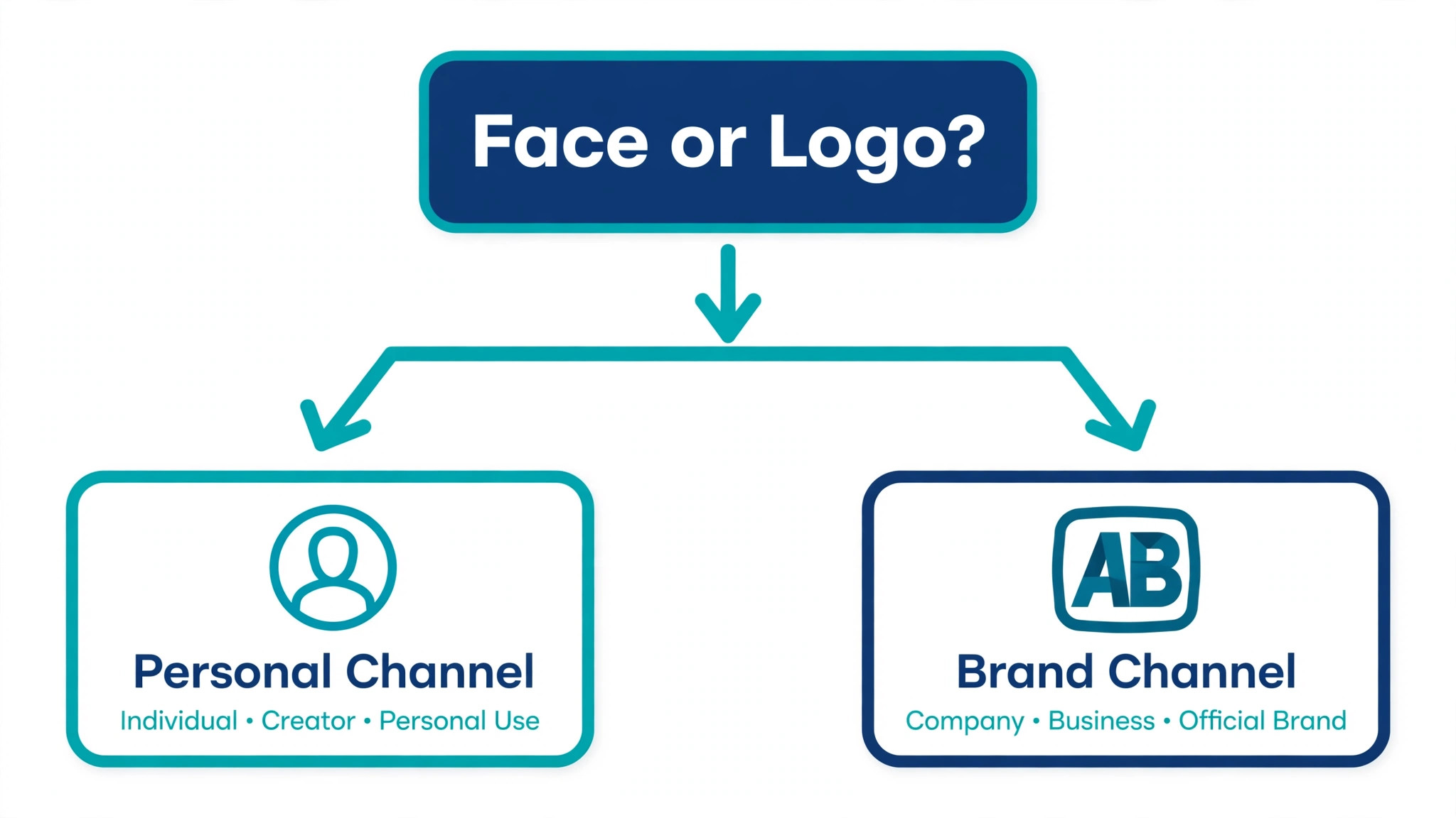
The first decision is what the icon shows, and there are only two good answers. A clear face works best for a personal channel, a vlog, a gaming channel built on a personality, or any channel where you are the product. A bold logo mark works best for a brand, a faceless channel, a tutorial channel, or any channel where the topic matters more than the person. Pick the one that matches your channel, and do not mix them. A small face next to a small logo is two ideas fighting in a space built for one.
A face icon needs a close crop, good light and a plain background. Use a head and shoulders shot, not a full body photo, and crop in tight so the face fills most of the circle. A smile helps, because a face that looks friendly earns more clicks in comments than a face that looks serious. Avoid sunglasses, hats that shadow the eyes, and busy backgrounds. The background should be one solid colour or a soft blur, never a street scene or a crowded room.
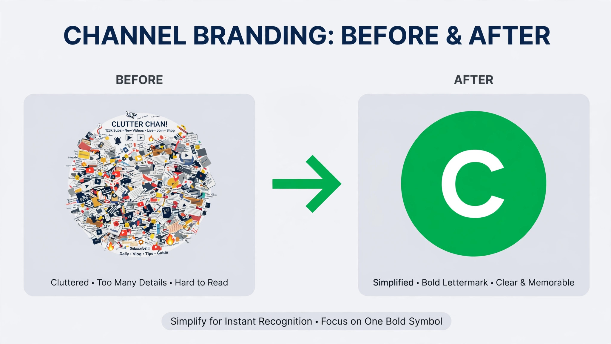
A logo icon needs a single mark, not a full wordmark. Your full channel name in small type will be unreadable at 98 pixels, so do not try to fit it. Use the symbol part of your logo, or a monogram of one or two letters in a bold font. The mark should fill the circle with padding around it, and it should read clearly in one colour. If your logo has thin lines, fine detail or a gradient, simplify it for the icon. A flat version of your mark will beat a detailed version every time at small size.
Tools That Make the Job Easy
You do not need professional software to make a good icon. A free design tool and a square canvas will do the job, and most of the tools below have a YouTube icon template built in. Pick the tool you already know, because learning new software for a one hour job is a waste of the hour.
| Tool | Cost | Best for |
|---|---|---|
| Canva | Free, Pro paid | Templates and fast results |
| Adobe Express | Free, Premium 9.99 dollars a month | Quick logo based icons |
| Looka | Free to generate, paid to download logos | A full logo to start from |
| Photopea | Free in the browser | Precise editing without installing anything |
| Figma | Free for individuals | Vector marks and exact control |
| Remove.bg | Free with limits | Cutting a face or product off a background |
Canva is the fastest route for most people. Open a custom 800 by 800 design, search the logo templates, pick a bold mark, change the colours to your brand, and export as PNG. Its free plan is enough for this job, and its background remover sits on the paid plan. Adobe Express is close behind, with a simpler editor and good typography. Looka is worth a look if you have no logo at all, because it generates logo options from a short questionnaire and you can use the mark it makes as your icon.
Photopea is the pick if you already have a logo file and need to clean it up. It runs in the browser, opens PSD and PNG files, and lets you crop, resize and export without installing anything. Figma is the pick if you want a vector mark that stays sharp at any size, and its free plan covers individual use. Remove.bg is a useful helper for face icons, since it cuts a person off a messy background in seconds and leaves a clean cutout you can place on a solid colour.
Step 1, Sketch Three Ideas on Paper First
Do not open the design tool first. Take a piece of paper and draw three rough ideas in circles, not squares, because the circle is the shape your audience will see. One idea should be your logo mark alone. One should be a monogram of your initials. One should be a simple symbol for your topic, such as a camera for a film channel or a dumbbell for a fitness channel. Spend ten minutes on this step. It will save you an hour of clicking through templates.
Show the sketches to one honest person and ask which one they remember after ten seconds. Memory is the test that matters, not beauty. A pretty icon that nobody remembers is a failure. A plain icon that people recognise is a success. The sketch that wins the memory test is the one to build, even if it is not the one you liked most.
Keep the sketch simple enough to draw from memory. If you cannot redraw your own icon in ten seconds, it is too detailed. The best channel icons in the world are all simple enough for a child to copy. A single letter, a single shape, a single face. That simplicity is what survives the shrink to 98 pixels.
Step 2, Build on an 800 by 800 Square Canvas
Open your tool and set the canvas to 800 by 800 pixels. Do not start from a rectangle and crop later, because the crop will shift your layout. Do not start from a tiny image and stretch it, because the stretch will blur the edges. Start square, stay square, and export square.
Place a circle guide on the canvas if your tool allows it. In Canva, add a circle frame the size of the canvas and design inside it. In Figma or Photopea, draw a circle the same size as the canvas and use it as a guide layer. Everything important must sit inside that circle, and the corners of the square must hold nothing but background colour. If your tool has no circle guide, imagine a circle touching the middle of each edge and keep your mark inside it.
Fill the background with a solid colour, not a photo and not a gradient that shifts across the square. A solid background makes the icon read as one object in a feed full of thumbnails. Your brand colour is the obvious choice, but a high contrast colour works too. A dark mark on a bright background, or a bright mark on a dark background, will stand out against both the light and dark themes of YouTube.
Step 3, Keep Everything Inside the Safe Area
The safe area is the central 70 percent of the square, and it is the only part of your design that is guaranteed to survive. YouTube crops the square to a circle, and the circle touches the middle of each edge. Anything in the corners is gone. Anything near the edge risks being clipped by the curve, so leave a margin of about 15 percent of the width on each side.
Test the safe area before you export. Shrink the design to a small size on screen, or hold your phone at arm’s length and look at it. If the mark still reads clearly, the safe area is respected. If the mark feels cramped against the edge, add padding. Padding is not wasted space. It is the breathing room that keeps a circle crop from eating your design.
Text is the most common victim of the safe area. A word that fits nicely in the square will lose its first and last letters to the circle. If your icon must carry text, use no more than two or three characters, use a bold font, and centre them with generous space. A single letter in a heavy weight will always beat a full word in a light weight at this size.
Step 4, How to Design a YouTube Channel Icon That Survives Dark Mode
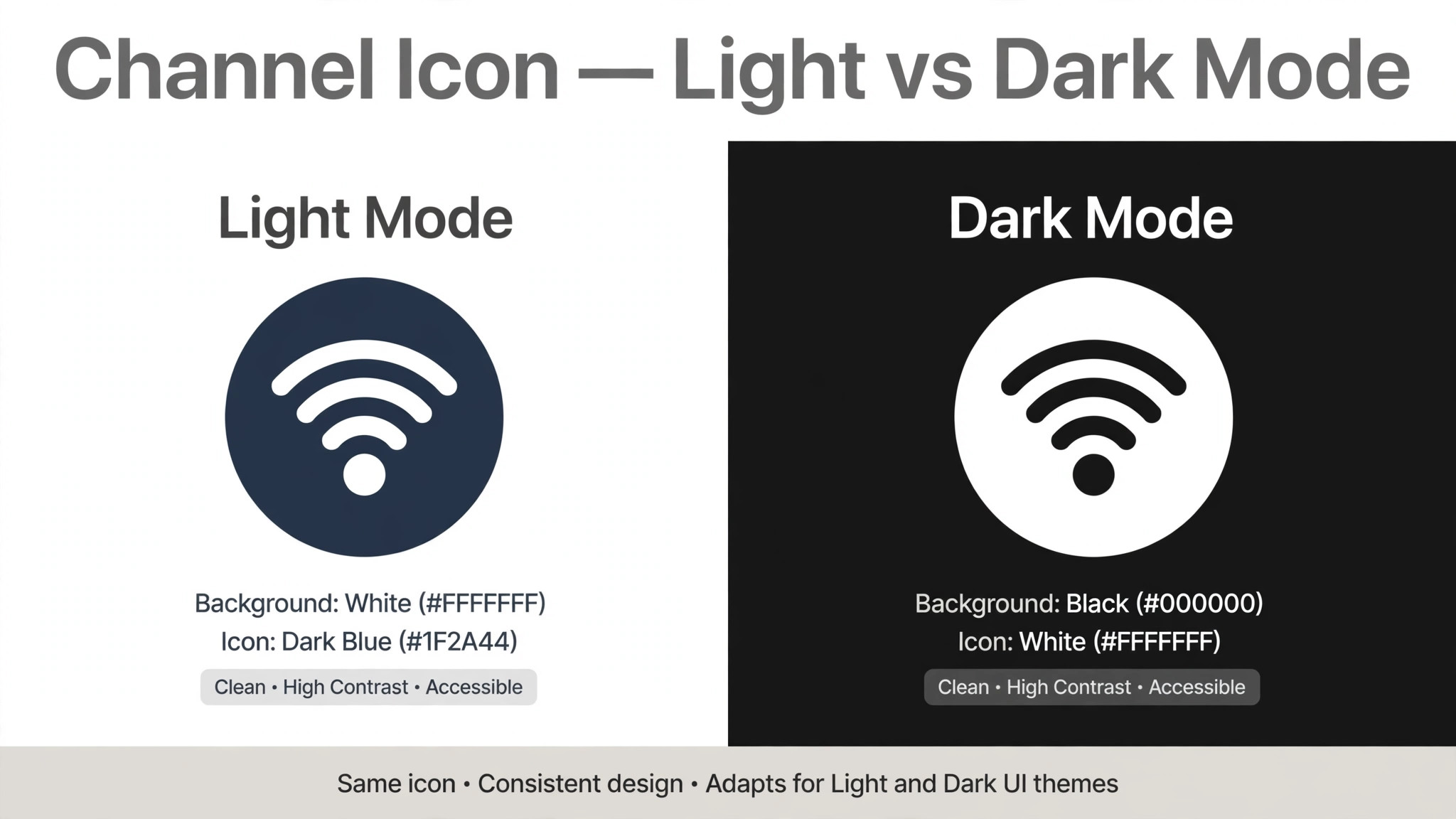
YouTube viewers use both light and dark themes, and your icon must work on both. A dark blue mark on a black background will vanish in dark mode. A pale yellow mark on a white background will vanish in light mode. Test your icon on both backgrounds before you upload, and pick a combination with strong contrast on each.
Two or three colours is the right limit. One background colour, one mark colour, and one accent if you need it. More colours make a small image noisy, and noise is the enemy at 98 pixels. Your channel colours should match your banner and your thumbnails, so the three images feel like one brand. If your thumbnails are red and black, your icon should not be green and purple.
Colour also carries meaning, and you should use that. A fitness channel in energetic red reads differently from a finance channel in calm navy, and viewers pick up that signal before they read a word. Pick colours that match the feeling of your videos, not just colours you like. Then keep them. Changing colours every few months resets the recognition you have built.
Step 5, Test the Icon at Real Size Before You Commit
This is the step most creators skip, and it is the step that catches the most mistakes. Export your icon, then view it at 98 pixels, which is the size it will appear in comments. If you cannot tell what it is at that size, it is not finished. Zoom out, not in. Designing at full size on a large monitor hides problems that only appear when the image shrinks.
Run three quick tests. First, place the icon next to three other channel icons in a row and ask whether yours stands out or blends in. Second, show it to someone for three seconds, hide it, and ask them to describe it. If they cannot, simplify it. Third, view it on a phone in both light and dark mode, in the feed and in comments. If it passes all three tests, it is ready. If it fails one, fix that one thing and test again.
A useful trick is to print the icon at the size of a coin and stick it on a wall. If you can recognise it from across the room, it will survive the feed. This sounds crude, and it works, because it forces you to judge the design at the size your audience will actually see it.
Real viewers are the best test of how to design a youtube channel icon well, because they have no attachment to your sketch. Show the icon to three people who have never seen your channel, next to three icons from channels in your niche, and ask which one they would click. Their answers will tell you more than any design rule. If your icon loses to a plain letter on a coloured square, the plain letter is the better design, and you should borrow its simplicity rather than defend your detail.
Step 6, Export the File the Right Way
Export as PNG for the best quality, especially if your icon has text or sharp edges. JPG is fine for a photo based face icon, and it will make a smaller file, but it softens crisp lines and adds artefacts around text. PNG keeps edges clean, and at 800 by 800 pixels the file will still be well under the 15 MB limit. If your PNG is somehow larger than a few megabytes, check that you have not exported at four times the size by accident.
Name the file clearly, such as channel icon 2026, so you can find it again when you need to update it. Keep a copy of the editable source file, not just the export. In six months, when you want to change the background colour or fix the spacing, you will want the layered file, not a flat PNG that you have to rebuild from scratch. Store both files in the same folder as your banner and thumbnails.
Do not export with a transparent background for the channel icon. YouTube renders transparency as white in some places, which looks broken on dark channel themes and in dark mode. A solid background colour is safer, and it makes the icon look deliberate rather than unfinished. Save transparency for the video watermark, which is a different image with different rules.
Step 7, Upload the Icon in YouTube Studio
Uploading takes two minutes, and the path is the same on desktop. Open YouTube Studio, go to Customisation, then Branding, and find the profile picture section. Click Change, pick your 800 by 800 file, and adjust the crop in the editor that appears. YouTube lets you drag the crop box, so centre your mark and leave the padding you designed. Save, and the new icon appears across the channel.
Check the result in three places before you call it done. Look at your channel page, where the icon shows largest. Look at one of your videos, where it sits next to the subscribe button. Look at a comment you have left, where it shows smallest. If it reads clearly in all three places, the upload worked. If it looks wrong in one place, the crop or the safe area is the cause, not the file.
The change can take a few minutes to appear everywhere, because YouTube caches images. If the old icon still shows on your phone, wait and check again rather than uploading the file twice. Uploading twice does not speed anything up, and it can leave you unsure which file is live.
Step 8, Check the Icon Everywhere It Appears
Your icon appears in more places than you think. It shows in search results next to your channel name, in the subscription feed, in notifications on a phone, in the comments under other people’s videos, and in the small circle on a smart TV. Each of these is a different size and a different background, so check the icon on a phone, a laptop and a TV if you can. A mark that works on a laptop can fail on a TV, where the icon sits on a dark background at a distance.
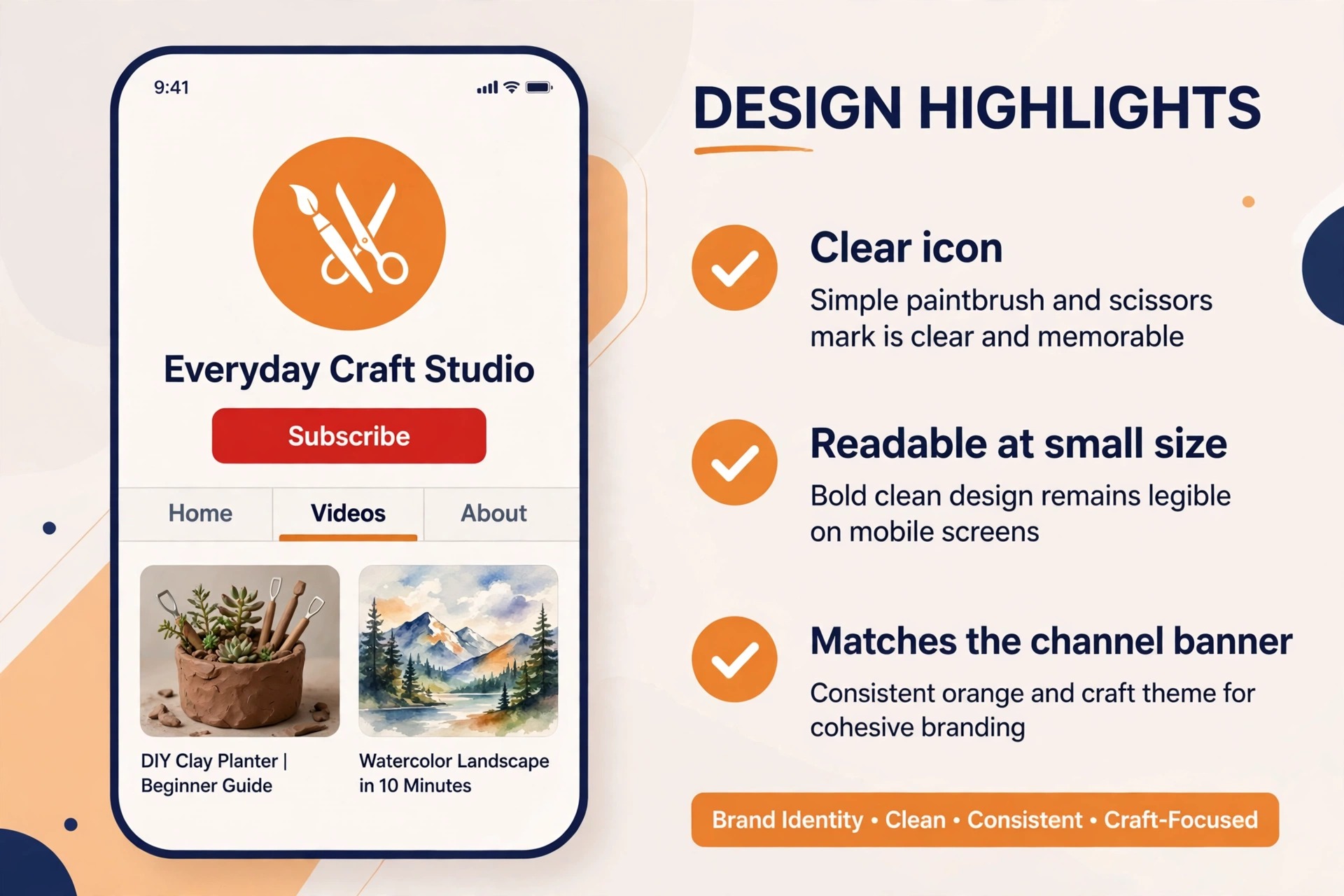
Ask a friend to find your channel in search and tell you whether the icon helped them spot it. That is the real test. An icon that helps a stranger find you in a list of similar names is doing its job. An icon that looks nice in your design tool but blends into the search results is not. If it blends in, raise the contrast, simplify the mark, or change the background colour until it stands out.
Do not change the icon again for at least six months unless something is genuinely broken. Recognition builds slowly, and every change restarts the clock. Viewers who learned your old icon need time to learn the new one, and during that time they will scroll past your videos without recognising them. A good icon is a long term asset, not a fashion choice.
Which Icon Style Fits Your Channel
| Channel type | Best icon style | Why it works |
|---|---|---|
| Personal vlog | Close face photo | Viewers subscribe to a person |
| Gaming | Bold symbol or mascot mark | Reads fast in a busy feed |
| Tutorial or how to | Monogram or simple symbol | Looks professional and calm |
| Brand or shop | Logo mark on a solid colour | Matches the shop and the packaging |
| Music | Single letter or abstract mark | Works across albums and videos |
| News or commentary | Face or bold initial | Trust comes from a visible person |
The table above is a starting point, not a rule. A gaming channel with a strong host can use a face, and a tutorial channel with a famous teacher can do the same. The pattern to follow is the one your audience already trusts. If your viewers come for you, show your face. If they come for the topic, show the mark. When you know how to design a youtube channel icon around that one decision, the rest of the choices get easier.
Mistakes That Ruin a Good Icon
The first mistake is using a full wordmark. Your channel name in small type will be unreadable at 98 pixels, and YouTube already shows your channel name next to the icon, so the text adds nothing. Use the mark or the initial, and let the name do its own job in text.
The second mistake is detail. When you learn how to design a youtube channel icon, remember that a detailed illustration, a thin outline, a small object in the corner, or a photo with a busy background will all collapse into noise when the icon shrinks. Remove one element at a time until the icon still works with nothing left to remove. That is the point where the design is finished.
The third mistake is low contrast. A mid grey mark on a mid blue background looks fine on a large monitor and invisible on a phone. Push the contrast further than feels comfortable. The icon will be seen at a small size, on a moving feed, by people who are not looking for it. It needs to shout, not whisper.
The fourth mistake is copying a famous channel. A similar colour, a similar letter, or a similar shape will confuse viewers and can look like impersonation. Your icon should be yours. If a viewer can mistake your icon for another channel at a glance, change it. Originality is not just honest, it is practical, because a distinct icon is easier to remember.
Frequently Asked Questions
What size should a YouTube channel icon be?
The first rule of how to design a youtube channel icon is size. Upload a square image at 800 by 800 pixels. YouTube renders it at 98 by 98 pixels in comments and larger on your channel page, and the 800 pixel upload stays sharp in both places. The file can be JPG, GIF, BMP or PNG up to 15 MB, with no animated GIFs. Keep the important parts inside the central 70 percent so the circle crop never clips them.
Can I use a photo of my face as my channel icon?
Yes, and it is the best choice for a personal channel. Use a close head and shoulders crop with good light and a plain background, so the face fills most of the circle. Avoid full body photos, busy backgrounds and sunglasses. A clear friendly face is easier to recognise in a feed than any logo, and it builds trust faster.
How do I change my YouTube channel icon?
Open YouTube Studio, go to Customisation, then Branding, and use the Change button under the profile picture. Upload your new square file, adjust the crop in the editor, and save. That upload is the last practical step of how to design a youtube channel icon. The new icon can take a few minutes to appear everywhere, so wait before you upload the file a second time. The old icon may still show on some devices until the cache updates.
Should my icon match my banner and thumbnails?
Yes. Use the same two or three colours and the same mark across the icon, the banner and the thumbnails, so the three images feel like one brand. A viewer who recognises your icon will also recognise your thumbnails, and that recognition is what turns a casual viewer into a subscriber. Consistency across the three images matters more than any single design choice.
Why does my icon look blurry on YouTube?
The usual cause is uploading a small image and letting YouTube stretch it. Upload at 800 by 800 pixels or larger, export as PNG for sharp edges, and check that you did not export a thumbnail sized copy by mistake. A second cause is a busy design with thin lines, which blur when the icon shrinks. Simplify the mark and the blur will often disappear.
How often should I change my channel icon?
As rarely as possible. A good icon should last at least a year, because recognition builds slowly and every change restarts it. Change the icon only when the channel changes direction, when the old design is genuinely broken, or when the brand itself is redesigned. A small refresh of colours is safer than a full redesign, because viewers will still recognise the shape.
The Verdict
A memorable channel icon is a bold mark or a clear face, built square at 800 by 800 pixels, kept inside the central safe area, and tested at the tiny size your audience will see. That is the whole method. If you follow the steps in this guide, you will know how to design a youtube channel icon that survives the circle crop, reads clearly in comments, and stays recognisable for a year. Build three sketches, pick the one people remember, test it small, and then leave it alone and let it work.