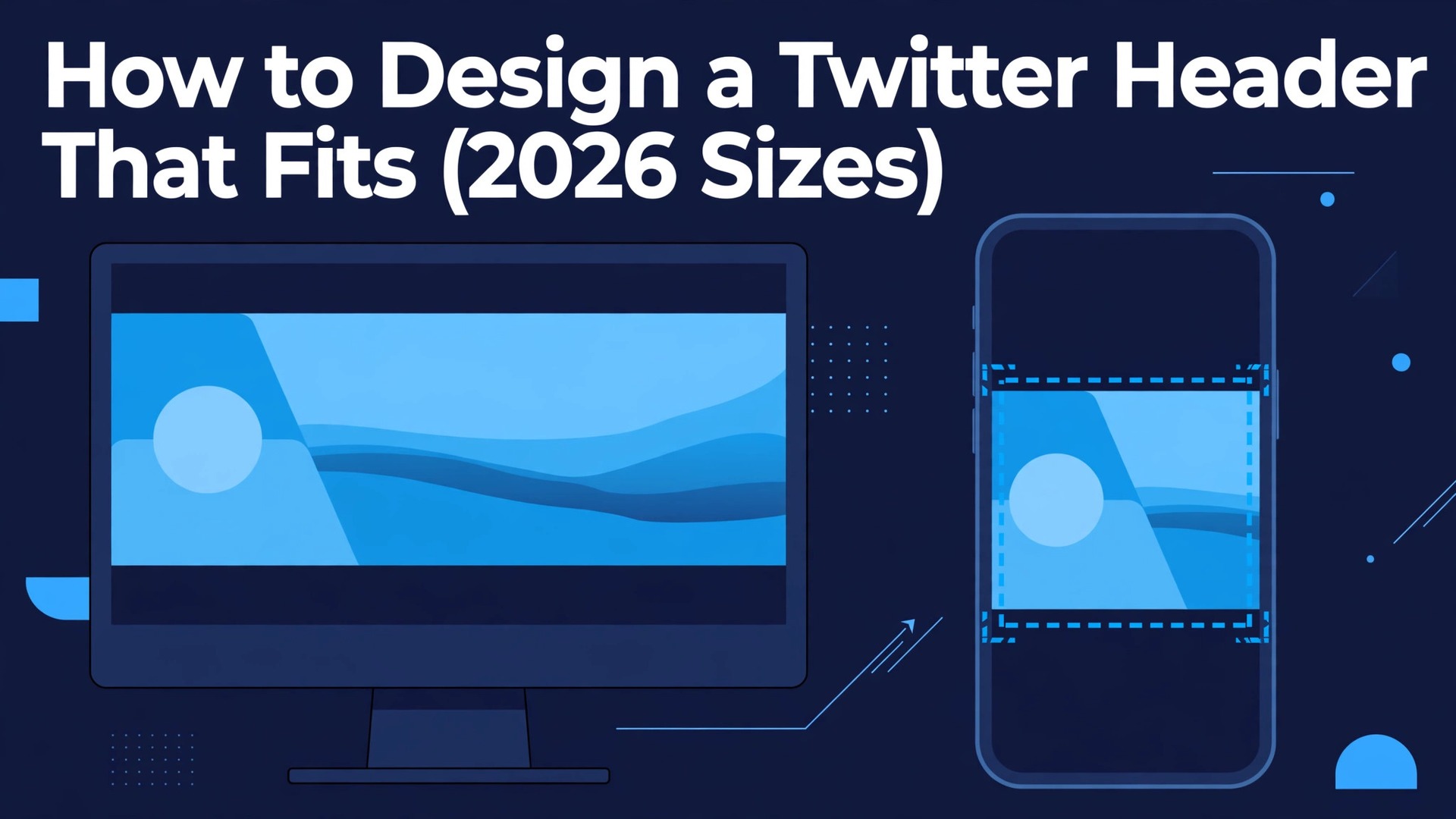
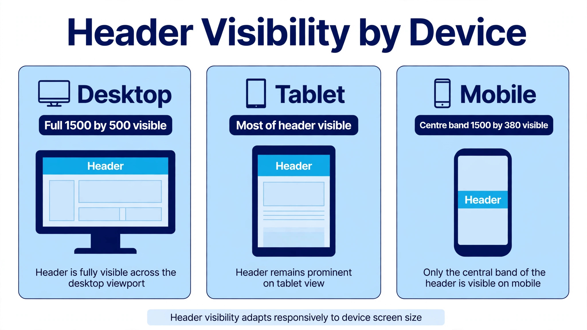
A header designed on a laptop and a header seen on a phone are two different images. On desktop, your 1500 by 500 banner shows in full. On mobile, the sides get cropped, the top and bottom lose about 60 pixels each, and your round profile photo covers the lower left corner. Most headers fail because they were designed for the desktop view and never checked anywhere else. Learning how to design a twitter header that fits means designing for the smallest, most cropped view first, and letting the desktop version take care of itself.
The numbers are simple, and they have been stable for years. The upload size is 1500 by 500 pixels at a 3 to 1 ratio, the file must stay under 5 MB, and JPG or PNG are the formats that work. The craft sits in what happens inside that frame. Keep the important content in the centre, leave the lower left clear for your avatar, and use text so large that it survives being shrunk to the width of a phone screen.
The Exact Sizes for 2026
Every guide agrees on the core numbers, and the official X Help Center confirms them. The table below is the whole specification in one place.
| Item | Size |
|---|---|
| Header canvas | 1500 by 500 pixels |
| Aspect ratio | 3 to 1 |
| Profile photo | 400 by 400 pixels |
| Maximum file size | 5 MB |
| Accepted formats | JPG, PNG, GIF static only |
| Mobile visible band | About 1500 by 380 pixels |
Upload at exactly 1500 by 500 pixels. A larger file does not improve quality, because X resizes it on the server, and a smaller file gets stretched, which leaves visible compression marks on text and edges. Export in sRGB colour, because that is the colour space the platform expects, and keep the file well under the 5 MB limit so the upload does not get recompressed harder than it already will be.
The profile photo matters here too, even though it is a separate upload. It displays at 400 by 400 pixels and crops to a circle, so a square photo with the subject centred works best. A photo with text near the edges will lose that text to the circular crop, and a busy background behind a face makes the small circle hard to read.
File format is a smaller decision that still shows in the result. PNG keeps sharp edges on text and logos, and it is the right choice when the header is mostly type and flat colour. JPG compresses photographic detail more efficiently, and it is the right choice when the header is mostly a photo. GIF uploads are accepted but render as a static first frame, so they offer no benefit for a header and should be avoided.
How to Design a Twitter Header That Fits on Every Screen
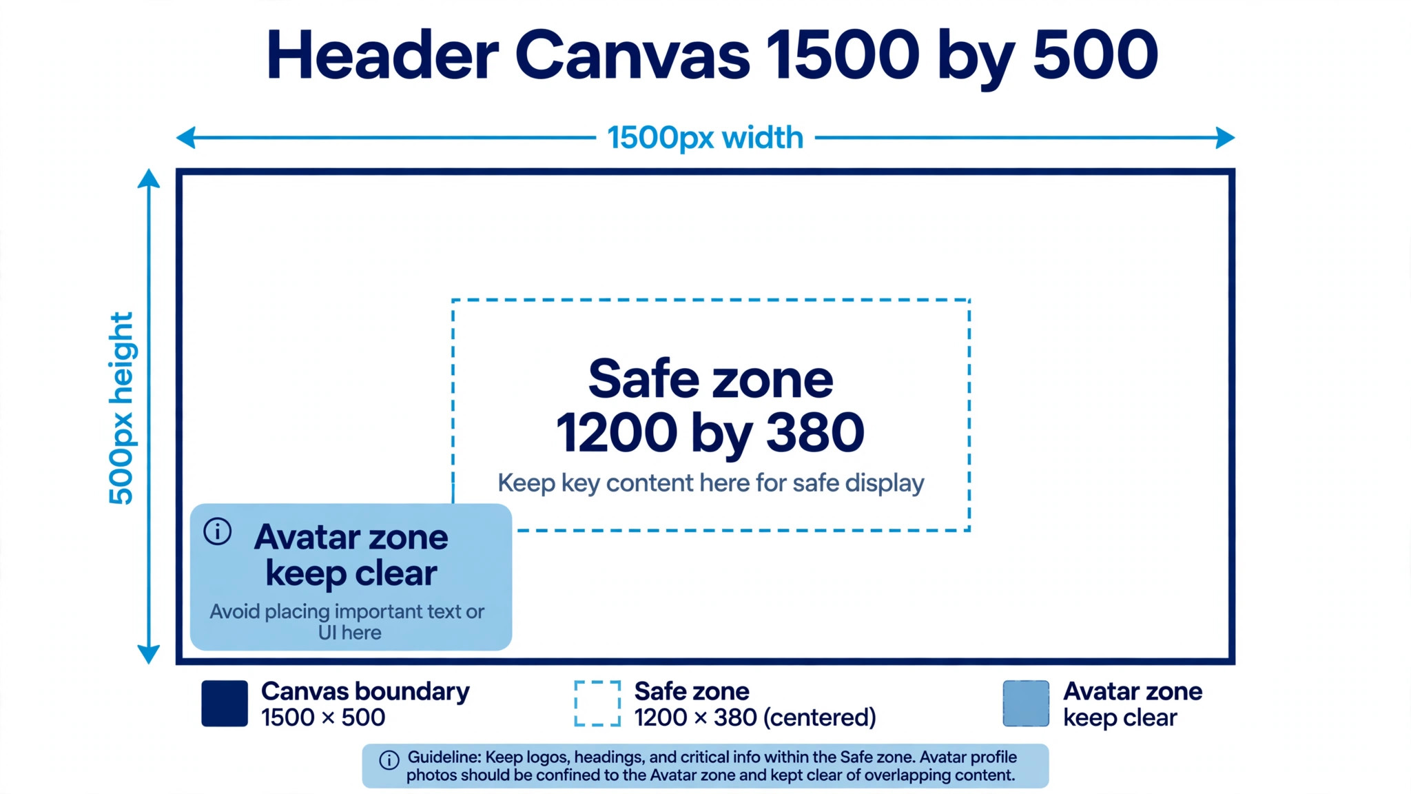
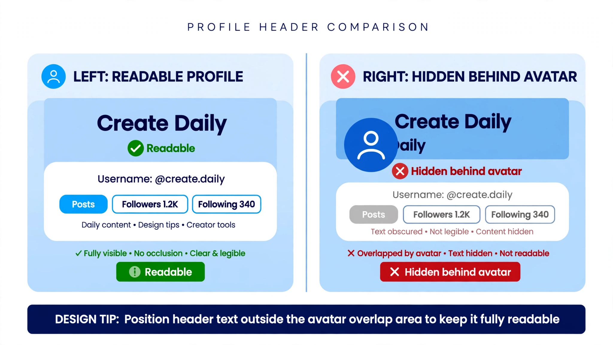
Two crops ruin headers, and both are predictable once you know them. First, X trims roughly 60 pixels off the top and 60 pixels off the bottom on narrower screens, so the visible band is closer to 1500 by 380 than to the full canvas. Second, your circular profile photo overlaps the lower left corner, covering anything you put there. Design for a centre safe zone, keep all text, logos, and faces inside the middle 70 percent horizontally and the middle 75 percent vertically, and never put anything important in the lower left.
Different guides draw the safe zone slightly differently, and the honest answer is that the exact crop varies by device and by app version. One guide recommends a centre safe zone of 1200 by 400 pixels, another recommends 1340 by 340 with 80 pixels of padding on the sides, and a third recommends a central 1100 by 380 rectangle. All three agree on the principle, which is to keep the important content in the centre and away from every edge. This guide uses the middle of that range, a centre zone of roughly 1200 by 380 pixels, with the lower left kept clear for the avatar.
Dark mode adds one more consideration. Most active users browse in dark mode, and the X dark background is a near black shade. If your header has dark edges, they blend into the background and the header looks smaller than it is. Add a subtle light border or make sure the design has contrast at every edge, so the banner reads as a deliberate shape rather than a floating image.
How to Design a Twitter Header Step by Step
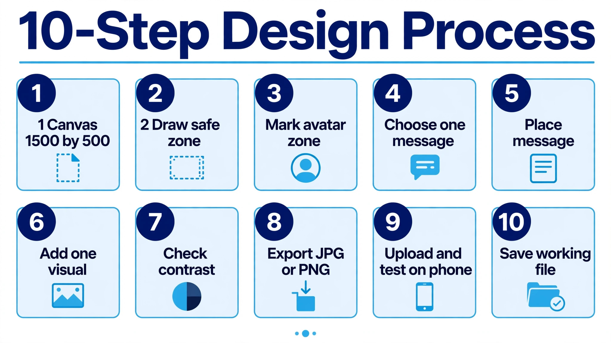
The workflow below works in any design tool, and it takes about an hour from a blank canvas to a finished upload. Follow the steps in order, and check the result on a phone before you publish it.
- Open a new canvas at exactly 1500 by 500 pixels, in sRGB colour, at 72 dots per inch. Name the file clearly and save a working copy before you add anything, so you can return to the clean canvas later.
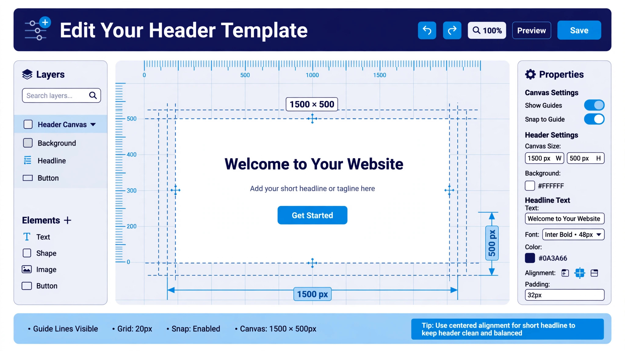
- Draw a guide box in the centre of the canvas at 1200 by 380 pixels, and treat it as your working area. Everything important lives inside this box, and everything outside it is decoration that may be cropped on some screens.
- Mark the lower left avatar zone as off limits. Reserve a box about 400 pixels wide by 200 pixels tall in the lower left corner, and keep it empty of text, logos, and faces.
- Choose one message for the header, in five words or fewer. A header is a visual element, not a billboard, and small text becomes unreadable on mobile, where the header renders at roughly 750 by 210 CSS pixels. One short phrase beats a paragraph every time.
- Place the message in the centre of the safe zone, in type large enough to read at a glance. Test the size by zooming out until the canvas is the width of a phone screen, and if you cannot read it instantly, make it bigger.
- Add one visual element that supports the message, such as a product screenshot, a photo, or a simple illustration. Keep it to the right side of the canvas, away from the avatar zone, and keep the left side clean.
- Check the colour contrast against both light and dark backgrounds. Preview the design on a dark background, because most viewers will see it there, and adjust the colours until the text reads clearly on both.
- Export two versions, a JPG for photographic designs and a PNG for designs with sharp text or a transparent logo. Compare the file sizes, and keep the final file well under the 5 MB limit.
- Upload the header from a desktop browser, then open your profile on a phone and on a tablet. Check the text, the avatar overlap, and the edges, and fix anything that is cropped before you call the job done.
- Save the working file with the guides and layers intact, and note the date you published it. A saved working file turns a future update into a ten minute edit instead of a full redesign.
What to Put in Your Header
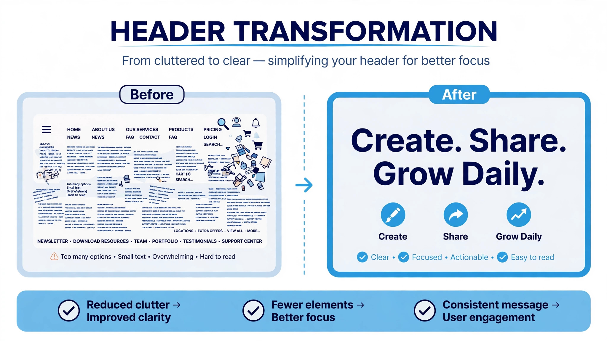
A header has one job, which is to tell a visitor what you do and why they should stay, in the two seconds before they scroll. Everything in the frame should serve that job, and anything that does not should be removed.
The strongest headers answer three questions without a single extra word. Who is this person, what do they do, and what will I get by following them. A founder header shows the product and a short value statement. A creator header shows the topic and the schedule, such as a weekly newsletter or a daily post. A business header shows the service and the proof, such as a result or a customer count. Pick the version that fits your account, and keep the other two ideas for the bio, where text belongs.
Photos work when they are wide and simple. A wide photo, a panorama, or a wide shot of a workspace fills the 3 to 1 frame naturally, because the frame is already the shape of a wide photograph. Portrait photos fail in this frame, because the crop removes the subject and leaves the edges. If you use a photo, pick one with a clear subject in the centre and empty space on the sides, and check it on a phone before you commit.
Text works when it is short and large. Three to five words in a bold typeface, placed in the centre of the safe zone, will be read by almost every visitor. A sentence in small type will be read by nobody, because the header renders too small on mobile for anything below a large headline size. If the message needs more words than the header allows, the message belongs in the bio, and the header should carry only the hook.
Colour does as much work as text, and it does it faster. A single strong background colour in your brand palette makes the profile recognisable at a glance, while a busy photograph behind small text makes both unreadable. If you use a photo, darken it slightly or add a soft overlay behind the text, so the words stand apart from the image. Test the result on a phone, because contrast that looks fine on a large monitor often fails at the size where visitors actually see it.
Header Ideas for Different Accounts
The same sizes fit every account, but the content should change with the audience, because a founder, a writer, and a shop are selling different things. The guidance below shows how to design a twitter header that fits the account behind it, rather than copying a layout built for someone else.
A personal account works best with a photo and a line of text that states the topic. The photo makes the account feel human, and the line tells a visitor what to expect, so the combination covers both trust and clarity in one frame. Keep the photo in the centre, keep the text short, and leave plenty of empty space, because a personal header that looks crowded feels like an advertisement rather than a person.
A business account works best with proof. A product screenshot, a result, or a customer count gives a visitor a reason to believe the claim in the text, and the header becomes evidence rather than decoration. Use the brand colours, keep the layout simple, and make sure the logo sits inside the safe zone, where the avatar cannot cover it.
A creator account works best with a schedule. A line that states the topic and the rhythm, such as a weekly post on a single subject, tells a visitor exactly what following will deliver. The background can be a strong brand colour with no photo at all, because the promise is the design. Keep the type large, keep the words few, and let the consistency of the schedule do the work that a busy image cannot.
A job seeker account works best with a role and a skill. A line that names the role and the strongest skill, set against a plain background, tells a recruiter what the account is for in a single glance. Avoid jokes, avoid clutter, and avoid anything that needs explaining, because a recruiter spends seconds on a profile and the header must survive that test.
The Best Tools for the Job
You do not need professional software to make a good header, and the tool you already know is usually the right one. The four tools below cover every skill level, from a first header in ten minutes to a fully custom design.
1. Canva
Canva is the fastest route to a finished header, and it is the tool most beginners should start with. Open a new design at 1500 by 500 pixels, or search for the Twitter header template, and you get a canvas with the size already set, plus a library of templates built for exactly this frame. Pick a template, replace the text and the photo, and export.
The free plan covers the basics, including templates and JPG and PNG export, and Canva Pro costs 144 dollars a year for one person, which unlocks premium templates and tools. The risk with Canva is a header that looks like every other Canva header, so change the colours, the typeface, and the layout before you publish, and do not ship the template untouched.
Canva suits creators, small businesses, and anyone who needs a good header today. The template library is the reason to use it, and the customisation is the reason the result can still look like yours.
2. Figma
Figma is the best tool when the header must match a brand system exactly. It is a browser based vector editor with a free tier, and it gives you precise control over guides, spacing, typography, and colour. Set up a 1500 by 500 frame, draw the safe zone guides, and design inside them with the same components and colours you use for the rest of the brand.
Figma exports PNG and JPG at multiple scales, and the file stays editable, so a future update is a small edit rather than a rebuild. The learning curve is steeper than Canva, and there are no ready made header templates built in, so it suits designers and teams rather than first time users.
Choose Figma when the header is part of a larger brand, and when the same design needs to appear consistently across a website, a presentation, and a social profile. The precision is worth the extra time.
3. Photoshop
Photoshop is the tool for photographic headers, where the image needs retouching, compositing, or careful colour work. Create a new document at 1500 by 500 pixels, 72 dots per inch, in sRGB, add guides at 80 pixels from the left and right edges, 60 pixels from the top, and 100 pixels from the bottom, and the safe zone is marked before you start.
Photoshop handles the details that simpler tools cannot, such as removing a background, blending two photos, or adjusting the light so the text reads over the image. It is a subscription product with no free tier for the full application, and it is slower than Canva for a simple text header, so use it when the photo is the design and the quality of the image matters most.
Photoshop suits photographers, agencies, and anyone whose header is built around a photograph that needs real editing before it can be published.
4. Adobe Express
Adobe Express is the quick option for a simple header with text and a template, and it suits users who already work with Adobe tools. It offers an online editor with a free plan, header templates at the right size, and fast export to JPG and PNG. The workflow is template led, so a finished header takes minutes rather than an hour.
The limits match the speed. Adobe Express gives you less control than Figma or Photoshop, and the results suit simple designs better than complex ones. Premium pricing is listed on the Adobe site and varies by region, so check the current page before you commit to a paid plan.
Choose Adobe Express when you need a clean header fast and you do not need pixel level control. For a brand critical header, use Figma or Photoshop instead.
Testing Your Header Before You Publish
A header that has never been tested is a guess, and the test takes five minutes. Upload the header, then open your profile on a phone, on a tablet, and on a desktop browser, and look at each version as a stranger would. Check the text first, then the avatar overlap, then the edges, and note anything that is cropped, hidden, or hard to read.
The phone test matters most, because most visitors arrive on a phone. Open the profile in the app, not in a browser, because the app crops differently and the avatar sits in a slightly different place. Scroll the profile up and down, and watch how the header behaves as the page moves, because the banner shifts under the profile information in ways a static preview cannot show.
Ask one other person to look at the header for five seconds and tell you what the account does. If they answer correctly, the header works. If they hesitate, the message needs to be shorter or larger. This test is the fastest way to learn how to design a twitter header that survives contact with real viewers, because it replaces your judgement with theirs, and their judgement is the one that decides whether they follow.
Keep a copy of the test screenshots with the working file, so the next update starts from evidence rather than from memory. A header that passed the test last time is a known good starting point, and a header that failed it is a record of what not to repeat.
Three Layout Formulas That Work
Different accounts need different headers, and three formulas cover most of them. Pick the one that matches your account, and adapt the details rather than inventing a fourth layout from scratch.
The founder formula splits the canvas into two sections. The left 35 percent stays clean and uncluttered to make room for the avatar, and the right 65 percent shows a crisp screenshot of a dashboard, a product, or an app, paired with a short value statement of about six words. The screenshot proves the product exists, and the statement explains why it matters, and the clean left side keeps the whole design calm.
The creator formula centres everything. One short line of text in the middle of the safe zone, a simple background in a strong brand colour, and nothing else. The topic is the message, and the schedule is the proof, so a line such as a weekly post about a single topic tells a visitor exactly what following will give them. This formula works best when the creator is already known for one subject.
The business formula leads with proof. A result, a customer count, or a short testimonial sits in the centre, with the service name beside it and a plain background behind both. The proof does the persuading, and the header does not need decoration to support it. This formula suits agencies, consultants, and local businesses where trust matters more than style.
Whichever formula you pick, test it against the other two before you commit. Build all three as quick drafts, view them on a phone, and keep the one that reads fastest. The draft that wins is usually the simplest one, because a header has two seconds to work and simplicity is the only design that fits inside two seconds.
Mistakes That Make a Header Invisible
The most common mistake is designing only for desktop. The desktop view shows the full banner, and the mobile view crops it, so a header that was never checked on a phone is a header that fails where most visitors see it. Check every header on a phone before you publish, and design for the cropped view first.
The second mistake is putting text in the lower left corner. The profile photo covers that area on every device, and text placed there is hidden behind the avatar from the moment the header goes live. Keep the lower left empty, and keep the important content in the centre of the safe zone.
The third mistake is using too many words. A header with a paragraph of small text is unreadable on mobile, and visitors do not stop to decipher it. Five words or fewer, in large type, is the limit that works, and anything longer belongs in the bio.
The fourth mistake is uploading the wrong size. An image that is not close to 1500 by 500 gets cropped automatically, and X chooses what gets cut, not you. Always design at the exact size, and never trust an automatic crop with your text or your logo.
The fifth mistake is using a dark design with dark edges in dark mode. Most users browse in dark mode, and a header with dark edges blends into the background, which makes the banner look smaller and unfinished. Add contrast at the edges, or use a background colour that stands apart from the near black of the dark interface.
The sixth mistake is forgetting the file format. A PNG suits sharp text and logos, and a JPG suits photographs, and choosing the wrong one leaves either a huge file or a blurry result. Export both, compare them at full size, and ship the one that looks better at the smaller file size.
Frequently Asked Questions
How to design a Twitter header on a phone?
Start with a template app such as Canva, open a 1500 by 500 canvas, and keep all text inside the centre of the frame. Use five words or fewer in large type, leave the lower left empty for your avatar, and export as JPG or PNG. Check the result by opening your own profile on the same phone, because the preview inside the design app does not show the mobile crop or the avatar overlap.
What size should a Twitter header be in 2026?
The header should be 1500 by 500 pixels at a 3 to 1 ratio, which is the size the official X Help Center recommends. Upload JPG or PNG under 5 MB, and keep the important content inside a centre safe zone of about 1200 by 380 pixels, because mobile screens crop roughly 60 pixels from the top and bottom and your avatar covers the lower left corner.
Why does my Twitter header look blurry?
Blur usually comes from uploading a file smaller than 1500 by 500 pixels, which X stretches to fit, or from heavy recompression of a file near the size limit. Upload at exactly 1500 by 500, export in sRGB, keep the file well under 5 MB, and use PNG when the design has sharp text. A photographic header should be exported as a high quality JPG rather than a small compressed one.
Can I use an animated GIF as a Twitter header?
You can upload a GIF, but it will not animate. X renders the header as a static image, showing only the first frame, so an animated file gains nothing and usually costs quality. Use a static JPG or PNG instead, and save animation for posts, where it actually plays.
How often should I change my Twitter header?
Change the header when the message changes, such as a new product, a new offer, or a new focus, and leave it alone the rest of the time. A stable header builds recognition, because returning visitors learn to spot your profile by it. Keep the working file saved with its layers and guides, so an update takes minutes instead of a full redesign.
Does the header affect how many followers I get?
A header will not bring followers on its own, but a bad one loses them. Visitors decide in seconds whether an account is worth following, and a cropped, blurry, or empty header signals an inactive or careless account. A clear header with one message and a clean design removes that doubt, and lets the posts and the bio do the convincing.
The Bottom Line
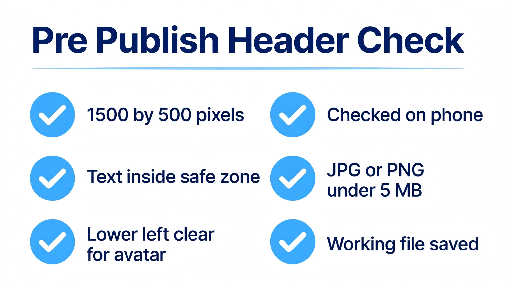
Learning how to design a twitter header that fits comes down to three habits. Design at exactly 1500 by 500 pixels, keep the important content in the centre safe zone with the lower left clear, and check the result on a phone before you publish. Pick the tool you already know, use five words or fewer, and save the working file for the next update. A header that follows those rules looks deliberate on every screen, and it tells every visitor what you do before they read a single post.