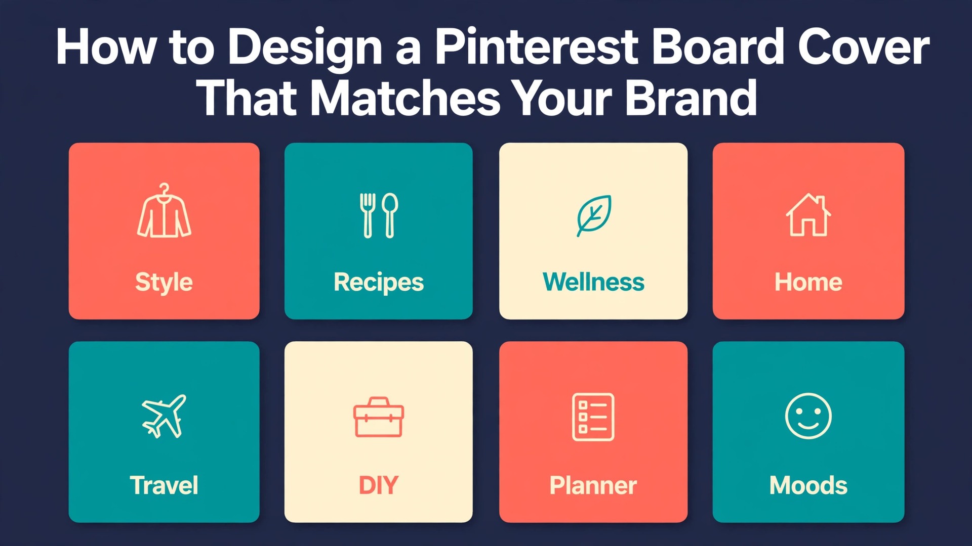
Your Pinterest profile is the first thing a new visitor judges, and right now your boards probably look like they belong to five different people. One cover is a bright product photo, the next is a dark moody pin, the third is a screenshot with tiny text, and the fourth is whatever Pinterest picked by itself. A visitor who cannot tell what you do in five seconds will leave, and that is a problem you can fix in one afternoon, because learning how to design a Pinterest board cover that matches your brand takes a template, a size, and eight careful steps, not a design degree.
This guide gives you all three. You will learn what a board cover is and how it differs from a profile cover and a header image, the size to build at, the three cover styles that work best, a brand system you can reuse, the full design workflow in Canva and Adobe Express, and the exact upload steps on desktop and iPhone, including the Android limit you need to know about. You will also find a preflight checklist, the mistakes that ruin most covers, and answers to the questions people ask most. By the end you will have a profile grid that looks planned, and a template that makes the next cover take ten minutes.
What a Board Cover Is
A board cover is the large image that represents one board when someone views your profile. It is the first image a visitor sees for that board, and it works like a shop sign, telling them what lives inside before they click. Pinterest picks a cover for you if you never choose one, usually the most recent pin on the board, which is why so many profiles look random. Choosing your own cover is the cheapest branding move on Pinterest, because it costs nothing and it changes how every board reads.
A board cover is not a separate upload. It is one of the pins already saved to that board, which you choose as the cover and crop. That single fact shapes how to design a Pinterest board cover. You cannot upload a cover directly to a board. You design a square graphic, save it as a pin to the board, and then pick that pin as the cover. If your board is empty, you cannot set a cover at all, so the first step for a new board is always to save at least one pin to it.
A board cover is also not the same as a profile cover or a header image, and mixing them up wastes time. A profile cover is the wide banner at the top of a business profile, at least 800 pixels wide and 450 tall, in a 16 by 9 ratio. A header image is a featured image at the top of a board, and Pinterest says you need at least one pin saved to the board before you can add one. A board cover is the board thumbnail on your profile grid. Keep those three separate in your head, and the rest of this guide will make sense.
The Size to Build At
Pinterest publishes no official size for a board cover, so how to design a Pinterest board cover starts with the size that independent size guides agree on, and it says so plainly where they disagree. The safe build size is 1000 by 1000 pixels, a square, which Tailwind and several 2026 size guides recommend. Other guides cite 600 by 600 pixels as the usual minimum, and both are sharp enough on screen, because Pinterest displays the cover small, under 200 pixels wide on desktop. Building at 1000 by 1000 gives you room to crop and keeps the file useful as a square pin too.
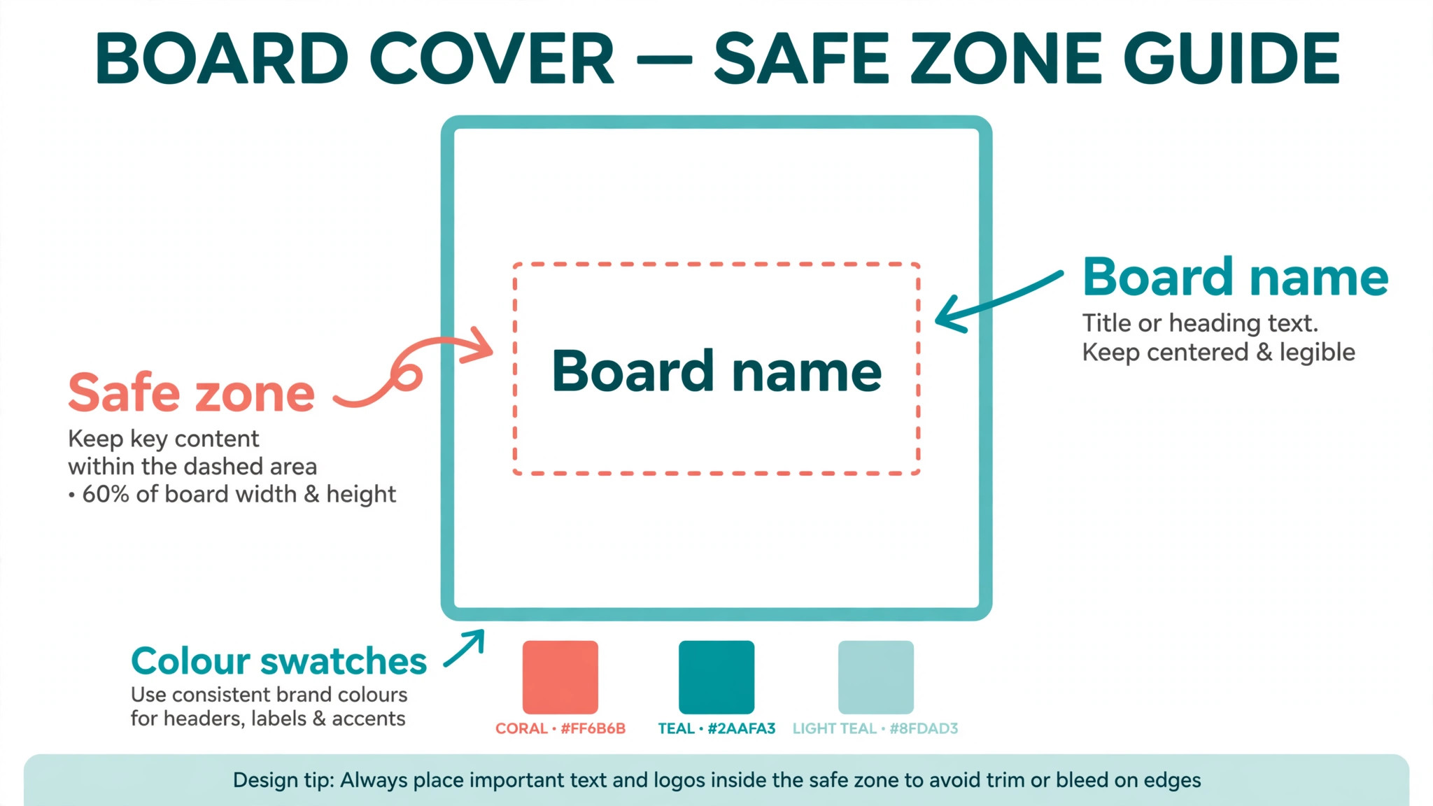
The display crop is the part most people get wrong. On a profile, Pinterest shows board covers cropped to a smaller, wider shape, so the top and bottom of a tall pin are trimmed, and on some views the cover appears as a square tile. That means the center of your design is the only safe place for text and faces. Keep the board name, the key image, and any icon inside the middle 60 percent of the square, and treat the outer edges as decoration only. A cover that looks perfect at full size and loses its title in the crop has failed at its one job.
Export as PNG for graphics with text and flat color, or JPG for photo led covers, and keep the file under 20 MB, which is the limit Pinterest cites for pins. Use a high quality export, not a compressed preview, because a soft cover next to sharp covers makes the whole profile look careless. Check the cover on a phone after you set it, because most Pinterest traffic is mobile, and a title that reads on a laptop can vanish on a small screen.
| Placement | Build size | Ratio | Note |
|---|---|---|---|
| Board cover | 1000 by 1000 | Square | Center text, edges crop |
| Board cover minimum | 600 by 600 | Square | Sharp enough on screen |
| Standard pin | 1000 by 1500 | 2 by 3 | The pin ratio, not a cover |
| Profile cover | 1600 by 900 | 16 by 9 | Wide banner, different job |
Three Cover Styles That Work
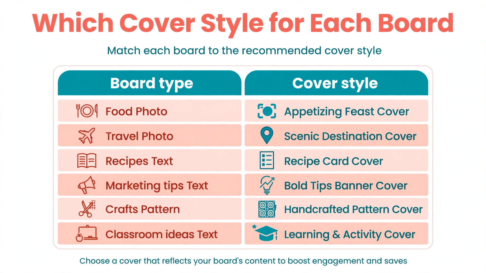
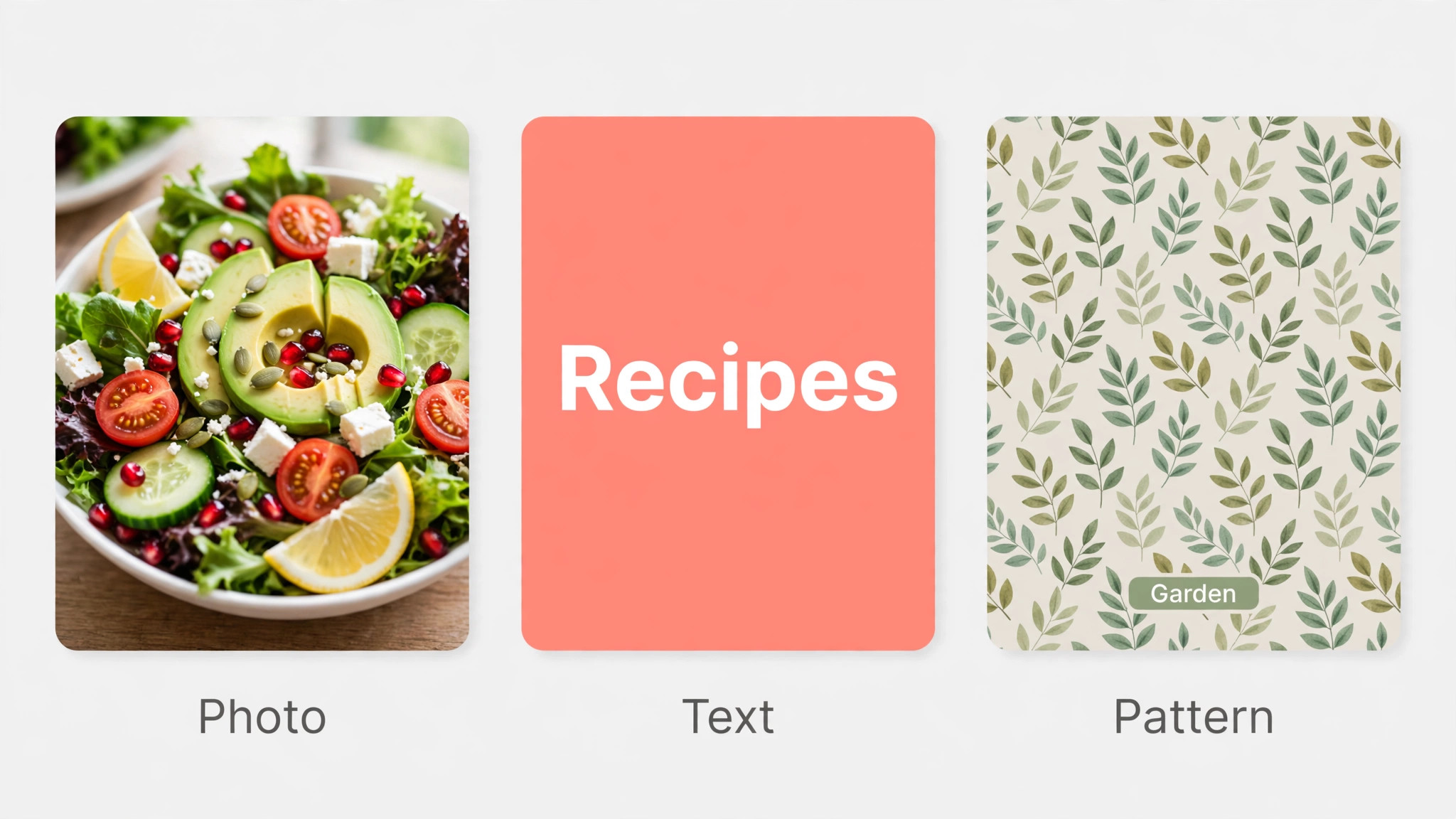
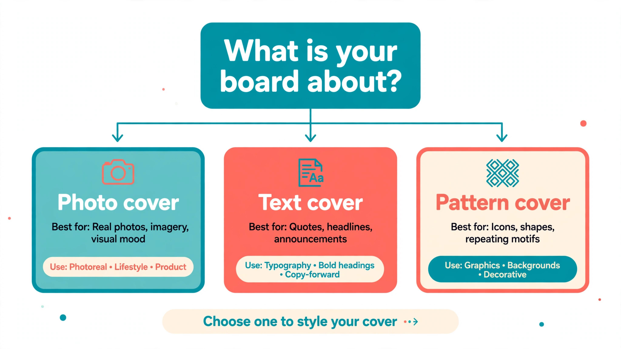
The first style is the photo cover, a single strong photograph with no text or with a small label. It suits food, travel, home, fashion, and product boards, where the image itself sells the topic. Pick the brightest, simplest photo on the board, crop it square, and add nothing, because a great photo needs no caption at the size Pinterest displays it. The risk is sameness, because ten photo covers in a row can blur together, so vary the color or the subject across boards.
The second style is the text cover, a flat color or pattern background with the board name in large type. It suits topic boards such as recipes, marketing tips, or classroom ideas, where the visitor needs to read the topic fast. Use one font, one or two colors, and type at least 120 points at 1000 pixels wide, so the name stays readable when the cover shrinks. The risk is clutter, because a long board name in small type becomes a grey smudge, so shorten names to two or three words where you can.
The third style is the pattern cover, a repeating motif, texture, or illustration with a small icon and a short label. It suits brand led profiles, craft sellers, and educators, where the pattern itself becomes the brand mark. Build one pattern tile and reuse it across boards with a different background color per board, so the grid looks unified and each board stays distinct. The risk is busyness, because a dense pattern fights the label, so keep the pattern light and the label dark, or the reverse, and never both busy at once.
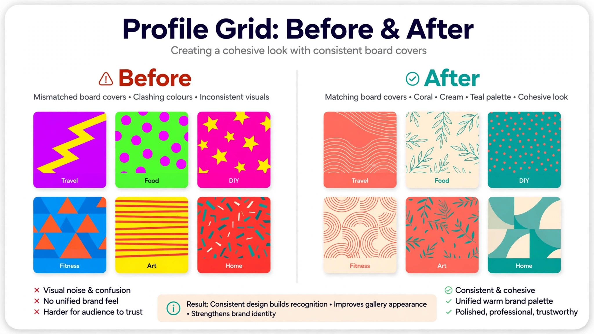
Pick one style for your whole profile and hold it. A profile with three text covers, three photo covers, and two pattern covers looks undecided, while a profile with eight covers in one style looks like a brand. If your boards fall into two clear groups, such as products and ideas, you can use one style for each group, but keep the colors and fonts identical across both, so the grid still reads as one profile.
How to Design a Pinterest Board Cover in 8 Steps
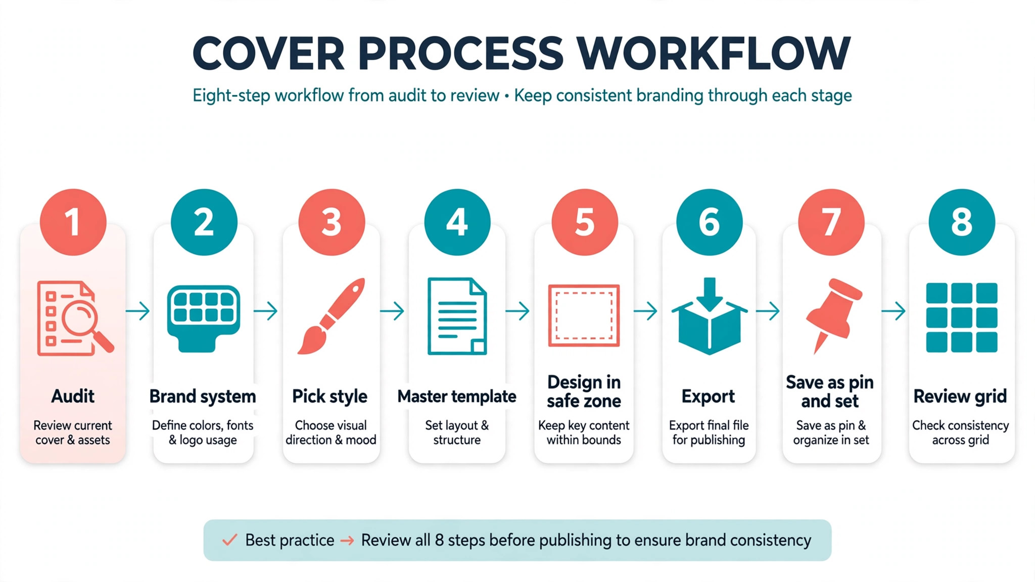
The eight steps below take you from a messy profile to a finished set of covers in one afternoon. Work through them in order, because each step depends on the one before it, and skipping the brand decisions in step two is how most covers end up mismatched.
Step 1. Audit Your Boards
Open your profile and list every board in the order a visitor sees them. For each board, write its name, its topic in five words, and whether its current cover helps or hurts. Most profiles have three problems at this stage, boards with no clear topic, boards with near duplicate names, and boards that have not been updated in a year. Merge the duplicates, rename the vague boards, and archive or delete the dead ones before you design anything, because a beautiful cover on a board nobody needs is wasted work.
Decide which boards deserve a custom cover first. Your five most visited boards and your five most important business boards come first, and the rest can follow over the next week. Finish the priority set completely before you move on.
Step 2. Define Your Brand System
Pick two colors, one font family, and one photo style, and write them down before you open any design tool. The colors should come from your website or your product packaging, not from a trend, because the covers must match the place visitors land when they click. The font should be one you already use, bold enough to read at 200 pixels wide, and the photo style should be one rule, such as bright and airy, or dark and moody, applied to every photo cover.
Save these choices as a one page brand sheet, with color codes, font names, and two example covers, and keep it where you design. Every future cover starts from this sheet, which is how the tenth cover matches the first without you remembering the exact shade of blue. If you change a color later, change it on every cover at once from the master template, not one board at a time.
Step 3. Pick One Cover Style
Choose one of the three styles from the section above, photo, text, or pattern, and commit to it for the whole profile. The choice should follow your content. Photo led businesses pick photo covers. Advice and idea boards pick text covers. Brand led shops pick pattern covers. If you truly cannot decide, pick text covers, because a readable board name helps every visitor, while a photo cover only helps when the photo is excellent.
Write the style choice on your brand sheet, with one example, and use it as a test for every cover you make. If a cover idea does not fit the chosen style, save it for a pin, not for a cover. Consistency is the whole point of a cover set, and one clever exception breaks the grid more than it helps the board.
Step 4. Build a Master Template
Open Canva or Adobe Express, create a custom design at 1000 by 1000 pixels, and build one master template from your brand sheet. Place the background, the safe zone guides, the board name text box, and the icon or photo frame exactly where they belong, and save it as your master. The safe zone is the middle 60 percent of the square, and you should mark it with guides, because anything outside it may crop on the profile grid.
Duplicate the master for each board instead of starting fresh, and change only the board name, the background color, and the photo. Duplication is the step that makes a set of eight covers take an hour instead of a day, and it is the step most people skip, which is why their covers drift. Name each copy after its board, so you can find it again when the board name changes.
Step 5. Design Each Cover Inside the Safe Zone
Design one cover per board from your duplicated template, and keep every important element inside the safe zone. Type the board name in the same size and position on every cover, place the photo or icon in the same spot, and change only the color and the image. A visitor scanning your profile should feel the rhythm, same layout, different color, different name, because rhythm is what makes a grid look designed instead of accidental.
Check readability at small size before you move on. Shrink the design to 200 pixels wide on screen, or hold your phone at arm’s length, and read the board name. If you cannot read it in two seconds, enlarge the type, shorten the name, or raise the contrast. Do this check for every cover, because a cover that reads at full size and fails at 200 pixels wide has failed where it actually lives.
Step 6. Export Each Cover Correctly
Export each cover as a PNG when it is mostly text and flat color, because PNG keeps edges sharp, and as a JPG when it is mostly a photograph, because JPG keeps the file small. Export at full size, 1000 by 1000 pixels, with the highest quality setting your tool offers, and name each file after its board, such as recipes board cover, so you can match files to boards without opening them. A clear file name prevents the common error of setting the same cover on two boards.
Check each exported file before you upload it. Open it, confirm the text is spelled correctly, confirm the colors match your brand sheet, and confirm the image is not stretched or squashed. Spelling errors on a cover are worse than spelling errors in a pin, because the cover sits on your profile permanently, and every visitor sees it. Fix errors now, not after the cover is live.
Step 7. Save the Cover as a Pin and Set It
Upload each cover graphic as a pin to its board, because Pinterest only lets you pick a cover from pins already saved to that board. Open the board, upload the pin, give it a title that matches the board, add a short description, and save it. Link the pin to your website or to the board itself where that makes sense, and repeat for each board in your priority set before you move to the setting step, so you are not switching between designing and uploading.
Now set the cover. On desktop, open your profile, open the board, choose Edit board, use the plus icon to update the board cover, pick the pin you just saved, and save. On iPhone or iPad, open the app, tap your profile picture, open the board, tap the ellipsis icon, choose Edit board, update the cover, pick the pin, and tap Done. Pinterest help pages report that board covers can be changed on iOS and desktop, not on Android, so Android users should set covers on desktop or an iOS device, and use the Android app to update the header image instead.
Step 8. Review the Profile Grid and Refresh Quarterly
Open your profile on desktop and on a phone, and look at the whole grid at once. The covers should read as a set, with consistent colors, fonts, and layout, and each board name should be readable at a glance. Fix any cover that breaks the rhythm, and re export and re set it the same day, while the template is still open.
Refresh the set every quarter. Rename boards that drifted, redesign covers for boards that changed topic, and replace photo covers whose images look dated. A quarterly refresh takes an hour with your master template, and it keeps the profile looking current without a full redesign. Put the refresh on your calendar now, because a cover set that is never reviewed slowly becomes the messy profile you started with.
Tools That Make Covers Faster
You can practice how to design a Pinterest board cover in any graphics tool, but the five below are the fastest for this exact job, because they offer square templates, brand kits, and one click exports. Pick one, learn it, and stay with it, because switching tools between boards is how a set drifts.
Canva
Canva is the default choice for board covers, because it offers a custom size canvas, thousands of templates, brand kits on Pro, and one click background removal. Create a 1000 by 1000 design, build your master template once, and duplicate it for every board. Pro costs 144 dollars a year for one person, and the free plan is enough to test the workflow, with limited brand kit use. The template library is the risk, because a cover built from a popular template can look like a thousand other profiles, so rebuild the layout from your brand sheet instead of using a template as is.
Adobe Express
Adobe Express is the best alternative when you already use Adobe tools, because it brings Adobe Stock photos, Adobe Fonts, and Firefly image tools into a simple editor. Premium costs 9.99 dollars a month, or 99.99 dollars a year, and the free plan covers the basics, including templates and stock assets. Its resize and background tools are fast, and its brand kit holds your colors and fonts for reuse. The library is smaller than Canva, so check that it holds the photos your boards need before you commit.
PicMonkey
PicMonkey blends photo editing with design, which suits photo led covers that need retouching before they become a cover. Basic costs 7.99 dollars a month, Pro costs 12.99 dollars, and Business costs 23 dollars, with a free trial and no permanent free plan. Its background remover, Smart Resize, and brand kit tools are strong, and its photo effects can lift a dull product photo into a cover worth using. Budget for at least Basic if you shortlist it, because there is no free tier to fall back on.
BeFunky
BeFunky is the simplest tool here for a quick cover, with a photo editor, a designer, and templates in one browser app. Pro costs 8.99 dollars a month or 39.99 dollars a year, and the free plan covers basic design with limits. Its strength is speed, because a cover from a photo takes minutes, and its collage tools suit pattern style covers. Its template range is thinner than Canva or Adobe Express, so it fits a small set of boards better than a large profile with many topics.
Snappa
Snappa is the fastest tool here for text led covers, because its editor is built for social graphics and nothing else. Pro costs 10 dollars a month on yearly billing, or 15 dollars monthly, and the free Starter plan allows five downloads a month. Its magic resize turns one cover into matching graphics for other networks, and its preset sizes remove the need to remember dimensions. The template library is smaller than Canva, so it fits a focused profile with a clear style better than a profile that needs many different looks.
Making a Set Look Unified
A unified set comes from repetition, not from decoration, so repeat four things on every cover and vary only one. Repeat the layout, the font, the text position, and the safe zone, and vary only the background color or the photo. A visitor who sees eight covers with the same layout and different colors understands in seconds that one person made them, and that understanding is trust. A visitor who sees eight covers with eight layouts understands only that nobody planned the profile.
Color is the easiest unifier and the easiest mistake. Pick a palette of three colors, one main, one accent, and one neutral, and use the main color on half the covers, the accent on a quarter, and the neutral on the rest. That ratio keeps the grid calm, while a grid where every cover uses a different bright color looks loud. If your brand colors are all bright, add a neutral background to half the covers, so the bright ones have room to breathe.
Type is the second unifier. Use one font for board names, one size, and one position, on every cover, and never add a second font for decoration. A single font at a consistent size reads as a system, while two fonts read as indecision. If a board name is too long for the size, shorten the board name, do not shrink the font, because shrinking the font breaks the system for one board and teaches visitors that your sizes are random.
Mistakes to Avoid
The first mistake is designing at the wrong size. A cover built as a tall pin will crop badly on the profile grid, and a cover built at low resolution will look soft next to sharp covers. Build at 1000 by 1000 pixels, check the crop on a phone, and never reuse a pin sized 1000 by 1500 as a cover without rebuilding it square.
The second mistake is putting text near the edges. Pinterest crops board covers on the profile grid, so a title near the top or bottom can lose its first or last line. Keep every word inside the middle 60 percent of the square, and treat the outer edges as decoration only. This one rule fixes more broken covers than any other change in this guide.
The third mistake is using a different style per board. A profile with photo covers, text covers, and pattern covers mixed together looks undecided, while a profile with one style looks like a brand. Pick one style for the whole profile, and keep it for a full quarter before you judge it, because a set needs time to look intentional.
The fourth mistake is forgetting the Android limit. Pinterest help pages report that board covers can be changed on iOS and desktop, not on Android, so an Android only user who follows a tutorial that assumes an iPhone will waste an hour looking for a button that is not there. Set covers on desktop, and use the Android app for the header image instead.
The fifth mistake is never reviewing the grid as a whole. A cover that looks good alone can clash with its neighbors, usually because its color is too bright or its photo is too busy. Review the full profile grid after every batch of covers, and fix the one cover that breaks the rhythm, because one loud cover makes the whole set look loud.
Final Check Before You Publish
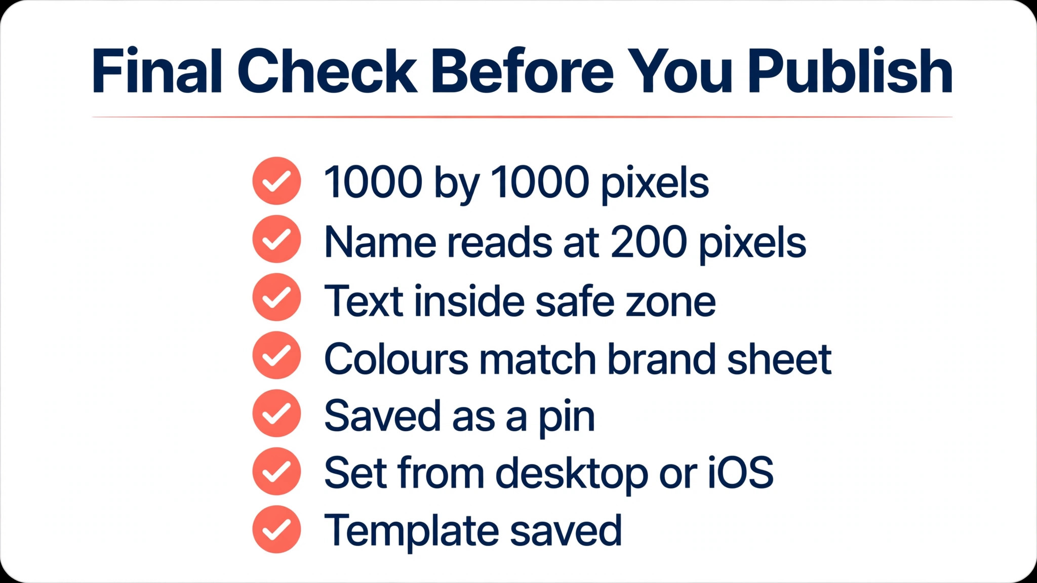
Run through this list for each cover before you set it, and fix any item that fails, because a cover set is only as strong as its weakest board.
- The file is 1000 by 1000 pixels, exported as PNG for text covers or JPG for photo covers.
- The board name reads clearly at 200 pixels wide, with no word cut by the crop.
- Every word sits inside the middle 60 percent of the square, with edges kept clear.
- Colors and fonts match the brand sheet, with no extra font or color added for one board.
- The cover graphic is saved as a pin to its board, with a title and a short description.
- The cover is set from desktop or iOS, and the profile grid is checked on a phone.
- The master template is saved and named, so the next cover takes ten minutes.
Frequently Asked Questions
What size should a Pinterest board cover be?
Build at 1000 by 1000 pixels, a square, which is the size Tailwind and several 2026 size guides recommend, and the size this guide uses throughout. Guides also cite 600 by 600 pixels as a usual minimum, and both are sharp on screen, because Pinterest displays the cover small. Pinterest publishes no official board cover size, so 1000 by 1000 is the safe choice, with the board name and key image kept in the center, because the profile grid crops the edges.
Can I upload a board cover directly?
No, and this is the step most tutorials about how to design a Pinterest board cover skip. A board cover must be a pin already saved to that board, so you design the graphic, save it as a pin to the board, and then pick that pin as the cover in Edit board. If the board is empty, save at least one pin to it first, because an empty board has no cover to choose. The guide above walks through the full upload and setting steps for desktop and iPhone.
Why does my board cover look cropped?
Pinterest shows board covers cropped to a smaller, wider shape on the profile grid, so the top and bottom of a tall pin are trimmed, and some views show the cover as a square tile. The fix is to design square at 1000 by 1000 pixels and keep text and faces inside the middle 60 percent, treating the outer edges as decoration. A cover built as a tall pin will always crop badly, so rebuild it square instead of fighting the crop.
Can I change a board cover on Android?
Pinterest help pages report that board covers can be changed on iOS and desktop, not on Android, so an Android user should set covers on a computer or an iOS device. On Android you can update the header image instead, which is the featured image at the top of the board, and you need at least one pin saved to the board before you can add one. Check the current help page before you plan a mobile only workflow, because Pinterest changes its menus.
Should board covers have text on them?
Text covers work best when the board topic needs reading, such as recipes, tips, or classroom ideas, and photo covers work best when the image sells the topic, such as travel or food. If you use text, keep the board name to two or three words, set it in one bold font, and keep it inside the safe zone, because small text vanishes at profile size. Never put a long sentence on a cover, because nobody can read it and it makes the grid look cluttered.
How often should I refresh my board covers?
Refresh the set every quarter, which takes about an hour with a master template. Rename boards that drifted, redesign covers for boards that changed topic, and replace photo covers whose images look dated. Learning how to design a Pinterest board cover once is not enough, because a set that is never reviewed slowly becomes the messy profile you started with, while a quarterly refresh keeps it looking current.
The Bottom Line
A matching set of board covers is a one afternoon project with a payoff that lasts for months, because every new visitor judges your profile by its grid before they read a single pin. Build a master template at 1000 by 1000 pixels, pick one style, keep every word inside the safe zone, save each cover as a pin, and set it from desktop or iOS. Start with your five most important boards today, finish the rest this week, and put a quarterly refresh on your calendar. When you know how to design a Pinterest board cover that matches your brand, the next cover takes ten minutes, and your profile finally looks like one person made it on purpose.