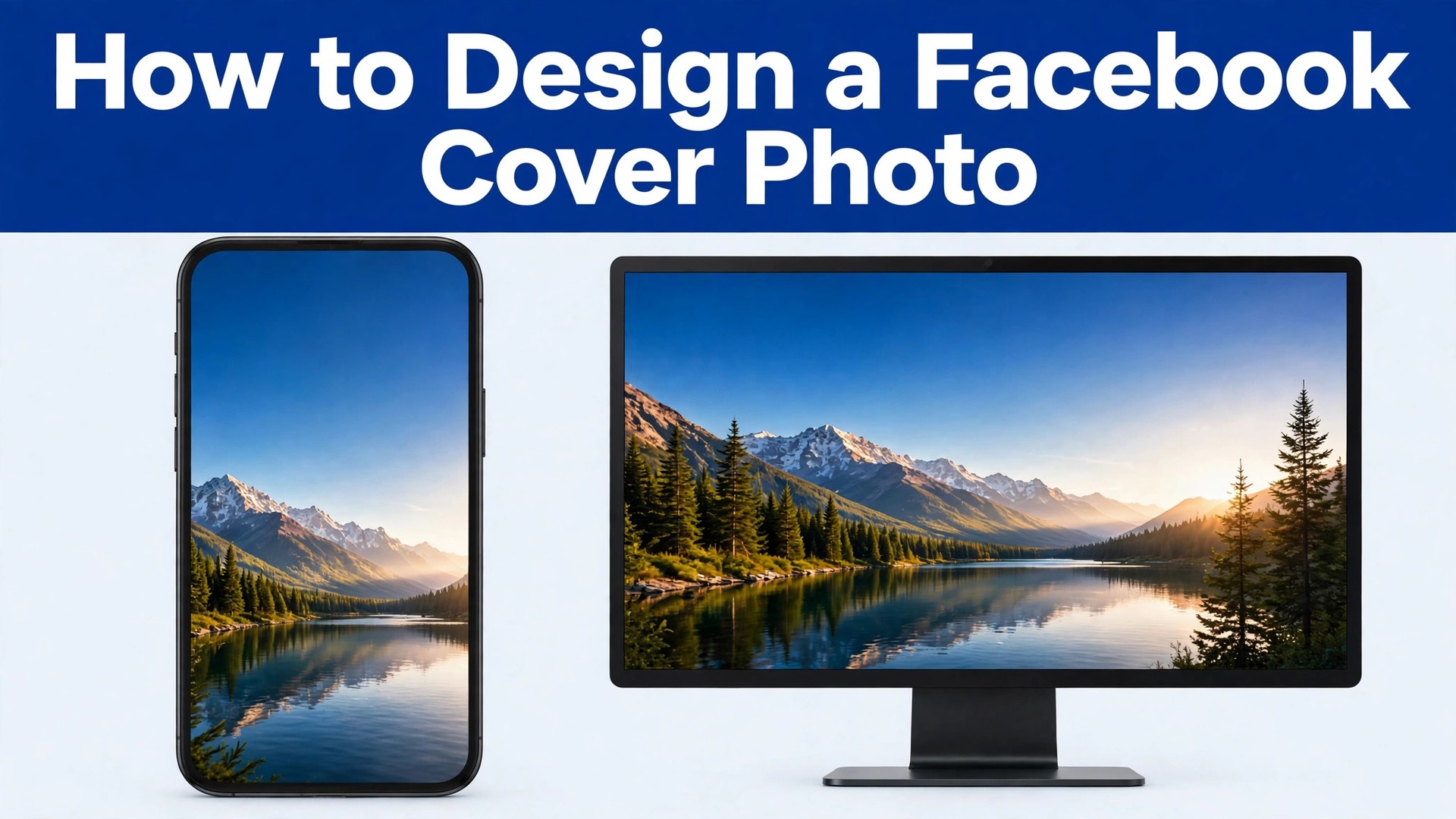
The cover that works everywhere is designed for the phone first and the desktop second. Most people build a wide banner on a computer screen, upload it, and only later discover that the sides are cut off on mobile and the headline sits behind the profile picture. That order of work is backwards. If you want to know how to design a Facebook cover photo that survives every screen, start with the smallest frame, put every word that matters inside it, and treat the extra width on desktop as decoration.
The rest of this guide follows that order, and it gives you exact sizes, a safe zone you can trust, and a workflow you can repeat for a personal profile, a business Page, a group, or an event.
A Facebook cover photo is the wide banner at the top of a profile or Page. It is the first large image a visitor sees, and it sets the tone before anyone reads a single post. For a business it can carry a current offer, a tagline, or proof of what the business does. For a creator it can show the work, the face, or the next release. For a personal profile it can be a favourite photo that simply looks good. The job changes with the account, but the technical problem stays the same. One uploaded image has to look right in two different shapes, on screens of every size, after Facebook compresses it.
This guide is written for people who run a Page or a profile and need a cover that looks intentional without hiring a designer. You do not need paid software. You need the right canvas size, a clear idea of what the cover should say, and a short check before you publish. The steps below work with free tools, and they work whether you start from a photograph, a flat colour background, or a template. Read the size section first, because every later decision depends on it.
The Sizes Facebook Actually Uses
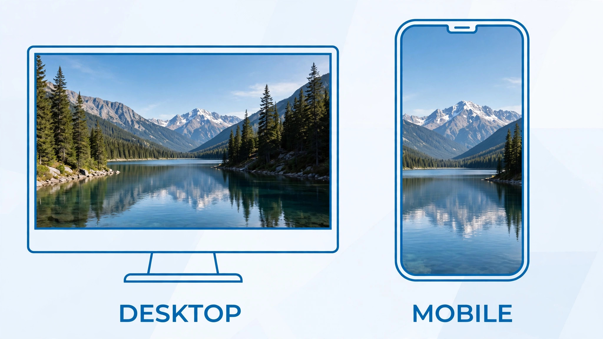
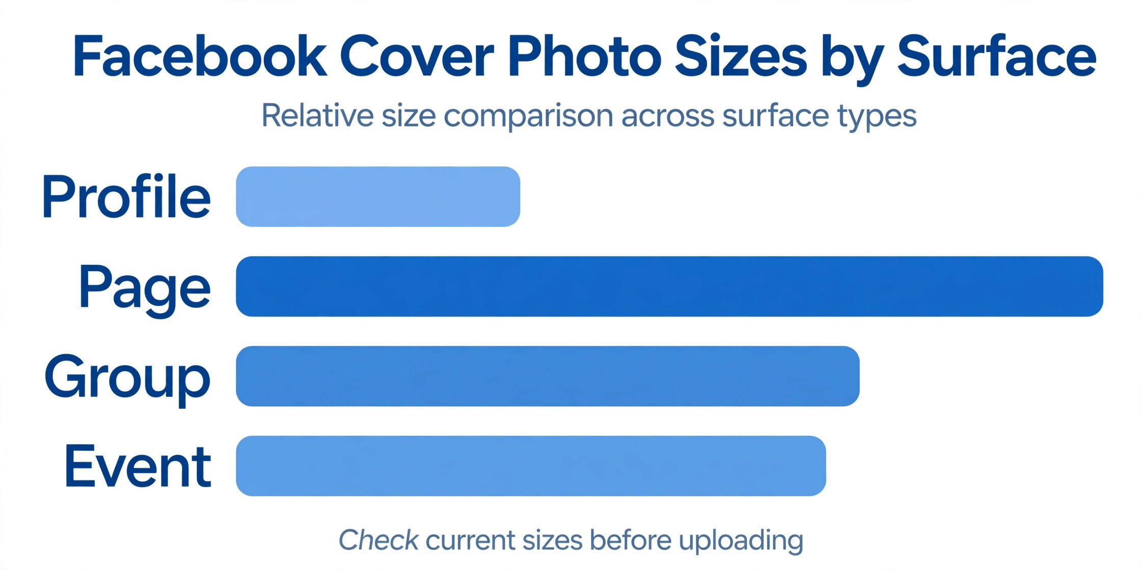
Facebook shows a cover photo at 820 by 312 pixels on a desktop computer and at 640 by 360 pixels on a phone. Those two frames are different shapes. The desktop frame is wide and short, while the mobile frame is narrower and taller, so the sides of your image get trimmed on a phone and the top and bottom get trimmed on a desktop. Facebook recommends uploading at 851 by 315 pixels, and most designers upload at 1640 by 624 pixels, which stays sharp on high resolution screens. The smallest file Facebook accepts is 400 by 150 pixels, but anything near that minimum looks soft once it is stretched across a wide screen.
The file itself matters as much as the pixels, and the first decision in how to design a facebook cover photo is the canvas size rather than the decoration. Facebook re-compresses every image on upload, so a heavy file does not buy you quality, it only slows the page down. Aim for a JPG under 100 KB when the cover is a photograph, and use a PNG when the cover is mostly flat colour and text, because PNG keeps sharp edges cleaner. Save photographs as sRGB JPG files, and check the file size before you upload. A cover that loads fast and looks sharp beats a cover that carries every pixel you could export.
| Surface | Desktop display | Mobile display | Recommended upload |
|---|---|---|---|
| Personal profile cover | 820 by 312 pixels | 640 by 360 pixels | 1640 by 624 pixels |
| Business Page cover | 820 by 312 pixels | 640 by 360 pixels | 1640 by 624 pixels |
| Group cover | 1640 by 856 pixels | 640 by 334 pixels | 1640 by 856 pixels |
| Event cover | 1920 by 1005 pixels | 1080 by 566 pixels | 1920 by 1005 pixels |
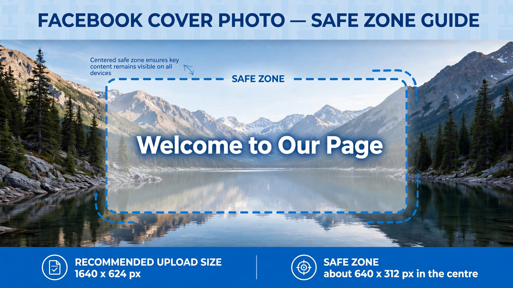
The single most useful measurement in this guide is the safe zone. The safe zone is the central rectangle of your cover that stays visible on both desktop and mobile. For a profile or Page cover, keep all text, logos, and faces inside a central area about 640 by 312 pixels. Anything outside that rectangle is decoration that may be cropped on one device or the other. The profile picture also overlaps the lower left of a personal profile cover on desktop, so keep that corner clear as well. Design inside the safe zone and the cover survives every screen without a surprise.
How to Design a Facebook Cover Photo in 8 Steps
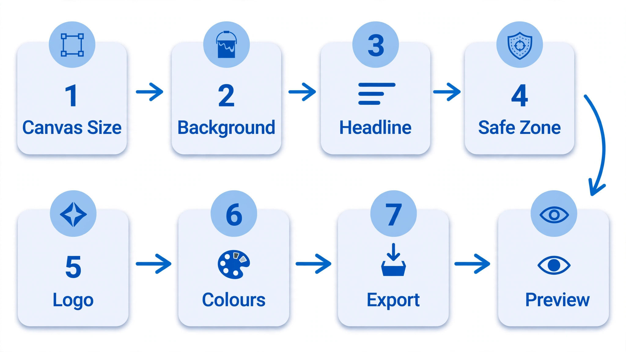
The eight steps below take you from a blank canvas to a published cover. Each step answers one decision, and the order matters. Do not place text before you have set the canvas, and do not export before you have checked the safe zone. The whole workflow takes under an hour once you have done it twice, and most of that time goes to choosing the photo or the message rather than to the technical work.
Step 1. Decide what the cover has to do
A cover can only do one job well, so pick that job before you open any tool. A bakery might want visitors to know it takes wedding orders. A coach might want people to join a mailing list. A musician might want the date of the next show to be impossible to miss. Write the job down in one sentence, then cut every element that does not serve it. A cover that tries to list services, show the team, announce a sale, and carry a slogan at the same time ends up saying nothing, because a visitor gives it about two seconds before scrolling on.
The job also decides the words on the cover. A cover for a local service business usually needs a short promise and a way to act, such as a phone number or the words book online. A cover for a creator usually needs a name and a reason to follow. A personal cover needs no words at all, since the photo is the point. If you cannot state the job in one sentence, the cover is not ready to design yet. Spend five minutes on this sentence and the rest of the steps get easier.

Step 2. Set the canvas to 1640 by 624 pixels
Open your design tool and start with a blank canvas of 1640 by 624 pixels for a profile or Page cover. That size is twice the desktop display size, which keeps text sharp on high resolution screens, and it matches the shape Facebook expects, so nothing is stretched or squeezed on upload. When you learn how to design a facebook cover photo, this canvas size is the foundation everything else rests on. If your tool offers a Facebook cover template, use it, since the template carries the right size and often marks the safe zone for you. Check the canvas size before you add anything, because resizing a finished design is the fastest way to ruin the layout.
Group covers and event covers need different canvases, so do not reuse a Page cover for them. A group cover uses 1640 by 856 pixels, and an event cover uses 1920 by 1005 pixels. Both are taller than a Page cover, which means a design built for a Page will look stretched or cropped when it is forced into those frames. Build each surface on its own canvas.
Step 3. Mark the safe zone before you place anything
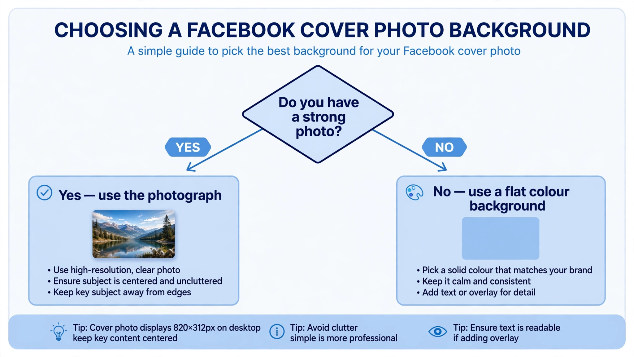
Draw a rectangle in the centre of the canvas that is about 640 by 312 pixels at the upload size, and treat it as the only area where important content is allowed to live. In most design tools you can draw a rectangle, set it to a light outline, and lock it in place so it does not move while you work. Everything outside that rectangle is background only. A sky, a blurred shop interior, a pattern, or a solid colour can extend to the edges, but no word, face, or logo should cross the boundary.
This step feels slow the first time and saves the most rework of any step in the guide. Covers fail on mobile for one reason above all others, which is that the designer placed the headline across the full width and Facebook trimmed both ends on a phone. The safe zone rectangle makes that failure visible before you upload anything. When the design is finished, delete the rectangle or hide its layer before you export, since it is a guide only and should never appear in the published image.
Step 4. Choose one photo or one flat background
Pick a single strong image or a single flat background, not both competing for attention. A photograph works best when it shows the work itself, such as a finished cake, a renovated room, or a speaker on stage. A flat background works best when the words carry the message, such as an announcement or a seasonal offer. A busy photo behind small text is the most common cover mistake, because Facebook compression softens the photo and the text loses contrast at the same time.
If you use a photograph, choose one with a clear subject and empty space in the centre where text can sit. Landscapes and group shots usually fail as covers because the subject is small and the centre is busy. Crop the photo to the cover shape before you place text on it, and check it at the size it will actually display, since a photo that looks great full screen can turn to noise at 820 pixels wide. If you use a flat background, pick a colour with enough contrast against white or dark text, and test it on a phone screen in bright light, where pale text on a pale background disappears.
Step 5. Place the text in the centre and keep it short
Put the headline inside the safe zone and keep it under eight words. A cover is not a flyer, and nobody reads a paragraph at the top of a Page. The strongest covers carry a name, a short promise, or a single date, and they leave the details to the posts below. Anyone learning how to design a facebook cover photo should treat the headline as the whole message, because it is the one line every visitor reads. Set the headline large enough to read on a phone without zooming, and keep it to one or two lines at most. If the headline needs a third line, the words are too long and should be cut.
Place supporting text below the headline, not beside it, and use a smaller size with plenty of space around it. A phone number, a web address, or a call to action belongs on one line under the headline, where the eye lands naturally. Avoid placing text near the left edge on a personal profile, since the profile picture overlaps that corner on desktop. When the text is set, step back and read the cover at phone size. If any word is hard to read, increase the size or the contrast rather than adding a shadow or an outline, which usually makes the problem worse.
Step 6. Match the colours to the Page
Choose two colours at most, and take them from the Page itself rather than from a random palette. The profile picture, the logo, or the brand colours of the business give you a starting point that already fits. A cover that matches the logo looks like it belongs to the Page, while a cover in unrelated colours looks like a stock image that was pasted on top. Use one colour for the background or the photo treatment and one for the text, and keep the contrast high enough that the text is readable on a phone in daylight.
Colour also carries meaning, so pick with intent rather than taste alone. Dark backgrounds with light text feel formal and are easy to read, while bright backgrounds with dark text feel energetic and suit sales, events, and launches. Avoid red text on a green background and other combinations that are hard for colour blind visitors to read. Test the cover by converting it to greyscale in your head or in your tool. If the text is still readable without colour, the contrast is strong enough for everyone.
Step 7. Export a sharp file under the size limit
Export the cover as a JPG when it is built on a photograph and as a PNG when it is built on flat colour and text. Set the export quality high enough that text edges stay clean, then check the file size and bring it under 100 KB if you can. In most tools you can lower the JPG quality one step at a time and watch the file size fall faster than the visible quality. A file of 80 KB that looks sharp is better than a file of 800 KB that Facebook compresses anyway, because the platform re-encodes every upload and the extra weight buys nothing.
Name the file clearly, such as facebook-cover-page-1640, so you can find it again when the offer changes or the season turns. Save the editable design file separately from the exported image, because you will want to change one line of text next month without rebuilding the whole cover. Before you upload, open the exported file at full size on your own screen and look at the text edges. If the letters look fuzzy at 100 percent zoom, export again at a higher quality or simplify the design, since a blurry cover is worse than a plain one.
Step 8. Preview on phone and desktop, then adjust
Upload the cover and look at it on a phone before you look at it on a computer. Open the Page in the Facebook app, check that the headline is fully visible, and confirm that no word is cut at the sides. Then open the same Page on a desktop browser and check the wider view, where the edges of the design appear and the profile picture sits over the lower left on a personal profile. Facebook lets you drag the image to reposition it after upload, so use that control to centre the important part if the crop is slightly off.
Ask one other person to look at the cover on their phone and tell you what it says in their own words. If they repeat the headline correctly, the cover works. If they mention the background first or cannot read the text, go back to step five and shorten the words or raise the contrast. Change one thing at a time and re-upload, since changing the photo, the text, and the colours together makes it impossible to know which change fixed the problem. A cover that passes this check on both screens is ready to stay up.
Cover Sizes for Groups, Events, and Business Pages
A business Page cover and a personal profile cover share the same size, but groups and events do not, and this is where most people go wrong. A group cover displays at 1640 by 856 pixels on desktop and 640 by 334 on mobile, which is a taller frame than a Page cover. An event cover displays at 1920 by 1005 pixels on desktop and 1080 by 566 on mobile, which is taller still. If you upload a Page cover to a group, Facebook crops the top and bottom to fit the taller frame, and the headline you centred for the Page can end up cut in half.
The safe zone rule still applies on these taller surfaces, but the rectangle changes shape with the frame. Keep the group name and the one line that explains the group in the centre of the frame, and keep the event name, date, and place in the centre of the event cover. The extra height is useful for a photograph, such as a wide shot of a venue or a crowd, because the taller frame shows more of the image. It is not useful for more text. A group or event cover with five lines of text fails in the same way a Page cover with five lines fails, only on a larger canvas.
Business Pages have one extra option that personal profiles do not. A Page can use a cover video instead of a static image, with a minimum size of 820 by 312 pixels and a length between 20 and 90 seconds. A short video of the shop, the product in use, or the team at work can hold attention longer than a still image, but it also carries the same safe zone problem, since the video is cropped the same way on mobile. Keep any text in the video inside the central area, keep the file small enough to load quickly, and remember that many visitors watch with the sound off, so the video must make sense without audio.
Four Tools That Make the Job Faster
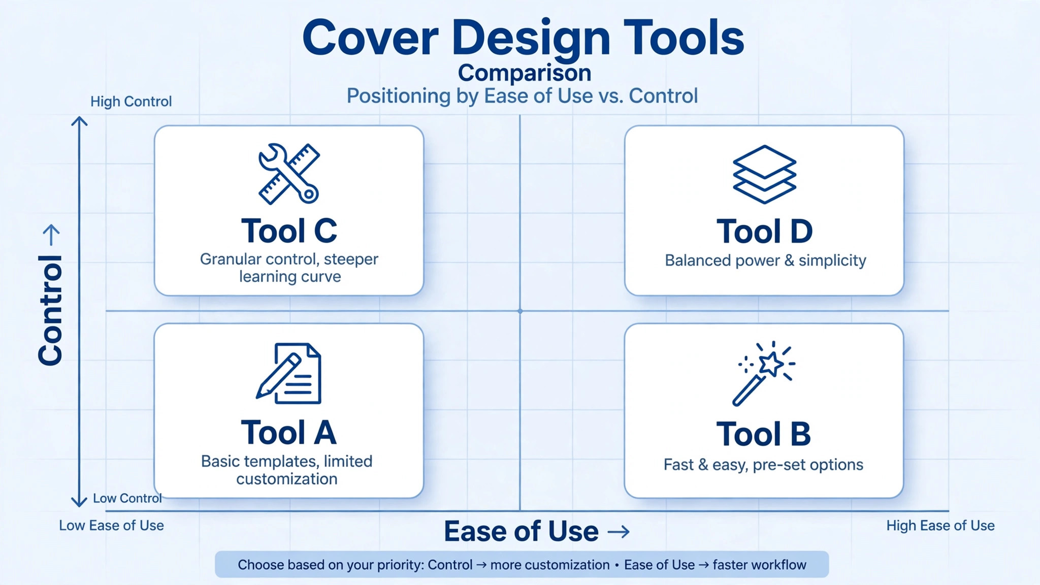
You can design a cover in any image editor, but a tool with a Facebook cover template saves the setup work and marks the safe zone for you. The four tools below all offer a free starting point and a template in the right size, and each of them supports the workflow for how to design a facebook cover photo without starting from a blank page. Pick the one whose editor you already know, since learning a new tool costs more time than the cover itself is worth.
Canva
Canva is the fastest starting point for most people, because its Facebook cover template is already sized correctly and its library holds thousands of layouts you can adapt in minutes. The free plan covers the template, the basic editor, and a large set of free photos and fonts, which is enough for a personal profile or a small business Page. Canva Pro, listed near 15 dollars a month in the United States with prices that vary by region, adds background removal, brand colours, and one click resizing to other sizes. The trade off is that the most popular templates are easy to recognise, so change the photo, the colours, and the fonts rather than publishing a template unchanged.
Adobe Express
Adobe Express is the strongest choice when print quality and clean typography matter, since it comes from Adobe and its text tools are more precise than most free editors. The free plan includes the Facebook cover template, a set of fonts, and Firefly image generation with daily limits, while Premium costs 9.99 dollars a month and raises those limits. Adobe Express is a good fit if you already use Adobe products or if you want the same design to work as a printed flyer as well as a cover. The editor takes slightly longer to learn than Canva, but the results look more considered, especially for service businesses that need a formal tone.
VistaCreate
VistaCreate, formerly Crello, is a solid middle option with a large template library and a free Starter plan that covers the basics. Its strength is animated covers and social graphics, which suit Pages that post often and want a consistent look across formats. The paid plan is priced by the month with annual billing bringing the cost down, and it removes the watermark on premium assets. VistaCreate is worth a look if Canva feels too familiar and you want templates that fewer of your competitors are using. The editor is straightforward, and the learning curve is short for anyone who has used a drag and drop tool before.
Snappa
Snappa is the simplest tool on this list, and that is its appeal. It offers a Facebook cover template, a small set of clean layouts, and an editor that stays out of the way, which suits a business owner who wants a decent cover in twenty minutes. The free plan allows a limited number of downloads each month, and the paid plan removes that limit. Snappa has fewer templates and fewer fonts than Canva or Adobe Express, so it is not the choice for a designer who wants fine control. It is the choice for someone who wants to finish the job, publish the cover, and get back to running the business.
Best Pick by Job
The right tool depends on the job, not on a ranking. A personal profile needs speed, a business Page needs brand control, and a Page that also prints flyers needs an editor that handles both. The table below matches each common job to the tool that fits it best, so you can skip the comparison and start designing.
| Job | Best pick | Why it fits |
|---|---|---|
| Personal profile, first cover | Canva | Free template and fast setup |
| Small business Page | Canva | Brand colours and easy edits |
| Formal service business | Adobe Express | Precise type and clean output |
| Frequent social posting | VistaCreate | Animated templates and variety |
| Fastest possible cover | Snappa | Simple editor, no learning curve |
| Cover plus printed flyer | Adobe Express | One design, print and screen |
If you only remember one row, remember the first. A personal cover made in Canva on the free plan is enough for almost everyone, and the paid plans only matter once you are making covers often or managing several Pages. The tool is a small part of the result. The size, the safe zone, and the short headline decide whether the cover works, and those three things cost nothing.
Seven Mistakes That Ruin a Cover
Most bad covers fail in the same seven ways, and all seven are avoidable once you know to look for them. Anyone learning how to design a facebook cover photo should read the list before exporting, and check the cover against each item in turn.
- Text runs to the edges of the canvas, so Facebook trims the first and last words on a phone.
- The headline carries more than eight words, so nobody reads it before scrolling past.
- A busy photograph sits behind small text, so the words disappear into the background.
- The profile picture covers the most important word, because the design ignored the lower left corner.
- The image is uploaded at 400 by 150 pixels, so it looks soft and blurred on a wide screen.
- The cover is a screenshot of a flyer, so the text is tiny and the layout fights the frame.
- The cover is never checked on a phone, so the owner only sees the desktop version that looks fine.
Frequently Asked Questions
What size should a Facebook cover photo be in 2026?
Upload a profile or Page cover at 1640 by 624 pixels, which is twice the desktop display size of 820 by 312 pixels. Facebook also accepts its recommended size of 851 by 315 pixels, and the minimum it takes is 400 by 150 pixels, though that minimum looks soft on a wide screen. Group covers use 1640 by 856 pixels and event covers use 1920 by 1005 pixels, so build each surface on its own canvas rather than reusing one image everywhere.
Why does my Facebook cover photo look cropped on mobile?
Facebook shows the same uploaded image in two different shapes. Desktop displays it at 820 by 312 pixels and mobile at 640 by 360 pixels, so the sides are trimmed on a phone and the top and bottom are trimmed on a desktop. The fix is to keep every word, face, and logo inside the central safe zone of about 640 by 312 pixels. Anything outside that rectangle is decoration that may be cut on one device or the other.
Can I use a video as my Facebook cover photo?
A business Page can use a cover video, with a minimum size of 820 by 312 pixels and a length between 20 and 90 seconds. Personal profiles do not support cover videos, so a profile needs a still image. A cover video is cropped the same way as a photo on mobile, so keep text in the centre and make sure the video makes sense with the sound off, since many visitors watch without audio.
What file format is best for a Facebook cover photo?
Use a JPG for a cover built on a photograph and a PNG for a cover built on flat colour and text. Save photographs as sRGB JPG files and aim for a file under 100 KB, since Facebook re-compresses every upload and a heavy file only slows the page. PNG keeps the sharp edges of text cleaner, which matters when the cover carries a headline or a logo.
How do I keep text from being covered by my profile picture?
On a personal profile, the profile picture overlaps the lower left of the cover on desktop, so keep that corner clear of words and logos. The safest approach is to centre the headline in the safe zone and leave the left and right edges for background only. After uploading, check the cover on a desktop browser as well as on a phone, and drag the image to reposition it if the overlap hides anything important.
How often should I change my Facebook cover photo?
Change it when the message changes, not on a schedule. A seasonal offer, a new product, an upcoming event, or a rebrand are all good reasons to update the cover. A cover that still advertises a sale from three months ago hurts more than an old cover that says nothing, because visitors read it as a sign the Page is not maintained. When you do change it, run the same phone check before you publish.
The Short Version
A good Facebook cover photo is a phone first design with a short message in the centre. Set the canvas to 1640 by 624 pixels, mark the safe zone, put one clear headline inside it, and export a sharp file under 100 KB. That is how to design a facebook cover photo that fits every screen, and the same steps work the next time the offer or the season changes.
Check the result on a phone before you check it on a desktop, and ask someone else to read it back to you. If they can repeat the headline, the cover does its job. The tools in this guide make the work faster, but the size, the safe zone, and the short headline are what decide whether the cover fits every screen.
The cover is a small piece of design with a large effect on first impressions. A visitor decides in seconds whether a Page looks current and trustworthy, and the cover is the largest thing they see in those seconds. Spend the hour, follow the eight steps, and publish a cover that looks deliberate on every device your visitors use.