You need twelve icons that look like they belong together, and you need them by Friday. The first generator gives you twelve icons in twelve different styles. The second gives you beautiful art that falls apart at 16 pixels. The third exports a flat image you cannot edit, and the fourth wants a monthly subscription before it shows you a single result. That is the real problem with icon tools in 2026. Generating one good icon is easy, and generating a consistent usable set is hard. The best icon makers are the ones that solve the set problem, not the single image problem, and this guide compares six of them on exactly that test.
An icon is a working asset, not a decoration. It must read at tiny sizes, match its siblings in weight and style, export in the format your platform needs, and carry a licence you can defend in front of a client. A tool that fails any one of those four tests will cost you more time than it saves, even when the first result looks impressive on screen.
How We Picked the Best Icon Makers
We judged every tool on five questions that match the real workflow. First, can it create a clean icon from a specific brief, with no extra clutter in the frame. Second, can it repeat a visual style across a whole set, so the twelfth icon matches the first. Third, can you refine the result without starting over, by editing colour, shape, or weight. Fourth, does it export a usable production asset, including vector SVG where that matters and sized PNG sets where it does not. Fifth, is the licence clear enough for commercial and client work.
Prices in this guide come from vendor pricing pages and 2026 comparisons that rechecked those pages in August through October 2026. Prices change often, and free allowances change even faster, so confirm the current terms on the vendor page before you pay. Where a vendor does not publish a price, this guide says so instead of guessing one.
The test behind these rankings was practical rather than theoretical. Each tool was asked to produce a set of icons for the same fictional app, covering navigation, settings, search, and sharing, and the results were compared at three sizes, on light and dark backgrounds, and after export to the formats a developer would actually receive. A tool scored well when the set held together at every size and the files opened cleanly in a standard design tool without repair work.
The Best Icon Makers at a Glance
The table below covers all six tools. Vector output and set consistency are the two columns that matter most, because they decide whether the result is a production asset or a pretty picture.
| Tool | Best for | Vector SVG export | Free plan |
|---|---|---|---|
| Recraft | Consistent icon sets | Yes, native | Yes |
| IconScout AI | Icons matched to a huge library | Yes | Yes |
| Iconikai | App store icons | Sized PNG sets | 5 per day free |
| Iconly | Production ready icons | Yes | Yes |
| Canva | Simple icons inside designs | Limited | Yes |
| Adobe Express | Quick icons for social and slides | Limited | Yes |
Best Pick by Job
No single tool wins for every icon job, because an app icon, a website set, and a slide graphic are three different tasks. The table below matches the pick to the job.
| Your situation | Best pick | Why it fits |
|---|---|---|
| You need a matching set for an app | Recraft | Six related icons in one style per click |
| You need icons that match existing assets | IconScout AI | Generation sits inside a 12 million asset library |
| You need an app store icon fast | Iconikai | Trained on performing app store icons |
| You need production files for a team | Iconly | Editing tools plus CDN delivery built in |
| You need an icon inside a design | Canva | The icon maker sits in the design tool |
| You need a quick icon for a slide | Adobe Express | Templates and speed beat depth here |
The 6 Best Icon Makers in Detail
1. Recraft
Recraft is the first name on most designer shortlists in 2026, and the reason is set consistency. One prompt produces six related icons in a single shared style, which is the hardest part of icon work and the part where general image generators fail most often. The style holds across the set, the line weight stays even, and the icons look like they were drawn by one hand.
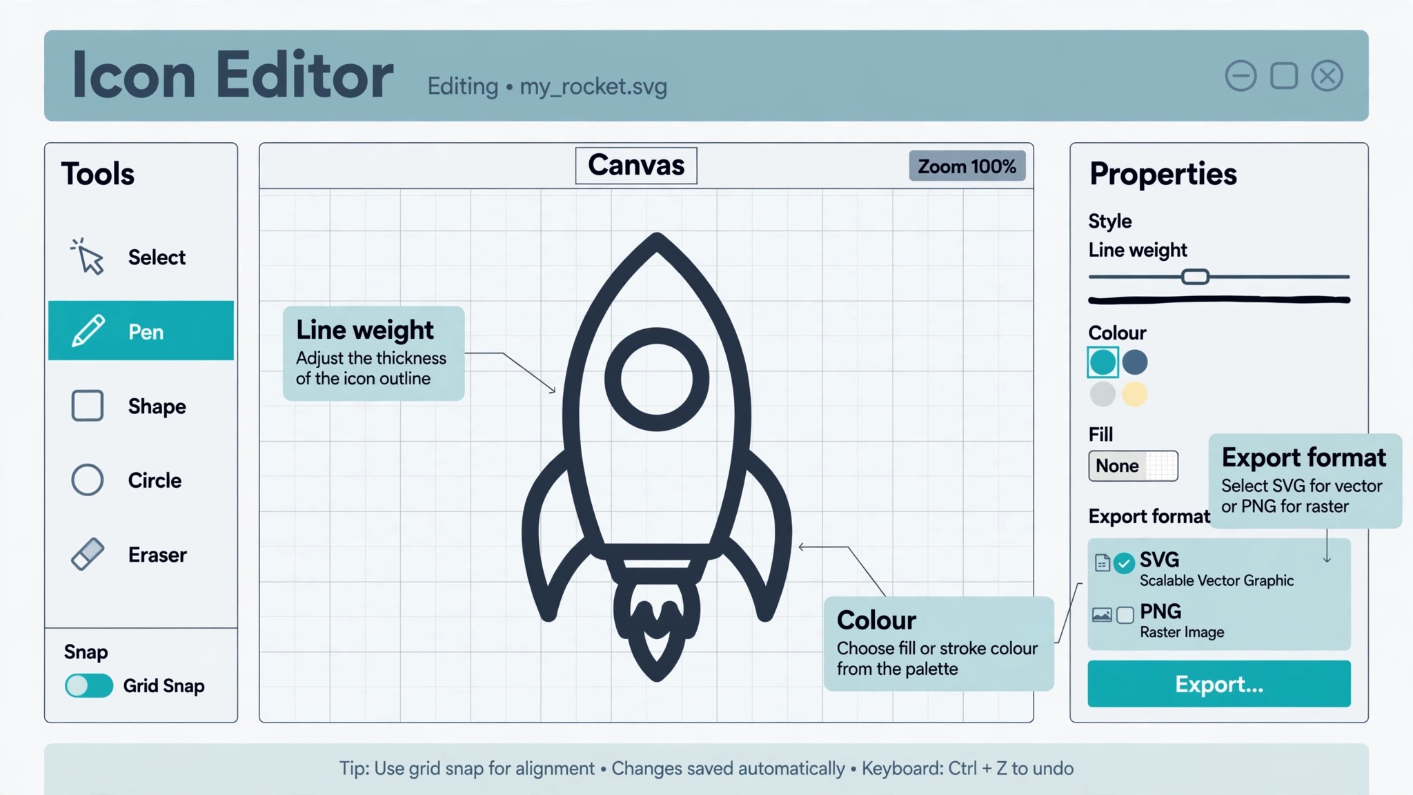
The standout feature is native vector output. Recraft exports clean editable SVG files that scale without losing quality and open properly in Illustrator or Figma, which is rare among AI generators and decisive for professional work. Most rivals export raster images that blur when resized, so a vector result is a genuine advantage rather than a nice extra.
Recraft offers a free tier worth running through first, and paid plans start at 20 dollars a month. The paid tier unlocks more generations and higher limits for teams. Choose Recraft when the deliverable is a matching set for an app or a website, and when the file must survive resizing, recolouring, and handoff to a developer.
2. IconScout AI
IconScout AI pairs generation with a library of 12 million assets, which is an unusual combination at this scale. You type what you want, vectors come out, and you can tweak colours and shapes in the browser before exporting. The library matters because a generated icon can sit next to an existing illustration, a 3D asset, or a photo from the same collection, and the set still holds together.
Every AI icon comes with full commercial rights, and IconScout states that contributor content is not used for training, which is a detail that matters on agency work where one bad asset audit can wreck a project. The licensing clarity is a real reason to pick this tool over a cheaper generator with vague terms.
IconScout suits teams that already use stock assets and want generated icons to match them. It is less specialised than Recraft for pure set generation, and the free allowance is smaller, but the combination of generation, editing, and a huge matching library makes it the most flexible tool in this guide for mixed design work.
3. Iconikai
Iconikai is built for one job, which is the app store icon, and it does that job better than any general tool in this guide. Its model was trained specifically on app store icons that performed well, and the difference shows in the results. Generation takes around eight seconds, and the output is shaped for the store rather than for a gallery wall.
In a September 2026 test of eight platforms, Iconikai scored 9.2 out of 10, the highest in the comparison, after generating more than 300 icons across six fictional apps and having professional designers rate the outputs blind. It cleared App Store Connect validation every time in that test, which is the practical hurdle that kills many AI generated icons at the last step.
The free plan allows 5 icons per day, which is enough to test the tool on a real project before paying. Paid plans unlock more generations and exports. Pick Iconikai when the deliverable is a single app icon that must pass store validation and stand out in a crowded search result, and use a set generator alongside it when you need the full interface set too.
4. Iconly
Iconly is purpose built for icon generation, and that focus shows in every part of the tool. Unlike general image generators, Iconly understands that icons need to be clean, consistent, and immediately usable, so it includes built in editing tools, style presets, custom templates, and CDN delivery for teams that ship icons to production.
The editing tools are the reason to choose it. You can adjust a generated icon without starting over, apply a preset across a set, and keep the style consistent as the set grows. The CDN delivery suits product teams that need icons served reliably rather than downloaded as loose files and emailed around.
Iconly leads the field for production ready icons in 2026 comparisons, and its workflow details come from hands on use rather than a marketing page. Choose Iconly when icons are a recurring deliverable for a product team, and when the handoff from design to production needs to be boring and reliable rather than exciting and fragile.
5. Canva
Canva is the icon maker for people who do not think of themselves as icon designers. It sits inside a design platform, so an icon can be dropped straight into a slide, a social post, or a flyer without an export step, and the learning curve is close to zero. The free plan covers the basics, and the template library means you rarely start from a blank page.
The limits are honest ones. Canva is a design editor with an icon maker, not a dedicated icon generator, so set consistency and vector export are weaker than Recraft or IconScout AI. An icon made in Canva works well inside a Canva design and less well as a standalone production asset that must be resized, recoloured, and handed to a developer.
Canva Pro costs 144 dollars a year for one person, which works out to 12 dollars a month, and unlocks premium templates and tools. Choose Canva when the icon is one element inside a larger design, and when speed and simplicity matter more than vector precision.
6. Adobe Express
Adobe Express is the quick option for simple icons in slides, flyers, and social posts. It offers an online design editor with an icon maker, a free plan, and the kind of template led workflow that gets a non designer to a finished result in minutes. The Adobe name also reassures teams that already use Adobe tools and want files that play well with the rest of the suite.
Like Canva, Adobe Express is a design platform first and an icon tool second, so it will not match Recraft for set consistency or vector output. The icons it produces are simple, clean, and suited to documents and posts rather than to app interfaces or brand systems. Premium pricing is listed on the Adobe site and varies by region, so check the current page before you commit.
Choose Adobe Express when you need a simple icon fast and you already work in Adobe tools. For a production icon set, start with Recraft or IconScout AI instead, and use Adobe Express for the supporting graphics around it.
Icon Styles Compared, and Which One Fits Your Product
Style is not decoration, it is a decision about how users read your product. The best icon makers handle several styles well, but each style suits a different job, and picking the wrong one creates more work than picking the wrong tool.
Flat icons use solid shapes and a single colour, and they read clearly at small sizes because nothing competes for attention. They suit product interfaces, dashboards, and navigation, where the icon must be recognised in a fraction of a second. Line icons use strokes instead of fills, and they feel lighter and more modern, but thin lines disappear at small sizes, so they need a minimum stroke weight to survive. They suit websites and marketing pages where the icons sit at larger sizes.
Filled icons use solid colour throughout, and they carry more visual weight than line icons, which makes them good for primary actions and key features. Three dimensional icons add depth and shadow, and they stand out in app stores and marketing, but they are the hardest style to keep consistent across a set, because every icon needs the same light source and the same depth. Gradient icons blend two colours, and they look modern on a landing page while ageing faster than any other style, so they suit campaigns rather than permanent interfaces.
The practical rule is to pick one style for the whole product and to test it at the smallest size before committing. Generate the same six icons in two styles, shrink both sets to 32 pixels, and keep the style that still reads clearly. The tools in this guide make that test cheap, and the test prevents the most common regret in icon work, which is discovering at launch that a beautiful style is unreadable where it matters.
User testing adds a second filter that no generator can replace. Show five people the icon without a label and ask what it means, and keep only the icons that at least four of them read correctly. An icon that needs a label to be understood is a decoration, not a control, and no amount of style will fix it. Run that test early, while changing the set is still cheap, and the final product will feel obvious in the way good design always does.
Vector or Raster, and Why the Format Decides the Tool
The format question comes before the tool question, because it eliminates half the options in one step. A vector SVG file is made of shapes and paths, so it scales from a 16 pixel favicon to a billboard without losing sharpness, and it can be recoloured and edited in a design tool. A raster PNG file is made of pixels, so it looks perfect at the size it was made and softens when it grows. For interface icons, logos, and anything that must survive resizing, vector is the right answer, and Recraft and IconScout AI are the tools in this guide that deliver it properly.
Raster still has a place. App store icons are delivered as PNG files at fixed sizes, and a 1024 pixel master exported to every required size is the standard workflow for iOS and Android. Iconikai and the free resizer tools handle that job well, because the sizes are known in advance and nothing needs to scale freely. The mistake is using a raster icon where a vector one belongs, such as a website navigation set that must look sharp on a retina screen and a low resolution screen at the same time.
Check the export options before you commit to a tool. Ask whether it exports SVG, whether the SVG opens cleanly in your design tool, and whether the PNG export covers the sizes your platform requires. A generator that only exports a single flat image is a concept tool, not a production tool, and it belongs at the start of the process rather than at the end of it.
There is also a file size question hiding behind the format question. Vector files stay small as they scale, while raster files grow with every pixel, and a website that loads dozens of large PNG icons pays for it in speed. A set of SVG icons can replace a whole folder of PNG files at different sizes, which simplifies the build and speeds up the page. That alone justifies choosing a vector capable tool for web work, even when the raster result looks identical on screen.
Licensing, the Part Most Comparisons Skip
Licensing is the least exciting part of choosing an icon maker and the part that causes the most trouble later. A generated icon with unclear rights can stall a client project, fail an agency audit, or force a redesign after launch. Three questions settle the issue before you use any result in commercial work.
First, does the tool grant full commercial rights to generated icons, including use in client work and in products you sell. IconScout AI states this clearly, and that clarity is worth more than a slightly prettier result from a tool with vague terms. Second, does the tool train its models on contributor content, and does it say so publicly. A tool that respects contributor rights is less likely to produce an icon that resembles an existing copyrighted work. Third, does the free tier carry the same licence as the paid tier, or does free use come with attribution or non commercial limits that disappear only after you pay.
Read the licence page, not the marketing page, and save a copy of the terms for any icon that ships in a client project. The five minutes this takes are cheap insurance against a conversation you do not want to have with a client after the work is delivered.
The same caution applies to icons that look like existing brands. A generated icon can resemble a well known logo by accident, especially when the prompt names a common object such as a bird, a fruit, or a shopping bag. If a result looks familiar, search for the shape before you use it, and regenerate when the resemblance is close enough to cause confusion. A quick search costs a minute, and a redesign after launch costs a week.
How to Choose an Icon Maker Without Regret
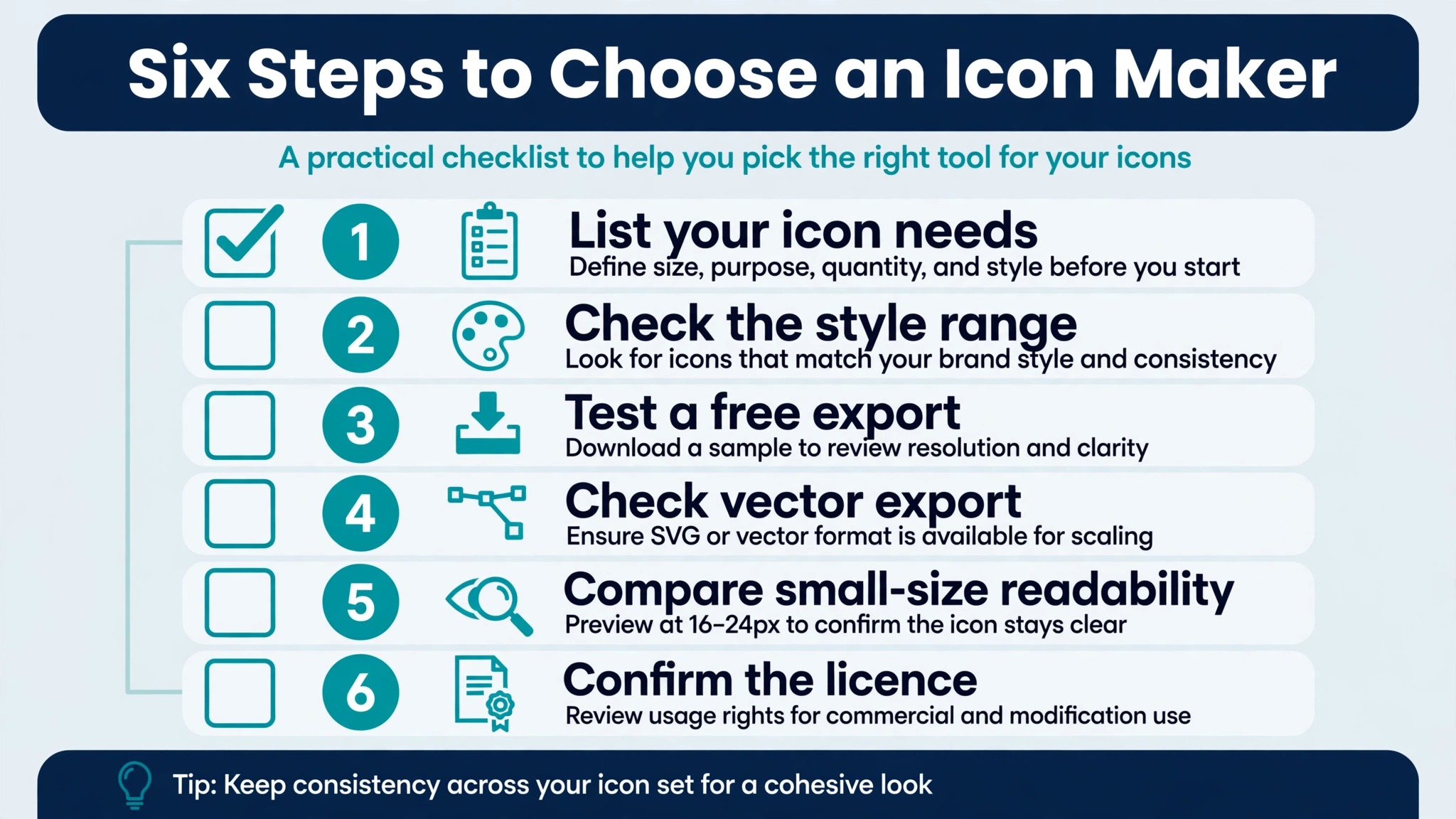
The choosing process is short when you know what the icon must do. Work through the steps below in order, and do not pay until a free test has produced an icon you would actually ship.
- Define the deliverable first. Write down the sizes, the formats, and the platforms before you open any tool, because an app store icon and a website navigation set need different tools.
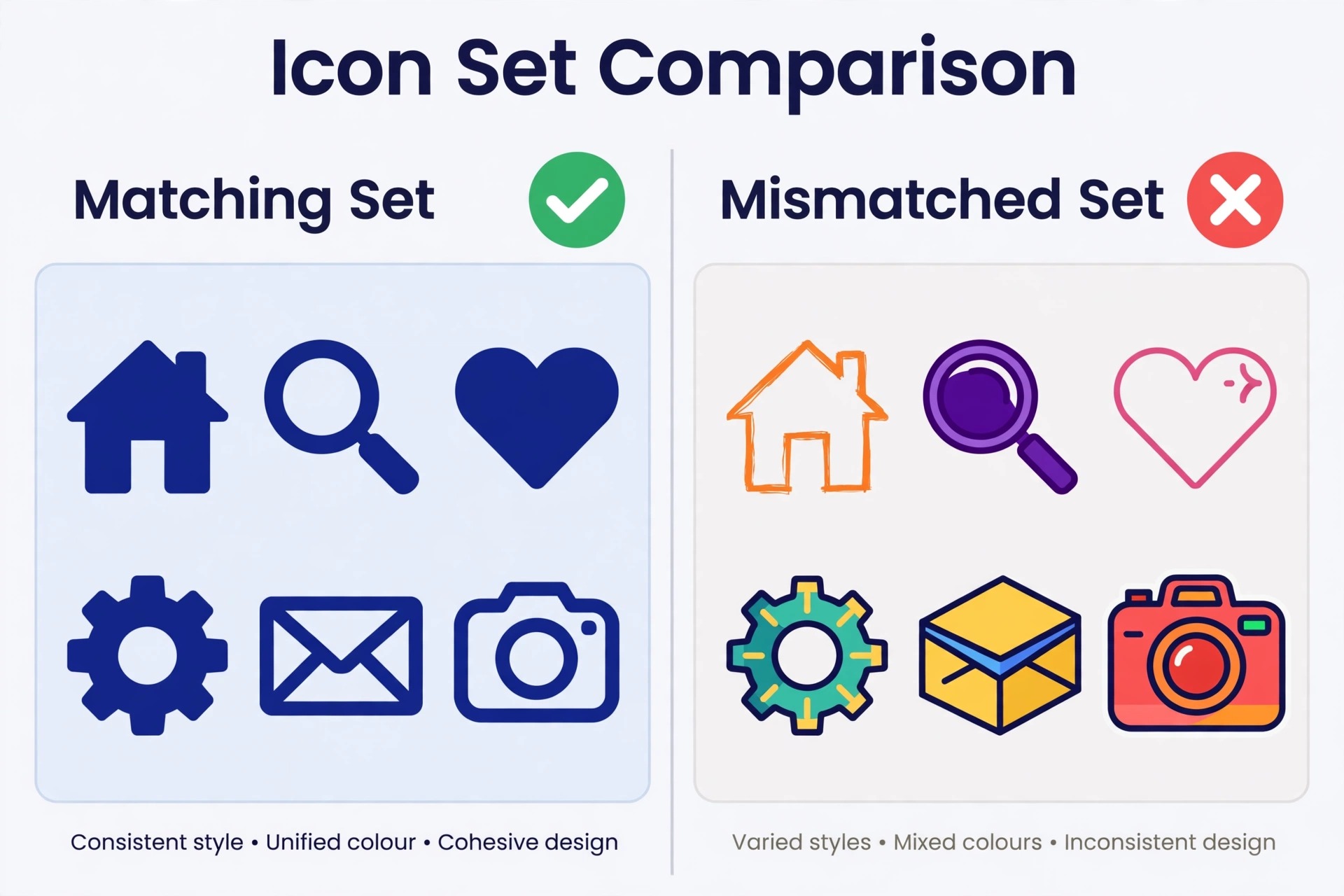
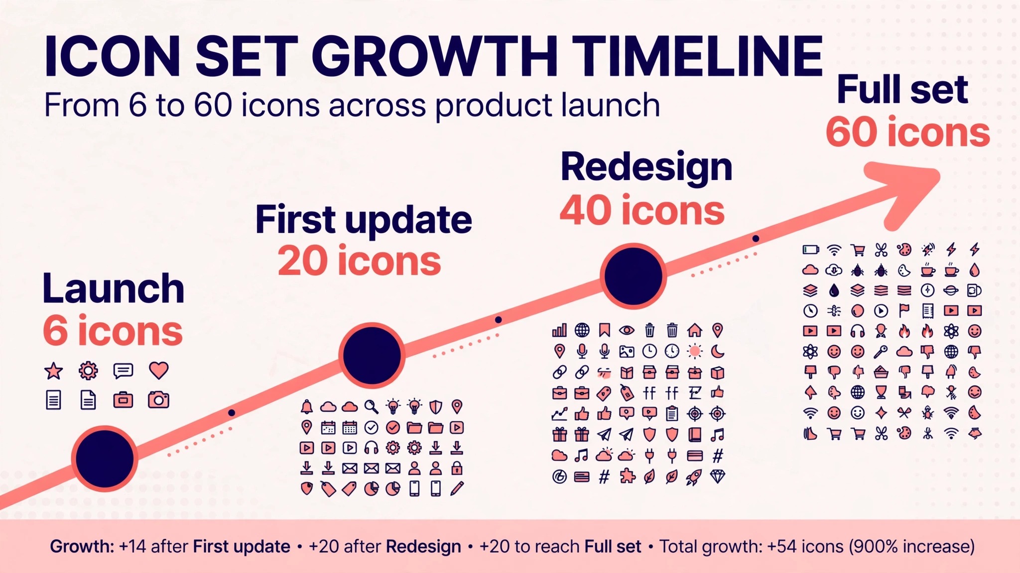
- Generate a test set, not a single icon. Ask for six icons on one brief and compare them side by side. A tool that cannot hold a style across six icons will not hold it across sixty.
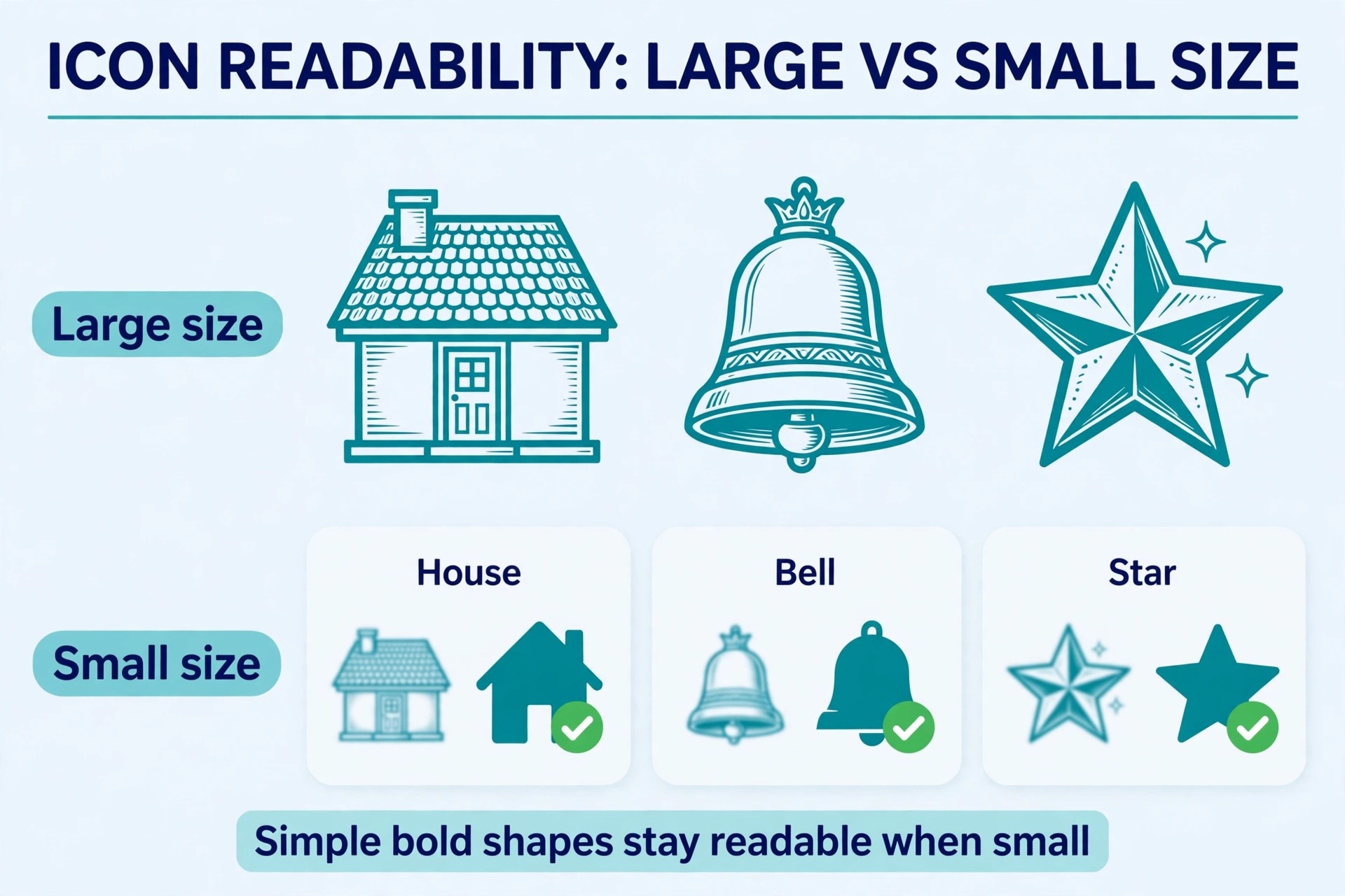
- Shrink the result to 16 pixels and look at it. An icon that reads at 16 pixels is a real icon, and one that turns into a smudge at that size needs to be simplified before it ships.
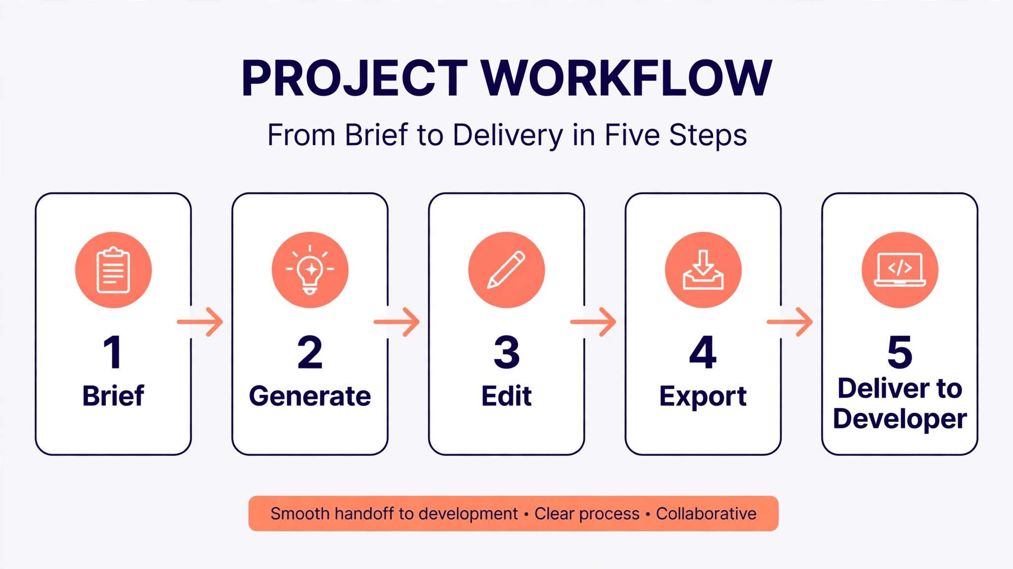
- Export the test icon and open it in your design tool. Check that the SVG is editable, that the layers make sense, and that the PNG sizes match what your platform requires.
- Read the licence terms for the plan you will actually use. Confirm commercial rights, client use, and whether the free tier carries the same terms as the paid tier.
- Test the handoff. Send the file to a developer or a teammate and ask whether they can use it without asking you a question. A clean handoff is the sign of a production ready tool.
Mistakes That Ruin an Icon Set
The most common mistake is judging a tool by a single beautiful icon. One icon proves the generator can make art, and it proves nothing about consistency, export, or licensing. Always judge by a set, because the set is the deliverable and the single icon is only the advertisement.
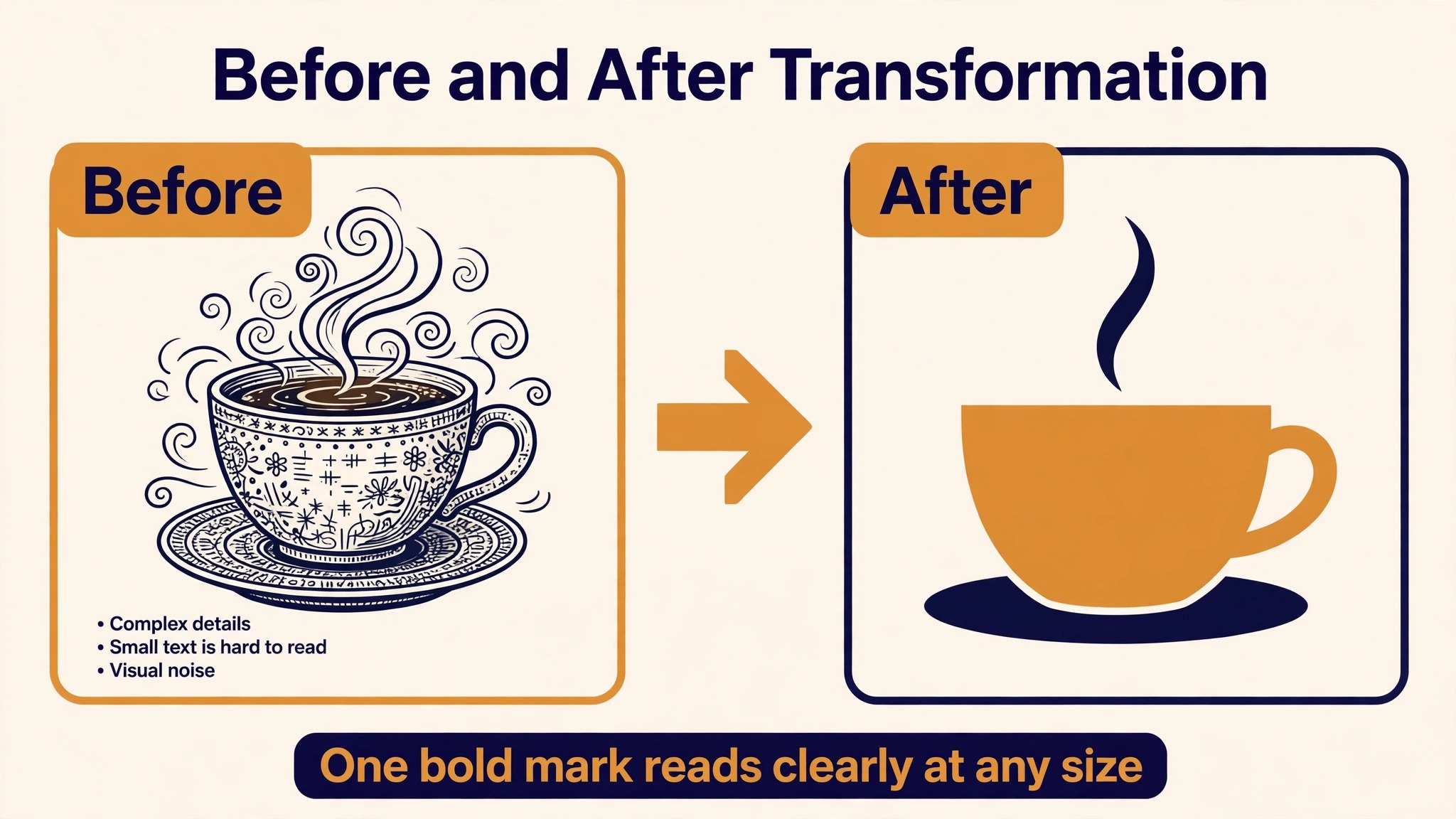
The second mistake is using a general image generator for production icon work. Tools built for art produce detailed, shaded, photographic results that look stunning at full size and fall apart as icons. They need heavy post processing for interface use, and the time spent cleaning them up exceeds the time saved by generating them. Use a specialised icon tool for the set, and keep the general generator for exploration and mood boards.
The third mistake is ignoring the small sizes. An icon designed at 1024 pixels with fine detail, thin lines, and subtle gradients becomes unreadable at 32 pixels, which is where users actually see it. Design for the smallest size first, then add detail only if the larger sizes need it, and test every icon at the size where it will be used most.
The fourth mistake is mixing styles inside one set. A flat icon next to a 3D icon next to a line icon looks like three different products, and users notice the inconsistency even when they cannot name it. Pick one style, one line weight, and one corner radius, and apply them to every icon in the set without exception.
The fifth mistake is shipping an icon without checking the licence. A free tier with non commercial terms, a generator with vague rights, or an asset that resembles an existing brand can all cause trouble after launch. Check the licence before the icon ships, not after a client asks about it.
The sixth mistake is designing icons in isolation from the product. An icon that looks perfect on a white artboard can vanish against a dark interface, clash with the brand colours, or compete with the text beside it. Always test icons inside the real interface, on the real background, next to the real labels, before you call the set finished.
Frequently Asked Questions
Which of the best icon makers is free?
Recraft, IconScout AI, Iconly, Canva, and Adobe Express all offer free plans, and Iconikai allows 5 free icons per day. The free tiers differ in what they allow, so test the free plan on a real brief before you pay. Recraft gives the strongest free experience for set generation, while Iconikai gives the best free test for a single app store icon.
What is the best icon maker for app icons?
Iconikai is the best choice for a single app store icon, because it was trained on performing store icons, generates in around eight seconds, and cleared store validation in a September 2026 test of eight platforms. For the full interface set inside the app, pair it with Recraft, which generates six matching icons in one style per click and exports them as editable vectors.
Do I need SVG export for icons?
You need SVG export when the icon must scale, be recoloured, or be edited after generation, which covers website navigation, product interfaces, and brand systems. You do not need it for an app store icon, which ships as sized PNG files. Recraft and IconScout AI are the strongest tools in this guide for SVG output, and both export files that open cleanly in standard design tools.
Can AI icon generators make a full matching set?
Yes, but only the specialised ones do it well. Recraft generates six related icons in one style from a single prompt, and Iconly applies style presets across a set so the icons stay consistent as the set grows. General image generators struggle here, because each generation is independent and the style drifts from one icon to the next.
What should an icon set cost?
A single icon set can cost nothing on a free tier, and a paid plan for serious work runs from 20 dollars a month for Recraft to 144 dollars a year for Canva Pro. The price that matters is the cost per usable icon, not the monthly fee, so judge a tool by how many icons in the set you would actually ship rather than by how many it generates.
How do I check if an icon licence covers client work?
Read the licence page on the vendor site and look for three things. Full commercial rights, permission to use the icon in client work, and whether the free tier carries the same terms as the paid tier. IconScout AI states full commercial rights clearly, which is the standard to compare other tools against. Save a copy of the terms for any icon that ships in a client project.
The Bottom Line
The best icon makers are the ones that treat icons as working assets rather than as pictures. Recraft wins for consistent sets with real vector output, IconScout AI wins when generated icons must match a large existing library, and Iconikai wins for the single app store icon that must pass validation and stand out in search.
Start with a test set of six icons, shrink them to 16 pixels, check the export and the licence, and only then decide which tool earns a place in your workflow. A good icon set is invisible in the best way, because users never notice the icons at all, they simply find what they need. That is the test that matters, and it is the one worth running before you pay for any tool. When the set passes, the tool has done its job, and the product feels finished.