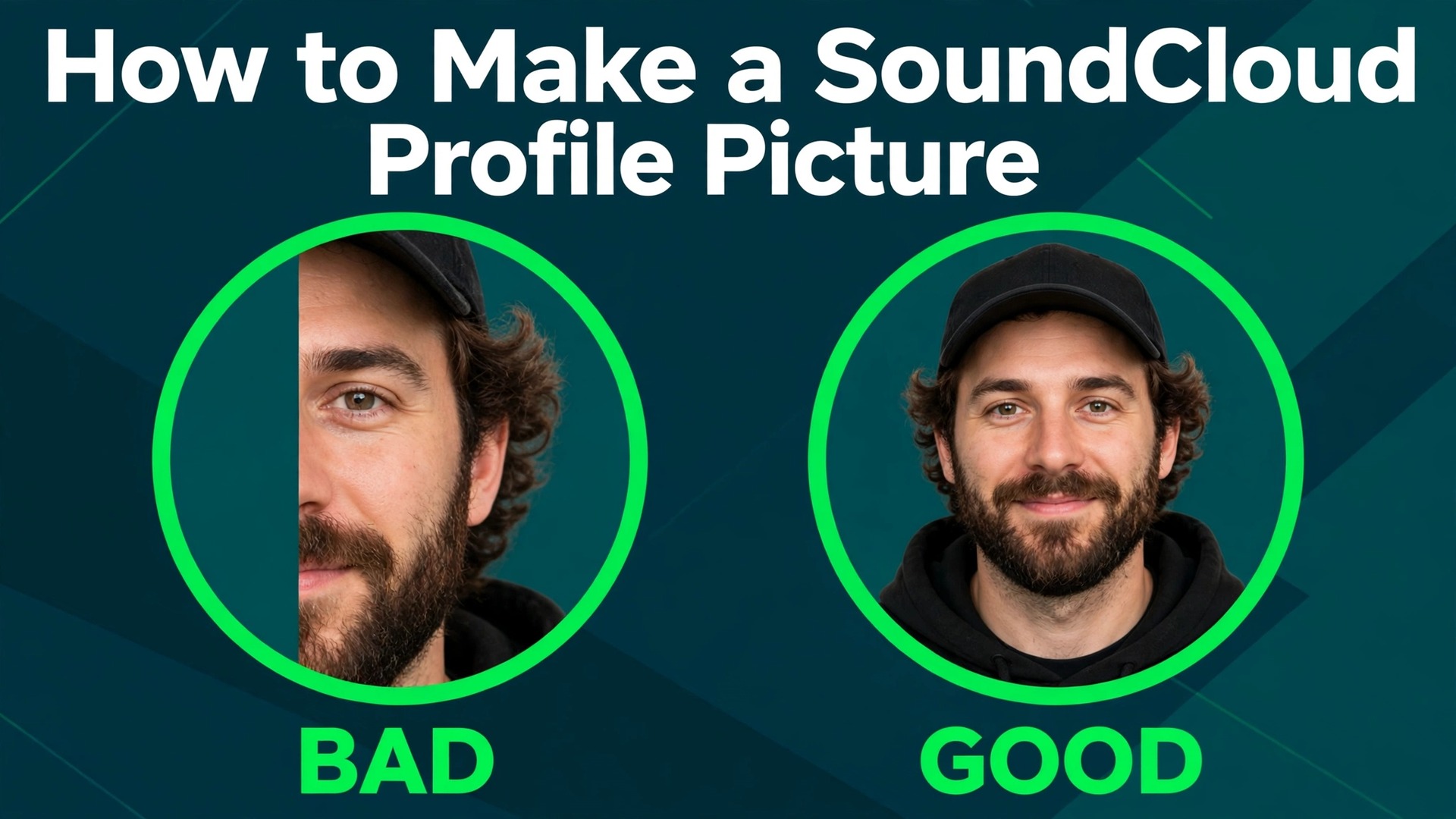
Your SoundCloud profile picture is about the size of a thumbnail on most screens, and it is cropped into a circle. That is the whole problem. A photo that looks great as a square can lose a face, a logo or a band name the moment SoundCloud cuts the corners away, and a low resolution upload turns blurry the first time someone opens your profile. This guide explains how to make a SoundCloud profile picture that survives the circle crop, stays sharp on every screen and still looks like you.
How to Make a SoundCloud Profile Picture: Sizes and Rules
SoundCloud publishes clear rules for profile images, and following them exactly avoids the most common failures. The profile picture must be a square image, at least 800 by 800 pixels, in JPG or PNG format, and under 2 MB in file size. SoundCloud recommends uploading at 1000 by 1000 pixels for the best quality, and that is the size this guide uses throughout. The picture displays as a circle everywhere on the platform, in comments, in reposts, on your profile page and in search results.
| Image type | Size | Format | File limit | Shape on screen |
|---|---|---|---|---|
| Profile picture | 1000 by 1000 recommended, 800 by 800 minimum | JPG or PNG | 2 MB | Circle |
| Header banner | 2480 by 520 minimum | JPG or PNG | 2 MB | Wide strip |
| Track artwork | 800 by 800 minimum | JPG or PNG | 2 MB | Square |
| Distribution artwork | 3000 by 3000 at 300 DPI | PNG or JPEG | No stated limit | Square |
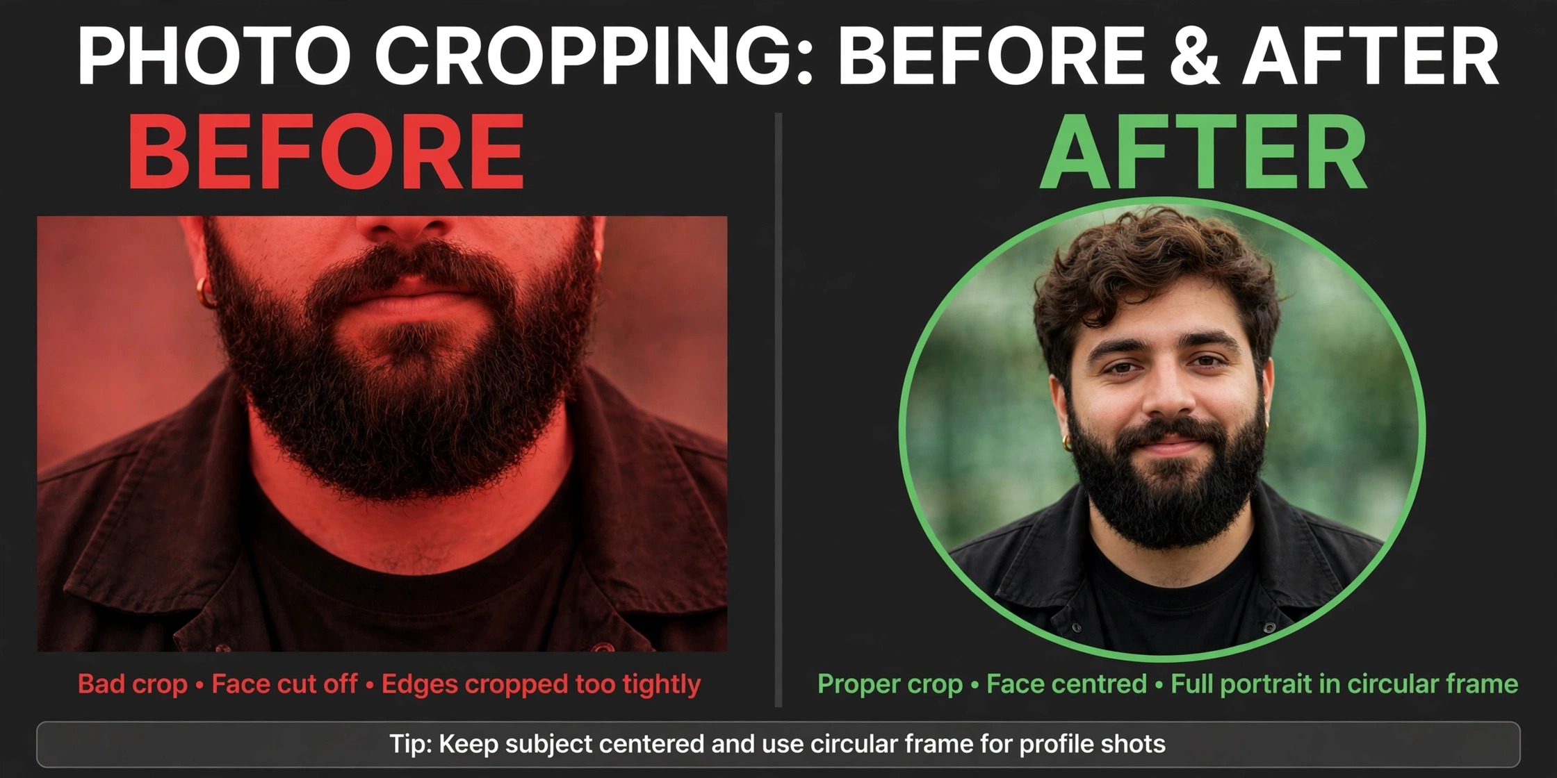
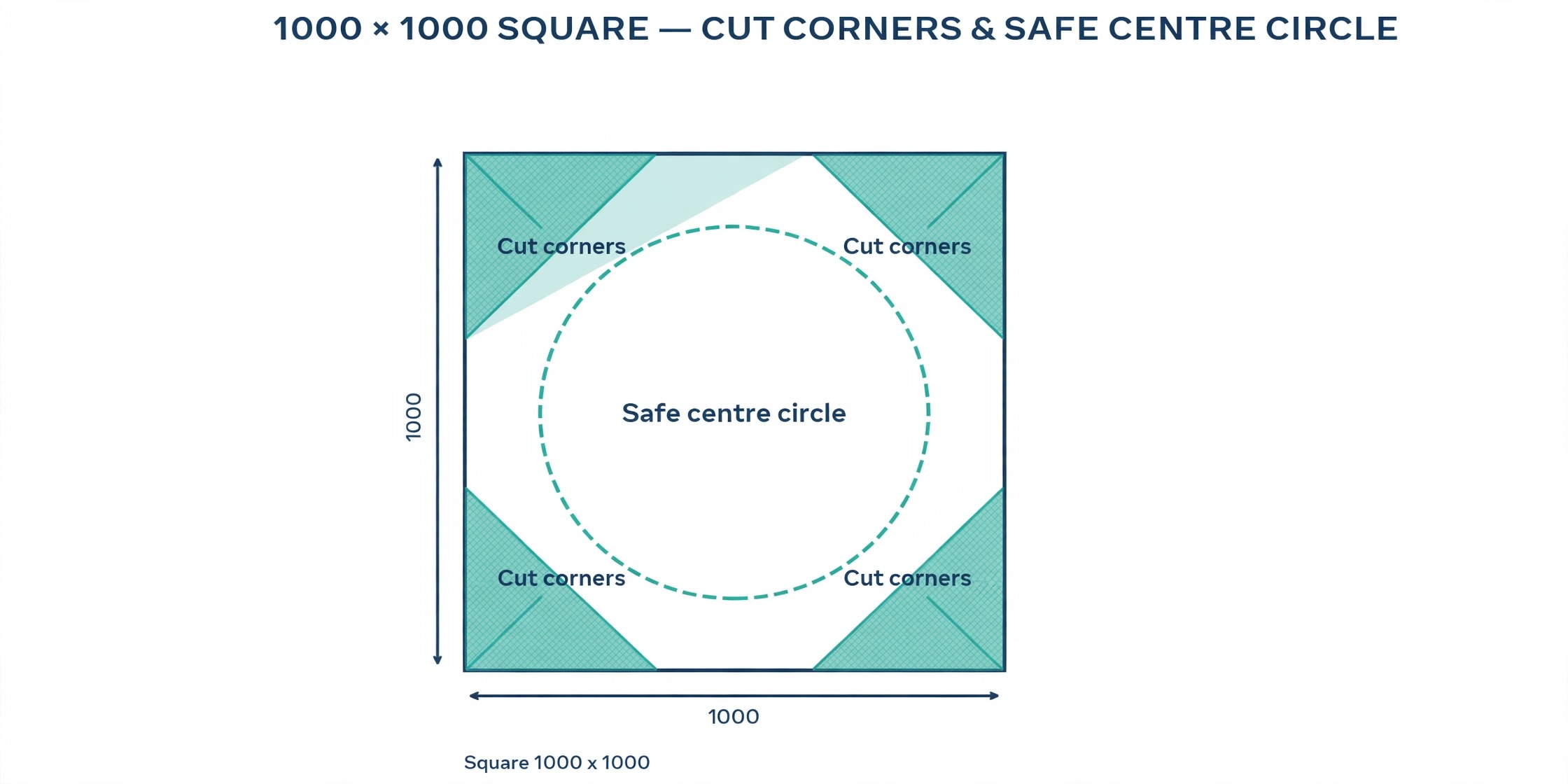
The circle crop is the detail that catches most people. SoundCloud cuts the four corners of your square, so anything important near an edge disappears. Keep the face, logo or symbol in the centre of the square, with clear space around it. Text near the edges gets cut, and small text anywhere becomes unreadable at the size the picture actually displays. A profile picture that works is one where the subject fills the middle half of the square and nothing important touches the border.
File size matters too. SoundCloud rejects uploads over 2 MB, and it compresses large images after upload. A 1000 by 1000 JPG saved at high quality usually lands well under the limit, while a PNG with heavy detail can exceed it. If your file is too big, export as JPG at 85 percent quality, or reduce the dimensions to 1000 by 1000 exactly. Do not upload a 4000 pixel original and expect SoundCloud to handle it cleanly, because the platform compresses oversized images and the result often looks worse than a correctly sized export.
The 8 Step Workflow
Follow these steps in order and you will have a finished profile picture in about twenty minutes, including the time it takes to pick the right photo. This workflow covers how to make a SoundCloud profile picture from the first choice to the final check, and it works whether you start from a photo or a logo.
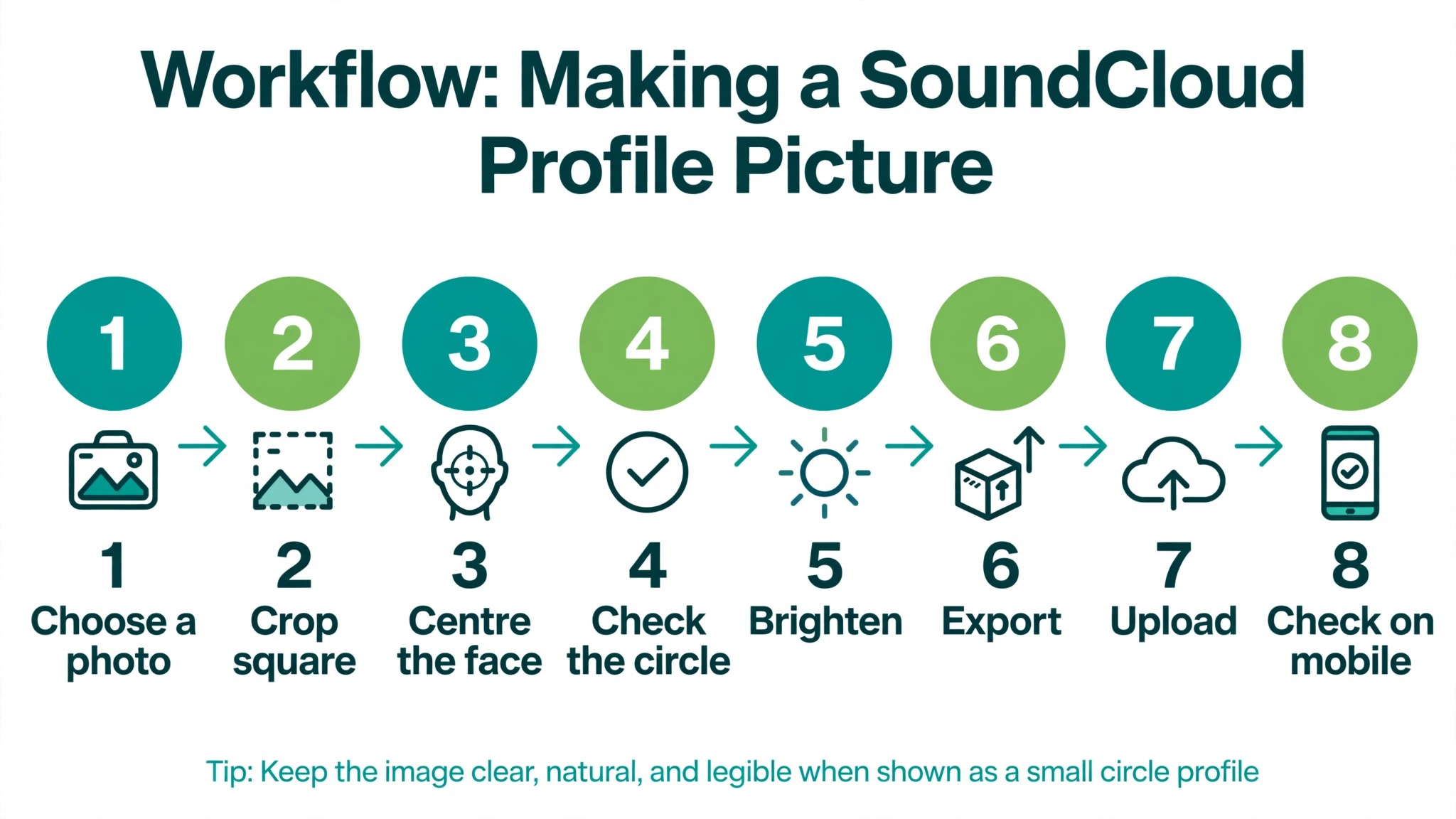
1. Choose a photo or logo that reads at thumbnail size.
Start with the image itself, not the editor. A close up portrait works better than a full body shot, because the face fills the circle. A simple logo works better than a detailed one, because fine lines vanish at small sizes. Open the image, zoom out until it is the size of a thumbnail, and ask whether you can still tell what it shows. If the answer is no, pick a simpler image.
2. Open a 1000 by 1000 canvas in your editor.
Set the canvas to exactly 1000 by 1000 pixels before you place anything. Working at the final size means no surprises at export, and it keeps text and shapes at the scale they will actually appear. Most editors offer a custom size option, and several offer a SoundCloud profile preset. Use the preset when it exists, and the custom size when it does not.
3. Place the subject in the centre with space around it.
Put the face or logo in the middle of the square and leave clear space on all four sides. The circle crop removes the corners, so the safe area is the centre circle, roughly the middle 70 percent of the square. Anything outside that circle is at risk. Check the placement by imagining a circle drawn inside the square, and keep every important detail inside it.
4. Add a background that makes the subject stand out.
A plain background beats a busy one at this size. A solid colour, a soft gradient or a blurred version of the same photo all work, because they push the subject forward. Avoid backgrounds with text, faces or strong patterns, because they compete with the subject and turn the tiny circle into visual noise. If you use a photo background, darken it slightly or add a soft blur so the subject stays the clearest thing in the frame.
5. Add text only if it survives the crop.
Most profile pictures need no text at all. Your name already appears next to the picture everywhere on SoundCloud. If you do add text, keep it to one or two words, use a bold font, and place it in the centre of the square. Test it at thumbnail size. If you cannot read it easily, remove it. A band name in small letters across the bottom of the square will be cut by the circle and unreadable in comments.
6. Adjust brightness, contrast and sharpness.
Small images need more contrast than large ones. Raise the contrast slightly, add a small amount of sharpening, and check the result at the size it will display. Faces benefit from a slight brightness lift, because the circle crop and the platform compression both darken the image a little. Do not overdo it. Heavy filters and strong saturation look worse after SoundCloud compresses the file.
7. Export as JPG or PNG under 2 MB.
Export at 1000 by 1000 pixels in JPG at 85 percent quality for photos, or PNG for logos and graphics with flat colours. Check the file size before you upload. If a PNG is over 2 MB, switch to JPG or reduce the colour detail. Name the file clearly, such as your artist name plus the word profile, so you can find it again later.
8. Upload the picture and check it on desktop and mobile.
Upload the finished image through your profile settings, then open your profile on a desktop browser and on the mobile app. Look at the picture in a comment thread, where it appears smallest, and on your profile page, where it appears largest. If anything looks cut off or blurry, go back to the editor, adjust the placement or the export, and upload again. SoundCloud lets you change the picture as often as you like, so iterate until it looks right in both places.
Design Rules That Make a Small Circle Readable
A profile picture is a piece of design that has to work at 40 pixels wide in a comment thread and at 200 pixels wide on a profile page. That range decides every choice. The first rule is one subject only. A picture with a face and a logo and a background scene is three subjects fighting for space, and at thumbnail size the fight ends with none of them readable. Pick the face or the logo, and build the whole image around it.
The second rule is contrast. The subject should be clearly lighter or darker than the background, and the colours should be far apart on the wheel. A dark logo on a dark background disappears. A pale face against a pale sky disappears. Check the image in greyscale, because if it works without colour, it will work with colour. The third rule is simplicity of shape. Circles, bold letters and simple symbols read well at small sizes. Thin lines, fine detail and small patterns turn into grey smudges after compression.
The fourth rule is consistency with the rest of your profile. Your profile picture, your header banner and your track artwork should look like they belong to the same artist. Use the same colours, the same font and the same style of photography across all three. A listener who finds you through one track should recognise you instantly on your profile page. The fifth rule is honesty. Use a recent photo that looks like you now, or a logo you actually use everywhere else. A picture that misleads a listener costs more trust than a plain picture ever will.
Colour deserves its own thought, because colour is what a listener notices first at thumbnail size. Pick one strong colour for the background and one contrasting colour for the subject, and let those two colours carry the image. A bright background with a dark subject works, and a dark background with a bright subject works just as well. What fails is a background and a subject in similar tones, because the two blend into one flat shape.
Warm colours feel energetic and suit upbeat music, while cool colours feel calm and suit ambient or acoustic work. The choice should match the music, not the fashion of the month, because the picture will sit next to your tracks for a long time.
Choosing Between a Photo and a Logo
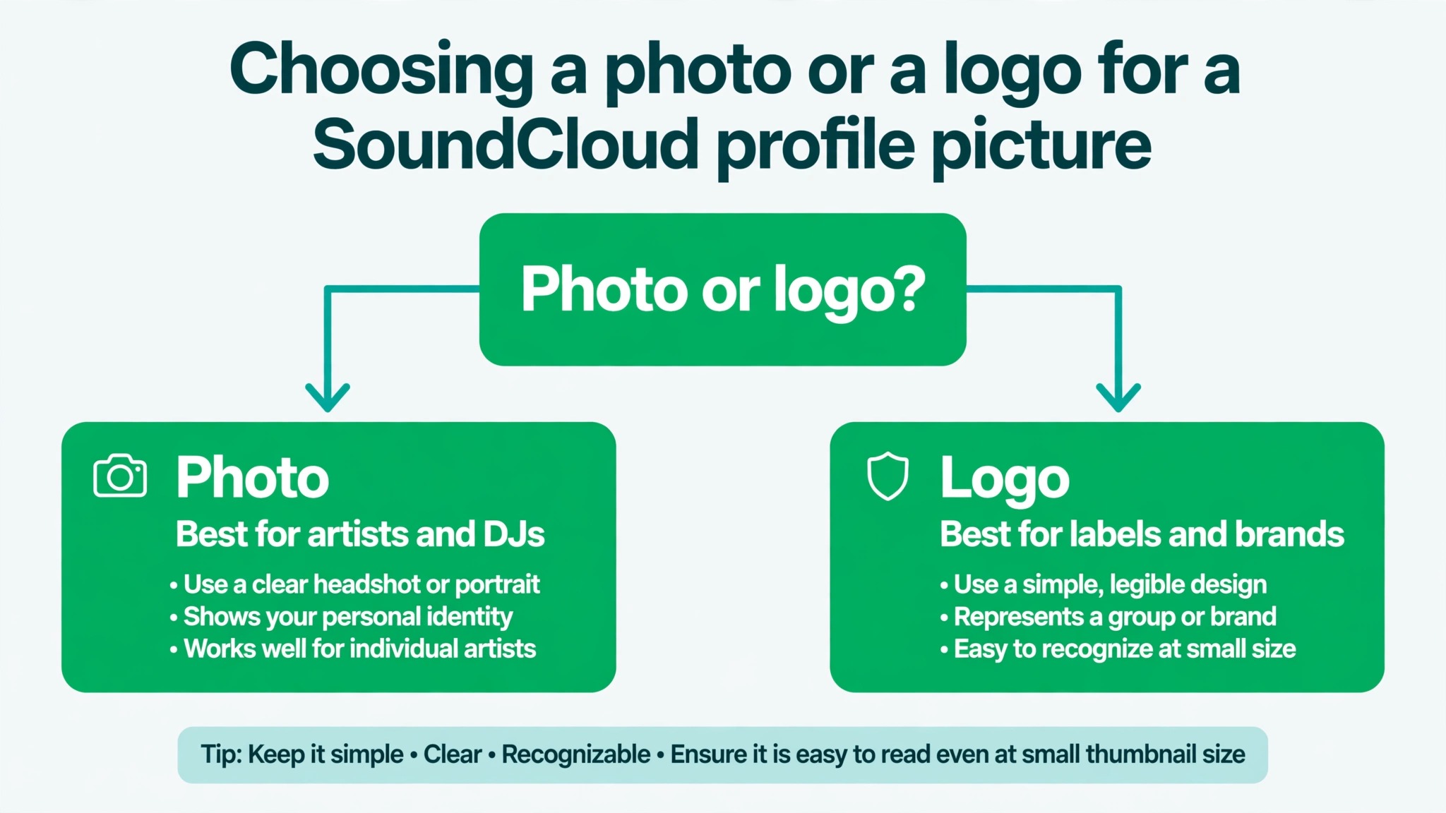
One of the first decisions in how to make a SoundCloud profile picture is whether to use a photo or a logo. A photo works best for solo artists, singers and producers who perform under their own name, because listeners connect with a face faster than with a mark. A close portrait with good light, a plain background and a direct gaze is the strongest choice for a personal brand, and it helps at live shows too, because the audience recognises the person they saw online.
A logo works best for labels, collectives, bands with a strong visual identity and producers who release under a project name rather than a personal name. A logo also ages better than a photo, because it does not go out of date when your hair changes. The logo must be simple, with bold shapes and no fine detail, because the circle crop and the thumbnail size punish complexity. A wordmark in a heavy font works well, while a detailed illustration with thin lines does not.
Some artists use both, with a photo as the profile picture and the logo in the header banner or the track artwork. That split works when the two images share colours and style, so the profile still reads as one brand. What does not work is a different logo on every track, because listeners lose the thread. Pick one picture for the profile, keep it stable for months, and let the track artwork carry the variety.
Tools for the Job
You do not need expensive software to make a strong profile picture. These eight tools cover how to make a SoundCloud profile picture at every budget and skill level, and each one handles the 1000 by 1000 square and the circle crop.
Canva
Canva is the easiest starting point. It offers SoundCloud profile templates, a drag and drop editor, background removal on the Pro plan and one click export at the right size. The free plan covers the whole job for most people. Pro costs $18 a month, or $144 a year, and adds the background remover and premium templates. Canva suits artists who want a finished picture in ten minutes without learning a new tool.
Adobe Express
Adobe Express is the closest rival to Canva, with strong templates, Adobe Stock photos and Firefly AI image tools. Premium costs $9.99 a month, or $99.99 a year. The free plan covers templates, resizing and basic editing, and the background remover is available on some free accounts. Express suits creators who already use Adobe tools or want premium stock photos in the same editor.
Photopea
Photopea is a free browser based editor that works like Photoshop, with layers, masks and full export control. It opens PSD files, exports JPG and PNG at exact dimensions, and costs nothing. The trade off is a steeper learning curve and ads on the free version. Photopea suits anyone who already knows Photoshop style editing and wants full control without a subscription.
Fotor
Fotor combines photo editing with design templates, and its portrait tools are useful for profile pictures. It offers one click enhancement, background blur and a simple editor that stays out of the way. Pro costs $8.99 a month, or $39.99 a year, and the free Basic plan covers the core editing. Fotor suits artists who start from a photo and want it polished rather than rebuilt.
Picsart
Picsart is a mobile first editor with strong filters, stickers and background tools, plus a desktop version. It is popular with musicians who design on their phones, and it handles the square canvas and export sizes well. The free plan covers most features with ads, and the paid plan removes ads and unlocks premium assets. Picsart suits creators who do everything on a phone and like a playful, fast editor.
Pixlr
Pixlr is a free browser editor with two modes, a quick express editor and a full featured editor with layers. It exports JPG and PNG at exact sizes and handles background removal on the paid plan. Pixlr suits people who want a free tool with more depth than Canva free but less complexity than Photopea.
Placeit
Placeit offers logo and profile picture templates built for musicians and creators, with mockups that show how the design looks in context. It is a paid tool with a monthly subscription, and it suits artists who want a logo style profile picture without designing from scratch.
Kapwing
Kapwing is a browser based editor that handles images and video in the same workspace, with templates, background removal and easy resizing. The free plan covers basic exports with a watermark on some formats, and paid plans remove the watermark and add features. Kapwing suits creators who also make video content and want one tool for both.
How to Upload on Desktop and Mobile
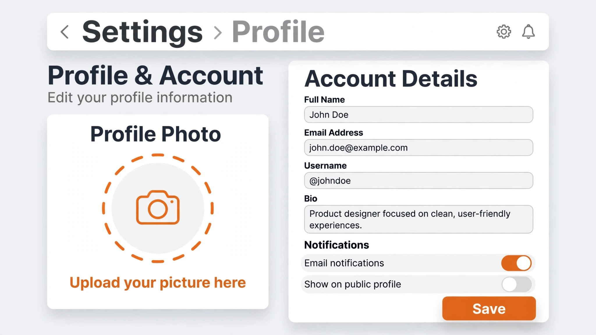
Uploading the picture takes less than a minute once the file is ready, and the upload is the easy part of how to make a SoundCloud profile picture. On a desktop browser, open SoundCloud and sign in, then open your profile page. Click the Edit button under your header, and look for the profile image section. Click Update image, choose your file, and use the drag and zoom controls to position it inside the circle preview. Save the change and refresh your profile to confirm the new picture appears.
On the mobile app, open your profile, tap the Edit button, and tap the profile picture to change it. Choose a photo from your library or take a new one, then adjust the crop and save. The mobile app offers less control over the crop than the desktop site, so check the result on desktop afterwards when you can. If the picture looks wrong on one device but right on the other, the problem is usually the placement inside the circle, not the file itself. Reposition the image so the subject sits in the centre, and upload again.
SoundCloud also lets you update your header banner from the same Edit screen. The banner needs at least 2480 by 520 pixels, and SoundCloud warns against text in the banner because it crops on smaller screens. Design the banner and the profile picture together, with the same colours and style, so the profile reads as one coherent page.
Fixing Common Problems
Even a careful plan for how to make a SoundCloud profile picture can hit a snag at upload time, and most of the failures have simple fixes. A blurry profile picture usually means the uploaded file was too small. SoundCloud stretches small images to fit, and the result looks soft. Upload at 1000 by 1000 pixels, and the blur disappears. If the file was already large, the problem may be over compression, which happens when a PNG with heavy detail gets squeezed under the 2 MB limit. Export as JPG at 85 percent quality instead, and the file will stay small without visible damage.
A cut off face or logo means the subject was too close to the edge of the square. Move the subject toward the centre and leave more space around it, then upload again. A picture that looks dark after upload usually needs a small brightness lift before export, because SoundCloud compression darkens images slightly. A picture that looks washed out usually had too much contrast or saturation applied before upload, and the compression pushed it further. Pull the edits back and export a gentler version.
A rejected upload usually means the file is over 2 MB or in an unsupported format. SoundCloud accepts JPG and PNG for profile pictures, and GIF appears in some older guidance but is not the format to rely on. Convert the file to JPG, check the size, and try again. If the upload still fails, try a different browser or the desktop site, because the mobile app occasionally fails on large files.
A picture that clashes with the header banner is a different kind of problem, and it is easy to miss because the two images are edited separately. Open your profile page after upload and look at the picture and the banner together. If the colours fight, adjust the banner to match the picture, or add a colour from the picture into the banner. A profile where the picture is warm and the banner is cold looks unfinished, even when each image is good on its own.
How Often Should You Change Your Profile Picture
Change your profile picture when something real has changed, not on a schedule. A new album, a rebrand, a new logo or a clear change in your look are all good reasons. A picture that changes every week confuses listeners, because recognition is the whole point of a profile picture. The listeners who follow you learn your picture the way they learn a friend’s face, and each change resets that recognition.
A good rhythm for most artists is one picture per release cycle, updated when a new project launches, and kept stable in between. Labels and collectives can keep a logo for years without any loss, because the logo is the brand. Solo artists should update the photo when it no longer looks like them, and not before. If you are unsure whether to change, ask a friend who follows you whether they would still recognise the profile. If the answer is yes, keep the picture.
Matching Your Picture to Your Genre
The picture should signal the music before a listener presses play. A hip hop artist with a bold, high contrast portrait and a city background tells a different story from an ambient producer with a soft, minimal image and muted colours, and listeners read those signals in a second. Look at the artists you admire in your genre and notice what their pictures share. The shared traits are the visual language of the genre, and your picture should speak it.
That does not mean copying anyone. It means understanding the expectations so you can meet them or break them on purpose. A metal band with a pastel profile picture confuses listeners, while a folk singer with a stark black and white portrait feels right. The picture is a promise about the sound, and a broken promise costs a play.
Test the picture against the genre by showing it to a friend without the music and asking what kind of sound they expect. If the answer matches your music, the picture is doing its job. If the answer is far off, change the colours or the subject before you upload, because fixing it now is faster than fixing it after a release.
SoundCloud Profile Picture Size Checklist
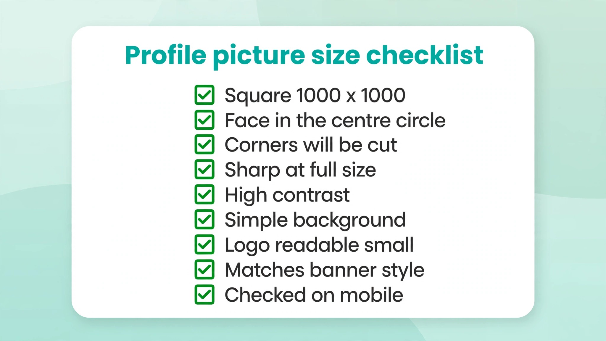
Use this checklist before every upload, and the picture will be right the first time.
- Canvas is exactly 1000 by 1000 pixels.
- File is JPG or PNG and under 2 MB.
- Subject sits in the centre with clear space on all four sides.
- Nothing important touches the edge of the square.
- Text, if any, is one or two words in a bold font at the centre.
- Image reads clearly at thumbnail size.
- Brightness and contrast checked at small size.
- Picture matches the header banner colours and style.
- Checked on desktop and on mobile after upload.
Frequently Asked Questions
What size should a SoundCloud profile picture be?
Upload a square image at 1000 by 1000 pixels in JPG or PNG format, under 2 MB. SoundCloud accepts a minimum of 800 by 800 pixels, but 1000 by 1000 gives the sharpest result on high resolution screens. The picture displays as a circle, so keep the subject in the centre. If you work at a larger size, such as 2000 by 2000, export down to 1000 by 1000 before upload, because SoundCloud compresses oversized images and the result often looks worse than a correctly sized export.
Can I use a PNG for my SoundCloud profile picture?
Yes. SoundCloud accepts JPG and PNG for profile pictures. Use PNG for logos and graphics with flat colours, and JPG for photos. Either way, keep the file under 2 MB and the dimensions at 1000 by 1000 pixels.
Why does my SoundCloud profile picture look blurry?
The most common cause is uploading a file smaller than 800 by 800 pixels, which SoundCloud stretches to fit. Upload at 1000 by 1000 and the blur should disappear. Over compression is the second cause, and exporting as JPG at 85 percent quality instead of a heavy PNG usually fixes it.
How do I change my SoundCloud profile picture?
Open your profile, click or tap Edit, and choose Update image on desktop or tap the picture on mobile. Select your new file, adjust the crop inside the circle preview, and save. The change appears immediately on your profile, though cached versions in other apps can take a few minutes to update. If the new picture looks wrong, check the placement inside the circle first, because a subject near the edge is the most common cause of a bad crop.
Should my profile picture match my header banner?
Yes, and this is one of the easiest wins on SoundCloud. Use the same colours, the same font and the same style of photography in both images, so the profile reads as one coherent page. A listener who arrives from a track should recognise your profile instantly. The banner is 2480 by 520 pixels, so it has room for a wide version of the same idea, while the picture carries the single clear subject.
Can I use the same picture for my track artwork?
You can, but it is usually better not to. Track artwork is square and at least 800 by 800 pixels, while the profile picture is cropped into a circle. A picture designed for a circle may look empty as a square, and a square artwork may lose its edges in the circle. Design each one for its own shape, and keep the style consistent instead.
Getting Your Profile Picture Right
A strong SoundCloud profile picture is not a design contest. It is a clear subject, in the centre of a 1000 by 1000 square, with enough contrast to read at thumbnail size. That is how to make a SoundCloud profile picture that works everywhere on the platform, from a comment thread to a profile page.
Pick a close portrait or a simple logo, keep it centred, export at the right size, and check it on desktop and mobile. That is the whole job, and it takes about twenty minutes. The artists who stand out on SoundCloud are not the ones with the most elaborate pictures. They are the ones whose picture is recognisable in a comment thread at a glance, and that recognition starts with a simple, centred, sharp image.