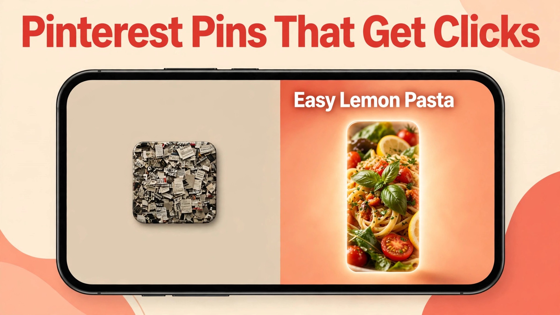
Two pins can point to the same page, use the same photo, and carry the same link, yet one earns ten times the clicks of the other. The difference is rarely the product. It is the size, the headline, the contrast, and the first second of attention. Learning how to design pinterest pins that get clicks means learning to win that first second, because Pinterest is a search surface where the image has to answer a query before the reader has time to think.
Pinterest rewards pins that are vertical, readable at thumbnail size, and honest about the page they lead to. It punishes pins that are square, crowded, vague, or misleading, by showing them less. This guide gives you a repeatable workflow for pins that earn clicks, from the canvas size and the headline to the image, the branding, the title and description, and the testing loop that keeps improving the result. Every number comes from Pinterest guidance or published 2026 pin research, and every step can be done in a free or low cost tool.
How to Design Pinterest Pins That Get Clicks Starts With the Canvas
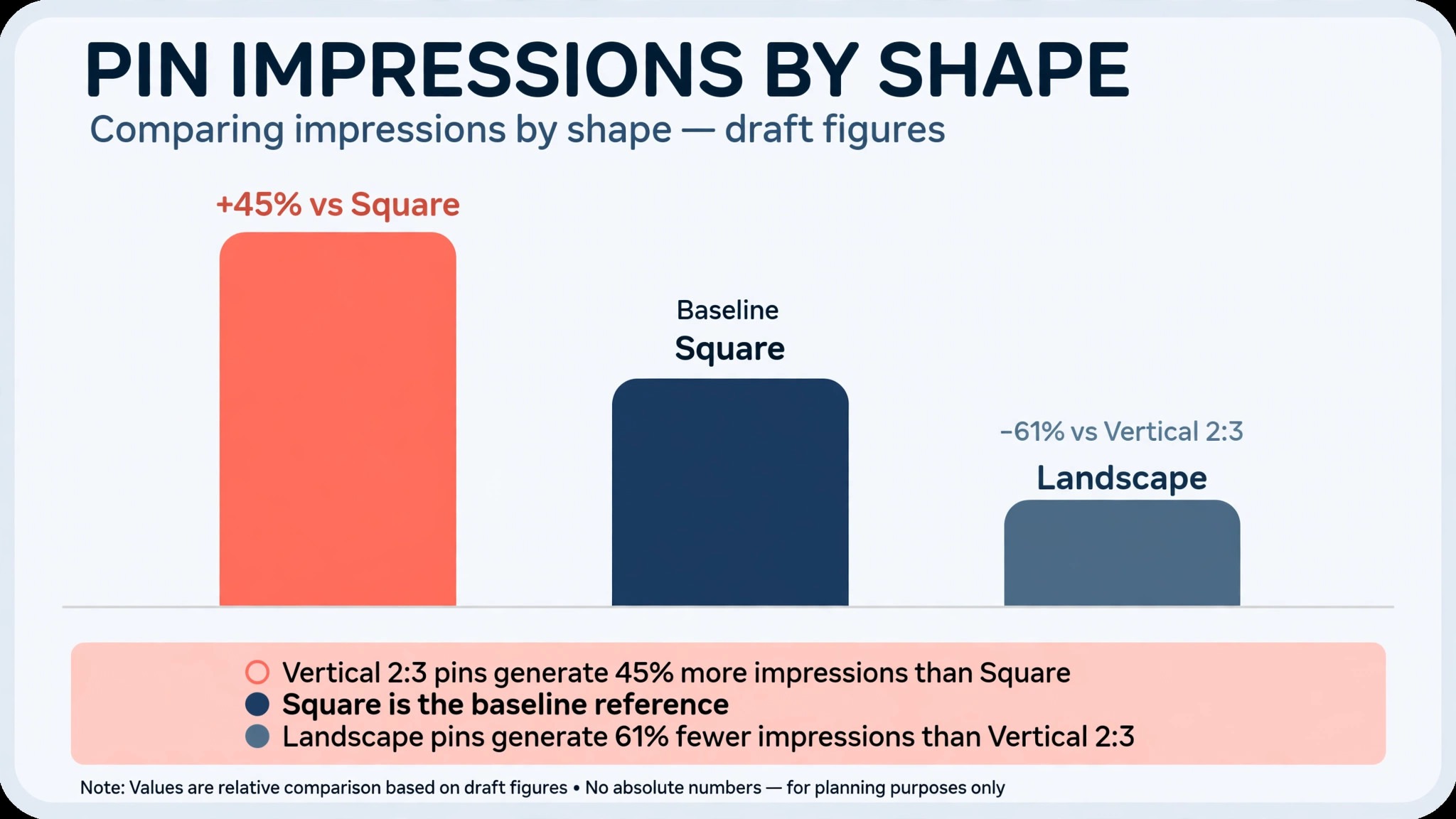
Set the canvas to 1000 by 1500 pixels, a 2 to 3 ratio, before you design anything. That size is the one Pinterest recommends for standard pins, and it is the size that fills the most feed space on a phone, where about 80 percent of Pinterest traffic arrives. A square pin gets less screen space and fewer impressions, and a landscape pin gets the least of all. Published research on more than 148,000 pins found that 2 to 3 vertical pins averaged 45 percent more impressions than square pins, while landscape pins averaged 61 percent fewer impressions than vertical ones. The canvas is the single highest impact choice you will make, and it costs nothing to get right.
Do not go taller than a 2 to 1 ratio, because Pinterest may crop the bottom of very tall pins in some placements. Keep everything important in the top two thirds of the pin, and keep the bottom third clean for the photo or the product. Export as a PNG or a JPEG, keep the file under 2 megabytes so it loads fast on a slow connection, and check the pin at thumbnail size before you publish. A pin that looks sharp at full size and unreadable at thumbnail size has failed, because the thumbnail is the size most people will see first.
Design at the final size, not at a larger size you plan to shrink later. Text that is set at 1000 by 1500 will look the way it will appear in the feed, and you will catch problems with spacing and contrast while they are still easy to fix. A pin designed at a random size and resized afterwards usually ends up with text that is too small, margins that are too tight, or a photo that is cropped in the wrong place. Start at 1000 by 1500, stay there, and let the canvas do its job.
Write a Headline a Scroller Can Read in One Second
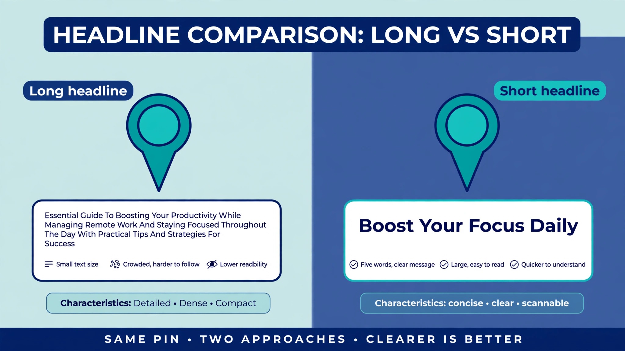
A pin has about half a second to stop a scrolling thumb, and how to design pinterest pins that get clicks starts with the headline, which does most of that work. Keep the overlay to five to eight words, in one strong headline and at most two short supporting lines. Research on 148,000 pins found that pins with a short readable overlay earned 2.1 times more outbound clicks than image only pins, while pins with 15 or more words of on image text saw a 29 percent lower close up rate. Fewer words, in larger type, with higher contrast, will beat a clever paragraph every time.
Put the headline in the top third of the pin, where the eye lands first. A headline buried in the middle gets scrolled past, and a headline at the bottom gets cropped in some placements. Use a bold sans serif font at 60 to 80 points, with a clear hierarchy between the headline and any supporting line. Use at most two fonts on the whole pin, because two fonts with clear hierarchy beat a crowded design every time. A third font adds noise, not style.
Make the headline a promise, not a label. A label says what the page is about, and a promise says what the reader will get. Compare a pin that says Summer Salad with a pin that says 5 Summer Salads Ready in 15 Minutes. The second one names a number, a time, and a result, and it gives the reader a reason to click. Use action language, name the benefit, and leave the detail for the page. The pin is an invitation, not the article itself.
Check contrast before you publish. Light text on a light photo and dark text on a dark photo both fail, and a semi transparent background bar behind the text is the honest fix when the photo is busy. Test the pin by shrinking it to the size of a phone thumbnail and reading it from arm’s length. If you cannot read it in one second, make the type bigger, cut a word, or move the text to a cleaner part of the photo. Readability is not a style choice. It is the difference between a click and a scroll.
Choose One Subject and Make It the Star
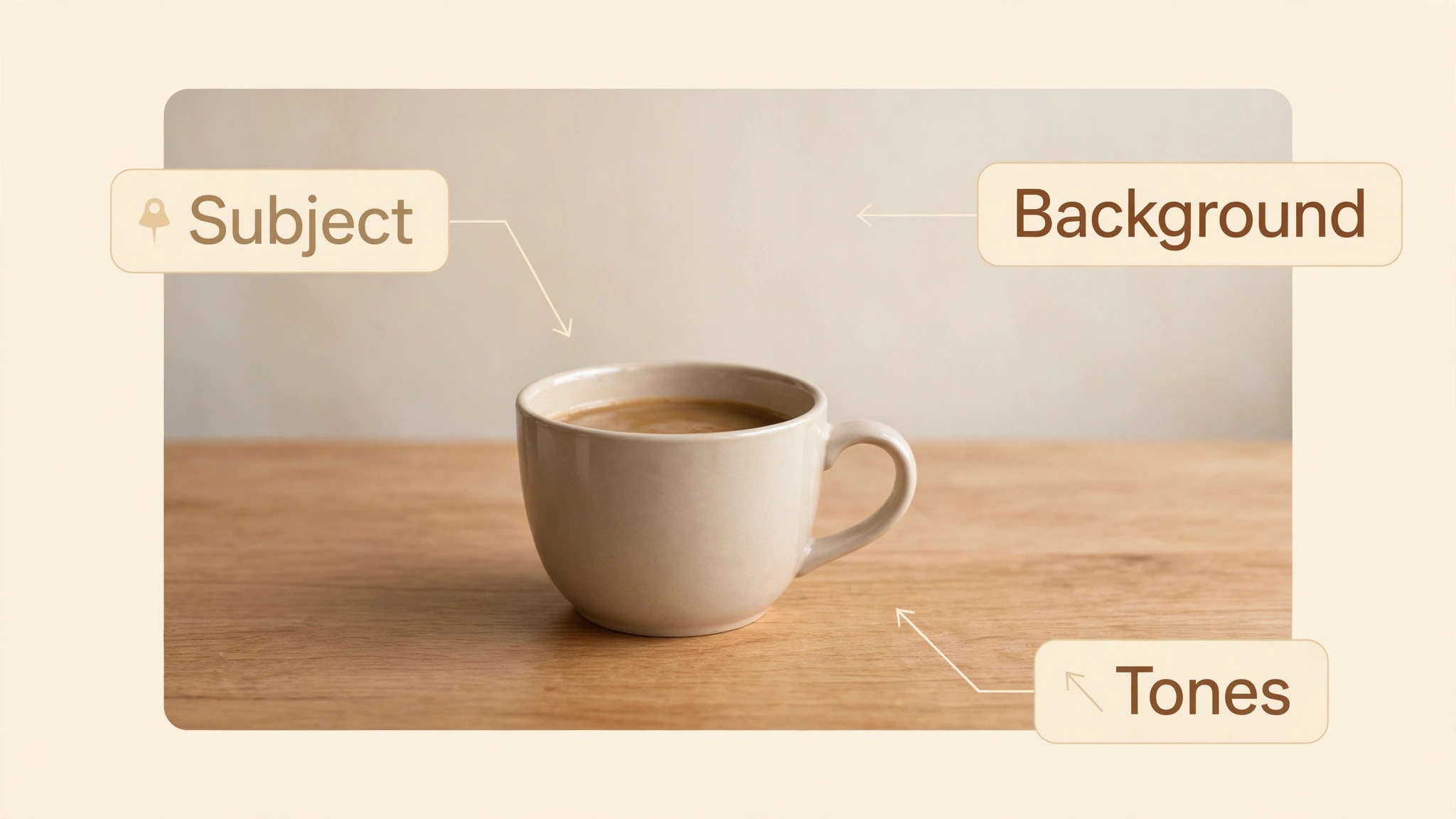
Every high performing pin has one clear subject, one uncluttered background, and a mid range exposure. The subject can be a dish, a room, a product, or a person, but it must be one thing, not five. A pin that tries to show everything shows nothing, because the eye has nowhere to land. When you learn how to design pinterest pins that get clicks, pick the subject that matches the search query, put it in the centre of the frame, and let the rest of the image support it.
Light and warm toned backgrounds earn more saves than dark ones, according to the same 148,000 pin study, which found warm toned pins averaged 8.4 saves per 1,000 impressions, 38 percent above dark background pins at 6.1. Very light and very dark images both get saved less, and the fix is usually a small exposure or saturation adjustment rather than a reshoot. Check the pin beside three competitors in the same search results, and ask whether yours is the one a stranger would tap. If it blends in, change the background, the colour, or the crop, not the product.
Use a real photo where the result matters, and use a clean graphic where the idea matters. A recipe pin needs a real photo of the finished dish, because the reader is judging whether they can make it. A checklist pin needs a clean graphic, because the reader is judging whether the list is worth saving. A lifestyle background can lift clicks sharply, with Pinterest reporting a 55 percent higher click through rate and a 13 percent lower cost per click when Walgreens tested lifestyle backgrounds against white backgrounds across about 50 products. The background is not decoration. It is part of the argument for clicking.
Keep the photo honest. A photo that shows a finished result the page cannot deliver will earn a click and lose a reader, and a reader who feels misled will not click your next pin. Use the real portion, the real room, and the real product, in good light, with a straight crop. Honesty compounds on Pinterest, because the same reader sees your pins again and again, and trust is what turns a first click into a follower.
Brand the Pin Without Ruining It
Branding helps a pin when it is small, consistent, and out of the way. Put a small logo or website name in a top corner, away from the headline and away from the lower right corner, where Pinterest places its own interface elements. A logo that covers the subject, competes with the headline, or sits where it will be cropped is worse than no logo at all. The reader should notice the brand after they notice the promise, not before.
Keep the brand colours and fonts consistent across every pin, so a follower can recognise your work in a crowded feed without reading the logo. Consistency builds memory, and that memory is how to design pinterest pins that get clicks that earn repeat visits, because a reader who has clicked you before will click you again. Change the photo, change the words, and keep the structure. A feed full of pins that look like they came from different businesses will never build that recognition, no matter how good each pin is on its own.
Do not put a watermark across the middle of the image. Watermarks signal that the creator cares more about theft than about the reader, and they make the pin harder to read at thumbnail size. A small corner mark is enough, and the link itself is the real protection, because a pin that leads to your page is a pin that works for you even when it is shared. Spend the branding effort on the page the pin leads to, where a strong first impression turns a click into a subscriber or a sale.
Titles and Descriptions That Pinterest Can Rank
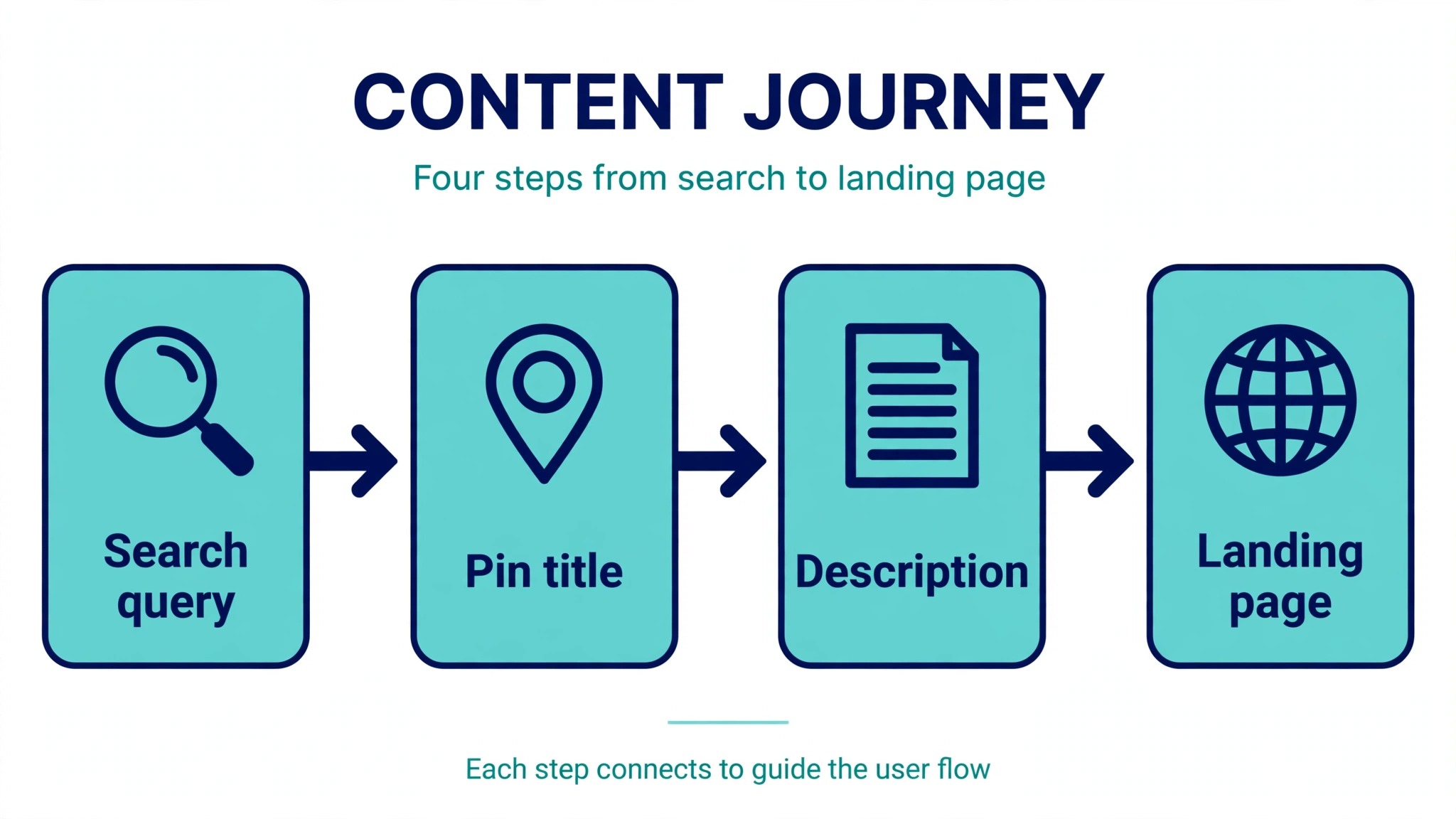
Pinterest is a search engine, and how to design pinterest pins that get clicks includes writing titles and descriptions that help the pin get found. The pin title can run up to 100 characters, and the description can run up to 500 characters, and both should carry the words a real person would search for. Put the main keyword near the start of the title, and write the description as a plain sentence that says what the page delivers, who it is for, and what the reader will find there. A title that reads like a search query will rank better than a title that reads like a slogan.
Write the description for a human first and for search second. A description stuffed with keywords reads as spam, and Pinterest treats it that way. A description that names the problem, the result, and the audience in one or two sentences will rank well and convert well, because it matches the query and it earns the click. Add two or three relevant hashtags at the end if they help, and skip the generic tags with millions of pins, where a small account will never be seen.
Match the pin to the page it leads to. A pin that promises five salads must lead to a page with five salads, not to a homepage, a category page, or a page with one salad and four adverts. Pinterest watches what happens after the click, and a pin that sends readers to the wrong page will lose distribution, even if the image itself is strong. The fastest way to improve a pin click through rate is often to fix the landing page, not the pin.
Fresh Pins, Repins, and How Many to Publish
A fresh pin is a new image for the same URL, and it is the main way to keep a page earning clicks over time. Pinterest allows several pins per URL, and each fresh pin is a new chance to reach a different searcher with a different headline, a different photo, or a different angle. Make two or three fresh pins for every important page, with different headlines and different images, and publish them days apart rather than all at once. A page with three good pins will outperform a page with one great pin, because it reaches three different kinds of searcher.
Repinning your own pin to a new board is not the same as a fresh pin, and it will not earn the same distribution. Use repins to organise your boards, not to chase reach. Focus the creative effort on fresh images, because the image is what the feed shows, and a new image is a new first impression. Keep a simple spreadsheet of the URL, the pin, the headline, and the date, so you know which pages have fresh pins and which ones are waiting.
Publish steadily rather than in bursts, because how to design pinterest pins that get clicks is a habit, not a single image. A few fresh pins a week, every week, will beat twenty pins in one day followed by a month of silence. Pinterest has a long tail, and some of the best pins take a month to gain traction, so judge a pin after two to four weeks, not after two days. A pin that looks slow in its first week can become a steady source of clicks for a year, and the only way to find those pins is to keep publishing and keep watching.
Video Pins and Idea Pins in 2026
Video pins follow different visual rules from static pins, because motion does the work that a headline does on a static image. Keep the video short, put the promise in the first two seconds, and add captions, because many viewers watch without sound. A video pin that starts with a slow logo will be scrolled past before the content begins, while a video pin that starts with the finished result will hold attention long enough to earn a click. Use video for processes, transformations, and before and after results, where motion shows what a still image cannot.
Idea pins, which were once a separate format, now sit inside the wider pin system, and the same rules apply. Lead with the result, keep each frame simple, and end with a clear next step. A video pin that teaches one thing well will outperform a video pin that tries to teach five things badly, because the viewer remembers one thing and clicks for the rest. Keep the file light, keep the vertical format, and test the video on a phone before you publish it anywhere else.
Do not make video for every page. A static pin is faster to make, easier to test, and often earns more clicks for a straightforward page, such as a recipe, a checklist, or a product. Reserve video for the pages where motion genuinely adds information, and spend the saved time making more fresh static pins. The format should serve the page, not the other way round.
Tools for Designing Pins Fast
Canva is the most popular tool for pin design, and its free plan covers templates, basic design, and 5 gigabytes of storage. Canva Pro costs 18 dollars a month for one person, or 144 dollars a year, and adds brand kits, premium content, background removal, and more storage. Start from a 1000 by 1500 template, set your brand colours and fonts once, and save a template for each pin type you make often. A template turns a 30 minute design into a 10 minute one, and that saving is what makes fresh pins sustainable.
Adobe Express offers a free plan and paid plans from 9.99 dollars a month, with quick graphics, photo tools, and brand kits. It suits teams that already live in Adobe products and want a fast route to a clean pin without opening a full design application. Photopea is a free browser based editor that opens layered files and suits a designer who wants Photoshop style control without a subscription. Tailwind is a Pinterest scheduling tool that also offers pin design and analytics, and it suits a business that wants scheduling and design in one place, though its price is higher than a design tool alone.
Pick one design tool and one scheduler, and build your templates there. A business that designs every pin in Canva and schedules it in Tailwind will outperform a business that owns five tools and uses none of them well. The tool does not make the pin work. The headline, the image, and the testing loop make it work, and the tool only removes friction from that loop.
Canva for Pin Templates
Canva works best for pins when you build a small set of templates and reuse them with discipline. Make one template for list pins, one for recipe pins, one for product pins, and one for quote or tip pins, and keep the headline position, the logo position, and the font sizes the same across all four. A follower who sees your pins in a search will recognise the structure before they read the words, and that recognition is what earns the second click.
Tailwind for Scheduling and Analytics
Tailwind schedules pins, tracks which pins earn clicks, and shows which boards perform best. Use its analytics to find the pins that earn outbound clicks, not just saves, because a pin with many saves and few clicks is a pin people like but do not act on. Schedule fresh pins days apart, keep the boards organised by topic, and review the analytics once a month. A scheduler that shows you the click data is worth more than a scheduler that only shows you the posting queue.
Test One Change at a Time
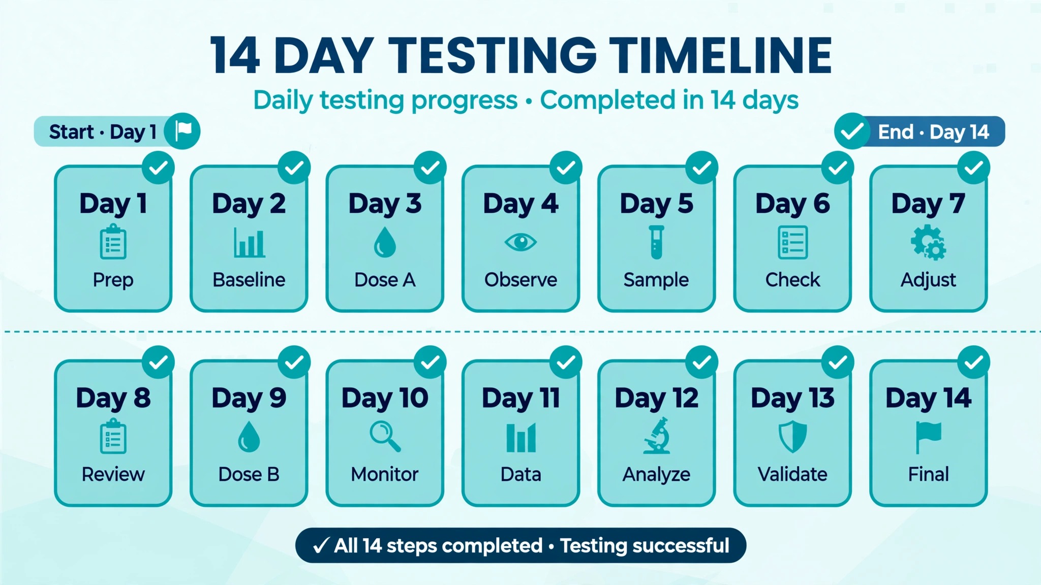
Testing is where good pins become great ones, and how to design pinterest pins that get clicks depends on changing one thing at a time. Change the headline, or the photo, or the colour, but never all three at once, because a test that changes everything tells you nothing. Give each test at least two weeks, because Pinterest has a long tail, and a pin that looks weak in its first week can grow for a month. Keep a simple spreadsheet with the pin, the change, and the saves and clicks after 14 days, and let the numbers decide.
Test the headline first, because it is the cheapest change and the highest impact one. Make a second fresh pin for the same URL with a different headline and the same photo, publish it a week after the first, and compare outbound clicks after two weeks. Then test the photo, by keeping the winning headline and changing the image. Then test the colour or the background. Three rounds of testing like this will usually double the clicks of a page, without any new content at all.
Watch outbound clicks, not just impressions or saves. Impressions tell you how many people saw the pin. Saves tell you they liked it enough to keep it. Outbound clicks tell you they wanted the page enough to leave Pinterest, and that is the number that matters for traffic. A pin with high impressions and low clicks has a visibility problem in reverse, which is a headline problem, not a distribution problem. Fix the headline, and the clicks will follow.
Mistakes That Kill Pin Clicks
The first mistake is using a square or landscape image. A square pin gets less feed space, and a landscape pin gets the least of all, so the same headline on a vertical pin will outperform the square version by a wide margin. Resize the pin to 1000 by 1500 before you design anything, and never publish a pin you designed for Instagram without resizing it first.
The second mistake is crowding the pin with text. Fifteen words of overlay will cut close ups by nearly a third, according to the 148,000 pin study, and a pin that tries to say everything says nothing. Cut the overlay to five to eight words, make the type bigger, and let the page do the explaining. The pin is an invitation, not the article.
The third mistake is linking to the wrong page. A pin that promises a specific result must lead to a page that delivers it, or the reader will leave and Pinterest will notice. Link to the exact page, not the homepage, and check the link on a phone before you publish. A broken or mismatched link wastes every click the pin earns.
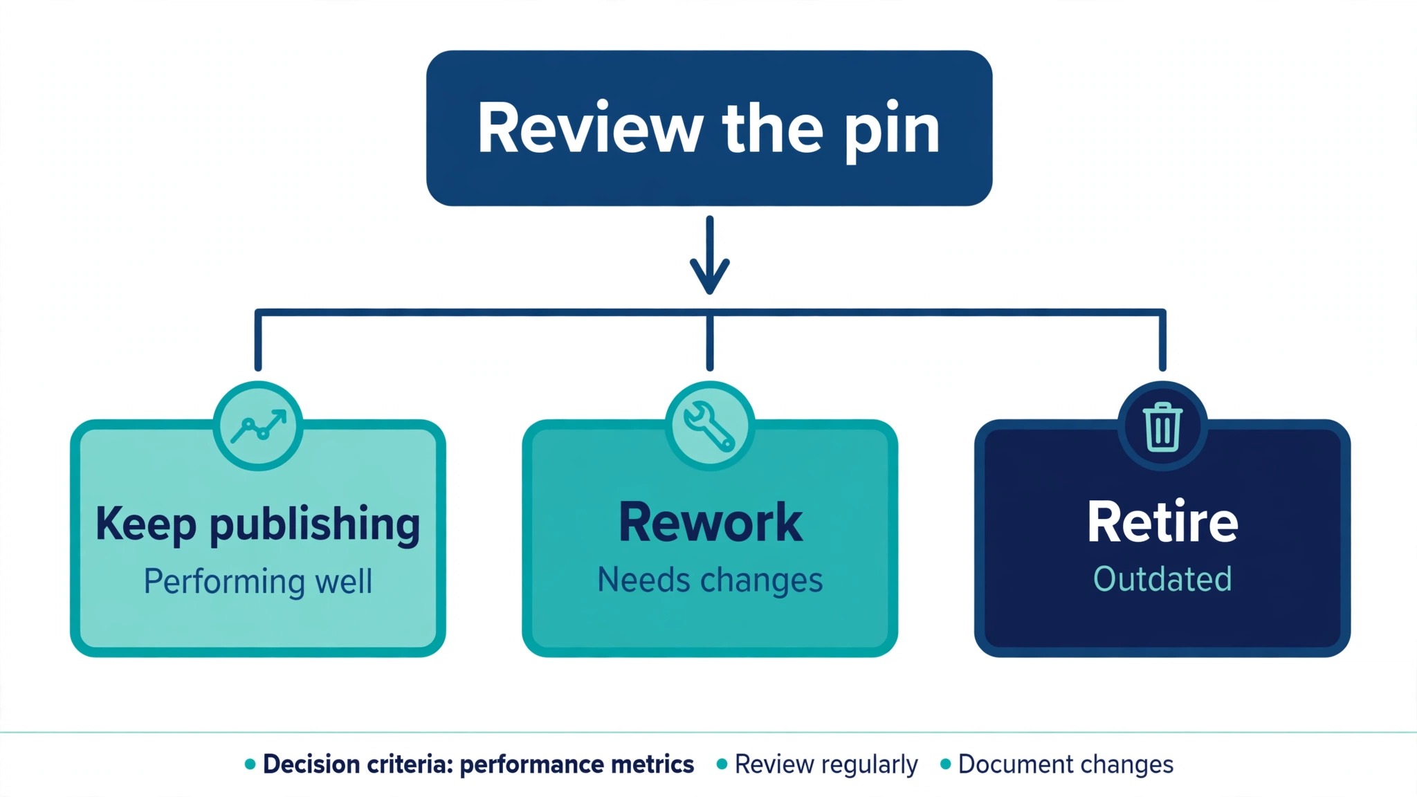
The fourth mistake is judging a pin after two days. Pinterest has a long tail, and some of the best pins take a month to gain traction. Give each pin two to four weeks, compare it with pins of the same age, and only then decide whether to retire it, repeat it, or rework it. Patience is part of the workflow, not a delay in it.
A Pin Design Checklist
Run this checklist before you publish any pin, and keep a copy beside your templates.
- Canvas is 1000 by 1500 pixels, a 2 to 3 ratio, and the file is under 2 megabytes.
- Headline is five to eight words, in the top third, in a bold sans serif font at a readable size.
- One clear subject fills the frame, with an uncluttered background and mid range exposure.
- Contrast is checked at thumbnail size, from arm’s length, in one second.
- Logo is small, in a top corner, away from the headline and the lower right corner.
- Title carries the main keyword near the start, within 100 characters.
- Description is a plain sentence within 500 characters, naming the result and the audience.
- Link goes to the exact page the pin promises, checked on a phone.
- Fresh pin is a new image and a new headline, not a repin of the old one.
- Test plan is written down, with one change and a 14 day review date.
Best Pick by Job
Different pages need different pin approaches, so choose by the job, not by the prettiest template. The table below matches the common jobs to the approach that fits each one.
| Your job | Best pick | Why it fits | Tool and cost |
|---|---|---|---|
| Recipe or food page | Real photo, short headline | Reader judges the finished dish | Canva, free to start |
| Checklist or how to page | Clean graphic, numbered promise | Reader saves the list | Canva Pro, 18 dollars a month |
| Product page | Lifestyle background, one subject | Background lifts click through rate | Adobe Express, from 9.99 dollars a month |
| Blog post with many pages | Three fresh pins per page | Each pin reaches a new searcher | Canva plus Tailwind |
| Video friendly process | Short vertical video pin | Motion shows the transformation | Phone camera, free |
| Quick test of a headline | Two fresh pins, one change | Cheapest test with the highest impact | Canva, free to start |
Check the price at checkout before you buy a tool, because vendors change list prices during the year and regional prices vary. A tool that fits your weekly habit at a fair price is worth more than a tool with more features that you never open. Start free, build templates, and pay only when a limit actually blocks you.
Frequently Asked Questions
What size should a Pinterest pin be in 2026?
A standard pin should be 1000 by 1500 pixels, a 2 to 3 ratio, which is the size Pinterest recommends. That size fills the most feed space on a phone, where most Pinterest traffic arrives. Do not go taller than a 2 to 1 ratio, because Pinterest may crop the bottom in some placements, and keep the file under 2 megabytes so it loads fast.
How many words should be on a Pinterest pin?
Five to eight words of overlay is the benchmark, in one strong headline and at most two short supporting lines. Research on 148,000 pins found that pins with five to eight words earned 2.1 times more outbound clicks than image only pins, while pins with 15 or more words saw a 29 percent lower close up rate. Fewer words, in larger type, will beat a clever paragraph every time.
How do I get more clicks on Pinterest pins?
Make the pin vertical, put a short promise in the top third, use one clear subject with high contrast, and link to the exact page the pin promises. Then make two or three fresh pins per important page, with different headlines and images, and test one change at a time for two weeks. Clicks come from the headline and the image, and they compound when the landing page delivers what the pin promised.
How many pins should I publish per week?
A few fresh pins a week, every week, will beat twenty pins in one day followed by a month of silence. Make two or three fresh pins for every important page, publish them days apart, and judge each pin after two to four weeks, because Pinterest has a long tail. Steady publishing builds distribution, and distribution builds clicks over months, not days.
Do hashtags help Pinterest pins?
Hashtags can help a pin get found, but they are a small factor next to the title, the description, and the image. Use two or three relevant hashtags at the end of the description, and skip the generic tags with millions of pins, where a small account will never be seen. A title that matches the search query matters far more than a long list of tags.
Should I use video pins or static pins?
Use static pins for most pages, because they are faster to make, easier to test, and often earn more clicks for a straightforward page such as a recipe or a checklist. Use video pins for processes, transformations, and before and after results, where motion shows what a still image cannot. Keep the video short, put the promise in the first two seconds, and add captions for viewers who watch without sound.
Why do my pins get impressions but no clicks?
High impressions with low clicks usually means the headline is not earning the click, or the image does not match the search query. Shorten the overlay to five to eight words, make the promise specific, check contrast at thumbnail size, and make sure the pin leads to the exact page it promises. Test a new headline on a fresh pin, and compare outbound clicks after two weeks.
The Final Word
A pin that gets clicks is not a lucky image, and how to design pinterest pins that get clicks is a repeatable workflow, not a guess. It is a vertical canvas, a short promise in the top third, one clear subject, honest branding, and a link that delivers what the pin offered. Build that pin, make two more fresh versions of it, test one change at a time, and give the results a month to show. The clicks will follow the work, and the work is simple enough to repeat for every page that matters.