Your website has a blank page icon in the browser tab while every competitor shows a neat little mark. That empty square is the first thing a visitor notices when they open five tabs at once, and it is the last thing most site owners fix. Learning how to make a favicon with Canva takes about twenty minutes, costs nothing on the free plan, and turns that blank square into a small piece of branding that works every time someone opens your site.
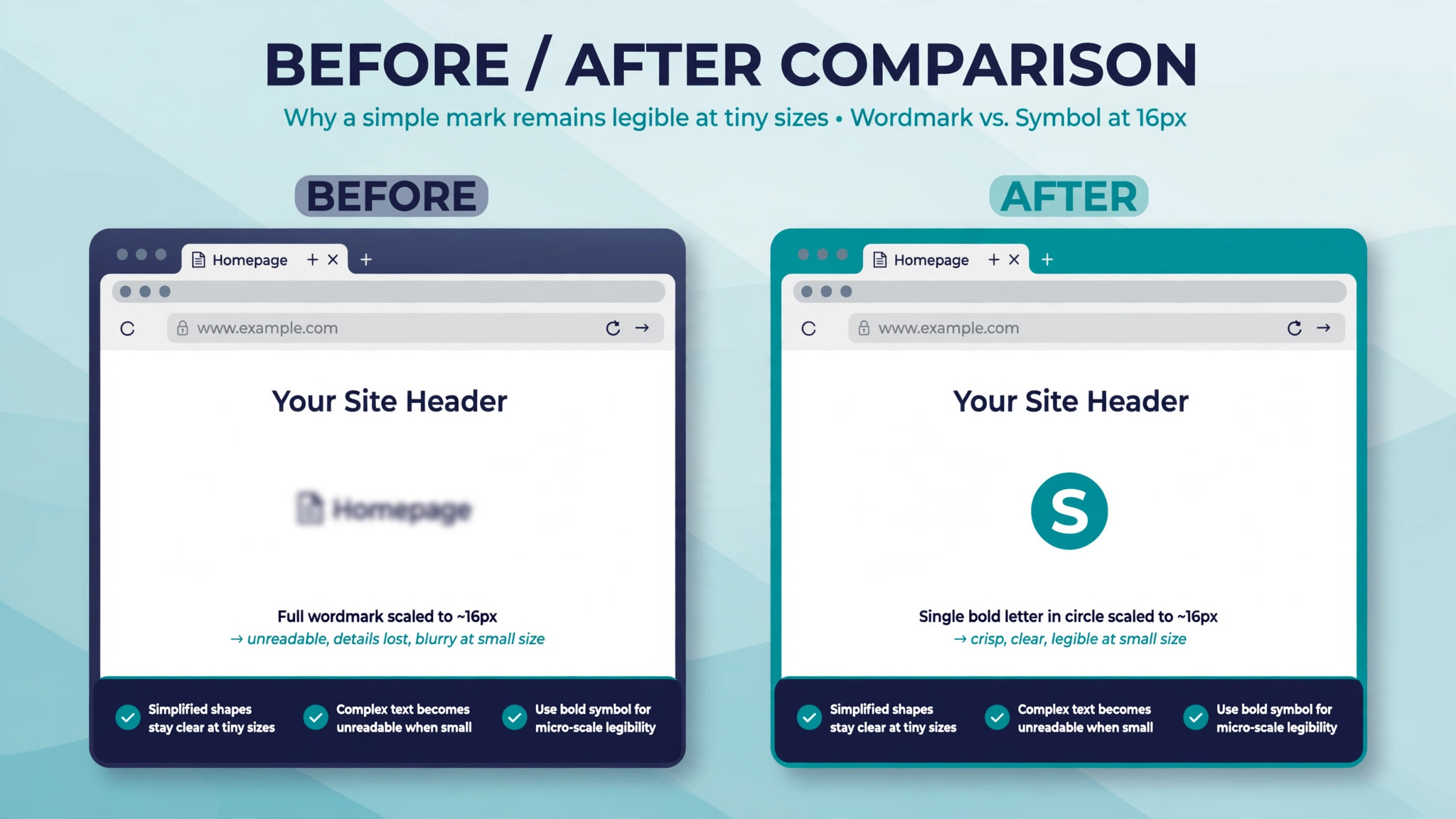
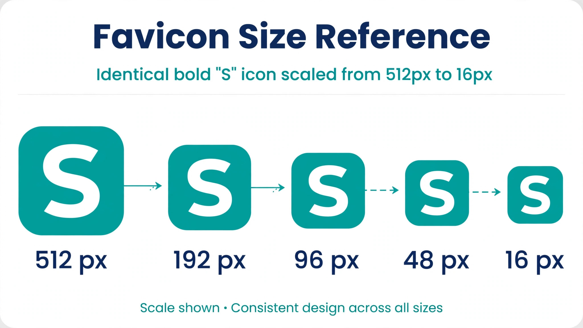
A favicon is the tiny square icon that appears in browser tabs, bookmarks, search results and phone home screens. Most visitors see it at 16 pixels wide, which is smaller than a fingernail on most screens. That size is exactly why the design needs care. A full logo with a long business name turns into unreadable noise at 16 pixels, while a single bold letter or a simple shape stays clear. The goal is not to shrink your logo. The goal is to design a mark that still reads when it is barely bigger than a grain of rice.
Canva is a practical choice for this job because it already holds the templates, shapes and fonts you need, and it exports the PNG files that WordPress and most site builders accept. You do not need design software, and you do not need to pay for Canva Pro to finish the job. The one feature that sits behind the paywall is the transparent background export, and there is a free workaround for that covered in step six. What follows is the full process, from the canvas size to the upload, with the mistakes that ruin most first attempts called out as they come up.
Why a Favicon Earns Its 16 Pixels
A favicon does three quiet jobs. First, it helps visitors find your tab again when they have a dozen open, which is how most people browse now. Second, it makes your site look finished and trustworthy in bookmarks and search results, where a missing icon reads as an unfinished site. Third, it carries your brand into places your main logo never reaches, like the home screen shortcut on a phone or the history list in a browser. None of these jobs needs a complex design. They need a mark that is visible at a glance.
Google shows favicons next to results on mobile search, and the icon must be a multiple of 48 pixels square or an SVG file to appear there, according to Google’s own guidance for site icons. That rule matters because a search result with a favicon draws the eye before a result without one. The file also needs to be crawlable, which means it should live in a public location on your site rather than behind a login or a blocked folder. Most site builders handle that placement for you once you upload the file.
The other reason to care is consistency. Your favicon is the smallest version of your brand, and it should match the colours and shapes people already associate with your site. If your logo is a blue circle with a white letter, your favicon should be that same blue circle with that same letter. A favicon that uses different colours or a different mark creates a small moment of doubt, and doubt is the last thing you want in a browser tab.
What You Need Before You Start
Gather four things before you open Canva. You need your logo file, ideally as a PNG with a transparent background, or at least a clear idea of the single element you want to use. You need your brand colours as hex codes, which you can copy from your website or your brand guide. You need to know your site platform, because WordPress, Squarespace, Shopify and Wix each ask for the file in a slightly different place. And you need about twenty minutes without interruption, because the design decisions go faster when you make them in one sitting.
The single most important decision is what the icon shows. A favicon works best when it shows one thing. That one thing can be the first letter of your business name, the main shape from your logo, or a simple symbol that represents what you do. A bakery can use a bold wheat shape or a capital B. A law firm can use a single serif letter in a dark colour. A tech startup can use the geometric mark from its logo without the wordmark. If your logo already has a strong standalone mark, use it. If your logo is only a wordmark, take its first letter and set it in the same font and colour.
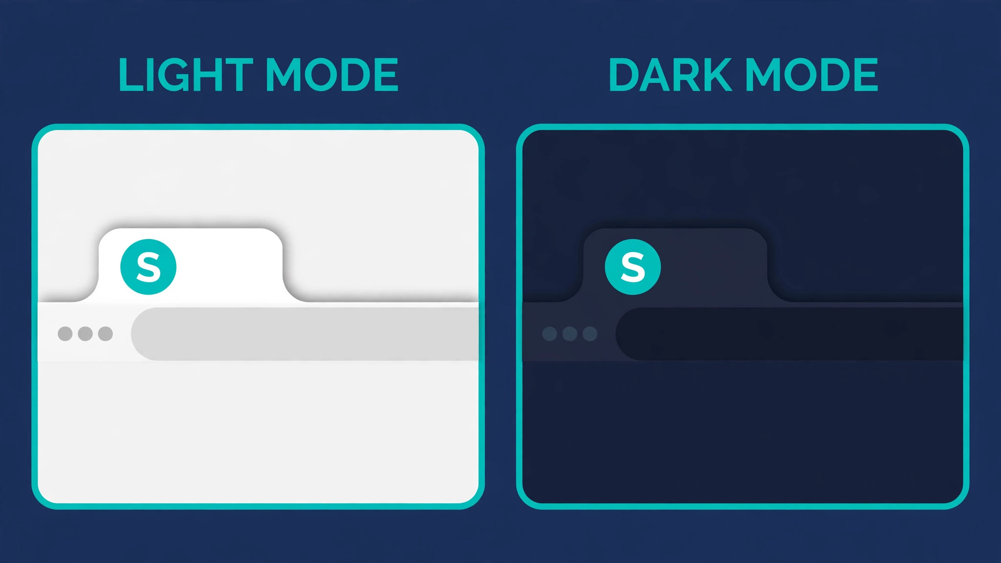
Plan for two versions from the start. The version people see in a browser tab sits on a light background, while the version on a phone home screen or a dark browser theme may sit on a dark background. A dark blue letter on a transparent background disappears against a dark tab. A white letter on a coloured square survives both. That is why most good favicons use a solid background shape with a light mark on top, rather than a transparent background with a dark mark.
How to Make a Favicon with Canva in 8 Steps
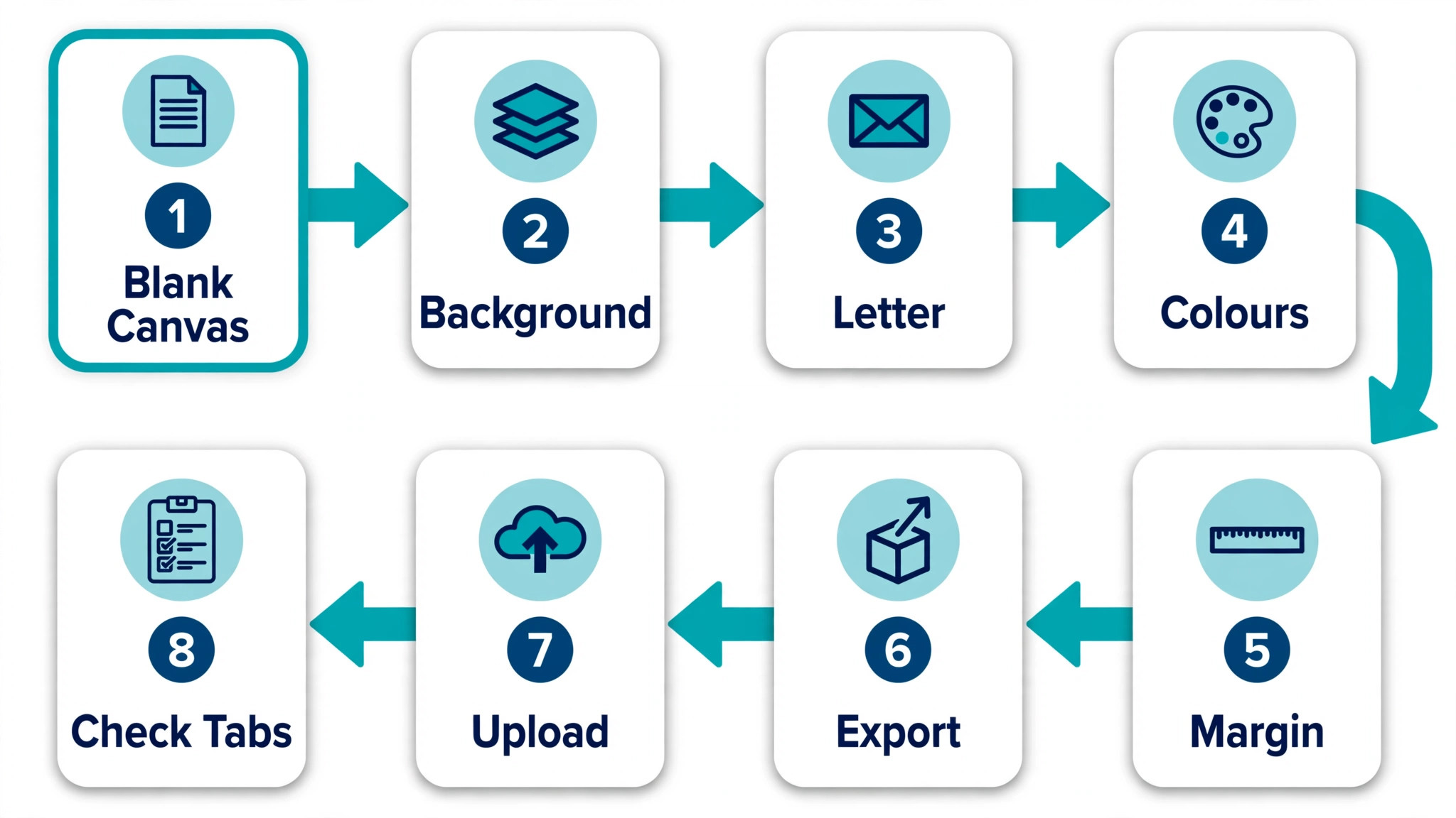
This is the full workflow for how to make a favicon with canva, from a blank canvas to a file ready to upload. Each step builds on the one before it, so work through them in order the first time. Once you know the process, the whole thing takes less than ten minutes for a second site.
Step 1. Open Canva and Set a 512 by 512 Pixel Canvas
Open Canva in your browser and sign in to your free account. Click the Create a design button, then choose Custom size from the menu. Type 512 in the width box and 512 in the height box, and make sure the unit is set to pixels. Click Create new design. This gives you a square canvas at the size WordPress recommends for site icons, and it is large enough that your design stays sharp when the platform scales it down.
WordPress asks for a site icon of at least 512 by 512 pixels, and it generates every smaller size from that one file. Starting at 512 pixels means the platform does the resizing for you, and you only need to design once. Canva also offers a logo size preset, but the custom size is better here because it gives you an exact square with no extra space to crop later. If you already have a Canva Pro account, you can also search the template library for logo designs and resize them later, but the custom canvas keeps the process simple on the free plan.
Step 2. Choose Your Background Shape and Colour
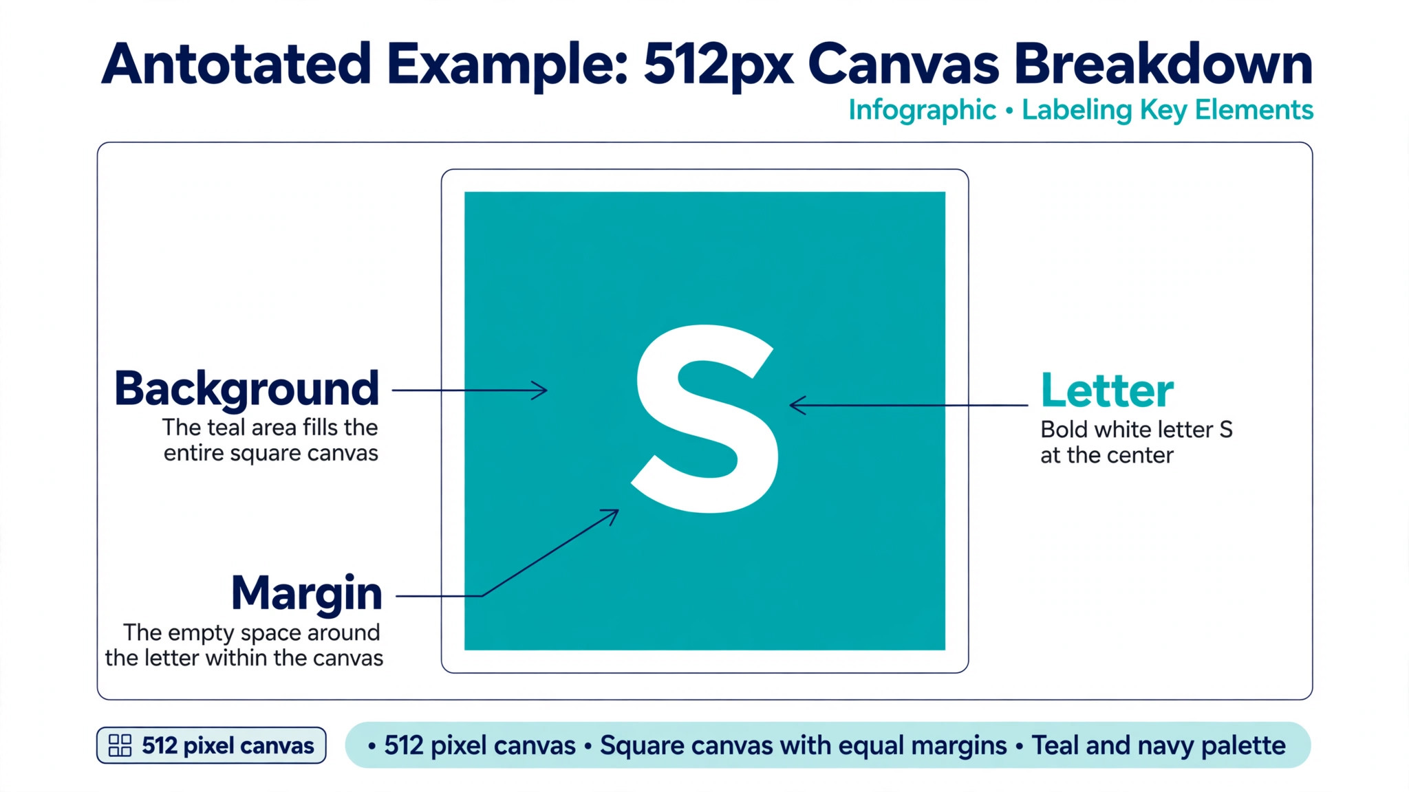
A favicon needs a background that makes the mark visible at tiny sizes. The safest choice is a solid square with slightly rounded corners in your main brand colour. Click on the canvas, then use the background colour control in the top toolbar to set your brand colour. If your brand colour is very light, use a darker shade of it so the icon still reads on a white browser tab. A white icon on a white tab is invisible, and that is the most common favicon mistake of all.
Rounded corners soften the square and match the way browsers and phones display icons, but do not overdo the rounding. A circle background also works well and looks natural on phone home screens. Avoid gradients and photos as backgrounds. A gradient that looks smooth at 512 pixels turns into muddy bands at 16 pixels, and a photo loses all detail. One flat colour, one clear shape, and plenty of contrast will carry the design further than any decorative effect.
Step 3. Add One Bold Mark or Letter
This is the step where most favicons fail, because the temptation is to add the whole logo. Resist it. Add one element only. If you are using a letter, click Text in the left sidebar, choose Add a heading, type the letter, and set it in a bold weight of your brand font. Make the letter as large as the canvas allows while leaving a small margin around it. The margin matters because browsers crop a few pixels at the edges, and a letter that touches the edge will look cut off.
If you are using a shape from your logo, upload the logo file and place it on the canvas, then delete or hide the wordmark part of the design. Use the Elements tab to find a simple shape if your logo has no standalone mark. A star, a leaf, a bolt or a geometric shape can work when it connects clearly to what your business does. Set the mark in white or a very light colour against your background. Light on dark gives the strongest contrast at small sizes, and contrast is what makes an icon readable in a crowded tab bar.
Step 4. Test the Design at 16 Pixels Before You Commit
Here is the test that saves most favicons from failure. Zoom out in Canva until your design is about the size of a thumbnail, or use the zoom control in the bottom right and set it to the smallest view. Then squint at the screen, or hold your phone at arm’s length. If you can still tell what the mark is, the design works. If it turns into a blur, the design needs simplifying. Remove a detail, thicken a stroke, or enlarge the letter until the shape reads clearly.
A useful trick is to take a screenshot of the canvas, shrink it to 16 by 16 pixels in any image viewer, and look at the result. This is the size your visitors will actually see. Many first drafts fail this test because they include two letters, a small symbol and a tagline. The fix is always the same. Keep the single strongest element and delete the rest. A favicon that shows one clear letter beats a favicon that tries to show your whole brand story in a space smaller than a pea.
Step 5. Check Contrast in Light and Dark Mode
Browsers now come in light and dark themes, and your favicon has to survive both. A dark mark on a transparent background vanishes on a dark tab. A light mark on a white background vanishes on a light tab. The solid background square you set in step two solves most of this, because the square itself carries the contrast. But check anyway. Open your browser settings, switch to dark mode, and look at a few tabs. Then switch back to light mode and look again.
If your background colour is close to the browser chrome in either mode, adjust it. A mid tone blue can blend into a dark grey tab bar, so push the colour darker or lighter until the square stands apart. Also check the icon against a white page background, because that is where it appears in bookmarks. The test takes two minutes and prevents the most embarrassing favicon outcome, which is an icon that is technically uploaded and practically invisible.
Step 6. Download as PNG and Handle the Transparent Background
Click Share in the top right, then Download. Choose PNG as the file type and set the size to the full 512 by 512 pixels. Download the file and give it a clear name like favicon-512.png. Canva’s free plan downloads the file with the solid background you designed, which is exactly what you want. The transparent background option sits behind Canva Pro, and you do not need it for a standard favicon.
If you do want a transparent version, for example because your mark is a white shape that should float on any background, you have two free options. You can remove the background colour from your canvas and download the PNG, then use a free background remover tool to strip the white, or you can start a Canva Pro free trial, export with transparency, and cancel before the trial ends. For most sites the solid background version is the better choice anyway, because it guarantees contrast in every browser theme. Keep the solid version as your main file and treat transparency as an optional extra.
Step 7. Create the Extra Sizes Your Site Needs
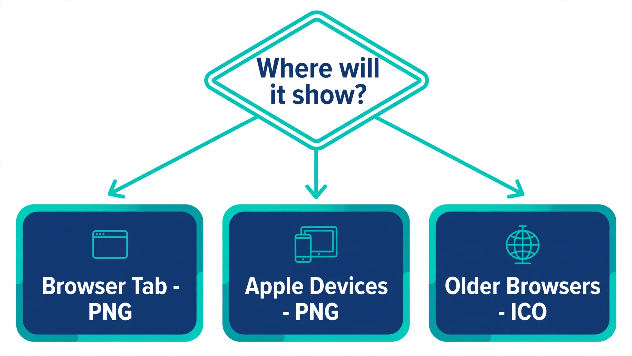
Your 512 pixel PNG covers WordPress, Squarespace and most site builders, which generate the smaller sizes themselves. If you run a site by hand or you want full control, generate the extra files too. A modern set needs a 32 by 32 pixel favicon.ico file for older browsers, an SVG version for sharp display at any size, a 180 by 180 pixel Apple touch icon for iPhones and iPads, and 192 and 512 pixel PNG files for Android home screens and install prompts. Free tools like RealFaviconGenerator take your 512 pixel PNG and produce the whole set with the code to add to your site.
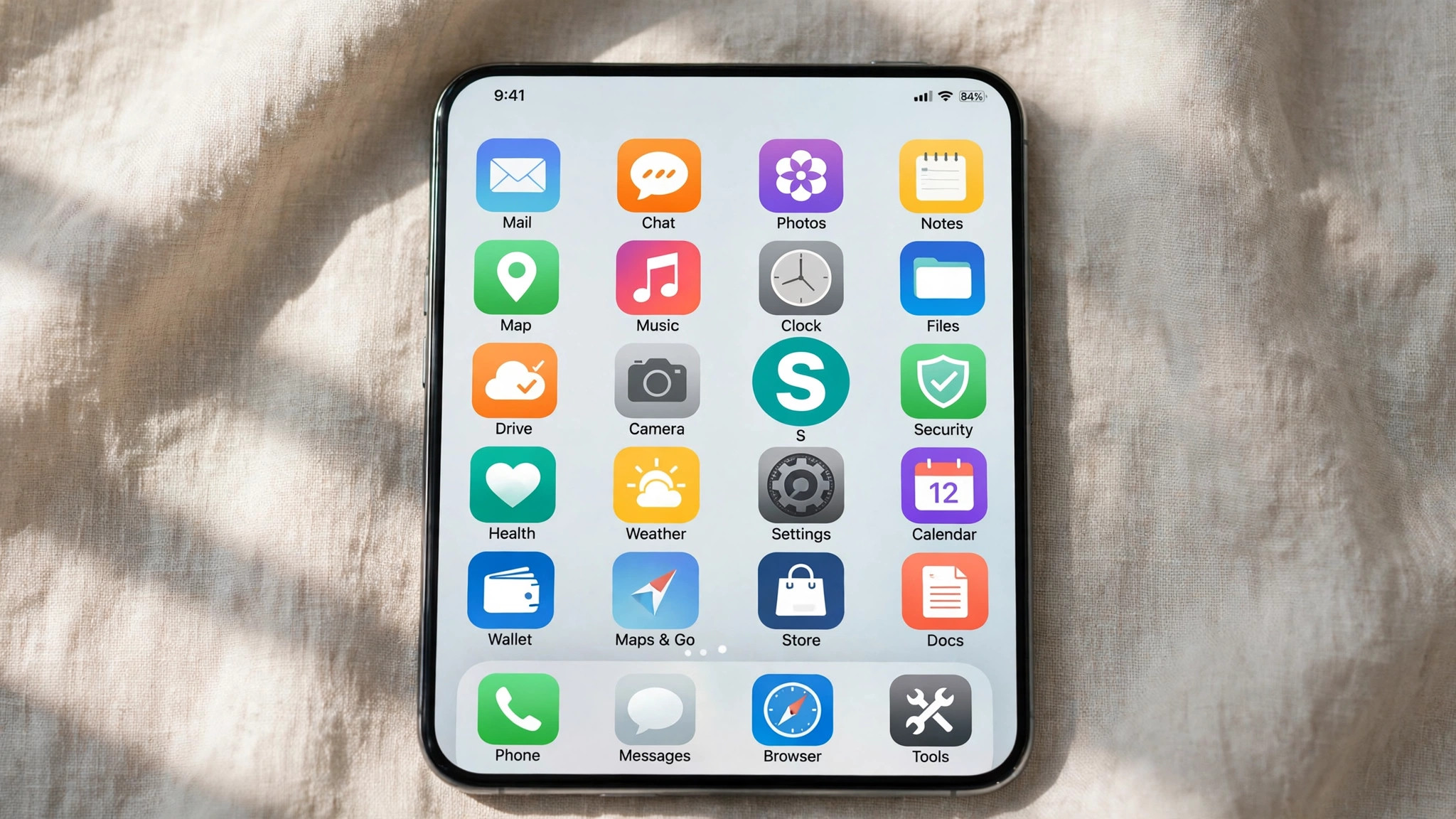
Do not skip the Apple touch icon if a meaningful share of your visitors use iPhones. When someone adds your site to their home screen without that file, iOS uses a screenshot of your page instead, which looks broken next to the clean icons around it. The 180 pixel file takes a minute to generate and fixes that completely. Name your files clearly and keep them in one folder so you can find them again when you redesign.
Step 8. Upload the Favicon and Check It Live
Upload the file in your site platform. In WordPress, go to Appearance, then Customize, then Site Identity, and upload the image as the site icon. In Squarespace, open Settings, then Website, then Favicon, and upload the PNG. In Shopify, open Online Store, then Preferences, and add the file under Favicon. In Wix, open Settings, then Favicon, and upload the image. Save the change, then open your site in a new browser tab and look at the tab bar. That is the moment of truth.
Browsers cache favicons aggressively, so your new icon may not appear right away. Clear your browser cache or open the site in a private window to see the fresh version. Check the icon in a bookmark too, and on your phone if you can. If the icon looks blurry, the upload may have used a smaller file, so re-upload the 512 pixel version. If the icon does not appear at all, check that the file is a PNG or ICO and that the upload actually saved. Once it appears in the tab, your site has its smallest brand asset in place.
Best Pick by Job
Not every reader needs the same approach, so match the method to your situation before you start designing. The table below gives the fastest route for each common case.
| Situation | Best route | Why it wins |
|---|---|---|
| WordPress site | Canva plus Site Identity upload | One 512 pixel file covers every size |
| No logo yet | Single letter in a bold brand colour | Reads clearly at 16 pixels |
| Existing logo with a mark | Upload the mark alone | Keeps brand consistency without clutter |
| Hand coded site | Canva plus RealFaviconGenerator | Produces the full file set and code |
| Phone heavy audience | Add the 180 pixel Apple touch icon | Stops iOS using a page screenshot |
Sizes and Formats That Actually Matter
The size table below covers the files that matter in 2026. You do not need to memorise it, but keep it handy when you export.
| File | Size | Where it appears |
|---|---|---|
| favicon.ico | 32 by 32 | Older browsers and RSS readers |
| icon.png | 512 by 512 | WordPress site icon source |
| icon.svg | Scalable | Modern browsers at any size |
| apple-touch-icon.png | 180 by 180 | iPhone and iPad home screens |
| icon-192.png | 192 by 192 | Android home screen and install prompt |
| icon-512.png | 512 by 512 | Android splash screen |
PNG is the format most people should use. It supports transparency, it compresses well, and every platform accepts it. SVG is sharper because it scales without losing quality, but not every platform lets you upload it as a site icon, so treat it as a bonus file rather than your only file. The ICO format survives mainly for older browsers that still request favicon.ico from the site root. If your site is hand coded, keep a 32 pixel ICO file in the root folder so those requests do not return a 404 error.
Google has its own rule worth knowing. For a favicon to appear in mobile search results, the icon must be a multiple of 48 pixels square or an SVG, and the file must be crawlable. A 48 pixel, 96 pixel or 192 pixel square all qualify. Your 512 pixel file does not qualify on the multiple of 48 rule, which is one more reason to generate the full set rather than uploading a single file and hoping for the best.
Mistakes That Ruin Most First Favicons
The same five mistakes appear in almost every bad favicon, and all five are easy to avoid once you know them.
- Using the full logo with the business name. A wordmark designed for a website header becomes an unreadable smear at 16 pixels. Use one letter or one mark instead.
- Designing on a transparent background with a dark mark. The mark disappears on dark browser themes. Use a solid background square in your brand colour.
- Adding thin lines and fine detail. Thin strokes vanish when the icon scales down. Thicken every stroke and remove any detail smaller than a few pixels at full size.
- Using a photo as the icon. Photos have too much detail for a 16 pixel square. A photo favicon looks like a blurry smudge in the tab bar, even when the original photo is excellent.
- Forgetting to test at real size. A design that looks good at 512 pixels can fail completely at 16 pixels. Shrink it before you upload, every single time.
A sixth mistake is subtler. Some site owners upload a favicon and never check it on a phone. The icon that looks fine in a desktop tab can look washed out on a bright phone screen, or it can clash with the phone home screen background. Open your site on your own phone after the upload and add it to the home screen. That thirty second check catches problems no desktop test will show.
How to Make a Favicon with Canva That Survives a Redesign
Brands change, and your favicon should change with them. When you update your logo or your brand colours, update the favicon in the same week. A stale favicon is worse than a plain one, because it tells returning visitors that the site behind the tab has not been touched in years. Keep your Canva design saved in your account so the next update is a colour change rather than a fresh design.
Save the source file as well as the exported PNG. Canva keeps your design in the cloud, but export a copy of the final PNG into the same folder where you keep your logo files. Note the hex codes you used, the font name and the letter you chose. A short note in that folder saves the next person on your team from guessing. If you hand the site to a developer or a new designer, that note is the difference between a five minute update and a full redesign.
One more habit pays off. Check your favicon once a year, in a fresh browser, on a phone you do not normally use. Browsers change how they display icons, platforms change their size rules, and a design that was perfect two years ago can look dated or slightly off today. A yearly check costs two minutes and keeps the smallest part of your brand in good shape.
Upload Shortcuts by Platform
The upload step is where people stall, because every platform hides the setting in a different menu. Knowing how to make a favicon with canva is only half the job. The other half is knowing where the file goes once it is exported, so here is the short version for the four platforms most readers use.
WordPress users should open the customizer, choose Site Identity, and upload the 512 pixel PNG as the site icon. WordPress then generates every smaller size automatically, and the icon appears in tabs, bookmarks and the admin bar. Squarespace users will find the setting under Settings, then Website, then Favicon, and the same PNG works there too. Shopify users should open Online Store, then Preferences, and add the file in the favicon field. Wix users will find it under Settings, then Favicon.
In each case, save the change and check the result in a private browser window, because the old cached icon can linger for hours in a normal window. Anyone learning how to make a favicon with canva for a hand coded site should place the ICO file in the site root and add the link tags to the page head, then test the result in two browsers before calling the job done.
Frequently Asked Questions
Can I make a favicon in Canva for free?
Yes. The free plan covers everything in this guide, including the custom 512 by 512 canvas, text, shapes and PNG export. The only feature behind Canva Pro is the transparent background export, and the solid background approach in this guide makes that feature unnecessary for most sites. You can also use a free trial of Pro for the transparent export if you need it, then cancel before the trial ends.
What size should a favicon be?
Design at 512 by 512 pixels, which is the size WordPress recommends for site icons and the size most platforms use as their source file. The icon itself displays at 16 by 16 pixels in a browser tab, with 32 by 32 and 48 by 48 versions used in bookmarks and search results. Starting large and letting the platform scale down keeps the small versions sharp.
What file format is best for a favicon?
PNG is the best default format because every platform accepts it and it supports transparency. SVG is sharper at any size but is not accepted everywhere as a site icon, so use it as an extra file rather than your only file. Keep a 32 pixel ICO file in your site root if you run a hand coded site, because older browsers still request it.
Why is my favicon not showing up?
The most common cause is browser caching. Browsers store favicons for a long time, so clear your cache or open the site in a private window to see the new icon. If it still does not appear, check that the upload actually saved in your platform settings, and confirm the file is a PNG or ICO at a square size. On WordPress, re-upload the 512 pixel file through Site Identity and save the customizer changes.
Do I need a different favicon for dark mode?
You do not need a separate file if your favicon uses a solid background square, because the square carries the contrast in both light and dark themes. A transparent favicon with a dark mark will vanish on dark tabs, and a transparent favicon with a light mark will vanish on light tabs. If you want a dedicated dark mode icon, modern browsers support an SVG with a media query, but the solid square approach solves the problem for nearly every site.
Can I use my full logo as a favicon?
You can, but you should not. A full logo with a business name becomes unreadable at 16 pixels, and the text turns into noise. Use the standalone mark from your logo, or the first letter of your business name in your brand font and colour. If your logo has no standalone mark, design one now. A simple shape that matches your brand will serve you better than a shrunken version of the full logo.
Final Verdict
A good favicon is a small job with an outsized return. It costs twenty minutes and nothing else, and it makes your site look finished in every tab, bookmark and search result where it appears. The rules are simple. Start at 512 by 512 pixels, use one bold mark on a solid background, test at 16 pixels before you upload, and check the result in a real browser and on a real phone. Learning how to make a favicon with canva is a one time skill, and once you have the file and the process, every future site takes ten minutes. Open Canva, set the canvas, and get the smallest part of your brand right today.