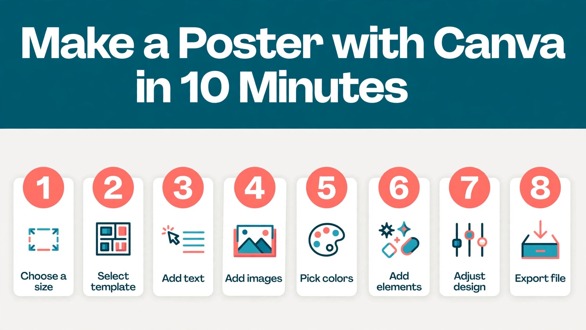
Your event is on Friday, the wall is empty, and nobody on your team knows how to use a professional design app. That is the exact moment Canva earns its place, because learning how to make a poster with Canva takes minutes rather than a weekend course. You pick a size, choose a template, swap in your words and photos, and export a file a print shop can use. The whole job fits into a lunch break when you know which buttons matter and which ones to ignore.
This guide walks through the process in eight steps, from choosing the size to exporting the finished file. The free plan covers every step, and we flag the moments where Pro saves real time so you can decide whether the upgrade is worth it for one poster. By the end you will have a poster that reads clearly from three metres away, prints without surprises, and looks like it came from a designer rather than a template.
What You Need Before You Start
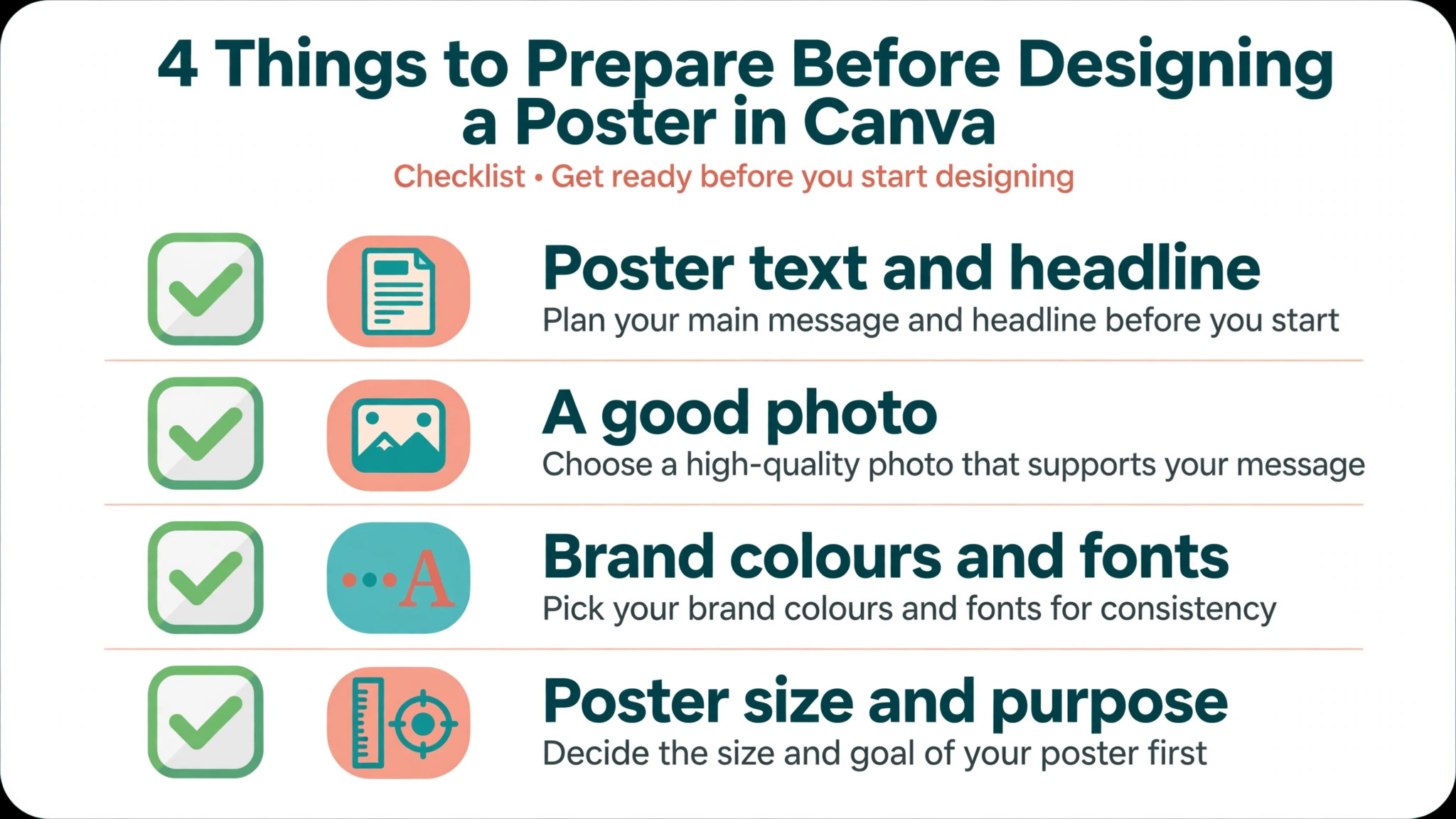
A good poster starts before you open Canva, with four things decided in advance. First, the one message the poster must carry, because a poster that tries to say five things says nothing at reading distance. Second, the event details, meaning the date, time, place and one way to act, such as a ticket link or a phone number. Third, one strong photo or graphic, because a poster with no image reads as a notice board rather than an invitation. Fourth, the print size, because a design made for a phone screen will blur when it is printed at 18 by 24 inches.
Gather those four items before you touch a template and the design itself takes about 10 minutes. The most common reason a poster takes two hours is not the tool, it is stopping halfway to write the headline, find a photo or ask someone for the date. Write the words in a notes app first, save the photo to your computer, and confirm the size with the printer or the wall where the poster will hang.
| Item | What to prepare | Where it goes |
|---|---|---|
| Headline | Five words or fewer | Top third of the poster |
| Details | Date, time, place, action | Lower third, larger than body text |
| Photo | One sharp image, high resolution | Centre or background |
| Logo | PNG with a transparent background | A corner, small and quiet |
Pick Your Poster Style First
Posters fall into a few styles, and choosing one before you browse templates saves the most time in the whole job. An event poster leads with a big date and a photo that sets the mood. A sale poster leads with the offer and the price, with the details in smaller type below. A notice poster leads with a short warning or instruction and uses high contrast so it reads from a distance. An art poster leads with an image and keeps the text to a title and a credit line.
Look at the wall where the poster will hang and match the style to the distance. A poster in a shop window is read from two metres away, so the headline must be huge and the details can be small. A poster on a community board competes with 20 other sheets, so the colour and the photo must win attention in one second. A poster inside a classroom is read up close, so you can afford a little more text. The style choice decides the template, the font size and the amount of white space, so make it before you open the template gallery.
Colour does as much work as the headline. Two colours plus black and white is enough for most posters, and a third colour should earn its place by marking the one action you want, such as the ticket link or the date. Canva templates often arrive with four or five colours, and the quickest improvement you can make is to delete one of them. High contrast between the text and the background is not optional, because a beautiful pale headline on a pale photo is invisible from the street.
How to Make a Poster with Canva in 8 Steps
The eight steps below follow the order that wastes the least time. Size first, because everything else depends on it. Template second, because a good template sets the layout for you. Text third, because the words decide the space. Images fourth, because they fill the layout the text leaves. Brand, checks and export last, because they only work on a finished design. Follow the order and you will not rebuild the poster halfway through.
Step 1. Pick the Right Poster Size
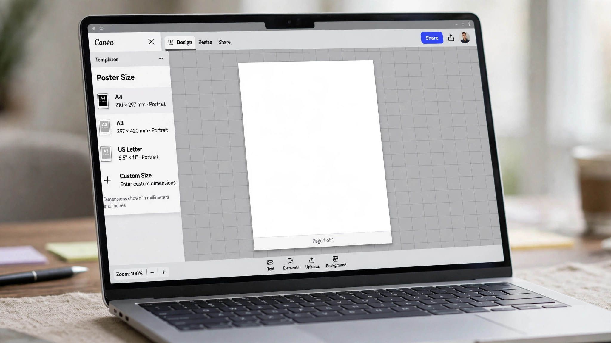
Open Canva and click Create a design, then search for Poster. Canva shows the common poster sizes, and you can also type a custom size in inches, centimetres or pixels. For a printed poster, 18 by 24 inches is the standard large size in the United States, 11 by 17 inches is the standard small size, and A3 at 29.7 by 42 centimetres is the standard size in much of Europe and Asia. Pick the size that matches your print plan, because a design made at one size and stretched to another loses sharpness.
Custom size is the right choice when the printer gave you exact dimensions or when the poster must fit a specific frame or window. Type the width and height, choose inches or centimetres, and Canva builds a blank page at that size. Do not start at a small size and plan to enlarge it later, because the images and text will soften. It is far easier to shrink a large design than to enlarge a small one, so when you are unsure, choose the larger size.
Step 2. Start from a Template or a Blank Page
Templates are the fastest route, and Canva offers thousands of poster templates for events, sales, classes, movies, menus and community notices. Search the template gallery with the event type rather than a vague word, so search for bake sale poster rather than poster, and you will see results that already carry the right layout. Pick a template whose layout you like rather than one whose colours you like, because colours take seconds to change and layout takes much longer to fix.
A blank page is the better choice when your poster has an unusual shape, a lot of text, or a brand layout you must follow exactly. Start blank, set your size, and build the layout yourself with text boxes and shapes. Beginners should start with a template for the first poster and try a blank page for the second, because the template teaches the layout habits that make a blank page work. Either way, delete any template element you do not need before you add your own content, because leftover shapes and lines are the most common source of a cluttered poster.
Step 3. Set the Layout with a Clear Hierarchy
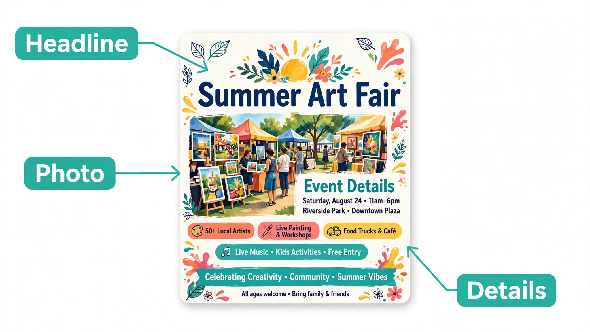
Hierarchy is the order in which the eye reads the poster, and a good poster has exactly three levels. The headline is the largest element and carries the one message. The supporting line is medium sized and carries the reason to care, such as the performer, the discount or the speaker. The details are the smallest text and carry the date, time, place and action. When all three levels use the same size, the eye has nowhere to start and the reader walks past.
Use the grid and the alignment tools to keep the three levels tidy. Canva shows purple guides when elements line up, and the Position tool lets you centre a group or space several items evenly. Keep the headline in the top third, the image in the middle, and the details in the lower third, which is the layout most templates use because it matches how people scan a wall. Leave empty space around each level, because white space is what makes the headline feel large rather than the font size alone.
Step 4. Add Your Headline and Text
Click the Text tool and add a heading, then type the headline you wrote before you started. Keep it to five words or fewer when you can, because a headline is a shout, not a sentence. Use a bold font at a large size, and check the headline from arm’s length by zooming out to 25 percent, because that is roughly how the poster will look from the street. When the headline is hard to read at 25 percent, it is too small or too thin.
Add the supporting line next, in a smaller size and a lighter weight, then add the details at the bottom in the smallest size that still reads at one metre. Keep the details to one line each where possible, one line for the date, one for the time, one for the place and one for the action. Avoid long paragraphs entirely, because nobody reads a paragraph on a poster. When a sentence feels necessary, cut it to a phrase, and when a phrase feels necessary, cut it to three words.
Step 5. Add Photos and Graphics
One strong photo beats three average ones, so pick the best image you have and let it carry the poster. This is the step where learning how to make a poster with Canva pays off, because the crop and position tools do the work a design app would charge for. Upload your own photo with the Uploads tool, or search Canva stock for a free image that matches the mood. Drag the photo into the frame and use the crop handles to fill the space, then double click the image to adjust its position inside the frame. A photo that is cropped tightly to the subject reads far better than a wide photo shrunk to fit.
Check the photo quality before you finish, because a blurry photo ruins an otherwise good poster. Zoom to 100 percent and look at faces and text inside the image. When the photo looks soft at full size, replace it with a higher resolution version or shrink it on the page so the softness stops showing. The free plan includes millions of stock photos, and Pro adds 141 million premium photos, videos and graphics, but a phone photo taken in good light often beats a stock image that looks like every other poster on the board.
Step 6. Apply Your Brand Colours and Fonts
Brand consistency is what makes a poster look professional rather than improvised, and Canva makes it easy once the colours are saved. On the free plan you can save one Brand Kit with three colours, and on Pro you can save five Brand Kits with your logo, colours and fonts. Click a text box or a shape, open the colour picker, and choose from the saved brand colours rather than guessing a shade each time. A poster that uses your real brand colours looks like it belongs to your business, while a poster with random colours looks like a one-off.
Fonts matter as much as colours, so pick one font for the headline and one for the details, and do not add a third. A bold display font works for the headline, and a clean readable font works for the details. Canva Pro lets you upload your own fonts, which matters when your brand uses a font Canva does not carry. When you have no brand font, use the font pairing Canva suggests inside the template, because those pairings were chosen by designers and they save you from a clash you would only notice after printing.
Step 7. Check Spacing, Alignment and Readability
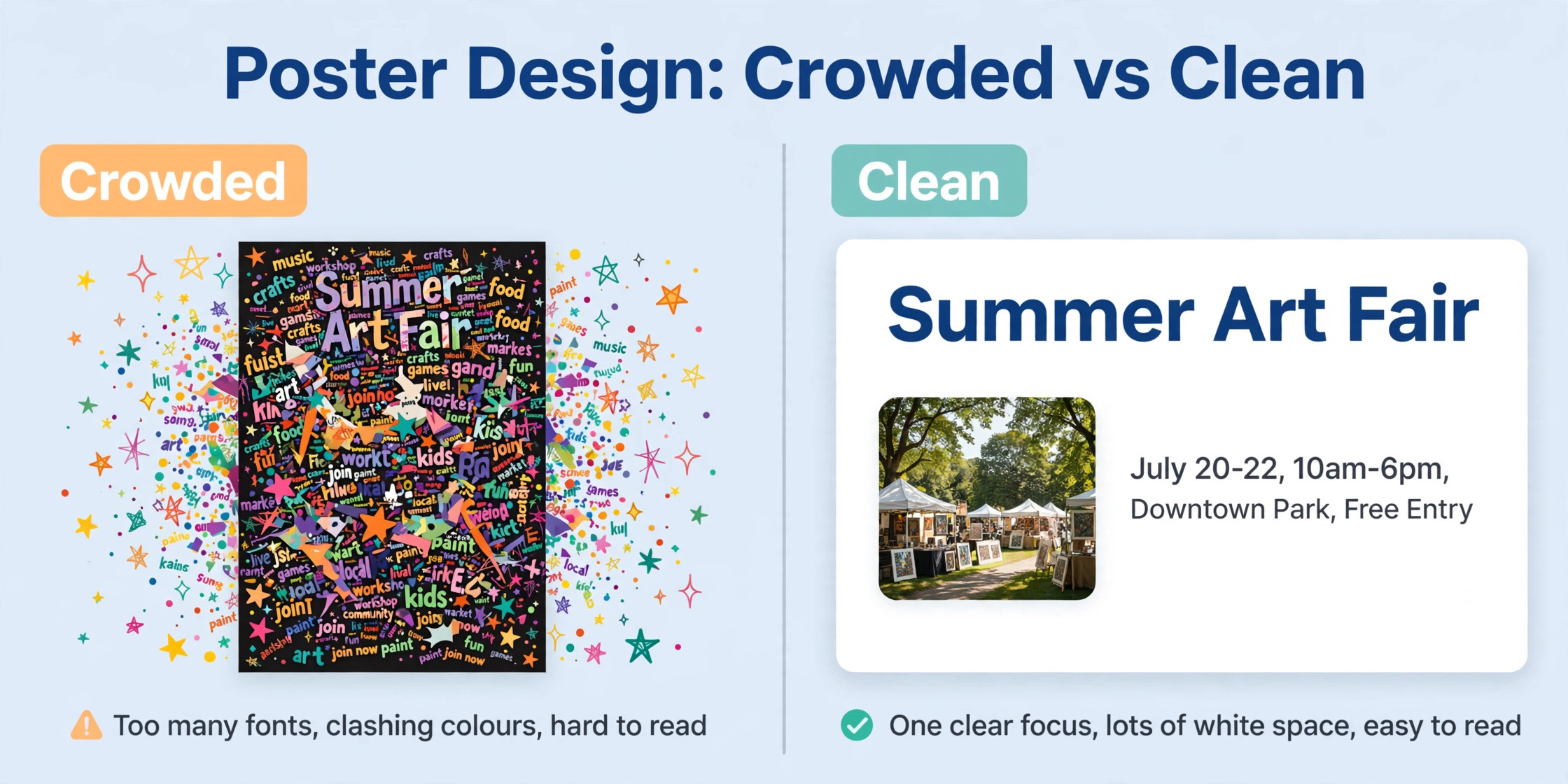
This is the step most people skip, and it is the step that separates a good poster from a great one. Zoom out to 50 percent and look at the whole page as a shape. The headline, the image and the details should form a clear path for the eye, with no element touching the edge of the page by accident and no text sitting on a busy part of the photo. When two elements feel crowded, add space between them rather than shrinking the text, because space is free and smaller text is harder to read.
Run three quick checks before you move on. First, read every word out loud and fix any typo, because a typo on a printed poster is permanent. Second, check that the date, time and place are correct against the original source, not against your memory, because a wrong date is the most expensive poster mistake. Third, check the contrast by squinting at the poster, because any text that disappears when you squint will disappear from the street too. Fix contrast by adding a solid shape behind the text or by darkening the photo under it.
Step 8. Export and Print or Share
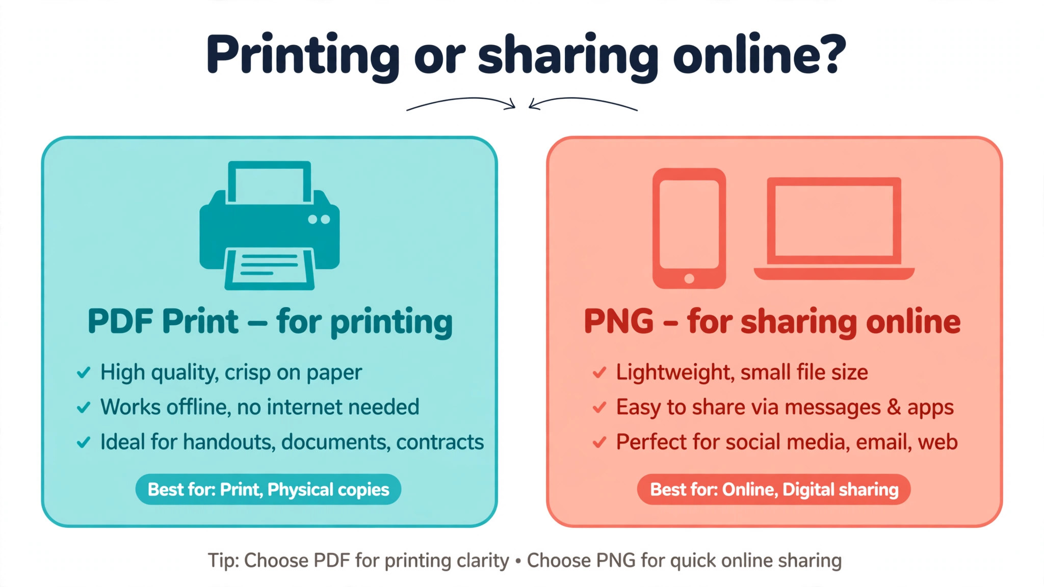
Export is where a screen design becomes a real poster, and the format you choose decides the result. For printing, choose PDF Print, which is the highest quality export Canva offers. On Pro you can also add crop marks and bleed and export in CMYK, which is the colour format print shops ask for, so the printed colours match the screen more closely. For sharing online, choose PNG for a crisp image or JPG for a smaller file, and download at the highest quality setting.
Before you send the file to a printer, confirm the size and the format they want, because every print shop has its own preference. Some want a PDF with bleed, some want a JPG at a set size, and some accept a Canva link directly. Canva Print can also print and ship the poster for you, which removes the file handoff entirely and is the easiest option for a first poster. Keep a copy of the finished design in Canva, because you will want it again when the event repeats next year.
Free vs Pro for Posters
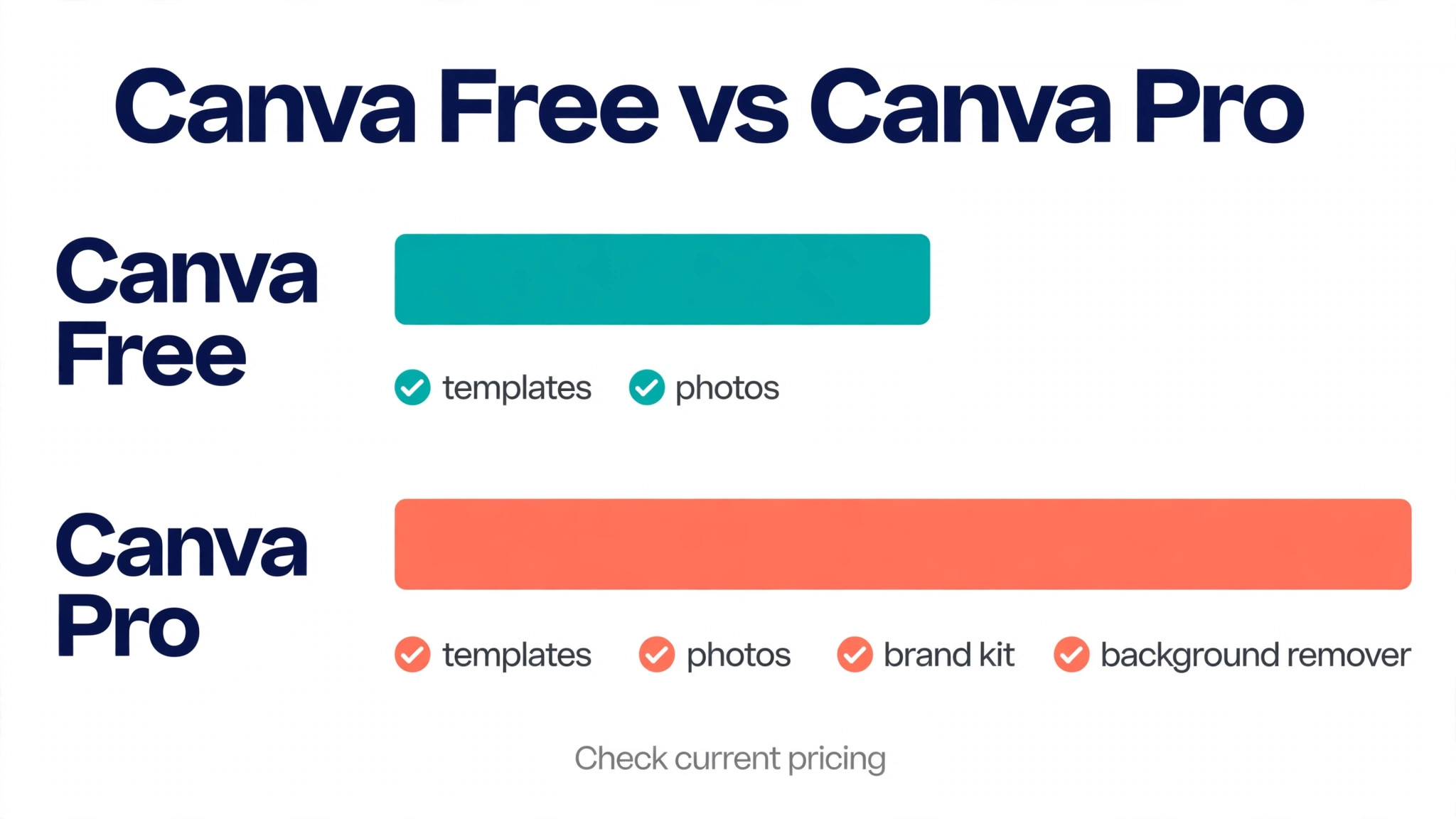
The free plan covers every step in this guide, and most people should start there. You get thousands of templates, millions of stock photos, 5 GB of storage and the full editor, which is enough for a one-off event poster. The free plan locks three features that matter for posters, the background remover, the full Brand Kit and Magic Resize, and it limits you to one Brand Kit with three colours. For a single poster, those limits rarely matter.
Pro costs 144 dollars a year, or 18 dollars a month paid monthly, and it pays for itself when posters are a weekly job. The background remover cuts a product or a person out of a photo in one click, which is the difference between a clean poster and a photo with a distracting background. Magic Resize turns one poster into a flyer, a social post and a story in one click, which saves an hour when the same event needs five formats. Pro also adds transparent PNG and SVG exports, 100 GB of storage and print-ready CMYK export, which is the feature a print shop will ask about first.
The honest rule is simple. Make your first poster on the free plan, and upgrade only when you hit a locked feature twice in one month. A monthly Pro subscription is the cheaper way to test it, because one month of Pro costs less than a single rushed print run. Cancel after the event when the posters stop, and your templates and designs stay in your account for the next time.
Poster Sizes That Work
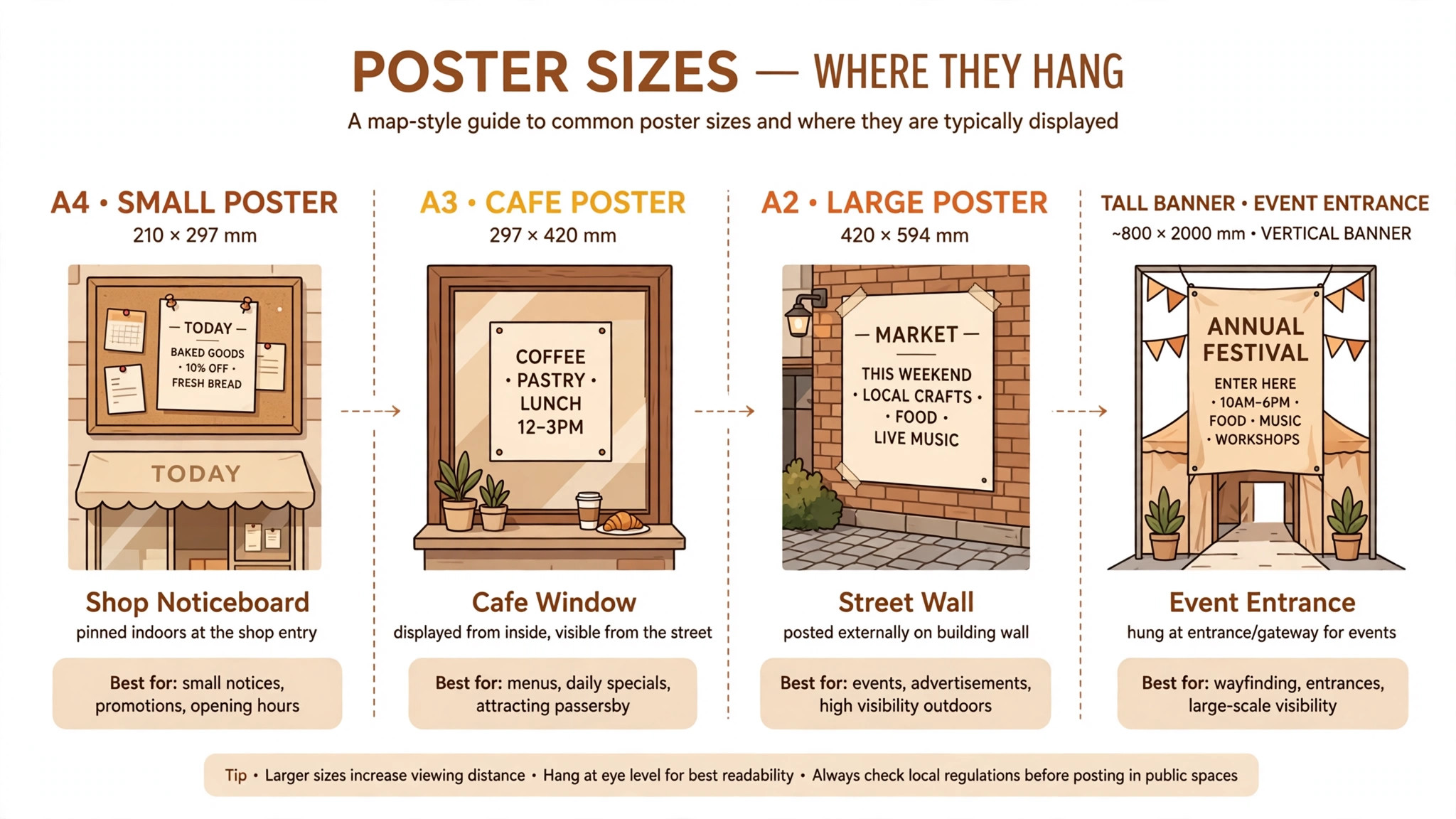
Size is a decision, not a detail, because it decides where the poster can hang and how far away it can be read. A small poster at 11 by 17 inches suits a shop counter, a classroom door and a community board, where readers stand within a metre. A large poster at 18 by 24 inches suits a shop window, a hall wall and a street board, where readers stand two or three metres away. A very large poster at 24 by 36 inches suits an exhibition hall and a conference, where the headline must win attention across a room.
Match the text size to the viewing distance rather than to the page size. A headline that reads well on a small poster will vanish on a large one, because the reader stands further away. As a rough guide, a headline for a large poster should be at least 100 points, and the details should be at least 24 points, but the real test is the zoom test from step four. Shrink the design to 25 percent on screen, and when you can still read the headline, the size is right.
Whatever size you pick, the steps for how to make a poster with Canva stay the same, because the size changes the canvas rather than the process. Print shops can also advise on size, so ask before you export when you are unsure.
Mistakes That Ruin Posters
The most common mistake is too many words. A poster is not a flyer and not a web page, and every extra sentence pushes the reader away. Cut the text until only the headline, one supporting line and the details remain, then cut one more line and see whether the poster still works. When it does, leave that line out. The poster that wins is usually the one with the fewest words on the board.
The second mistake is low contrast, usually pale text on a busy photo. The fix is simple, add a solid shape behind the text, darken the photo, or move the text to a quiet part of the image. Canva has a background remover on Pro and a transparency slider on both plans, and either tool can rescue a poster that looked fine at full screen and unreadable at arm’s length. Check contrast with the squint test from step seven before every export.
The third mistake is the wrong export. A JPG downloaded at low quality will look soft when printed large, and a PNG made for a phone screen will pixelate on a 24 inch poster. Export for print as PDF Print, and for screens as PNG at the highest quality. The fourth mistake is forgetting the action, because a beautiful poster with no date, no place and no ticket link is decoration rather than an invitation. Put the action in the largest detail text, and check it twice.
Reuse One Poster Everywhere
A poster that works once should work five times, and Canva is built for that. Once you know how to make a poster with Canva, the second version is a duplicate rather than a new design. Duplicate the design from your homepage, then change the size for each format you need. Pro users can use Magic Resize to turn the poster into an Instagram post, a story, a Facebook cover and a flyer in one click, then adjust each version by hand, because automatic resizing is a starting point rather than a finished design. Free users can duplicate the design and change the size manually, which takes a few minutes per format.
Keep the headline and the photo the same across every version, and change only the layout and the detail text. That consistency is what makes people recognise the event when they see it a second time. Save each version with a clear name that includes the format and the date, so you can find the right file in a month. The time you save by reusing one strong design is the time you can spend on the next event, and it is also how small teams produce a professional campaign without a designer.
Print at Home vs a Print Shop
A home printer suits a single poster for a door or a classroom, and it costs nothing beyond paper and ink. Use the best quality setting, choose thick paper when you have it, and print a test copy first, because home printers often darken colours and cut the edges. A home print is fine when the audience is small and the poster is temporary.
A print shop suits anything that must look professional, anything larger than A3, and any run of more than five copies. The shop prints on heavier paper, matches colours more accurately, and can add a laminate finish that survives rain on a street board. Ask for a price before you commit, because a single large poster can cost more than a pack of ten small ones, and the paper choice changes the price. Bring the PDF Print file on a USB stick or send it through the shop website, and ask for a proof when the poster matters.
Frequently Asked Questions
Can I make a poster in Canva for free?
Yes, you can make a complete poster on the free plan, including templates, stock photos, text and PDF export. The free plan gives you thousands of poster templates and millions of stock photos, plus 5 GB of storage, which is enough for a one-off event poster. Pro adds the background remover, Magic Resize, the full Brand Kit and CMYK export, but none of those are required for a good poster. Start free, and upgrade only when a locked feature slows you down twice in one month.
What size should a Canva poster be?
The right size depends on where the poster will hang and how far away readers will stand. Use 11 by 17 inches for a counter, a door or a community board, 18 by 24 inches for a shop window or a hall wall, and 24 by 36 inches for an exhibition or a conference. When the printer gives you exact dimensions, use a custom size with those numbers rather than guessing from a template. Always design at the final size, because enlarging a small design softens the images and the text.
How do I print a poster made in Canva?
Download the design as PDF Print, which is the highest quality export and the format most print shops prefer. On Pro you can add crop marks and bleed and export in CMYK, which helps the printed colours match the screen. Send the PDF to your printer with the size and the paper type you want, or use Canva Print to order the finished poster with shipping and tracking. Ask the printer for their file specifications first when you use a local shop, because the preferred format and bleed size vary.
How to make a poster with Canva that looks professional?
A professional poster follows three rules, few words, high contrast and consistent branding. Keep the headline to five words, use one font for the headline and one for the details, and use your real brand colours rather than the template colours. Leave empty space around each section so the eye can find the headline first. Learning how to make a poster with Canva that looks professional is mostly about restraint, because the tool makes it easy to add elements and the skill is knowing which ones to delete.
Can I use my own photos in a Canva poster?
Yes, you can upload your own photos from your computer or phone with the Uploads tool, and Canva accepts JPG, PNG and other common formats. Use the highest resolution version you have, because a low resolution photo will look soft when printed large. You can crop, filter and position an uploaded photo exactly like a stock image, and on Pro you can remove the background in one click. Own photos usually beat stock images for local events, because the audience recognises the place and the people.
How long does it take to make a poster in Canva?
A simple poster takes about 10 minutes when the words, the photo and the size are decided before you start. The first poster takes longer, usually 30 to 45 minutes, because you are learning the editor and choosing a template. Repeat posters for the same event take five minutes, because you duplicate the old design and change the date. The time goes to decisions rather than to the tool, so prepare the headline and the details first and the design stays fast.
Knowing how to make a poster with Canva is a skill that pays off every time your business, school or community needs to be seen. Start with the size, pick a template for the layout, keep the words short, use one strong photo, and export as PDF Print for the printer. Make the first poster on the free plan, and let the results decide whether Pro earns its price. The wall is waiting, and ten minutes is enough.